
After Reviewing 100s of Landing Pages, These Are the Top 3 Mistakes

You start to see trends after reviewing 100s of landing pages.
When someone asks me to review their landing page, I could copy and paste the same feedback I’ve given 100+ times and it would be spot on.
I’ve learned that when you’re good at something or done it over and over and over again, what’s a secret to others becomes more and more obvious to you.
In the back of my mind, I have a list of 10–15 things I look for on every landing page.
But there are 3 mistakes that are way more common than the rest.
If you fix these, you’ll have a great advantage over your competition. And yes — being better than your competitors matters if you want to make money or do anything significant online.
People have limited time and resources to spend. When they’re ready to buy, they’re comparing you and your competitors side-by-side.
Only the best of the best wins.
Chances are, your competition is making these mistakes. I’ll show you how to avoid the common mistakes so you win.
Let’s get right into it!
1. Too much we. Not enough you.
Your landing page is about your business, your product, or your service.
The big problem with that is no one cares about you. They care about themselves. People are selfish, so your landing page needs to be more about the reader than your thing.
That doesn’t mean you don’t explain what your product or service does.
It means you need to communicate why it’s valuable to the reader.
Here are two great examples I found:
Example #1 is from kapwing.com
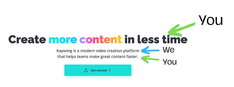
The headline is a big benefit. Then you read what Kapwing is, and another benefit. The sentence about the product is sandwiched between two benefits that the reader cares about.
This landing page would suck if the headline was “Kapwing is a modern video creation platform”, but that’s exactly what I’ve seen on so many landing pages.
People don’t care about what your business does — they care a lot about what it does for them.
Example #2 is from webgazer.io
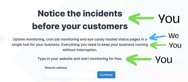
See how they do the same thing?
Benefit What the product does Benefit Benefit
Your landing page can and should have stuff about you and your business.
But you need to use “you” and “your” twice as many times as “we”.
2. Absence of social proof
I say this in every article I write about landing pages. I’ll continue saying it because it’s still a problem. A lack of social proof is also an easy problem to fix.
Most of the landing pages I review have social proof — it’s just hiding somewhere else.
Last week, I reviewed landing pages for a podcast and a mobile app. The podcast had reviews on the Apple podcast app, and the app had reviews in the App Store. But neither of them had any reviews on the landing page. Both of those are easy to copy → paste.
Social proof doesn’t just build trust — although that’s the primary benefit.
I’m hesitant to go to a new restaurant or cafe if it’s empty. Why aren’t there other people eating and drinking here? Is there something wrong with this place? I have the same thoughts when I click on someone’s Calendly link and every time slot is available. They must not be working with anyone else. I don’t buy something from Amazon if there are 0 reviews.
Seeing other people used the thing and had a good experience is crucial.
This also creates FOMO — people want to do what other people are doing. 7,500 writers are reading this newsletter? I better join them so I don’t miss out.
Lastly, testimonials enable users to envision themselves using your product or service. Good reviews will highlight the best features and benefits and give the reader an idea of what it’s like to sign up or use your thing.
You can’t have too much social proof
Justin Welsh is a great example of this — his course pages have a shocking amount of reviews. But you can’t scroll down the page and still have doubts that his courses are awesome.
There’s no possible way that many people have done this course and left a glowing review if the course is bad.
Mark Spera from growthmarketingpro.com said he’s A/B tested this and has never seen a page perform worse with the addition of social proof.
What can you do if you don’t have any reviews yet?
When you launch something new, you need the landing page to be spot on. That means you need to have some type of social proof.
Here are 4 ideas to get social proof before you can collect customer reviews:
- Get recommended by an adjacent business.
- Offer a full guarantee — promise to fix things if everything goes wrong.
- Pre “sell” your product or service for free, in exchange for an honest testimonial.
- Share your experience or industry certification. Show people why you/your product are qualified to solve the problem.
Once your landing page is live and you’re getting customers, you need to ask and incentivize your users or buyers to give you a review or testimonial.
If you don’t ask, most people won’t give you a review, even if they love your product.
3. Clear CTAs
Your landing page needs to have one clear goal.
When you spend so many hours building and optimizing your own landing page, it’s easy to assume that people will find our CTA button, know exactly why they should click it, and know what happens when they do.
That’s not the reality of the matter.
If your visitor wants the thing badly enough, they’ll put in some extra effort to find and click your CTA, but most people will be on the fence. If anything confuses them, or they don’t know which button to press, they’ll leave.
You need to make your CTA crystal clear and very obvious.
Remember, most of your visitors are there for the first time, and you’ve been on your page 100s of times.
I have a few general rules for call to action buttons.
- Use specific text, not “Get Started”
- Make all of your CTA buttons match (color and text)
- Don’t use that color anywhere else on your landing page
- Use multiple (identical) CTA buttons if your landing page is long
- Include something to reduce risk near your CTA button. Example: Free trial (no credit card required)
According to VWO, Open Mile increased their conversions by 232% after removing the clutter and adding white space around their landing page CTA.
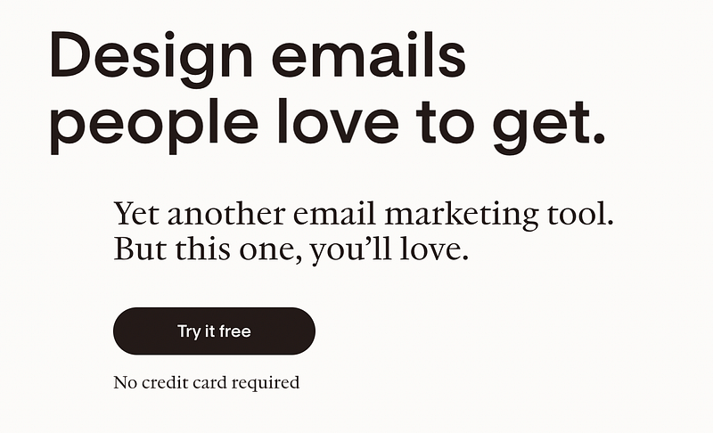
Flodesk is a good example of specificity and reducing risk by telling you Try it free and no credit card required. I wouldn’t use a black button, but it stands out fairly well.
Influence Kit is a good example of a CTA button that stands out.
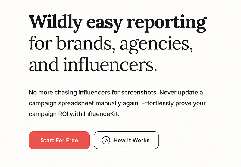
You’re immediately drawn to the button, and that color isn’t used anywhere else. They also show you how to use a secondary CTA button — and this one simply scrolls you down the page.
I wouldn’t recommend using multiple buttons if the second one takes you to a different page.
One exception might be [Start for free] and [Book a demo] because they’re both dealing with getting started with the product/service.
Your CTA is only a few words, but it’s the most important button on the entire page.
If you fix these 3 common mistakes on your landing page, you’ll be well on your way to higher conversion rates.
In case you couldn’t tell, I’m a bit obsessed with landing pages. I’ve written a number of articles sharing my tips and strategies, and have plenty more in the works.
ps. I just launched Page Pilot — my 1-on-1 landing page course. It’s a done-with-you course that will help you create awesome landing pages for yourself and clients.