
Advanced Tutorial: How to Master Matplotlib Like an Absolute Boss
Use Matplotlib like never before

I used to have a rule…
When I was a beginner learning data visualization, I used to have a rule — never, ever visit the Matplotlib documentation.
Nothing good ever came out of there. When I was on its pages, my eyes would process English words but, somehow, they were interpreted into my brain like I was deciphering a foreign language. Then I would stumble upon some masterpieces like these, and I would think, do I even use the same library?
Even if you are a seasoned programmer, I am sure you’ve faced similar challenges while learning Maplotlib. It is no easy library. There are so many classes and so damn many ways of doing the simplest tasks — utter confusion.
If you are in that position or want to step up your Matplotlib game, I’ve got the guide you need. I will show you to reach deep into the roots of the Matplotlib jungle, set a fire on it, and fly out on a jetpack.
Let’s start!
Matplotlib artists
Though exceptional programmers wrote Matplotlib, it consists of base classes called Artists.
Every circle-annotated component of the plot is implemented as a separate class that inherits from the base artist. But this ability to represent everything as a class has its pros and cons.
On the one hand, it gives Matplotlib unprecedented flexibility. Using their respective class, you can tweak virtually any plot component until you are satisfied. Often, you have multiple options to do the same task, enabling you to switch between different interfaces.
Perhaps, this is what upsets Pythonistas about MPL the most. According to the zen of Python, there should be one, and preferably only one obvious way to do something. And Matplotlib API is a violation of this rule in every way imaginable.
As a result, beginners are confused. They don’t know which class or function to use to do a simple task. They don’t understand the documentation because, frankly, it is so damn hard to understand. Even experienced developers may not have a clue what errors like this mean:
Naturally, you are frustrated because you don’t know where the heck you used the Lined2D object or where it came from.
If you’re one of these people, I will show you a few tricks that I have learned, which will make you a pro Matplotlib user and read the documentation like you would read children’s bedtime stories.
Creating a smooth workflow of your own
We will start by choosing a unified approach to doing tasks. There are many ways to do a single one, so it is essential to stick to only one style and master it.
The workflow I use to create a plot and customize it is as follows:
- Create the plot itself with basic elements and low customization.
- Find out the weaknesses of the plot and make a note of the components you want to improve.
- Isolate those weak components with relevant Matplotlib functions.
- Tweak them until you are satisfied, using the Swiss army knife of Matplotlib (more on that later).
- Save or display the plot.
We will learn how to do each step in detail. I guarantee you that this framework works for almost any type of plot you create and the customization you want to make.
Figuratively speaking…
Let’s start by learning how to create plots using figures. A Figure object in MPL is the highest-level artist, which can be considered as the canvas you draw everything on.
You can create a figure with nothing drawn on it with the figure function. On its own, the figure does nothing - remember that it is the blank white page you draw your plots on.
We will come back to figures later.
Let’s throw Axes!

The fun begins when we add axes to the figure. The Axes class is an artist that represents a set of x, y coordinate systems in a plot:
The function to add a blank axes to a figure is add_axes but in practice, you never use it. Instead, you usually create a single figure and one or more axes simultaneously using the subplots function:
>>> fig, ax = plt.subplots()
This immediately creates a figure and attaches an axes (coordinate system). Next, we start plotting data on the axes using the plotting methods.
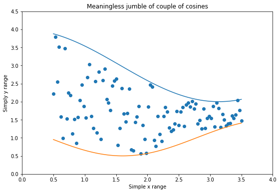
These plots have names such as bar, hist, scatter, boxplot, etc. Let's create a simple scatterplot and draw a couple of lines:
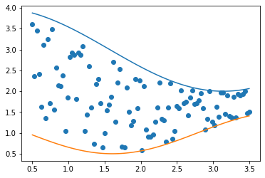
We can already see that the plot needs a few text labels. Besides, we don’t like the default colors of the points and the lines. Also, the figure itself is a bit small.
See what we did here? We first created a base plot and identified the components we want to improve. Now, we need to figure out how to extract those components and customize them.
Breaking down the plot components and their components and their components
Since we created the axes and figures at the beginning, they are already isolated as objects (fig and ax).
Now, let’s assume for a moment that we have the figure but not the axes. How do we extract it from the figure?
Every matplotlib artist has several methods that start with get_* prefix. If we call the dir function on fig, we can see a few examples:
In the list, we see a little function called get_axes, so we'll use it.
The official class name of axes is AxesSubplot and as we see, there is only one on the list:
ax = axes_list[0]I know these are fundamental concepts, but the lesson you should take from here is that every class in MPL has such get_* functions that allow you to retrieve different parts of that component class.
The swiss army knives of Matplotlib

Now that we have a couple of objects, it is time we customize them using their parameters. But first, we have to ask — what parameters does my object accept and what values do they take?
That’s where the swiss army knife of Matplotlib comes into play. It is the function plt.setp ( set parameter) and it is accessible through the PyPlot API.
So, let’s see what parameters the figure object accepts:
Calling the function on an object with no parameters prints the documentation of all object arguments. In the list of parameters, we see the one we want to change, which is the figure size. It is the one named size_inches:
Passing the object and its parameter name as a string is shorthand for printing out the parameters’ possible values. Now, let’s finally change the figure size:
The function returns None, meaning the operation was successful. Now, we take a look at the plot once again:
>>> fig.get_figure()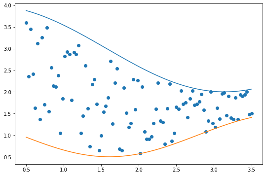
Now, it is time for axes:
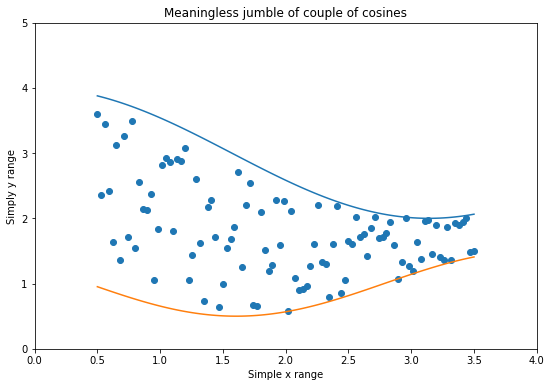
We want to change the axis labels, limits, the title, and the axis spine color. If we don’t know the current values of these parameters, we call plt.getp - a friend of setp:
>>> plt.getp(ax, "xlim")(0.35, 3.65)Similar to setp, getp returns the defaults or current values of parameters. Calling it without any arguments on an object returns all default values. Let's change the ones we wanted:
But how about the line and marker colors? We also said we would be tweaking the axis lines? Well, they are separate classes, so we need to extract them from the axes. But before we do that, there is a couple of crucial concepts we need to learn about. This section only served as an introduction to setp and getp functions.
Containers and primitives
To get from the base artists to colorful plots, the components need to go through a long chain of inheritance of many MPL classes. Along this chain, two groups of classes are essential to how you use Matplotlib. These groups are called containers and primitives.
We’ve already seen two instances of containers — figures and axes. The figure contains axes, and axes contain pretty much everything.
Primitives are all the graphical or geometrical objects that go into a container. You rarely use these primitives directly. They are created dynamically when you call plotting functions. You can access all of their names under the patches module of Matplotlib:
As you can see, we have got everything we need to create histograms, scatterplots, boxplots, and line plots. They all can be made using patches like circles, rectangles, polygons, and lines.
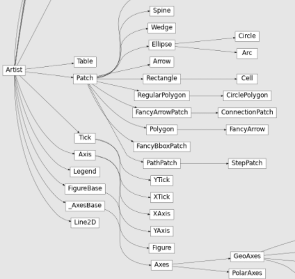
From the above map of Matplotlib classes, we see the little Lind2D I mentioned earlier. It is a class that draws the lines and markers when we plot scatterplots and lines using plot or scatter functions.
Now, getting back to our plot — here are the steps we have made so far:
Let’s look at all artists within theax:
We see our lines. We also see four spines, which are separate classes. The X and Y-axis objects are visible along with the first element, which we haven’t seen before.
PathCollection represents the groups of dots. So, let's extract it and give the dots a few customizations:
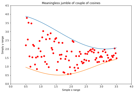
We increased the size a bit and gave the dots a red color with black edges,
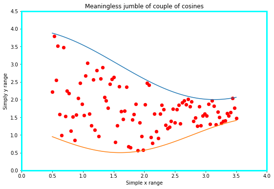
Similarly, we can tweak the spines:
A final trick I recommend is storing all created plots into a variable so that you can work on them separately without having to access them through axes:
Putting everything together
Let’s structure all the jumbled pieces of information we learned today:
- Create the plot and mark the parts you want to improve.
- Extract a single component. Call
diron the axes or figure object if you don't know what you are looking for. Also, theget_*prefixed functions are helpful in this case. - After you have a component, see the default values of its parameters by calling
plt.getp. - Mark the parameters you need and call
plt.setpon each of them to see the possible values they accept. - Set your custom values using the same function.
- Iterate through 2–5 until you have the perfect plot you need.
Once you go through this workflow a few times, you will get more comfortable with higher-level functions. Instead of extracting every component from the axes and primitives, you will start passing arguments directly to the function calls or when creating the axes.
But setp, getp and dir functions are everything you need if you ever encounter an unknown Matplotlib class or function.
Besides, learning the concepts of artists, patches, and containers/primitives has set you up to understand the documentation to its fullest extent. These are the terms that come up the most in the docs. I strongly recommend going through them with your newfound knowledge to learn even more.
Summary
Data visualization isn’t about learning a plotting library. It is a combination of creativity, understanding the audience, and delivering insights in a professional and informative way.
I expect all these three skills from your end. My part was to show how you can use one of the strongest plotting libraries in the Python ecosystem to complement those skills. I have taught you a powerful iterative process that enables you to improve Matplotlib plots in an intelligent and structured manner.


