
Admiring the Essence of the Book
Two cover designs that brilliantly express their essence with type and imagery
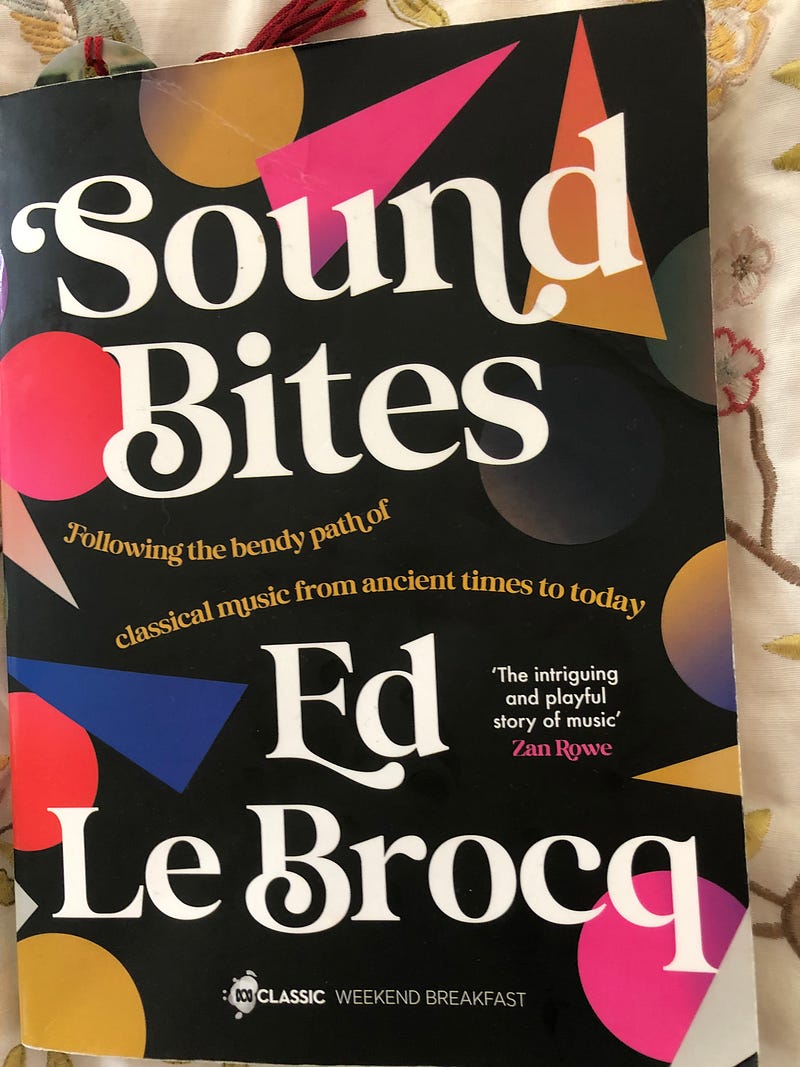
I’m halfway through a fascinating book. It’s called Sound Bites by Ed Le Brocq and is a history of Western music.
Ed is the weekend breakfast presenter on ABC Classic, an Australian radio station.
What I love about Ed is that he makes everything entertaining and gentle at the same time. Even guillotines.
And he is so visual. I guess that’s a result of radio.
But I digress. Because I am not here to talk about the book's contents, but the book’s design.
The first thing I like to do when I start a new book, after selecting it from the library or bookshop shelves, is to look at the cover design.
Next, I go to the left-hand page with the legal information, trademarks, and so on. I’m not interested in whether the author has asserted their moral rights or not. I’m looking for something else.
Jewels in the copyright information
I’m interested in the font! The typeface! And the leading. The little ink blots that form letters and punctuation symbols. Their personality. Their readability. Their innate visual beauty.
The typeface fits into the design concept. See the typeface? It looks like it is composed of musical notes and semiclefs. It’s a chocolate box of delicious wisdom, filled with strawberry cream or hard nutty pieces. See the hazelnut whirl in the letter B, the flowing salted caramel extruding from the capital E?
The design concept should be communicated through the typeface as much as the pictures. Here, the pictures are attractive, much like the tasty chocolate box. There are sharps and flats, wedges of colour, and resolved rounded edges of something exotic, like guava.
Minion Pro. Mereweather. Adobe Garamond. How brutal. How elegant. How futuristic and minimal. So, so much can be conveyed by a skilful font choice.
Book margins. The beauty comes from lots of white space. A thick top margin, a wide left and right margin, and beautifully justified text are all, well, justified.
The Copyright page often contains instructions as to how you can achieve the same look. Specifically, the leading and line spacing.
These elements of control have been omitted from the new-fangled apps like Canva, but they give the ultimate control over whether something will look squashed or airy. That means readable, or too much work. This shows the difference between a self-published book and a professionally published one.
Cover design
Ed’s book was designed by Hazel Lam of HarperCollins ANZ Design Studio with typesetting by Kirby Jones. Good job!
The cover of Sound Bites features colouful shapes and arcs of curved type. It fits the subtitle of the book, following the bendy road from ancient music to today.
By a stroke of fate or exceptional taste on the part of the publisher, my newest book purchase, the sublime Julia Baird’s Bright Shining has also been designed Hazel Lam with typesetting by Kirby Jones
Kudos yet again!
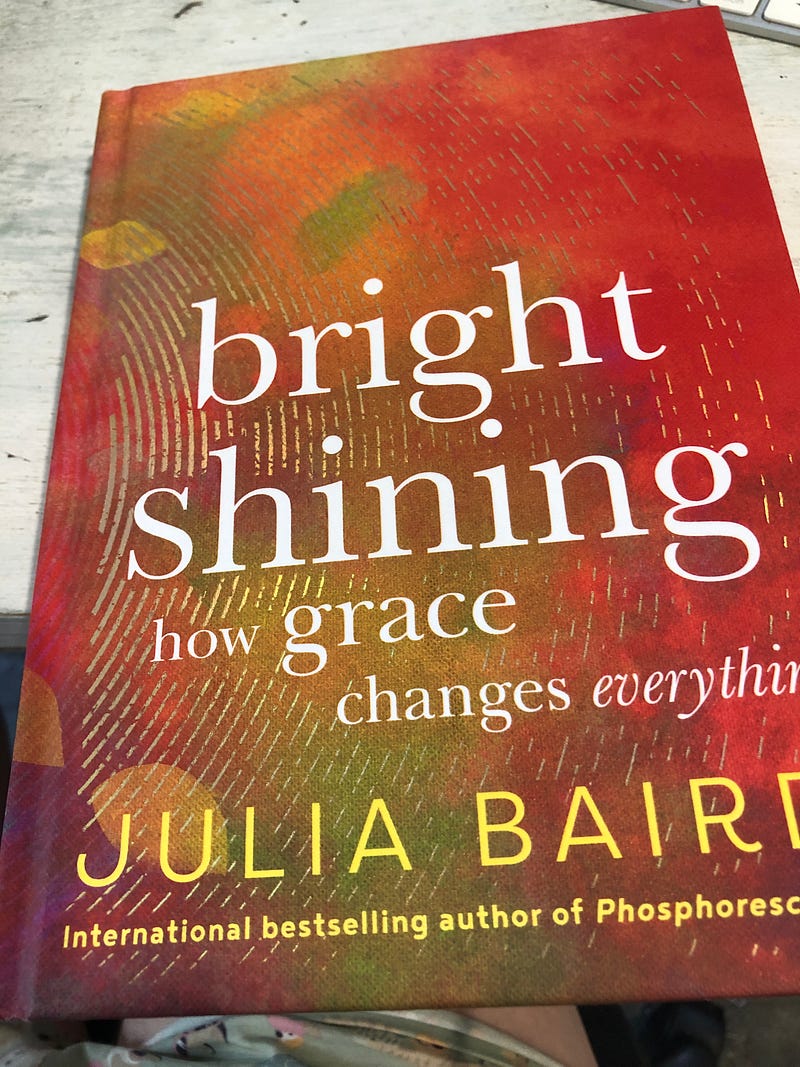
Now the cover of Baird’s book is glorious. It is a large thumbprint, perhaps, or a fine waterfall of unique gold rivulets.
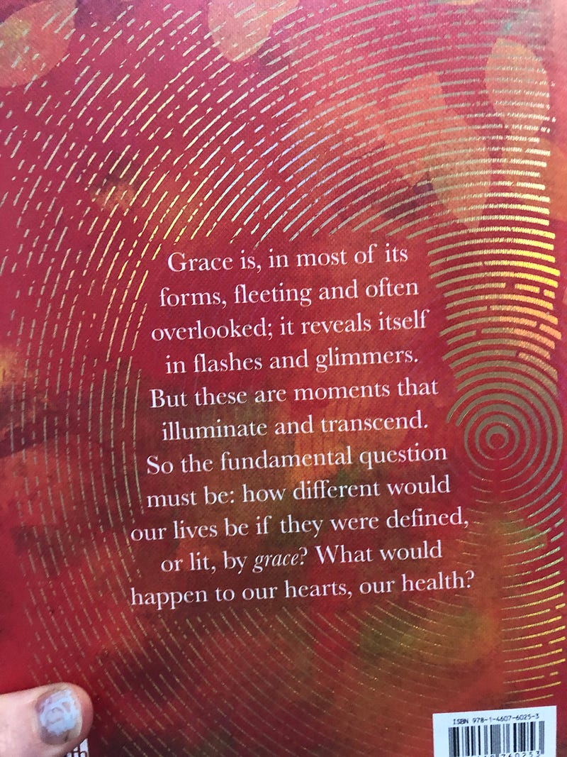
The back cover has centred text between the arcs of gold. Much like Julia herself. One of a kind and glorious.
The book is about grace. The beguiling beauty and power of grace.
How incredibly difficult a concept to demonstrate visually. Lam has done it, though, with an exquisitive concept — the fingerprint.
Tips for the self-publishers
The content of the first few pages shows what to put into your own self-published book. We start with an optional interior cover. In Baird’s latest, it is the sun on a black background of space.
It’s a striking image that pays respect to the first inhabitants of the land and sea, who were highly effective custodians of the land, clearing it with fire. After a national referendum voting no to listening to First Nations people, Baird’s words sing.
“I’d also like to acknowledge the importance of telling the truth about out history, which has been warped, denied, and dismissed for too long, so that enduring harms can be reckoned with and our future may shine bright.”
Both books are worth reading and published by HarperCollins. But check out the design of the covers and the typesetting as well and enjoy those too. After all, design is all part of the communication.