
Adding Dark Mode to Your React App with Emotion CSS-in-JS
Dark theme is one of the most requested features over the past few years. The most popular reason is that “it’s easier on the eyes,” followed by “it’s elegant and beautiful.” Apple in their Dark Mode developer documentation explicitly writes: “The choice of whether to enable a light or dark appearance is an aesthetic one for most users, and might not relate to ambient lighting conditions.”
Both Apple and Google made a dark theme an essential part of UI, more and more websites do the same to enable dark mode. In this article, I will walk you through some basics of implementing dark mode in a React app.
Designing dark mode
If you are a developer and working on your project alone, or you don’t have a designer in your team, this section will be useful for you. Otherwise, you could skip this section and jump to the next.
As this blog is not a design blog, I will just list some of the basic principles or resources that I found useful.
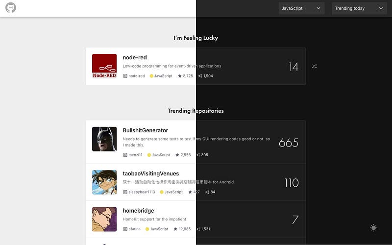
The material design website dark mode page is the best resource I found so far. Here are some of the highlights:
- Do not use pure dark
#000000as your background color, it does not look good and create more eye strains than the light mode, use dark grey instead (they use#121212). - In material design, they use Elevation to differentiate the distance between two surfaces along the z-axis (e.g. card, navigation). In light mode, it means darker and wider shadows for higher elevation; in dark mode, it means whiter background.
- Dark mode does not mean simply invert all colors, shadow color should still be dark.
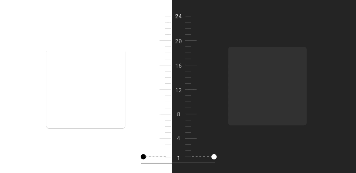
- For any elevation or any color-text combination, the contrast ratio should be at least 4.5:1. This means to get 4.5:1 at the highest elevation, you should use a contrast level of at least 15.8:1 between text and the background. (You could use color contrast tools to test contrast ratio.
- Use desaturated color to keep the contrast ratio at least 4.5:1. Handling color in dark mode is hard, refer to this article to read more.
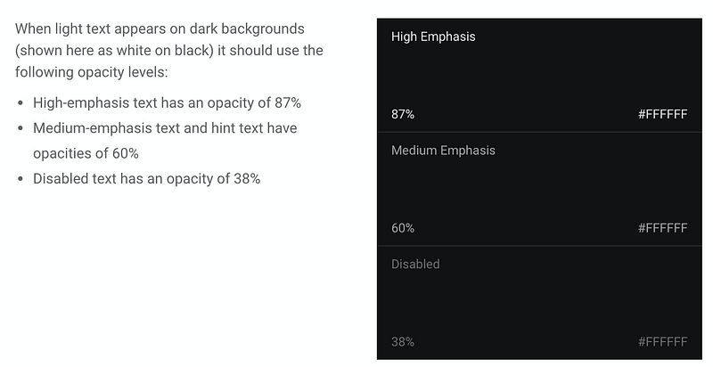
- Use light text on dark background and reference table below.
1. Use emotion to toggle background and text
Let's start with a simple canvas with text and a button, to change between dark mode and light mode.
At the moment, it does not do anything besides toggling the internal state of isDark value and change text.
In dark mode, we will want to change:
- Text color to
#fff - Background-color to
#121212 - Invert button text, button background-color, and hover colors
We are using emotion for styling because it is simple, but the concept will work if you are using pure CSS or CSSModule (you will need to set the theme in context and toggle class name in the component).
1.1) Adding ThemeProvider with the theme color values
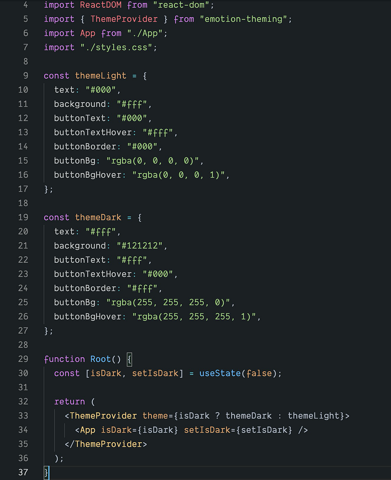
Here we define all the changing colors in an object called themeLight or themeDark and pass it to ThemeProvider. We have refactored the main code to another file called App.js, and we will use the theme values in App.js in next section.
1.2) Using theme values in App.js
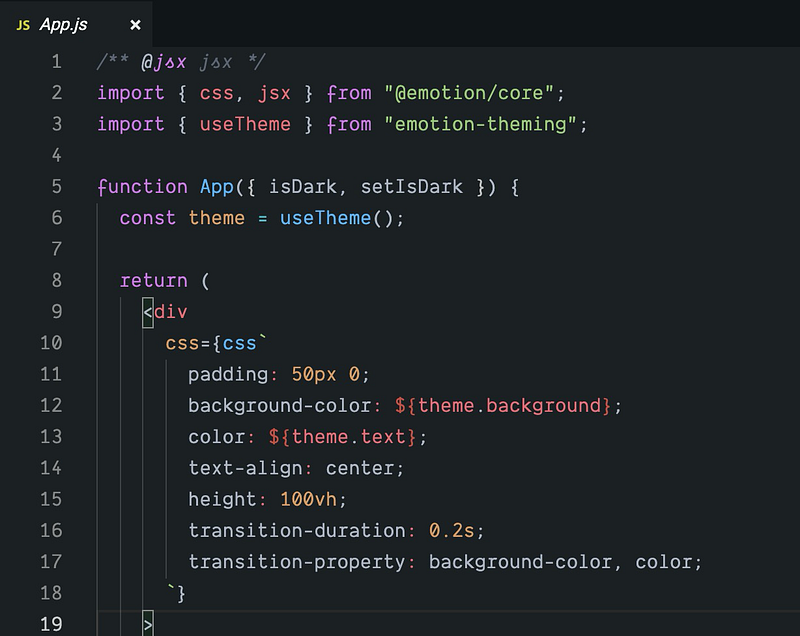
emotion has provided a useful hook useTheme to use a theme in a child component of ThemeProvider. In your style code, you could just change your color with a variable from theme object passed to ThemeProvider. For example:
const theme = useTheme();<div
css={css`
background-color: ${theme.background};
color: ${theme.text};
`}
>There is another way below to achieve the same goal without useTheme hook, but I feel useTheme could make code a little bit simpler.
<div
  css={theme => css`
    background-color: ${theme.background};
    color: ${theme.text};
  `}
>
1.3) Adding animations
Now if you click the button, the theme values will change and the styles will change accordingly. You will notice the changes are too quick and it does not feel natural. If we add some basic CSS transitions, there will be a subtle change in the background and text colors when you press the button.
transition-duration: 0.2s;
transition-property: background-color, color;
The current code looks like this:
2. Set the initial theme based on the user’s system settings
It is nice to toggle by clicking the buttons, but can we do better? If the user is already using dark mode in the system, can we enable dark mode by default instead of asking user to toggle?
There is actually a CSS query for it: prefers-color-scheme
/* Light mode */
@media (prefers-color-scheme: light) {
    html {
        background: white;
        color: black;
    }
}

/* Dark mode */
@media (prefers-color-scheme: dark) {
    html {
        background: black;
        color: white;
    }
}
The prefers-color-scheme media feature is used to detect if the user has requested the page to use a light or dark color theme. It works with the following values:
no-preference: Indicates that the user has made no preference known to the system. This keyword value evaluates asfalsein the boolean context.light: Indicates that the user has notified the system that they prefer a page that has a light theme (dark text on light background).dark: Indicates that the user has notified the system that they prefer a page that has a dark theme (light text on dark background).
Finding out if dark mode is supported by the browser
As dark mode is reported through a media query, you can easily check if the current browser supports dark mode by checking if the media query prefers-color-scheme matches at all.
if (window.matchMedia('(prefers-color-scheme: dark)').matches) {
  console.log('🎉 device on Dark mode');
}
At the time of writing, prefers-color-scheme is supported on both desktop and mobile (where available) by Chrome and Edge as of version 76, Firefox as of version 67, and Safari as of version 12.1 on macOS and as of version 13 on iOS. For all other browsers, you can check the Can I Use support tables.
In our index.js, we just need to change the initial state of useState from false to window.matchMedia('(prefers-color-scheme: dark)').matches
const [isDark, setIsDark] = useDarkMode(
  window.matchMedia('(prefers-color-scheme: dark)').matches
);Conclusion
There are so much more you could go beyond this point: save user preference on a server or local storage, adding dark mode for some complex components like react-select (just grab this gist if you want to get some reference). I have also recently added dark mode to hacker tab chrome extension, you could check the whole commit here.


