
Adapt to evidence quickly
SCRUM & LEAN UX | Episode 12
The ‘Scrum and Lean UX’ series discusses the appliance of Lean UX principles and practices in Scrum. All its articles have this theme and can be read on their own.
Lean UX guides Scrum Teams towards working in smaller, more focussed iterations that build evidence for hypotheses quickly.
Naturally, the earlier we obtain evidence the less waste incurs. The same goes for the duration between a learning and the adaptation.
So, how to minimize the time from evidence to adaptation?
In this article we’ll run through 5 ways that enable us to do so:
- Embrace Incremental Development;
- Involve actual users (moving out of the cave);
- Remove bottlenecks;
- React to evidence in real-time;
- Personalize Delivery;
1. Embrace Incremental Development
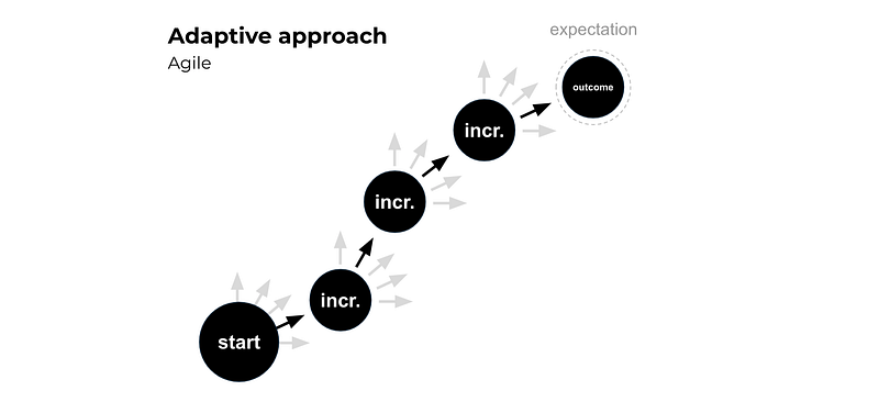
Scrum Teams establish the minimum that is needed to establish a viable yet valuable addition or adaptation of the increment. After collecting insights on how it is received and used, what would make sense to add, adapt or even remove next?
The beauty of small increments is that we learn about user experience throughout development. Rather than creating by-products and fake-person marketing personas, we learn from feedback on the actual product and actual users as early as possible.
Scrum’s empirical approach to product development is based on a simple but powerful law of nature: we know more tomorrow than today, so we need to be able to adapt our plan to valuable learnings we collect along the way.
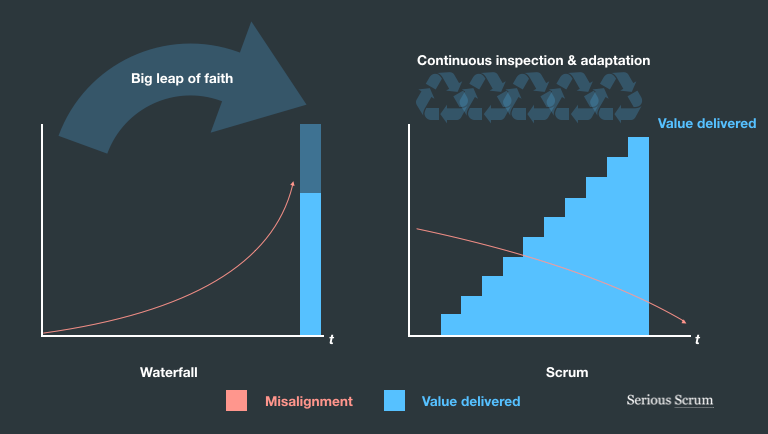
This way we are not only avoiding misalignment in market demand, but by having cross-functional teams we also avoid misalignment between specialists. With short communication lines between specialists a team can adapt more aptly. In Waterfall, there is a big and scary gap between those that deliver and those that did the initial research and created the initial plan.
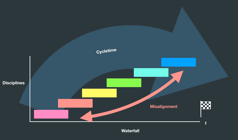
In every phase in Waterfall, whenever a new discovery requires adaptation, it requires work to flow in reverse direction along its ‘conveyor belt’ slowing down and messing up everything else moving in forward direction. What makes it even more problematic is that the specialists required to make changes to reverse-flow work have already moved on to other projects. This will mess up those timelines also. This is why Waterfall managers generally value sticking to the plan over adapting to new valuable learnings. Even when it’s finally time to deliver the product, the timeline has expired and budget has been spent.
2. Involve actual users
Way too many Scrum Teams and UX Teams remain stuck in “the cave”. And by being stuck in the cave I mean they are not working with end-users in person each Sprint. After all, a UX expert is “already trained to know what the user needs”, right?
Our tendency to stay inside our comfortable caves have led to practices like “rich marketing personas” (or “ideal buyer personas”) which some marketing organisations spend good fortunes on. Those sharp looking “this is how we wish our audience looked like” type of fake people provide no evidence but evidence of inside-out, heads-up-our-own-ass type of thinking and decision making. These picture-perfect personas are designed to please marketing managers, not actual audiences.
When we talk about evidence, we talk about learning about actual outcomes and actual experience. Although the two are heavily related, they are not the same.
Proto-persona’s (the scribbled ones that can fit on the back of a beer coaster) can be valuable when followed up by an assignment to actually try and find real people that fit the profile: a minimal viable audience. Finding people that match a proto-persona is actually part of validating an assumption early. It’s better to do this right away than wait and see if this audience can be reached after the product is build.
Even tools that provide data (like screen recordings, heatmaps and a/b test data) do not share what a customer is experiencing emotionally. Although this quantitive data is valuable from a commercial conversion perspective, they do not share what a user’s thought process is. Just what they are doing with their mouse. A/B test data does not voice a user’s frustration. More conversions does not equal a better user experience. More conversion does not equal a stronger brand identity or customer loyalty.
It’s time to rethink popups, flashy ads, fly overs, paywalls, modals, hovers, lightboxes, promotion stickers, tooltips, plugins, award banners, chat windows.
Now, don’t get me wrong, all these tools and practices are great ways to support obtaining evidence. Although this data is valuable, it needs to be reinforced by involving users into the process. An no, we can’t escape having to leave the comfort of our cave by introducing feedback forms.
3. Remove bottlenecks
Just like a factory production line in Lean, in Lean UX we also need to pay attention to bottlenecks. I won’t go into the specifics of the Theory of Contraints in Lean. But in Lean UX it also pays to pinpoint bottlenecks in terms of the production (flow of work), but also in the user flow.
As an example from the web development industry: Companies have a tendency to clutter homepages as internal managers compete for its space. It turns into a corporate-political battlefield.
It’s where various stakeholders are screaming for user attention. Where brand marketeers argue for iconic uniform brand image to safeguard the first-impression. Where product marketeers need to promote new product releases. Where E-commerce/Sales Managers slam promotions on over-stocked items. Where Compliance demands a place to make customers aware about product safety updates and product registration. Where the CEO wants to flash the latest consumer-award. And where the Service Manager opts to make it easy for users to chat with them right off the bat.
The homepage… when everything screams for attention, nothing gets the attention it deserves.
Some brands however are catching the drift that the homepages are dying a slow death.
I worked for several brands in the past and they all struggle. I intended to provide some actual examples here, but I’ve been mandated not to… which tells something about how sensitive this subject can be (and my lack of courage 😧).
Instead of stepping on fragile toes, I highly recommend this article by Michal Malewicz. He shares some profound insights in where Modern UX took a turn or two into the wrong direction, circling back inside the cave, with some brilliant examples on cases where increased conversions also increase frustrations.
4. React to evidence in real-time!
In the modern digital landscape, homepages have become less important as it becomes easier to channel the right audiences to the right place in the right time in their journey.
A modern website has several dynamic landing pages and these might very well receive more traffic than the homepage. Brands are getting better at working out user-flows that don’t involve the homepage. Instead users will be guided through a single-purpose flow.
Working with real users provides real tangible context. Combine this with real-time data and one can experiment with the positioning of content and features, with a properly engaged and activated audience. It gets people to where they need to be without all the hassle and screams for attention in order to maximize conversion.
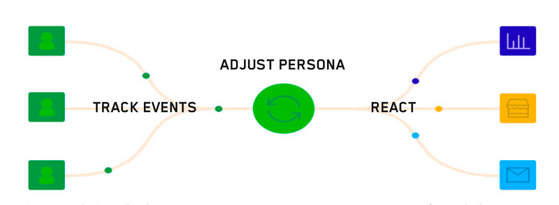
Next, with a live product and the collection of real-user-data digital persona’s can be segmented and adjusted real-time enabling the UI to react instantly. The UI can determine dynamically on-the-spot what to serve to whom and when.
5. Personalize Delivery
It’s not easy peasy, but yes, this means a single page can serve different content and data depending on what it learned from the user’s behavior and profile. This way the UI can obtain evidence and react instantly.
This means brands should get with it and learn how to create dynamic pages that serve personalised content and triggers that are fit for the user’s purpose. This is called Adaptive or Reactive Design and often involves Machine Learning.
There is another benefit of involving users in learning how output should be delivered. Generally, teams that are in the cave rarely deliver: they dump. Afterwards, when learning the results aren’t quite what was expected, they simply argue or conclude that “users are stupid, they don’t know how to use the new features”.
With Waterfall those are pretty big dumps. And even with long iteration cycles, organisations might still be delivering too much to swallow in one go. Ok, a here is a somewhat raunchy example: Now, consider serving a customer this big sausage at a party. Would you truly expect them to swallow it whole in one go?!
Nah. So slice it up.
For the love of you user, guide them through each delivery. Don’t just dump, force-feed or rapid-fire everything to everyone. Serve. Try out the delivery on the involved audience as they can provide learning on how to deliver it to the broader audience. Don’t just collect their data, or track conversion. Listen. Learn, rinse, repeat.
So, to minimizing time-to-evidence and evidence-to-adaption in UX: embrace incremental development, involve actual users, identify and remove bottlenecks, manage adaptive/reactive evidence-based segments and personalize delivery.
