
Accessible Social Media: How To Get It Right.
Social media platforms usually aren’t very good at accessibility. They tend to prioritise functionality over inclusion. And they don’t incentivise users to bother creating content that works for everyone.
And I get it. If you’re not aware of the concept of accessibility, it can be a daunting subject. You might find yourself asking questions like:
- Why do I need to make my social content accessible
- How do I do it?
- How far do I have to go?
And it’s that last one that might catch you out the most. Accessibility is something of a spectrum. And there’s always going to be more you can do. That means you might get called out even when you’ve made the extra effort. And that can be disheartening.
But as long as you’re willing to learn and accept feedback graciously, you’ll also be improving. And remember, just being open to the subject at all puts you ahead of most folks! And the more people that start incorporating accessible practices, the better.
The basics: what is accessible social content?
Whenever you post something on social media, you should be thinking about the people who’ll see it. Maybe that means tailoring the messaging for the specific audience or including information they’ll need to understand your post.
If I tweeted, “Today we’re launching Inverse ETFs!” that wouldn’t be accessible to anyone who doesn’t know what an inverse ETF is, myself included. This kind of informational accessibility is, hopefully, obvious! If you’re not already thinking about this when planning your social content, go and brush up on your communication skills! The Monzo Tone of Voice is a great place to start.
When we talk about accessibility on social media, though, we’re usually talking about accessible formats. In other words, how accessible are the mediums you’re using for your content? Social media has no shortage of formats to pick from, and they all have their benefits. But they each come with their pitfalls too. Here are a few:
- Text-only: great for describing what you what to say, but less suitable for folks who might need a more visual way to understand what you mean
- Images: great for ‘showing the thing’ but less suitable for folks who have vision impairments
- Video: great for making engaging content, but worthless without subtitles
Let’s dig a bit more into each of these.
Text posts: simple, right?
You might think the simplest way to keep your content accessible is to use text. Text is the most basic way to navigate the web, and tools exist to help folks of all needs access text content. Screen readers, for example, do a great job of reading out text and on-screen elements to make it possible for people with vision impairments to access the web.
But you can still get this wrong! And we see this the most on Twitter. There’s a trend of using non-alphanumeric characters to either create mini pictures with symbols (‘ASCII art’) or to add text effects such as bold or italics.
These look cool and get great engagement. But they’re not accessible. That’s because a screen reader doesn’t know that you’re using that obscure mathematical symbol to draw a cartoon rabbit in a tweet. So it’ll just read out the proper name of the symbol, which sounds BAD.
To see this for yourself, check out the replies of the excellent @asciiArtHelpBot account on Twitter. It takes inaccessible tweets and shows you exactly what they’ll sound like for someone using a screen-reader.
And I know how tempting this is! I’ve seen so many trends going around using ASCII formats, and the brands all getting applauded for doing their witty take on them. But it makes me sad to know that not everyone will get to enjoy them.
And there’s an easy solution. You can screenshot your fancy ASCII art and upload it as an image instead. Then you can use the wonderful world of alt-text to describe your hilarious picture. Win-win.
Oh, and one last word on accessible text. Don’t forget your hashtags. They should always be in what’s called Camel Case. That means Capitalising The Start Of Each Word In The Hashtag, e.g. #YearInMonzo. This makes them more accessible for screen-readers to parse. And it also helps avoid any nasty ambiguities, like the famous #Susanalbumparty incident.
Images: a bit tricker
Images are inherently a bit inaccessible. You have to look at them, which means you might experience difficulties if you have any sight issues. And that’s big trouble for something like Instagram, which is ENTIRELY visual content.
I know what you might be thinking, and let’s address it. So, to play Devil’s Advocate: Why bother making visual content for folks who can’t see? Isn’t that like trying to make music for deaf people? Perhaps some spaces are just inherently inaccessible to some groups by nature, and we accept that?
I disagree. Accepting that some groups can’t access your content is a dangerous game. And it creates a vicious feedback cycle where already-excluded groups continue to be excluded, and the divide widens. Work backwards, I say; start with including everyone and figure out how to get there. If everyone can’t enjoy the thing you’re building, then you’re probably making the one thing.
Images are a great example of this. Yes, a partially sighted person will never experience an image exactly the same way as someone with perfect vision. But we don’t need to leave anyone behind.
For social content, that means alt text is critical. If you haven’t heard of the term before, it’s a property you can attach to images that describes them. So for a picture of the Mona Lisa, I might add “a portrait of a young woman in front of a landscape with an enigmatic smile” (although the Mona Lisa is so famous that you could also go with “Da Vinci’s Mona Lisa”). Screen readers know how to handle alt-text, so boom, job done. You’ve just made your images accessible.
This isn’t as easy as I’m making it sound, though. Firstly writing alt text is a bit of an art and something I’m still learning. I’ve long-grappled with the philosophical problem of describing how something appears without simply referring to aspects of its appearance. For instance, is it beneficial to describe something as a “red circle” if the viewer has never seen the colour red before?
The way around this is to keep your alt text as descriptive as possible. “A charming house in front of a stunning waterfall” would be an unhelpfully flowery description, for example.
And this approach also means that certain kinds of content have to be off the table. The example I’d use would be this post we did on the Monzo Twitter.

I meant this as a bit of fun. Zooming in on the image directed you to a link in our bio, which sent you off on a chase across the web to many other places, like a mini treasure hunt. People liked it, but a few folks contacted me to say it wasn’t accessible.
And they were right! ‘Hiding’ something in an image isn’t something that works for everyone. And just putting the answer in alt text feels like it’d be robbing those folks of the fun of the experience. So no more image treasure hunts! (Fun as they are).
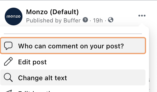
Most platforms will let you add alt-text when you post an image. But it’s also hidden sometimes. But poke around the menus and you’ll normally find some kind of change alt text option.
Videos: the final hurdle
Videos are great if you can do them. And they’re a fab way to convey information engagingly. By combining audio and video, you can communicate a lot of information quickly. But you can also get it very wrong.
Let’s start with the audio side. For starters, most folks aren’t watching social content with their sound on. So if your video has someone talking without any subtitles, most folks won’t have a clue what you’re on about. So, as agencies love to say, build for sound-on but delight with sound-on. SUBTITLE YOUR VIDEOS, FOLKS.
And this isn’t as hard as you think. I’ve wasted countless hours downloading apps to do this or tearing my hour out in Adobe software, trying to line up text perfectly. These days I recommend simply using Kapwing’s subtitler tool. This works using actual magic to generate subtitles for you automatically, all time-stamped and everything. All you have to do is go through and correct any transcription errors. But it’s pretty accurate by default. A life-saving tool!
The second challenge is one that I don’t have a good solution for. And that’s video descriptions. So like alt-text but for video. This isn’t something I know much about, though I know it’s important. But both making it and adding it to video is a bit of a mystery to me (see, it’s a journey!), and I’d love to know more if anyone has any tips.
And this is where it all comes back to the question of how far you take this. I know the realities of content production. Just getting the thing made can feel almost impossible sometimes. Then having to do the work on top to make things accessible in these extra ways can feel impossible.
But it’s worth doing! The more people that can access your content, the better! And it usually has other benefits too. Running ads on social with subtitles will perform better. Adding alt-text to your images in blog posts will help boost your SEO. And more!
— -
And that’s just the basics of thinking about accessibility for your social content. There’s a wealth of information to dig into out there.
I’d particularly recommend checking out and following Alexa Heinrich, who’s genuinely taught me so much. Her Social Media Accessibility Checklist should be pinned by your desk somewhere.


