
Accessibility is Hard: Before You Get Toast-happy, Think About Everybody!
I love toast. For someone who loves toast, I have’t made one in 9 years but that’s because I don’t have a toaster, so I kind of have an excuse. But toast is great. A bit rough on the outside, soft on the inside, smells great in the morning, and goes well with anything! It’s a bit of a bummer that I don’t get to write about actual toast, but the UI component someone very “creatively” called toast.
The perfect web storm that brew the toast
The abridged version of the toast’s history is basically as follows. Mobile OS developers such as Android and iOS wanted to provide notifications to the users. The thing popped up from the bottom of the screen, a motion which was very similar of a toast popping up from the toaster when ready — so toast it was called. The rest is history, I won’t bother you with the details.
What followed then is another piece of software development history seemingly unrelated, but entirely the cause of today’s toast-happy designs: the mobile-first movement around 2010. This particular trend caught on because believe it or not, everywhere in the world it is a lot cheaper to purchase a smart-phone, than a regular computer, so web consumption suddenly became a possibility for exponentially more people than before. Of course, it wasn’t by any means a revolutionary idea. What it proposed was merely taking responsive design (desktop > mobile) and doing it the other way around (mobile > desktop). If done well, this had the potential of speeding up websites and web-apps on mobile, while looking good (similar to native mobile apps) and consuming less data. Laptop and desktop users would then pretty much inherit most of the mobile UI, with maybe some reshuffling of the components and an additional feature here and there.
The final contributor to the perfect storm was a parallel trend in both design and development (designers and developers get along much better these days, yay!), which was and allegedly still is at the core of Agile development — reusable components. What this rendered was something that from an accessibility perspective resulted in a lot of head-ache for accessibility experts. All the mobile toasts were suddenly showing up on laptops, desktops, monitors as wide as 32" or even wider for the super-wide fans of screen real-estate. And this was a problem, one that few realised until it was too late and the web ended up with a toast-happy generation of websites and web-apps.
Let’s get some facts right
Toasts are not universally reusable components.
Toasts unfortunately are a terrible example of component reusability and if there was ever one that is exclusive to mobile, then the toast is it! Don’t take my word for it though, let’s see the host of issues that these components generate on desktop layouts.
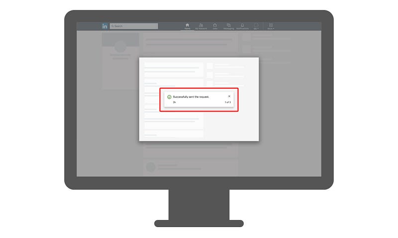
Toasts cannot co-exist with modals!
And that’s a simple reality. An accessible desktop UI cannot have a toast and a modal open at the same time. Because there is no native “toast” component, any attempt at an accessible toast, is piggy-backing on role="dialog" or any of its ARIA variants.
Modal — technically another natively non-existent component — does the same. The result is two dialogs in the same view at the same time. There are no mechanisms to safely navigate between more than one open dialog. There is no reliable way of managing focus between the two, and even if there was, from a development perspective it would be a night-mare. How do you decide which gets focus when? Remember that you cannot take control over the behaviour of the UI for accessibility reasons. That is the opposite of accessibility. The user still has to remain in control, but if you suddenly shift focus away from the modal because the toast appeared, then you’re breaking the rules.
But… but… it disappears, does it not…?
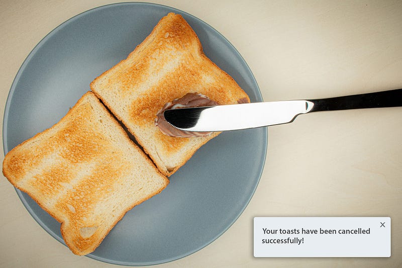
Ehm. It shouldn’t. And that’s regardless whether it’s a success or error toast. It. Cannot. Disappear. You must allow the user to read it and act on it. Ultimately, there is no difference between success and error in terms of importance in the user-journey. It’s just as important for me to know that my takeaway food order did or didn’t go through for some reason. The former puts me at ease that I shall be fed, the latter enables me to look into why I may potentially starve to death!
A disappearing toast makes a lot of assumptions, which is the core of the problem. In the real world, where people multi-task, get distracted and a million other things happen, a toast that comes and goes will easily be missed. If your UI goes through the trouble of offering that toast, then the information must be important enough not to hide it after a few seconds.
Fine. It won’t disappear…
Just when you thought you finally have the solution, I’m here to break up the premature celebration again, and tell you that you’re nowhere near solving the problem. Not even close! I’m annoying, aren’t I? Well, so are toasts on desktop UIs. 😉 Turns out the human eye isn’t as perfect as one would expect. What works really well on a small mobile screen where your eyes focus on the entirety of it, on desktop, the larger the screen, the less you actually focus on. It’s called field of vision/view.
There is a nifty calculator that tells me that I should be viewing my 27" 4K monitor at 21" distance with my 20/20 eye-sight. Except I am not, and I know nobody who sits at the ideal viewing distance from their monitor either. Go ahead, try it with your screen sizes as well.
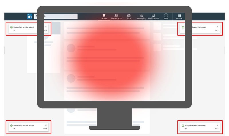
What typically happens on these UIs, is that the toast gets shoved into one of the corners of the screen. This is incredibly risky, because as users interact with the page, those corners tend not to be in one’s field of vision. This is especially true if it’s a new UI that you don’t know where to expect things to show, and you’re already overwhelmed by just trying to get the job done. When you’re submitting taxes or buying that coveted concert ticket you have only 120 seconds to fill in the form for, the last thing you care about is some God-forsaken corner of your screen! If nobody puts Baby in the corner, then why do we put the toasts there?!?
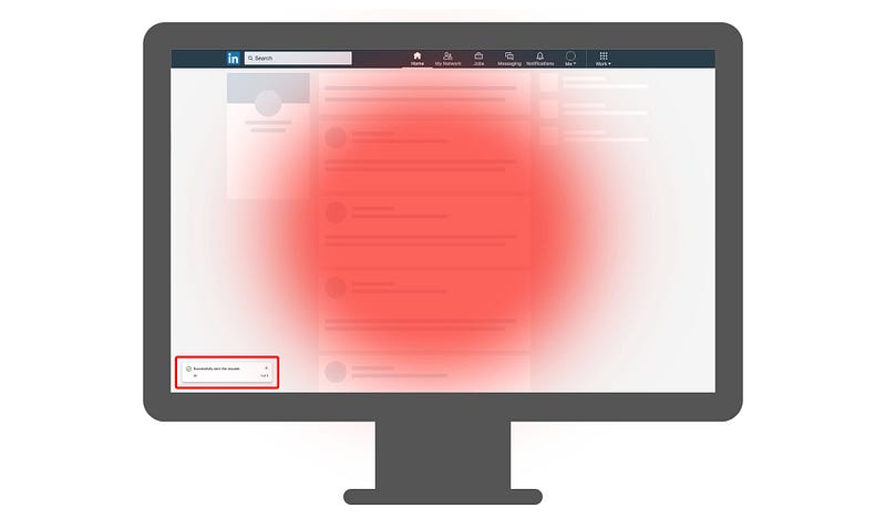
As if that wasn’t bad enough, you’ll be surprised to hear that many individuals use their browser or the entire OS at various levels of magnification. Be that 200% or 50%, it’s equally bad, though the former does affect more people. At 200% zoom, nothing that’s in the corner of the screen will be visible. Nothing. Nada. Nichts. Throw all the toasts you like at that user and they’ll be completely oblivious to them.
Arrgh! OK. I’ll put it in the center of the screen. Ya happy now?
No. Not happy at all. Torrential rain is nothing compared to my abundant flow of crocodile-tears. While you’d think that having a toast in the center of the screen would resolve all issues, and thus also allow the use of native alerts, you would swiftly find yourself back at my first point: modals and toasts being unable to coexist. What you’d have now is a modal dialog on top of which you would have another dialog, obstructing some of the modal view, forcing you to interact with it. In certain circumstances this might not be an issue, but as modal contents tend to become more and more complex — which may or may not be an accessibility issue in itself — being a far cry from what used to be just a simple dialog, this approach will nor work, or be accessible.
You’re killing me, man…
Not at all, and don’t give up just yet. There is absolutely no need to pack up and leave for the North Pole to set up a polar bear pedicure business. I’m making you the best UX-er and UI designer there ever was, while making millions of users happy in the process! Because there is a solution: don’t use toasts! I know, I know… I could have just started with that, but that would have been a tweet, and I don’t tweet. I blog, and profusely so. Or so I’ve been told…
The solution — one of them — is indeed that, though. Admitting that the toast component is not reusable for desktop UIs, and getting a little more creative. Based on my experience, I can think of two major solutions:
- don’t use toasts at all on desktop
- use toasts in conjunction with a notification center.
Only Two Ways to Skin The Toast
Which is great, because it makes things a lot less confusing and allows teams to plan and collaborate better — which is key when approaching accessibility within digital products. From concept or ideation, to design, user research, UX, development, QA and release, it is very important to understand that delivering an accessible experience is a common responsibility, and when it comes to toasts it’s even more so. Toasts are without a doubt a cross-cutting concern for an application, not just an isolated feature or capability.
Ditch the toasts, go inline!
I’ll admit that completely ditching the toasts in your app might come off as a radical approach — and it is, but if you haven’t yet invested a lot in toasts, then this might be the solution for you. The core concept here is having all your success and error notifications inline, in context and in close proximity to the action. Say you’re adding something to a list that requires a server to respond with a success or a failure? You can easily do that by adding appropriately styled text with helpful iconography within the list item itself, or just above the list. If it’s an error, it can even include a retry, cancel or report issue mechanism, further improving the UX.
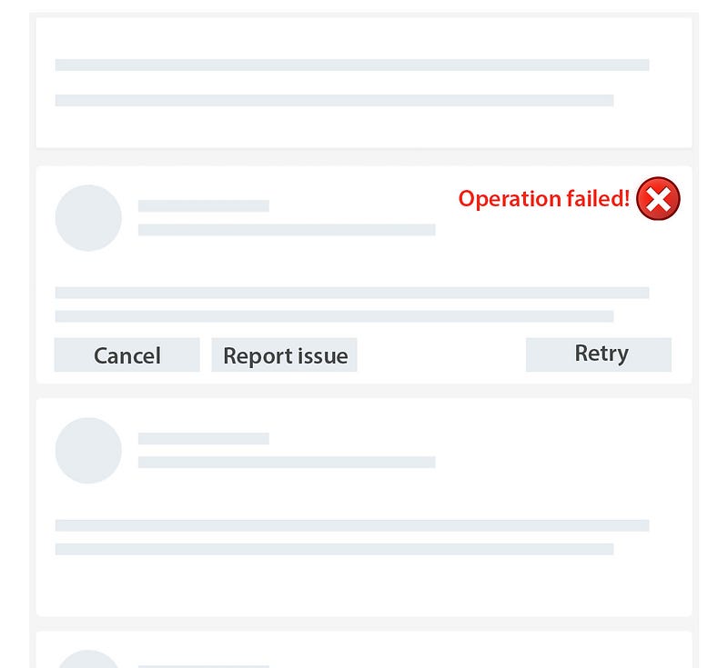
Of course, in the case of a success event, you can just add the text “Added” with a checkmark ✅ next to it, and keep it there until the user refreshes for any reason the view or adds another item.
It’s worth noting that there is nothing stopping you from adding an additional notification panel to your app, where users can browse through their notifications/toasts in historical order and dismiss them as they please, however that approach makes a lot more sense in this next scenario.
Keep the toasts if you must, but add a notification center.
Apple is considered to be one of the most prominent champions of accessible design and user experience, so it should be of no surprise that their example of dealing with notifications is a great one to follow. You will notice that toasts are present on both iOS and MacOS. However, that is not all. You will find that users also have a notification panel that is very accessible and stores these “toasts” until the user decides to dismiss them. I for one miss most of them when they pop up because of various reasons, anywhere from being distracted by the task at hand, the fox outside my window roaming through the car park, the Amazon delivery person or the fire alarm going off yet again because my neighbours are terrible cooks and burn the toast every chance they get.
Adding a notification panel that is connected is some way or another to the navigation menu with detectable ways of telling the user certain events happened, enables a product to move forward with accessibility without stripping out a core feature and redesigning the entire UI. As long as there is an accessible notifications panel where you collect these events in your application, you can:
- hide success notifications after an arbitrary amount of time
- hide error notifications that have not been actioned
- avoid dealing with stacking toasts
- avoid having more than one toast on the screen at any given time
But there’s one more thing…
A bonus solution if you will. One that might not be an option right now, but worth keeping an eye on: the Web Notification API. Unfortunately, browser support isn’t quite there just yet, as neither Safari or Android WebView support it at the time of this writing, but as a solution they combine the best of both worlds. Toasts using this API would be rendered by the operating system, would follow a more rigid standard, and automatically take advantage of the OS’ notification panel feature. You’re welcome to check out a quick demo for yourself!
Closing the toast on a positive note
Toasts, while they work great on mobile due to the small screen sizes, clearly aren’t an accessible solution for desktop experiences.
I would urge all involved in releasing digital products to opt as much as possible for the inline solution, but given the “commercially reasonable effort” clause, it is of course accepted when a complete overhaul is not possible, to come up with alternative solutions. This is where ARIA can be very helpful and creative solutions such as notification panels. They often should be seen as Plan B, but the good news is that with clever application of ARIA properties on a legacy web application, or an additional feature, such as the notification center, will enable all users to have a more accessible and thus more positive and more memorable experience.


