
Logistic Regression for Binary Classification: Hands-On with SciKit-Learn
Using Python and Google Colab
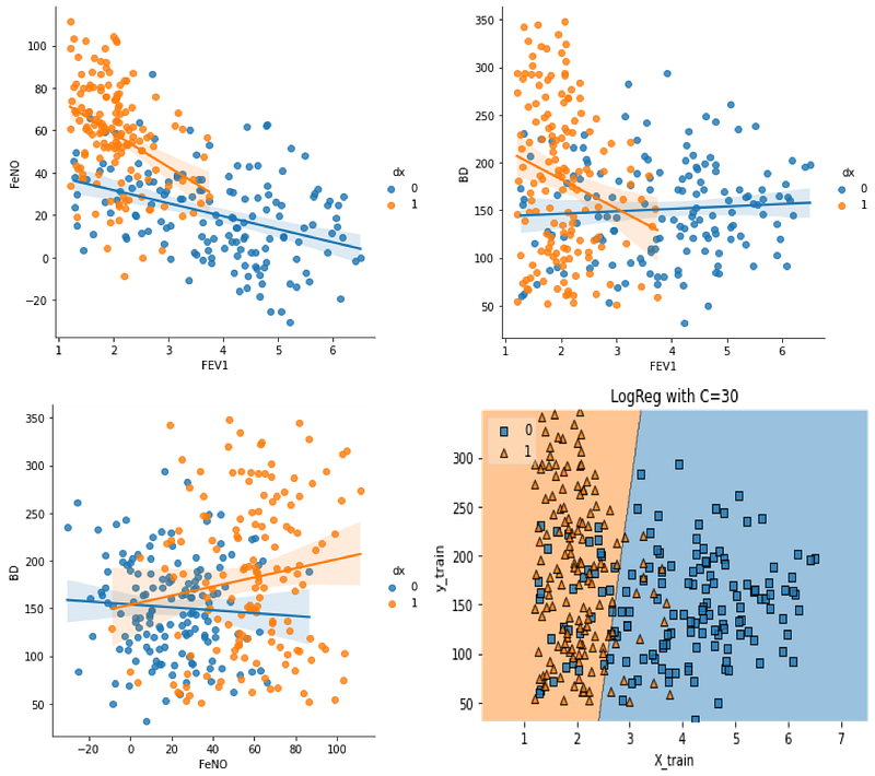
Table of contents:1. Introduction
2. What type of problems can be solved with Logistic Regression
3. Mathematical Interpretation
4. The C parameter
5. Hands-On:
-Import Libraries
-Create Data
-Exploratory data analysis
-Splitting data into train and test data sets
-Build and evaluate the model
-Finding the best C value
-Build a visualisation for the modelLogistic Regression is one of the first algorithms you will read, speak and listen about when the topic is Machine Learning. Logistic Regression is similar to multiple regression, but with a binary (dependent) output variable and continuous or categorical predictive variables. When the dependent variable is binary (1 or 0), we cannot use linear regression.
The output in logistic regression is expressed through a probability of occurrence, while in simple regression, a numerical value is obtained. Therefore, logistic regression presents itself as a method of determining the probability of occurrence of the predicted values of a binary variable.
What type of problems can be solved with Logistic Regression?
Logistic Regression is used to solve binary or multi-class classification tasks. In this article we will only discuss binary classification. One good example of Logistic Regression use for classification purposes is for detecting disease, where several variables are used to predict a binary outcome (presence or absence of disease). The predictive variables can be either categorical, continuous or ordinal.
Mathematical interpretation
The general expression for Logistic Regression is:
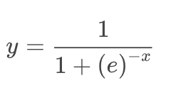
And the graphical representation is:
As you can see, the function range is between 0 and 1. When we fit the model to the logistic function we will change the x value with the coefficients of our data parameters and get a probability of our outcome being closer to 1, or closer to 0. You can also notice by graphical inspection that for x<0, the y value will be closer to 0, and for x>0, y value will be closer to 1. So, basically if you know if x is a positive or negative value, you will know which class the object belongs without needing to calculate y. However, you still need to know the value of y if you want know how strong is the prediction.
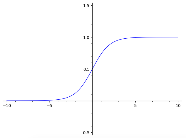
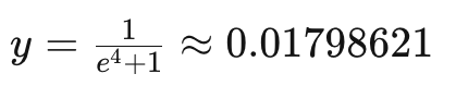
For example:
With x = 3:
We will get:
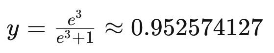
Which means a great probability of the object to be in class 1. In contrast, if x= -4, then it has a great probability of being in class 0.
But how is x calculated in the model?
To fit our model, which means to calculate x value for the model, it is assumed a linear relationship between the predictive variables, and the probability of the outcome (y=1 or y=0). This way, x will be fitted using a linear regression technique, with an interception m, and coefficient values for predictive variables B1, B2, B3...
I have explained linear regression in previous publications, and you can find it here and here.
The C parameter:
The C value in Logistic Regression is an user adjustable parameter that controls regularisation. In simple terms, higher values of C will instruct our model to fit the training set as best as possible, while lower C values will favour a simple models with coefficients closer to zero.
Hands-on:
Now we will fully implement and evaluate a Logistic Regression model using SciKit-Learn and Python. We will also learn how to adjust model parameters to control model for complexity, over-fitting and/or under-fitting.
Import the necessary libraries:
#Import Libraries:from random import random
from random import randint
import numpy as np
import pandas as pd
import matplotlib.pyplot as plt
import seaborn as snsfrom sklearn.model_selection import train_test_split
from sklearn.linear_model import LogisticRegressionfrom mlxtend.plotting import plot_decision_regionsCreate Data:
We will create data for this case study by building a dataset to be used as example. I will name the variables as a parameters of lung function (FEV1 and BD) and lung inflammation (FeNO), and the outcome variable as disease presence or not, in this case for asthma. But please remember, this is not real data, is data artificially created for this example, and based on my expert knowledge in this field. If you are using your own data, you can jump directly to step “Exploratory Data Analysis”.
#Fabricating variables:#Creating values for FeNO with 3 classes:
FeNO_0 = np.random.normal(15,20, 100)
FeNO_1 = np.random.normal(35,20, 100)
FeNO_2 = np.random.normal(65, 20, 100)#Creating values for FEV1 with 3 classes:
FEV1_0 = np.random.normal(4.50, 1, 100)
FEV1_1 = np.random.uniform(3.75, 1.2, 100)
FEV1_2 = np.random.uniform(2.35, 1.2, 100)#Creating values for Broncho Dilation with 3 classes:
BD_0 = np.random.normal(150,49, 100)
BD_1 = np.random.uniform(250,50,100)
BD_2 = np.random.uniform(350, 50, 100)#Creating labels variable with two classes (1)Disease (0)No disease:
not_asthma = np.zeros((150,), dtype=int)
asthma = np.ones((150,), dtype=intNow we will concatenate the previous created values into three predictive variables and one outcome variable:
#Concatenate classes into one variable:FeNO = np.concatenate([FeNO_0, FeNO_1, FeNO_2])
FEV1 = np.concatenate([FEV1_0, FEV1_1, FEV1_2])
BD = np.concatenate([BD_0, BD_1, BD_2])
dx = np.concatenate([not_asthma, asthma])The next step is to create a DataFrame and add the variables to the DataFrame:
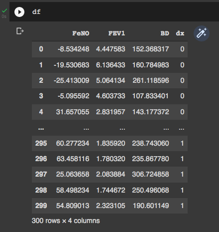
#Create DataFrame:
df = pd.DataFrame()
#Add variables to DataFrame:
df['FeNO'] = FeNO.tolist()
df['FEV1'] = FEV1.tolist()
df['BD'] = BD.tolist()
df['dx'] = dx.tolist()We can take a look of our DataFrame by simply typing “df” to check if everything is OK. It is possible to see that our DataFrame has 4 columns (three predictive variables and one outcome variable), and 300 rows.
Exploratory Data Analysis:
This is a simple Exploratory Data Analysis (EDA) just to understand how our variables behave and how they relate with each other and with the outcome (disease presence or absence). First we will see how our variables are distributed according to the disease presence or not:
#Exploring dataset:sns.pairplot(df, kind="scatter", hue="dx")
plt.show()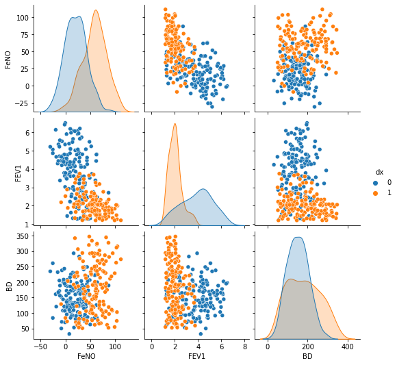
We can check the ability of the different parameters to distinguish between disease presence/absence. The parameter “BD” showed the worst power to distinguish between the two classes, has we can see higher overlap of values.
sns.boxplot( x=df["dx"], y=df["FEV1"] )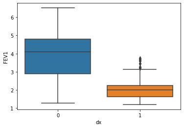
sns.boxplot( x=df["dx"], y=df["FeNO"] )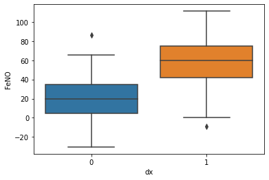
sns.boxplot( x=df["dx"], y=df["BD"] )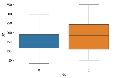
And then we can check correlations between the difference parameters. Are correlations are always stronger for the cases when asthma is present, and less significant when disease is absent.
sns.lmplot(x="FEV1", y="FeNO", data=df, fit_reg=True, hue='dx', legend=True)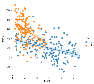
We see a stronger correlation between FEV1 and FeNO when disease is presence, and this correlation is negative (seen by the negative slope), which means that for higher values of FeNO we will find lower values of FEV1.
sns.lmplot(x="FEV1", y="BD", data=df, fit_reg=True, hue='dx', legend=True)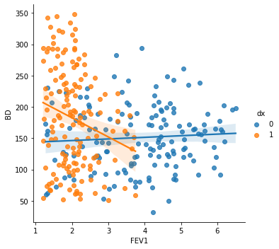
When checking the correlation between FEV1 and BD, we found that a negative correlation is seen when asthma diagnosis is presence. This way, lower values of FEV1 are associated with higher broncho dilation values.
sns.lmplot(x="FeNO", y="BD", data=df, fit_reg=True, hue='dx', legend=True)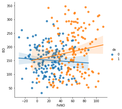
Lastly, the correlation between FeNO and BD shows that higher values of FeNO are associated with higher values of BD when asthma is present (positive correlation).
Splitting data into train and test Data sets:
We will use 80% of our data to build the model, and the remaining 20% to test the model. But first, we will create our X and y variables, where X represents the dataset with the predictors, and y an array of values with the outcome.
#Creating X and y:
X = df.drop('dx', axis=1)
y = df['dx']
#Data split into train and test:
X_train, X_test, y_train, y_test = train_test_split(X, y, test_size=0.20)Build and evaluate the model:
#Fit the model:
logisticregression = LogisticRegression().fit(X_train, y_train)
#Evaluate the model:
print("training set score: %f" % logisticregression.score(X_train, y_train))print("test set score: %f" % logisticregression.score(X_test, y_test))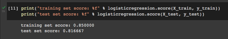
As we can see, our model performed slightly better on the training set, which may indicate we are over-fitting. Fortunately, we can use the C value to adjust the model and try to find a best model that weights the compromise between model complexity, over-fitting and under-fitting.
Lets see what happens if we set C=100:
#C=100
logisticregression100 = LogisticRegression(C=100).fit(X_train, y_train)print("training set score: %f" % logisticregression100.score(X_train, y_train))
print("test set score: %f" %
logisticregression100.score(X_test, y_test))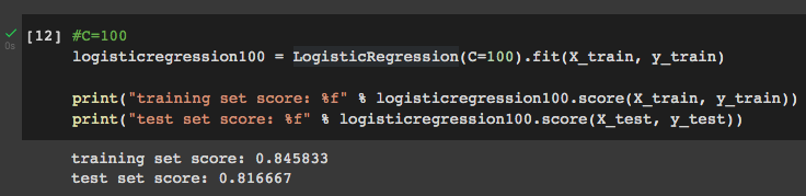
Setting C=100 has a small effect on training set score, with no effect on test set score, which means that it does not improve the model.
Setting C=0.01:
#C=0.01
logisticregression001 = LogisticRegression(C=0.01).fit(X_train, y_train)print("training set score: %f" % logisticregression001.score(X_train, y_train))
print("test set score: %f" %
logisticregression001.score(X_test, y_test))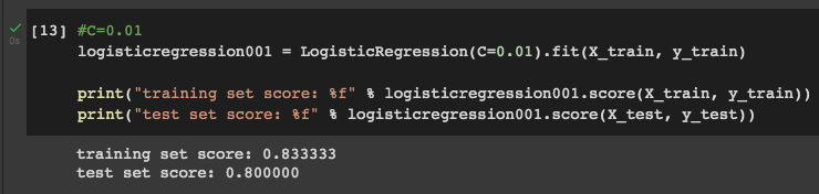
Setting C=0.01 decreases both training set score and test set score, which means that it is not a good value for this parameter.
Finding the best C value:
To find the best C value we should use a more sophisticated approach than trial and error. One way to do it is by plotting several accuracy score at different C values for both training and test sets.
training_accuracy = []
test_accuracy = []
# try c values from 0.001 to 100:
c_settings = np.arange(0.001, 100, 0.1)for i in c_settings:
# build the model
clf = LogisticRegression(C=i)
clf.fit(X_train, y_train)
# record training set accuracy
training_accuracy.append(clf.score(X_train, y_train))
# record generalization accuracy
test_accuracy.append(clf.score(X_test, y_test))plt.plot(c_settings, training_accuracy, label="training accuracy")
plt.plot(c_settings, test_accuracy, label="test accuracy")
plt.legend()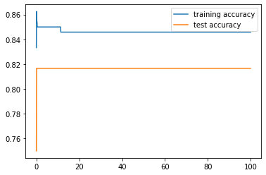
In the plot we can see that training and test accuracy values come closer after approximately a C value of 10. It is not entirely clear in this plot, so we can plot a smaller interval:
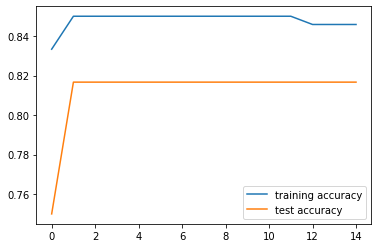
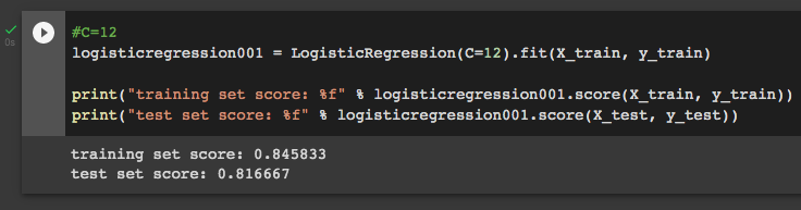
Now it is easy to see that at C=12 training and test accuracy values are closer, which means this is our optimal C value. We can check it:
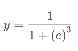
Build a visualisation for the model:
Lastly, we can visualise our model performance by build a graph with the decision regions. For doing that, we need our DataFrame to be in csv format:
df.to_csv('data.csv', index = False)
data = pd.read_csv('data.csv')
Then we build a function for the graph using two main variables (we know we will use FEV1 and FeNO, once BD has greater class overlap):
def logisticReg_comparison(data,c):
    x = data[['FEV1','FeNO',]].values
    y = data['dx'].astype(int).values
    LogReg = LogisticRegression(C=c)
    LogReg.fit(x,y)
    print(LogReg.score(x,y))
    #Plot decision region:
    plot_decision_regions(x,y, clf=LogReg, legend=2)
    #Adding axes annotations:
    plt.xlabel('X_train')
    plt.ylabel('y_train')
    plt.title('LogReg with C='+str(c))
plt.show()logisticReg_comparison(data,12)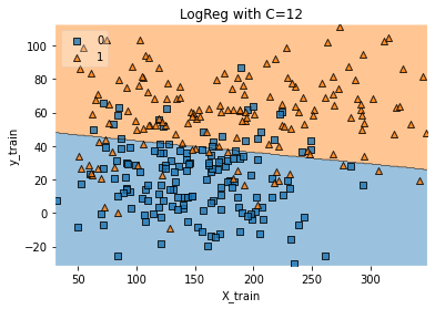
Thank you for reading! Let me know if you have corrections or suggestions and don’t forget to subscribe to receive notifications about my future publications.
If: you liked this article, don’t forget to follow me and thus receive all updates about new publications.
Else If: you want to read more, you can subscribe to Medium membership with my referral link. It will not cost you more but will pay me for a coffee.
Else: Thank you!