A Very Simple Exploratory Analysis of a Kaggle Dataset on the Data Science Job Market in 2023 using R

Full disclosure upfront: I got the idea for this article from another Medium writer in an extremely similar article he published on May 12th using Python to do his analysis, but I am an R user myself, so I thought it would be a fun little task to just re-do most of his steps and maybe add in a few of my own but using R for everything rather than Python. If you want to read this article to learn about current characteristics of the data science job market and/or recent trends in it, I wouldn’t take his or mine as very indicative though because the Kaggle dataset we both use only has 3,755 observations. I have not been able to source the dataset yet, if I do, I’ll edit this article with that pertinent information, but I am going to assume as my internal null hypothesis here for the time being that if there is not any clear indication that the sample is representative of the overall US data science industry right now, then it is not representative.
I know most Medium articles about data science use Python, not R, and not only that, there is some sort of quasi Manifest Destiny mindset among a lot of people who think one day soon, every data scientist will be using Python. I typically use R though, and it’s not that I don’t like Python or even that I prefer R to Python, it is because I prefer RStudio to just about any other IDE out there.

Because I would really like to avoid just re-writing the aforementioned article which inspired me to write this one in terms of the brief introduction it has and its sparse commentary throughout, I am going to assume you have already read it, or can skim it real quick, section-by-section as they are in the same order here, as you read this one.
Loading the Data
A description of the dataset I am going to use throughout this article and a link to download it for yourself can be found here on Kaggle.
library(tidyverse)

# load the salaries dataset using read_csv() from the readr library
salaries_df <- read_csv("ds_salaries.csv")
As always with R, you start out with the library function to import the necessary package(s) you’ll need to call on. The tidyverse package is not a single package but a catalogue of related packages in R including the readr package which is where the read_csv() function comes from. It loads in datasets much faster than base R’s read.csv(), and it automatically loads them as tibbles as well as you’ll see below as we explore this dataset’s properties, characteristics, and contents:
> class(salaries_df)
[1] "spec_tbl_df" "tbl_df" "tbl" "data.frame"
> head(salaries_df)
# A tibble: 6 × 11
work_year experience_level employmen…¹ job_t…² salary salar…³ salar…⁴ emplo…⁵ remot…⁶ compa…⁷ compa…⁸
<dbl> <chr> <chr> <chr> <dbl> <chr> <dbl> <chr> <dbl> <chr> <chr>
1 2023 SE FT Princi… 80000 EUR 85847 ES 100 ES L
2 2023 MI CT ML Eng… 30000 USD 30000 US 100 US S
3 2023 MI CT ML Eng… 25500 USD 25500 US 100 US S
4 2023 SE FT Data S… 175000 USD 175000 CA 100 CA M
5 2023 SE FT Data S… 120000 USD 120000 CA 100 CA M
6 2023 SE FT Applie… 222200 USD 222200 US 0 US L
# … with abbreviated variable names ¹employment_type, ²job_title, ³salary_currency, ⁴salary_in_usd,
# ⁵employee_residence, ⁶remote_ratio, ⁷company_location, ⁸company_sizeAs you can see, salaries_df is both a classic data.frame and a tibble which is great because it has the best of both worlds. But how large is it?
> dim(salaries_df)
[1] 3755   11
We now see the dataset contains 3,755 observations on 11 different variables pertaining to data science employment.
The head() function gave us the datatype of the first few columns, but we want to know the datatype for all of the columns, so we use R’s structure function str() to find out, it is the closest thing to Python’s info() function, but they are quite different in some ways, e.g. the lack of a null vs non-null count for each column:
> str(salaries_df)
spec_tbl_df [3,755 × 11] (S3: spec_tbl_df/tbl_df/tbl/data.frame)
 $ work_year         : num [1:3755] 2023 2023 2023 2023 2023 ...
 $ experience_level  : chr [1:3755] "SE" "MI" "MI" "SE" ...
 $ employment_type   : chr [1:3755] "FT" "CT" "CT" "FT" ...
 $ job_title         : chr [1:3755] "Principal Data Scientist" "ML Engineer" "ML Engineer" "Data Scientist" ...
 $ salary            : num [1:3755] 80000 30000 25500 175000 120000 ...
 $ salary_currency   : chr [1:3755] "EUR" "USD" "USD" "USD" ...
 $ salary_in_usd     : num [1:3755] 85847 30000 25500 175000 120000 ...
 $ employee_residence: chr [1:3755] "ES" "US" "US" "CA" ...
 $ remote_ratio      : num [1:3755] 100 100 100 100 100 0 0 0 0 0 ...
 $ company_location  : chr [1:3755] "ES" "US" "US" "CA" ...
 $ company_size      : chr [1:3755] "L" "S" "S" "M" ...
 - attr(*, "spec")=
  .. cols(
  ..   work_year = col_double(),
  ..   experience_level = col_character(),
  ..   employment_type = col_character(),
  ..   job_title = col_character(),
  ..   salary = col_double(),
  ..   salary_currency = col_character(),
  ..   salary_in_usd = col_double(),
  ..   employee_residence = col_character(),
  ..   remote_ratio = col_double(),
  ..   company_location = col_character(),
  ..   company_size = col_character()
  .. )
 - attr(*, "problems")=<externalptr>
One interesting feature you can see from using the structure function here is that the salary_currency variable is not always American dollars. This means it would be unwise to jump to the conclusion that this dataset is only comprised of observations on data scientists working in the United States.
You can also see that while most of the nominal variables have good descriptive names, not all of them do. For instance, the abbreviations for company_size are very clear: S for small, M for M for medium, and L for large, but the abbreviations chosen for the experience_level and employment_type variables are not immediately obvious.
As in the other article, it is important to check for missing data, so we repeat that step below using sum(is.na(salaries_df)) rather than df.isnull().sum().sum():
> sum(is.na(salaries_df))
[1] 0
Now that we don’t have to worry about any missing data, we can look to see how many unique values are in each of the 11 columns using one of R’s handy apply() functions.
> sapply(salaries_df, function(column) length(unique(column)))
         work_year   experience_level    employment_type          job_title             salary
                 4                  4                  4                 93                815
   salary_currency      salary_in_usd employee_residence       remote_ratio   company_location
                20               1035                 78                  3                 72
      company_size
                 3
From this, we can see there are only 3 possible different company sizes, in order to find out what those 3 sizes are, we can use the table function combined with the standard base R $ syntax:
> table(salaries_df$company_size)

   L    M    S
 454 3153  148
Now how about salary_currency? It says there are 20 of them, which countries would that be? I am curious, so let us find out:
> table(salaries_df$salary_currency)

 AUD  BRL  CAD  CHF  CLP  CZK  DKK  EUR  GBP  HKD  HUF  ILS  INR  JPY  MXN  PLN  SGD  THB  TRY  USD
   9    6   25    4    1    1    3  236  161    1    3    1   60    3    1    5    6    2    3 3224
And one more thing, I know that one of the 4 values in work_year must be 2023, and I would hope the other 3 are 2022, 2021, and 2020, but it is still a good idea to check because it only takes a few seconds.
> table(salaries_df$work_year)

2020   2021   2022   2023
  76    230   1664   1785
And fortunately, this is in fact the case.
Data Visualizations
We will be using the ggplot2 library to re-create all of the charts in the other article here.
The Top 10 Job Titles in 2023 in this Data Science Employment Dataset
### The Top 10 Job Titles for this year (so far)
# Filter and count
jobs <- salaries_df %>%
  filter(work_year == 2023) %>%
  group_by(job_title) %>%
  summarise(count = n()) %>%
  arrange(desc(count)) %>% head(10)

# Create the barplot
ggplot(jobs, aes(x = reorder(job_title, count), y = count)) +
  geom_bar(stat = "identity", fill = "steelblue") +
  coord_flip() +
  labs(x = "Job Titles", y = "Counts", title = "Top 10 Job Titles in 2023") +
  geom_text(aes(label = count), hjust = -0.3)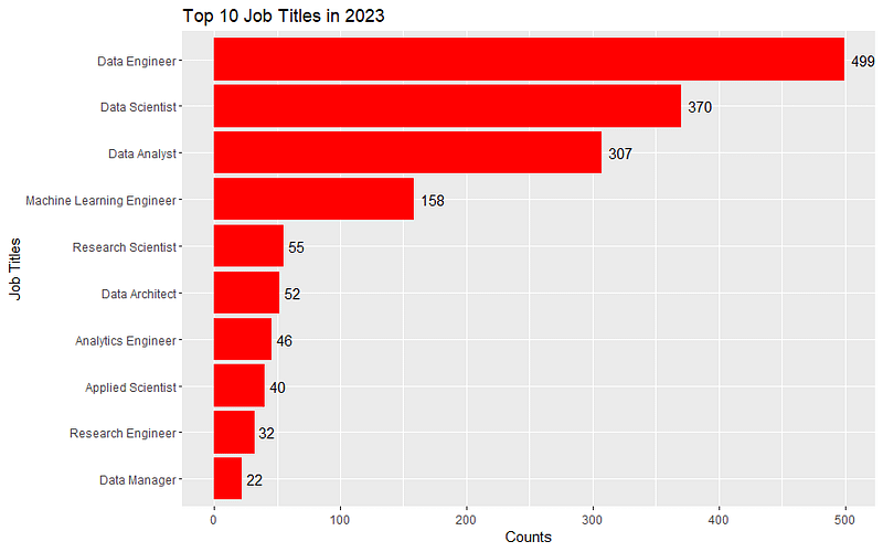
But these are all the same color, lame! So here is how to do it with different colors for each (assuming you already ran the code above to create the jobs object):
# Create the same barplot with different colors for each job title
ggplot(jobs, aes(x = reorder(job_title, count), y = count, fill = job_title)) +
  geom_bar(stat = "identity") +
  coord_flip() +
  labs(x = "Job Titles", y = "Counts", title = "Top 10 Job Titles in 2023") +
  geom_text(aes(label = count), hjust = -0.3) +
  scale_fill_brewer(palette = "Set3")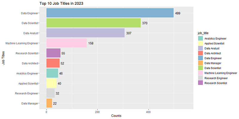
The Number of Jobs by Experience Level
### Experience Levels
unique(salaries_df$experience_level)

# Create the barplot
ggplot(salaries_df, aes(x = experience_level)) +
  geom_bar(fill = "steelblue") +
  labs(x = "", y = "Counts", title = "Experience Levels") +
  geom_text(stat = 'count', aes(label = ..count..), vjust = -0.3)
And that creates this bar chart:
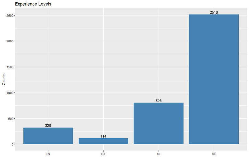
But there are a few issues here, one it would look nicer if each bar was a different color, and two, the labels are still not intuitive. Here is how to fix that issue:
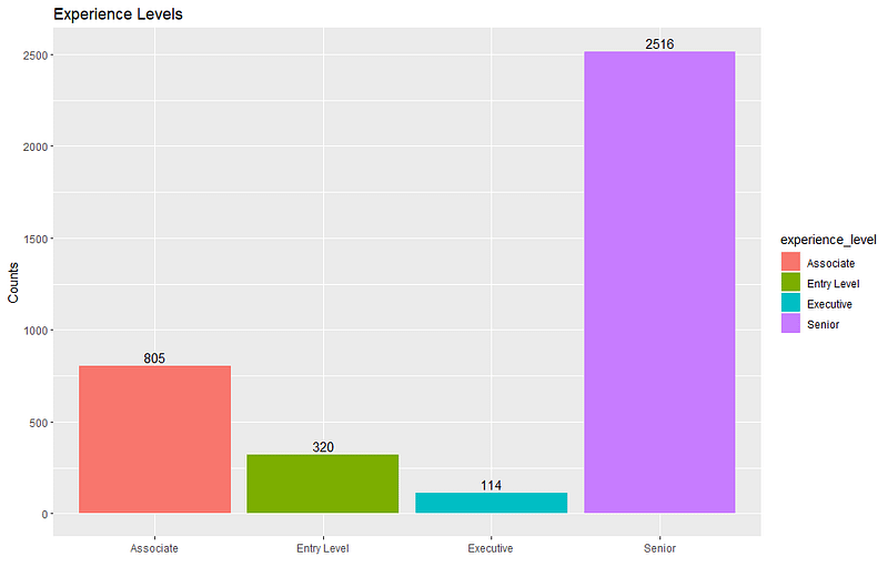
I changed MI from Middle Tier or Mid Level which is probably what it stands for to Associate because that is the corresponding experience level option when job hunting on LinkedIn.
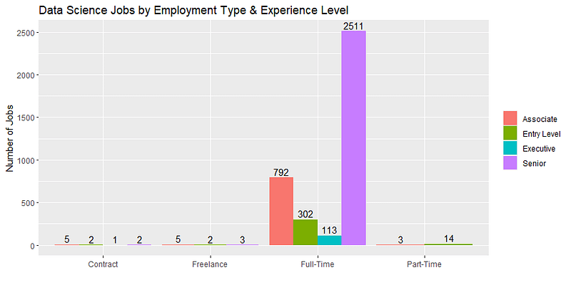
The Number of Jobs by Employment Type and Experience Level
Here, I repeat what I did above, but within each of the 4 employment type categories which will yield a bar chart with 4 clusters of these 4 bars for each experience level.
### Jobs by both Employment Type and Experience Level
unique(salaries_df$employment_type)

> unique(salaries_df$employment_type)
[1] "FT" "CT" "FL" "PT"

# Replace values in the employment_type column
salaries_df <- salaries_df %>%
  mutate(employment_type = recode(employment_type,
                                   "FT" = "Full-Time",
                                   "PT" = "Part-Time",
                                   "CT" = "Contract",
                                   "FL" = "Freelance"))

# Create the barplot showing how many data science jobs there are in
# this dataset by experience level as before, and also by employment type
ggplot(data = salaries_df, mapping = aes(x = employment_type, fill = experience_level)) +
  geom_bar(position = "dodge") +
  labs(x = "", y = "Number of Jobs", title = "Data Science Jobs by Employment Type & Experience Level") +
  theme(legend.title = element_blank()) +
  geom_text(stat = 'count', aes(label = ..count.., group = experience_level),
            position = position_dodge(width = 0.9), vjust = -0.3)
Here is the chart that code creates:
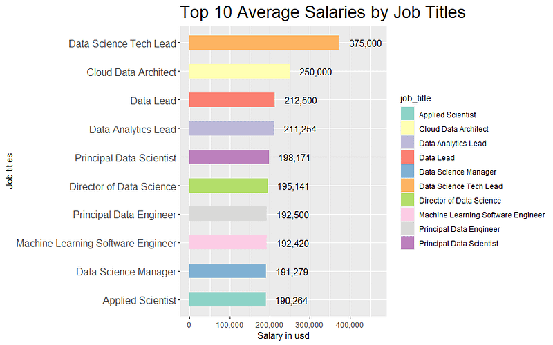
Mean Salaries by Job Titles
### Mean Salaries by Job Titles
# Filter, group, and calculate mean
job_title_salary <- salaries_df %>%
  group_by(job_title) %>%
  summarise(salary_in_usd = mean(salary_in_usd, na.rm = TRUE)) %>%
  arrange(desc(salary_in_usd)) %>%
  head(10)

# Create the barplot
ggplot(job_title_salary, aes(x = reorder(job_title, salary_in_usd), y = salary_in_usd, fill = job_title)) +
  geom_bar(stat = "identity", width = 0.5) +
  coord_flip() +
  labs(x = "Job titles", y = "Salary in usd", title = "Top 10 Average Salaries by Job Titles") +
  geom_text(aes(label = format(round(salary_in_usd), big.mark = ",", scientific = FALSE)), hjust = -0.3) +
  scale_fill_brewer(palette = "Set3") +
  theme(plot.title = element_text(size = 18), axis.text.y = element_text(size = 11)) +
  expand_limits(y = max(job_title_salary$salary_in_usd) * 1.25)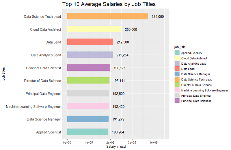
Unfortunately, the horizontal axis labels have defaulted to scientific notation, so I added scale_y_continuous(labels = scales::comma) on at the end to fix that, which looks much better in my opinion.