
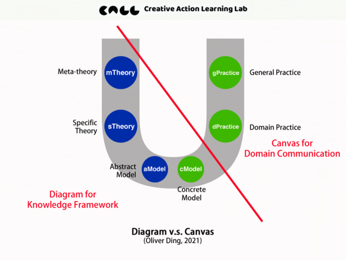
A Typology of Knowledge Diagrams (v2, 2022)
Last year, I worked on the D as Diagramming project which produced two books (drafts) and a set of tools for studying knowledge diagrams.
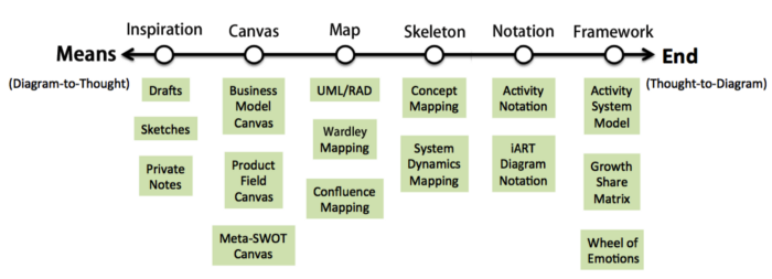
The diagram below is called the Means — End Spectrum which was introduced on Nov 29, 2021.
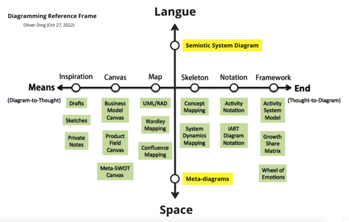
On Oct 27, 2022, I modified the above diagram and made a new version. Now it has a new name: the Diagramming Reference Frame. See the diagram below.

The major change is adding two types of diagrams:
- Semiotic System Diagrams
- Meta-diagrams
This week I made a new version of Diagramming Reference Frame. See the diagram below.
This article will introduce more details about this typology of knowledge diagrams.
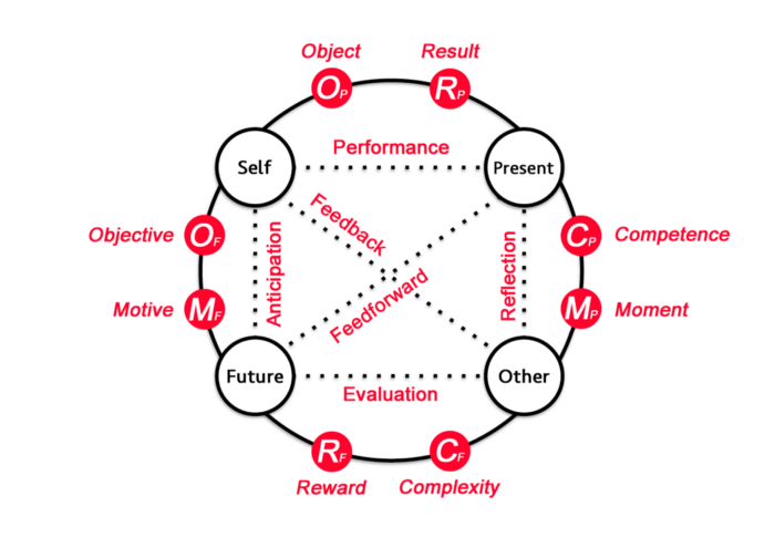
1. The Mediating Instrument Perspective
Inspired by Activity Theory and the Activity Checklist, I adopt the Mediating Instrument perspective to discuss the diagramming practice and highlight four essential issues for discussion.
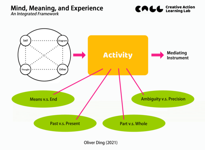
The above diagram shows four issues. Some issues are inspired by Activity Theory, other issues are defined by the “Diagram—Thought” curating practice.
- Means v.s. End: This issue is directly adopted from Activity Theory. However, I am going to discuss a Means-End Spectrum in order to present various instrumental values of diagrams.
- Past v.s. Present: This issue is inspired by the principle of Development, which is an important principle of Activity Theory. I will focus on the evolution of thoughts and diagrams.
- Part v.s. Whole: This issue is inspired by the principle of the Hierarchical structure of activity, which considers a three-level hierarchy: operation — action — activity. I will discuss diagram-in-use as a whole and a particular action of using a diagram.
- Ambiguity v.s. Precision: This issue is inspired by the principle of Object-orientedness, which means any activity has its motive and goals which point to a final outcome. I consider the process of thought to be an activity that aims to transform ambiguous ideas into precise ideas.
The above four issues are discovered from the D as Diagramming project. Since I just conducted a few case studies, these issues are not a complete list for studying knowledge diagrams. I consider them a good starting point.
2. The Means-End Spectrum
The Means-End issue is a complicated issue in the literature of Activity Theory and Vygotsky’s Cultural-historical theory of psychology because scholars have different interpretations of Vygotsky’s ideas. As mentioned above, the mediated action v.s. mediating activities debate is an example. A second example might be Newman and Holzman’s ideas v.s. Bruner’s ideas. According to Newman and Holzman, “Vygotsky’s tool-and-result method is purposeful in the Marxian sense, not, contrary to Bruner’s formulation, in the instrumentalist sense. Vygotsky’s rejection of the causal and/or functional methodological notion of tool or instrument for a purpose or result in favor of the dialectical notion of tool-and-result in the study of human psychology is new and revolutionary.” (1993, p.40)
From the perspective of Activity Theory, I consider the Means v.s. End issue within concrete activities. For a particular activity, a diagram might be an end, I call it Thought-to-Diagram. For another particular activity, the same diagram might be a means, I call it Diagram-to-Thought. If we combine these two situations together, we can develop a Means-End Spectrum and use it to present various instrumental values of diagrams.
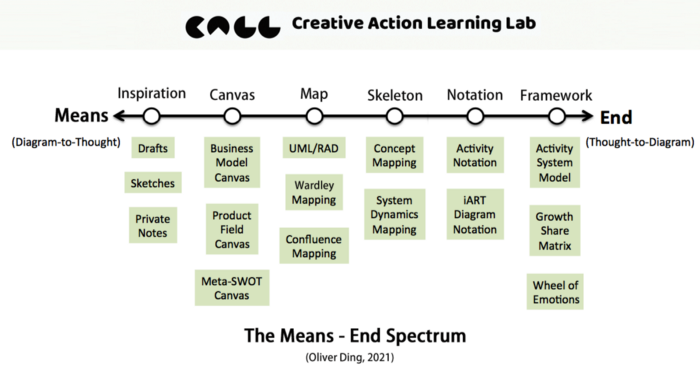
The above diagram offers a spectrum with six types of diagrams. The left side refers to Means (Diagram-to-Thought) and it stands for a weak ontological position of diagrams. We don’t have to require a perfect form of diagrams if we use them as means for our thinking and private discussions since we don’t make diagrams as final products.
The right side refers to End (Thought-to-Diagram) and it requires a strong ontological position of diagrams. In order to make diagrams as final products for others to use, we have to work hard to produce ideal diagrams.
Based on the spectrum of ontological positions of diagrams, I identify six types of diagrams:
- Inspiration
- Canvas
- Map
- Skeleton
- Notation
- Framework
The weakest position is Inspiration which refers to drafts, sketches, private notes, etc.
The strong position is Framework which refers to formal knowledge models.
3. Framework
If you read my articles about diagrams, you probably notice that I use Frameworks and Models interchangeably.
A knowledge framework is a bridge that connects theory and practice. An ideal knowledge framework should contain two types of concepts:
- Theoretical Concepts
- Operational Concepts
Theoretical Concepts are adopted from Meta-theory or Specific Theory. Some frameworks don’t associate with any theories, they only have operational concepts.
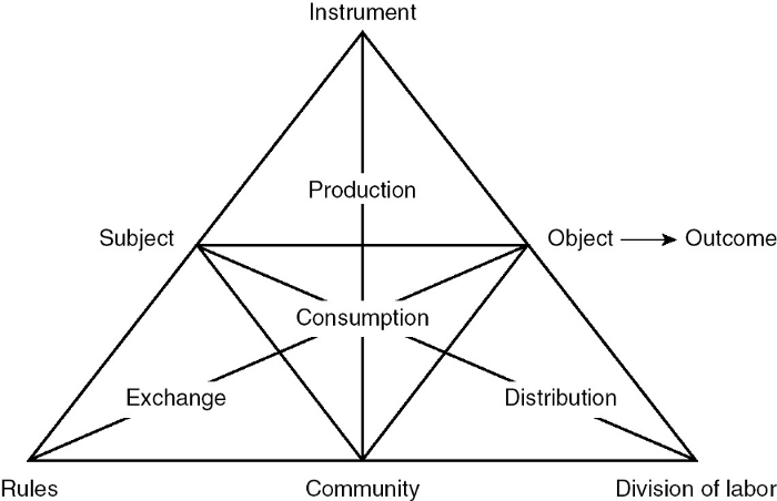
Operational Concepts are framework-dependent concepts for guiding research and reflection. For example, Yrjö Engeström’s Activity System Model is a knowledge framework. Its diagram displays seven operational concepts.
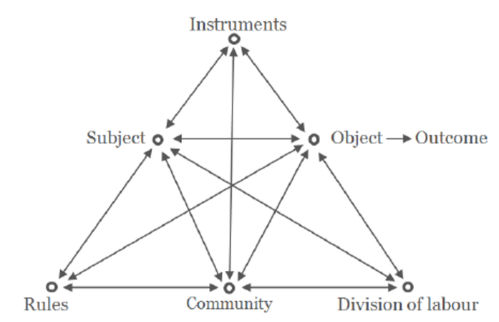
We should notice that a knowledge framework can directly adopt some theoretical concepts as its operational concepts. For example, the above diagram shows “Subject” and “Object” which are core theoretical concepts of Activity Theory. However, some researchers use “Actor” to replace “Subject” with the same diagram for their own work. The concept of “Actor” should be understood as an operational concept. For real-life research, the difference between “Subject” and “Actor” doesn’t matter since we need to see the final data which refers to a person or several people.
While Yrjö Engeström uses the word “Instruments”, other researchers use “Mediating Tool” or similar words. For example, Maral Babapour, Antonio Cobaleda-Cordero, and Marianne Karlsson adopt Activity Theory to develop a framework for understanding the interrelations between users and workplace design. They use the word “Mediating Tool”.
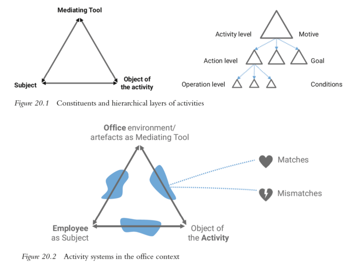
Both theoretical concepts and operational concepts can be defined precisely or vaguely. For example, the scope of the concept of “Instruments/Mediating Tool” is very broad in Activity Theory. The above diagram shows an example, the authors understand “Office Environment” as a “Mediating Tool” from the perspective of Activity Theory. Since Activity Theory doesn’t have a theoretical concept of “Environment,” researchers tend to use the concept of “Instruments/Mediating Tool” to understand “Environment”.
We also should notice that a knowledge framework’s diagram may not display some key theoretical concepts. In fact, we don’t have to display theoretical concepts in a diagram because we can discuss them with words in a research report. For example, the concept of “Mediation” is a foundational theoretical concept of Activity Theory. In fact, Yrjö Engeström’s Activity System Model was developed with double mediations. However, the Activity System Model doesn’t display the word “Mediation” in its diagram.
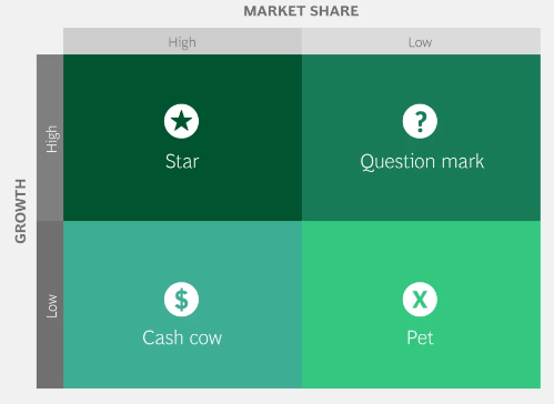
The Growth-Share Matrix is a portfolio management framework that helps companies decide how to prioritize their different businesses by their degree of profitability. The matrix was created in 1968 by BCG’s founder Bruce Henderson.
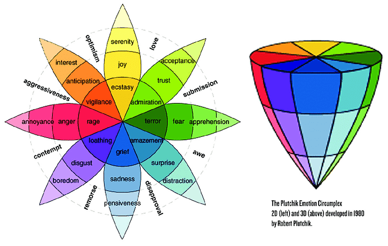
Wheel of Emotions is a model of emotion classification, it was developed by psychologist Robert Plutchik in 1980.
4. Notation
It means the process of adding notes to a knowledge diagram. Sometimes, the notation will turn a basic model into an expanded model. The term “Diagram Notation” is inspired by Daisy Mwanza’s Activity Notation which is one of four methodological tools of the Activity-Oriented Design Method (AODM).
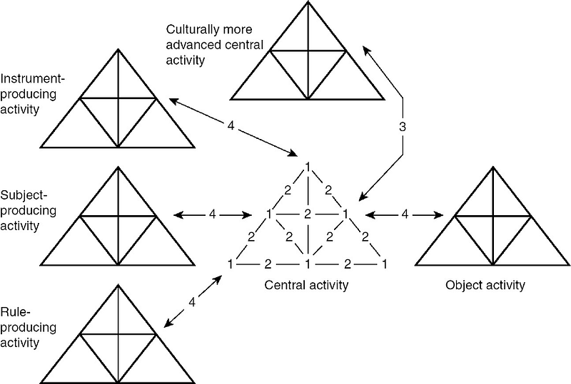
The Activity Notation is based on Yrjö Engeström’s Activity System Model. See the diagram below. You can find more details about it in Activity U (IV): The Engeström’s Triangle and the Power of Diagram.
In 2001, Daisy Mwanza published a paper and introduced an activity theory based methodology for guiding computer system design. She argued that “ Activity Theory (AT) has emerged as a suitable framework for analysing social and cultural issues because it provides a language to describe what people do in context. However, many computer system developers have failed to benefit from this insight mainly due to lack of established methods to operationalise ideas from this framework for the purpose of guiding the design process.”
Noticing the lack of a standard and specified method for applying Activity Theory within HCI, Mwanza developed an Activity-Oriented Design Method (AODM) with four methodological tools. One of the tools is called Activity Notation which breaks down the situation’s whole activity system into smaller manageable sub-activity triangles (see the diagram below).
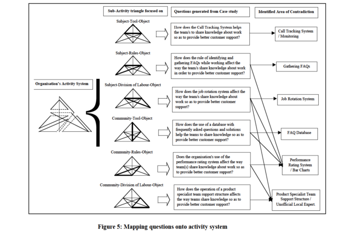
She also developed a set of general research questions which are specific to a particular combination within the activity notation. Mwanza said, “These questions are used as pointers to what to look for during observational studies, also in questionnaires and interviews as triggers to help decide on what questions to ask.” Finally, researchers and designers can analyze and interpret data they gathered with a key concept of activity theory: contradictions.
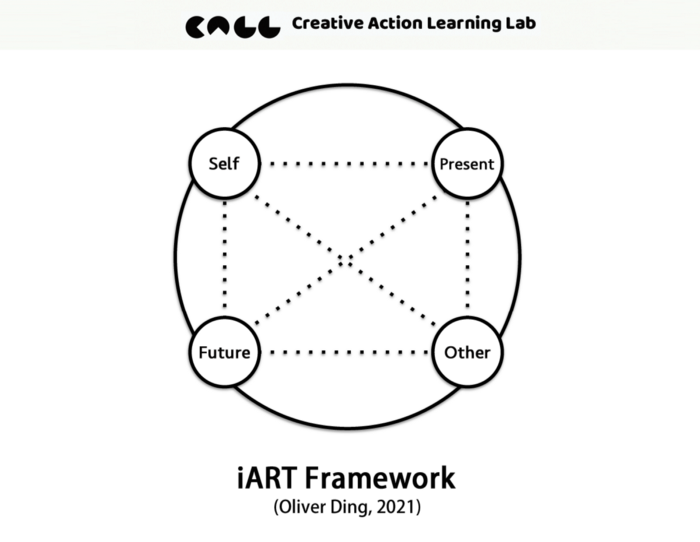
The Activity Notation can be considered an expanded model of the Activity System. Now we can use the term Diagram Notation to describe the process of adding notes to a diagram d and turning a basic model into an expanded model. I also made an iART Diagram Notation and expanded the basic model of the iART framework into an expanded model.
The diagram below is the basic model of the iART framework.
The diagram below is called iART Diagram Notation.
You can find more details here.
5. Skeleton
This type of diagram doesn’t have a solid framework, but it offers a systematic way of structure for organizing concepts.
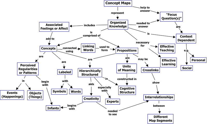
For example, Concept Mapping is a method developed by Joseph Donald Novak in the 1970s. The Concept Mapping method doesn’t provide a particular knowledge framework, but it guides people to build their own conceptual frameworks.
The diagram below is a concept map showing the key features of concept maps. Concept maps tend to be read progressing from the top downward. You can read the original article in The Theory Underlying Concept Maps and How to Construct and Use Them.
The System Dynamics Mapping refers to a series of system thinking archetypes that were developed by Senge (1990) and Pegasus Communications (1989–1996). One of these archetypes is the Accidental Adversaries archetype.
System Dynamics Mapping often uses Causal Loop Diagrams to visualize wicked complexity. For example, the diagram below is a preliminary causal loop diagram demonstrating the complexity of the COVID-19 pandemic environmental–health–socio–economic system. You can find more details about it in the original paper: Developing a Preliminary Causal Loop Diagram for Understanding the Wicked Complexity of the COVID-19 Pandemic.
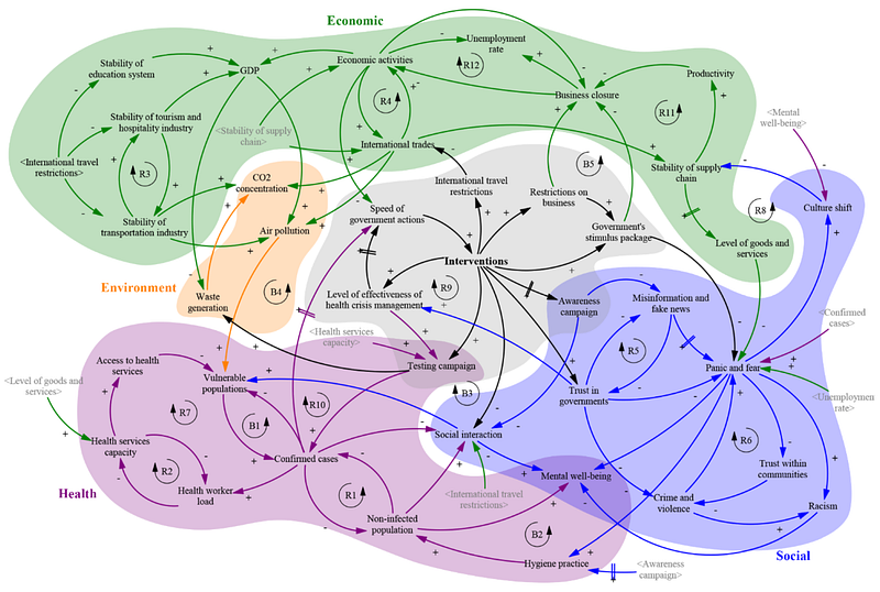
Since Causal Loop Diagrams are so popular, some companies developed specific software for drawing Causal Loop Diagrams. For example, the Vensim PLE software, see this video.
6. Map
This type of diagram is used as a mapping platform for modeling or sense-making. Sometimes they also offer a specific method of conceptualization.
For example, UML/RAD is used for modeling processes in the field of Software Engineering and Information Systems. UML stands for Unified Modelling Language which includes Activity Diagrams as one of its techniques. RAD stands for Role Activity Diagrams which is a method of modeling processes too.
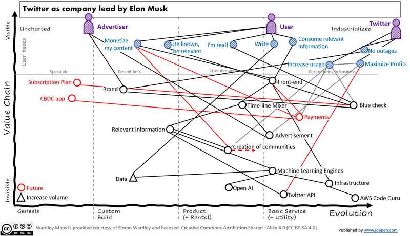
Wardley Mapping is a method for sense-making in the field of business strategy. People also use it for thinking and discussion. For example, Joaquín Peña Fernández uses Wardley Map to discuss social media platforms, especially Twitter.
He started with the user needs by using the Wardley Map. See the attached diagram.
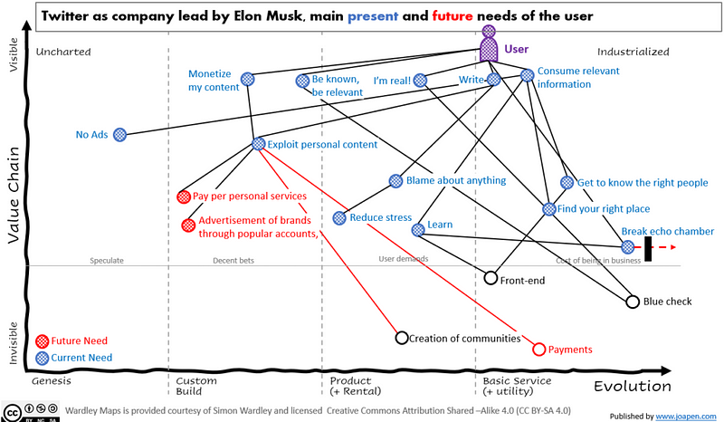
He also made a map for mapping Twitter as a company led by Elon Musk. See the diagram below. You can find more details in his original blog post Virtual mapping conversation about Twitter.
You can find more examples of Mapping Wardley on his website: Government and Facebook conflicts; How to bring back benefits of social media companies to people, etc.
Confluence Mapping was introduced by Cynthia Kurtz in her 2021 book Confluence: Tools for Thinking about How Organized Plans and Self-organized Patterns Flow Together.
7. Canvas
What is the major difference between a framework and a canvas? A simple answer is that the former focuses on expressing the relationship between several concepts while the latter primarily offers spaces for posting notes which can be considered as data about concepts.
When you design a diagram, your goal is to find an ideal spatial structure to represent a set of concepts and their relationship. You don’t have to consider making spaces for others to add data about concepts. People tend to add notes around the diagram if they need to do it. For example, I made the diagram below in July. I just added some texts which refer to a set of metaphors about Strategy and Design around the diagram.
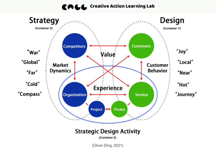
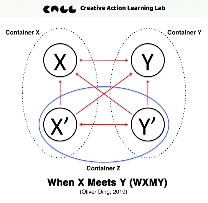
The original diagram is When X Meets Y (WXMY). I didn’t design spaces for adding notes. I discovered these spaces for adding notes which don’t correspond to concepts of the diagram. Here we have to pay attention to the picture and the diagram. The picture is a container that contains the diagram. However, the space outside the diagram is part of the picture. The act of adding notes on the space refers to the picture, not the diagram. This insight is very important if we talk about diagram-in-use for a particular situation in a particular environment. For further discussion, you can read this one: Physical Space Affordances and Graphic Space Affordances.
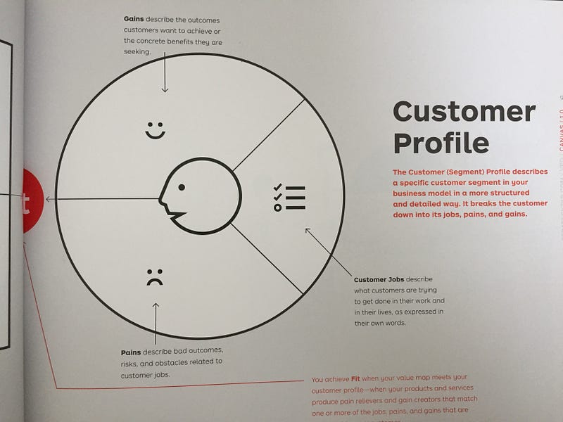
However, the purpose of a canvas is just to offer spaces for adding notes and stickers which contain data corresponding to concepts. For example, A 2014 book titled Value Proposition Design offers a canvas for understanding value propositions and customer segments. The Customer Profile module sets three spaces for sensemaking: Customer Jobs, Gains, and Pains. According to the authors,
- Customer Jobs: describe what customers are trying to get done in their work and in their lives, as expressed in their own world.
- Gains: describe the outcomes customers want to achieve or the concrete benefits they are seeking.
- Pains: describe bad outcomes, risks, and obstacles related to customer jobs.
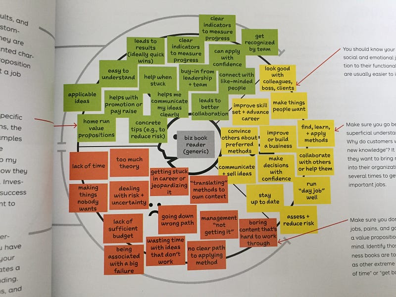
The above two pictures show the original canvas and its one use case. It is clear that the value of a canvas is its status of canvas-in-use for understanding data in order to achieve sensemaking in a special situation. In the case of Value Proposition Design, the situation is designing a business model for a new/old product/service.
Since canvases are designed for encouraging contributions, they became a popular instrument in several fields such as educational workshops, team meetings, design and innovation events, and other creative communication activities. The situational function requires makers to print canvases in a large size and post them on physical walls.
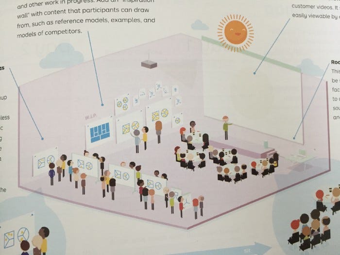
According to the authors of Value Proposition Design, the walls of the venue are important for a workshop. They emphasize, “Walls: Large vertical surfaces are indispensable, whether movable or part of the building. Make sure you can stick large posters, sticky notes, and flip chart paper on them…Set up an area where you can expose canvases and other work in progress. Add on ‘inspiration wall’ with content that participants can draw from, such as reference models, examples, and models of competitors.” (2014, p.167)
The same method is applied to the online environment too. Thanks to the rise of collaborative whiteboard platforms, now we can design, deliver and use canvas in digital spaces.
Business Model Canvas may be the first business knowledge canvas. It made a standard format for Knowledge Canvas and it attracted many followers. For example, Event Design Canvas and Design Ops Canvas. You can find more canvases here.
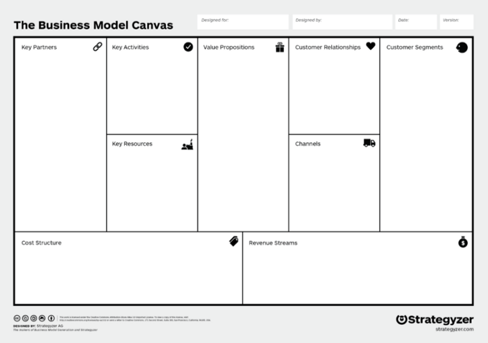
However, there are two strategies for adopting a standard format: 1) you can adopt both the concept of Knowledge Canvas and the visual layout from the Business Model Canvas and 2) you can only adopt the concept of Knowledge Canvas and create your own visual layout.
Can we find an example of the second approach? Let’s look at the canvas below.
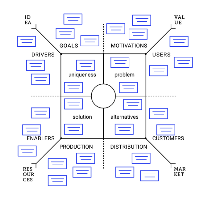
Product Field Canvas is a sense-making tool for building products.
According to the authors of the framework, “The visual form of the Product Field is a Mandala. According to the Groups Keyboard, a mandala helps you and your team to perceive wholeness and see gaps and unities under a diversity of perceptions.”
This is the difference! While The Business Model Canvas puts a set of “building blocks” in an A4 sheet, The Product Field Canvas jumps out of the box and gives a Mandala a free space.
Meta-SWOT Canvas turns classic SWOT into a dynamic and action-driven strategic tool.
8. Inspiration
Drafts, sketches, and private notes are used for recording inspirations in the process of creative thinking. They may be the seed of other types of diagrams.
In the past few years, I have had a keen interest in the intellectual biographies of academic creators. Authors of these biographies often collect private notes and personal letters in order to explore creators’ thought development deeply. I often saw some amazing diagrams in these books.
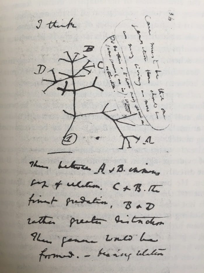
For example, the above picture is Darwin’s second attempt to sketch the idea of the irregularly branching tree of nature. I saw this diagram in Howard E. Gruber’s 1974 book Darwin on Man. Let me quote what Gruber described Darwin’s thoughts behind the diagram.
Soon he realizes that the coupling of monadism and the branching model requires the simultaneous extinction of many related species, not as an occasional event but as a regularly recurring phenomenon. The evidence patently does not support this deduction. (B 35) But he does not immediately abandon either idea. Instead, he goes on to develop the branching model with much greater precision and detail, stresses the point that conserving the numbers of species requires extinction, and explores in a quasi-mathematical form the amount of divergence that the branching model can permit him to imagine.
He redraws his sketch of a tree; where the first two sketches were rough, mainly intended to show the idea of a dead base and consequent discontinuities, the second sketch is cleanly drawn and more abstract, with a definite symbol used to distinguish between extinct and living forms, so that the number of each is actually countable.
Almost immediately Darwin reformulates the branching model in terms of human survival and descent, as though the ordinary form of a genealogical family tree were inherent in his idea from its conception (B 40–41) in this early treatment of the subject, the idea of selective survival in order to keep the number of species constant is clearly stated. But at this time he applies the idea only to extinction, not to the production of new species. (Darwin on Man, p.143–144)
Such sketches and diagrams are private tools for sensemaking. Creators rely on these tools to turn their ideas (personal tacit knowledge) into unshared drafts and notes (personal explicit knowledge). Sometimes, new ideas are born from the process of diagramming.
The above discussion offers a rough typology of diagrams. However, the value of the Means-End Spectrum is highlighting the dynamics of ontological positions of diagrams because it matches the dynamics of thoughts.
9. Diagramming Reference Frame
On Oct 27, 2022, I modified the above diagram and made a new version. Now it has a new name: the Diagramming Reference Frame. See the diagram below.
The major change is adding two types of diagrams:
- Semiotic System Diagrams
- Meta-diagrams
Six months ago, I contact Ping-keung Lui who is a theoretical sociological theorist. Lui aims to build a brand new theoretical sociology as a candidate for the paradigm of sociology. According to Lui, “There are three kinds of theories in sociology, namely, social theory, sociological theory, and theoretical sociology. ”
In the past several months, I read his books and papers and learn about his approach to theoretical sociology. One thing I really like is his Semiotic System Diagrams and the related method using Semiotic System Diagrams to curate sociological theories.
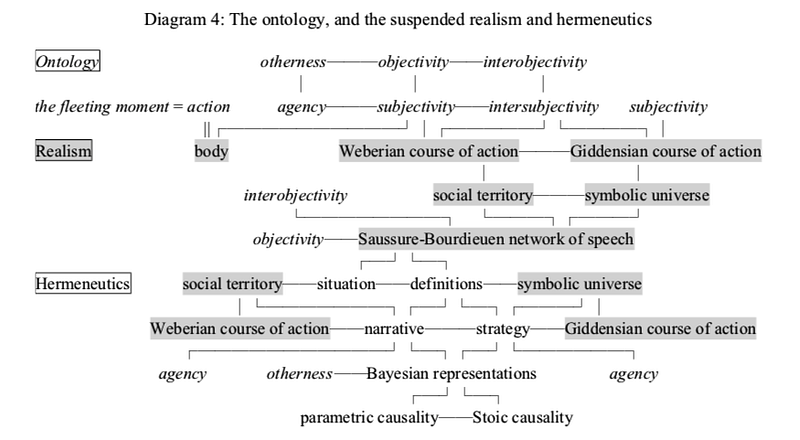
The structure of Lui’s theoretical sociology is a nested structure. See the diagram below. According to Lui, “The realism comprises a subjectivist structuralism and an objectivist stock of knowledge, while the hermeneutics is an interpretation and an analysis. Second, I shall present an ontology that nests the realism within its boundaries.” (p.250, 2016, Aspects of Sociological Explanation)
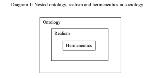
Source: Aspects of Sociological Explanation (Ping-keung Lui 2016, p.251)
We should see this grand theory as a dialogue between philosophy and sociology because “Ontology” and “hermeneutics” are respectable terms in philosophy, but “realism” — sandwiched between them — is not.
The whole structure of the grand theory is represented by the following semiotic system. You can find more details about Semiotic System Diagrams in Three Paths of Creative Life and A Semiotic System.
Lui’s Semiotic System Diagrams are quite unique because remove the spatial structure from normal diagrams and only keep concepts.
This is a counterexample of the Means — End Spectrum. Originally, I can place it on the Means — End Spectrum. Later, I realized that I can expand the spectrum into a matrix.
10. Langue and Parole
One important notion I learned from Lui’s theoretical sociology is from Ferdinand de Saussure’s structural linguistics.
Langue and parole is a theoretical linguistic dichotomy distinguished by Ferdinand de Saussure in his Course in General Linguistics. Langue refers to the abstract system of language while parole means concrete speech.
Lui’s theoretical sociology and Semiotic System Diagrams are inspired by Saussure’s structural linguistics.
The theoretical sociology I have conceived is an example: It has an ontology, a realism and an hermeneutics, each of which is by itself a cluster of interconnected keywords; and then there are some more interconnections between some members of any two clusters. Thus, a network of all keywords of a theoretical sociology is formed, and together with annotations of every keyword and every interconnection between keywords, the theoretical sociology is specified. Clearly, annotations are meant to guide us to read and understand the network of keywords. In fact, this network is the famous semiotic system in Saussure’s structural linguistics. As I have said early, he calls it language because innumerably many speeches can be made within its four corners.
Source: Ingold’s Idea of Making — A View from Theoretical Sociology (Ping-keung Lui 2020, p.21)
Lui used “Langue (Language)” to refer to his theoretical sociology while “Parole (Speech)” refers to all empirical sociologies.
I notice that all theoretical sociologies I happen to come across in the literature are each a speech, and usually a long one. But, in contrast, I conceive my own as a language, that is, a semiotic system in which innumerable number of speeches can be made within its four corners. Figuratively speaking, a semiotic system can be likened to a wetland in which innumerable speeches live and breed like birds. On the other hand, all empirical sociologies are in the first place each a speech, and if they can be made within the four corners of a certain semiotic system then they can be said to be supported and contained by the theoretical sociology that is represented by its semiotic system. Empirical sociologies are birds in that semiotic system as a wetland.
Source: Ingold’s Idea of Making — A View from Theoretical Sociology (Ping-keung Lui 2020, p.23)
Lui’s Semiotic System Diagrams inspired me to reflect on the Means-End Spectrum.
11. Langue and Space
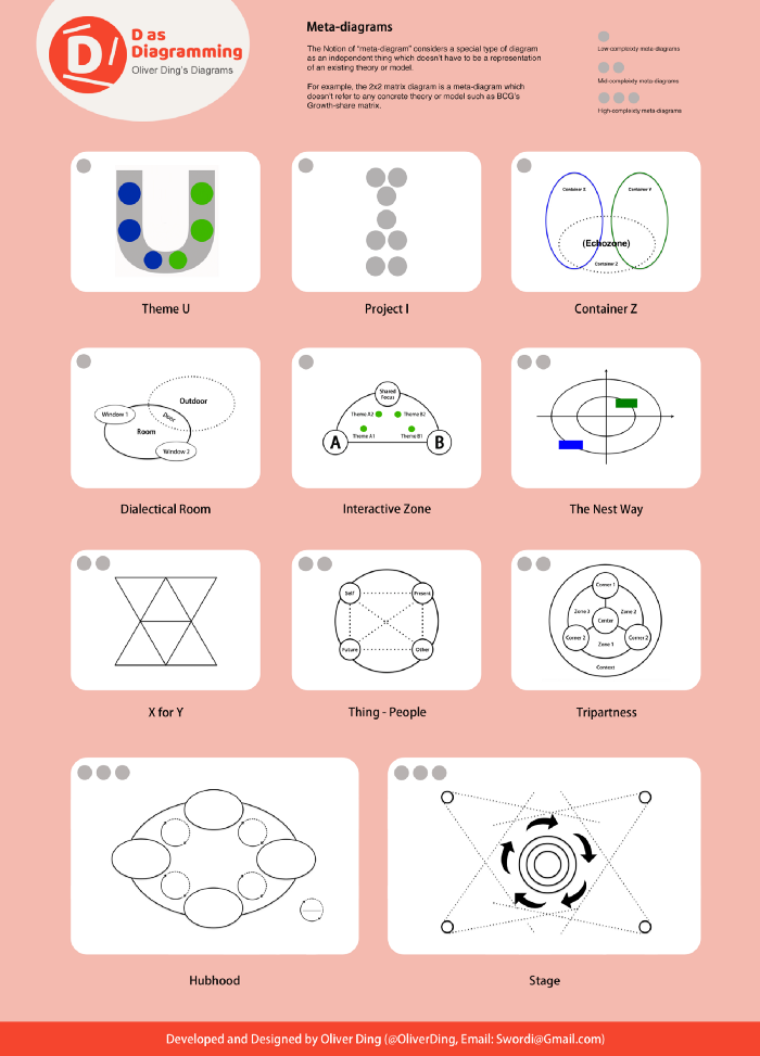
The notion of “meta-diagram” considers a special type of diagram as an independent thing that doesn’t have to be a representation of an existing theory or model. For example, the 2x2 matrix diagram is a meta-diagram that doesn’t refer to any concrete theory or model such as BCG’s Growth-share matrix.
In the past several years, I designed a series of meta-diagrams. See the picture below.
If we put Lui’s Semiotic System Diagrams and my meta-diagrams together, we can find two extreme examples of diagrams.
- Semiotic System Diagrams: remove the spatial structure from normal diagrams.
- Meta-diagrams: remove all texts from normal diagrams.
This is a significant insight!
I realized that there is a new dimension for thinking about diagrams and diagramming: the Langue—Space dimension.
Finally, I made a new version of the Means—End Spectrum.

It has a new name: Diagramming Reference Frame.
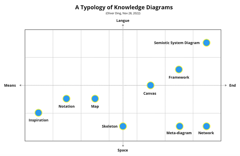
12. A Typology of Knowledge Diagrams
The Diagramming Reference Frame was made on Oct 27, 2022. Later, I reflected on the matrix. I realized that it can be represented with a different visual look.
I also added “Network” to the typology. It refers to “Diagram Network”.
Several diagrams connect together and form a network. From the perspective of Activity Theory, the concept of Diagram Network echoes the idea of Activity Network. The diagram is the basic model of Activity Network.
Each diagram refers to an activity and a Diagram Network refers to an Activity Network.
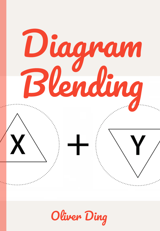
A Diagram Network can be built with the Diagram Blending method or the Diagram Expanding method. You can find more details about Diagram Blending in Diagram Blending: Building Diagram Networks (Introduction).
Update
On August 10, 2023, I defined a new type of diagram: Thematic Network Diagram.
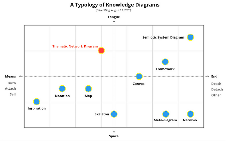
You can find more details in TALE: Thematic Network Diagram.


