
A trading turtorial on On-Balance Volume OBV
Last week, I talked about the MACD, one of my favourite indicators to use and how I specifically like to use it. This week, I’ll show you another indicator which I very much like using
What does it do?
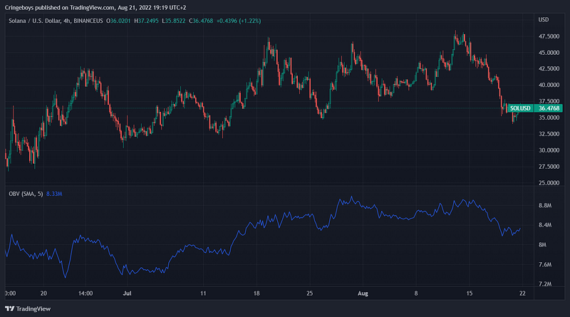
On-Balance Volume (OBV) measures the buying/selling pressure = volume behind the price movements.
How to trade it
It’s the same story is what I mainly do with regular price and also with MACD, I draw trendlines.
It’s so deceivingly simple but yet so effective.
If you’re not comfortable with drawing trendlines, I recommend you to check these articles out:
Draw those trendlines
One thing I recommend doing is color coding your trendlines. This might sound childish but is actually very helpful as there always are different trends, depending on the timeframe you’re looking at.
My colour scheme:
Daily Timeframe (1–14 days) = Light Green
Weekly Timeframe (14–30 days) = Orange
Monthly timeframe (30+days) = Pink
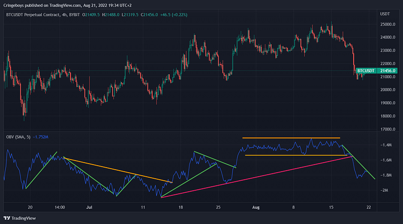
As you can see you can actually have a Weekly downtrend while actually being in a daily downtrend, this is the importance of using colours to differentiate the timeframes.
Entry:
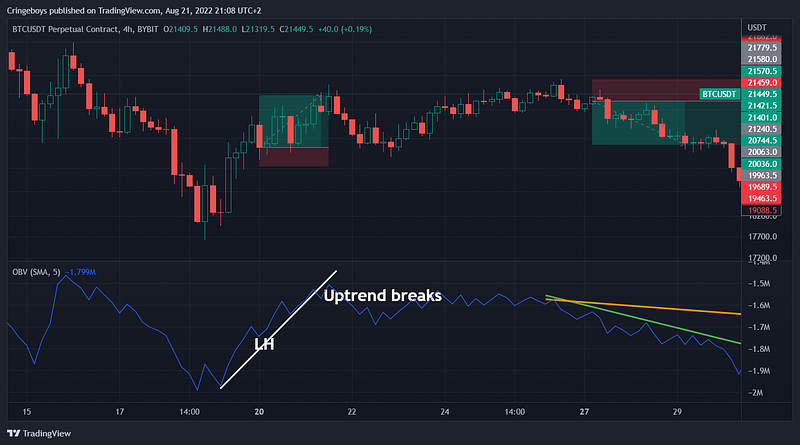
- Higher Low in a downtrend, OBV touches trendline
Or
- Lower High (LH), OBV touches trendline
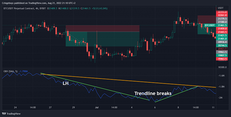
Exit is when the OBV trendline breaks.
Stop loss gets placed at recent swing High/Low (or closer if you want to minimize stop loss at the risk of getting caught out).