
The Brutally Honest Stock Market Indicator That Tells When to “Buy”
One look at the data shows us why
(One year ago this week)
It’s the second week of March 2020 and the coronavirus is spreading quickly. The World Health Organization characterizes the virus as a pandemic, and the same day, the US President closes the country’s borders to foreign travelers. The stock market is plummeting. Graphic images of virus victims piled up in makeshift morgues come in from Europe. No one knows how worse it will get and fear is rampant.
Amidst all the noise, on March 12, the stock market lets out a big scream “Buy now!” Did anyone hear it? I, for one, had just traveled overseas the day before and was still groggy. I didn’t hear anything. The only thing on my mind was stocking up food supplies for the national lockdown that would go into effect the next day.
Luckily for myself and others who follow the stock market, the initial scream was followed by another one on March 16 and a final gasp on March 18. I heard the last one and hurriedly wrote a friend that the market is being scalped and is screaming “Buy now!” Even the metals market had joined the chorus by the 18th with the silver-gold ratio hitting the highest note ever recorded.
Lots of money and shares changed hands in those days. Luckily for those bailing out of the market, others were ready to get in. Moments like these are what keep the market “game” going all these years.
So what stock market indicator am I referring to? To set some context, it came during a dinner table discussion about stocks with my father, a life-long follower of the market. I was never interested in studying the market like he did, but just wanted to understand how the market was priced overall and whether or not it was a good time to invest. After all, the well-worn formula for success in the market (“buy low, sell high”) states “buy low” but how does one know when that is?
It was during a bear market in the 1970s or 1980s when I first heard these words, which in my experience have endured the test of time (at least modern times):
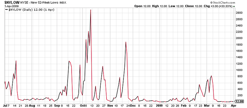
“When there are 1500–2000 or more new 52-week lows* in the market, that is the time to buy stocks. The only problem is there will be doom and gloom everywhere and you won’t want to.”
That was it. A cold, impersonal number, reflecting how low stock prices have fallen. And a cold heart required to buy stocks right then and there. (My father doesn’t recall saying those words anymore, but then again he’s 92 years old)
*The 52-week low is defined as “the lowest price at which a security, such as a stock, has traded during the time period that equates to one year.” The indicator reflects how many stocks on the Exchange have reached a 52–week low price. The New York Stock Exchange currently has about 2800 companies.
Although it is said the market always looks forward, when assessing the usefulness of the 52-week low indicator for understanding market value, I decided to apply some hindsight (because it supposedly is always 20/20). Nowadays one can find charts online and when studying those, I looked at data extending back to the last major event (the 2007–2008 financial crisis), including some minor events since then. The two charts are below:
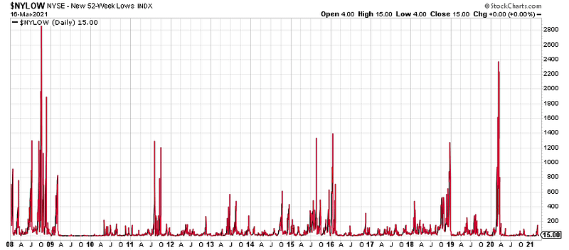
- New York Stock Exchange 52-week lows since January 1, 2008 — number of 52-week lows on the right axis, date along the bottom.
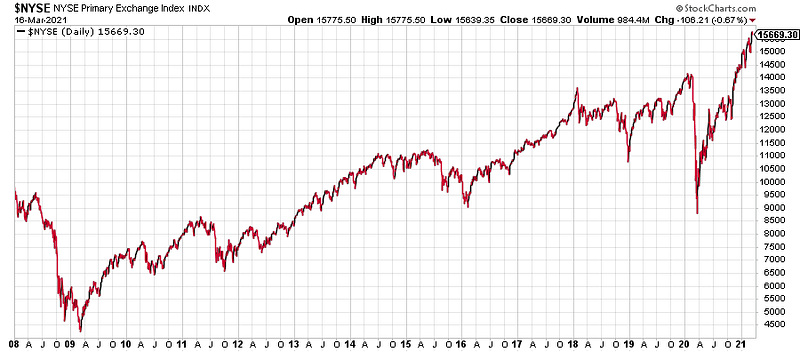
- New York Stock Exchange index since January 1, 2008 — price on the right axis, date along the bottom.
After lining up the charts and studying them for a while, I arrived at the following understanding:
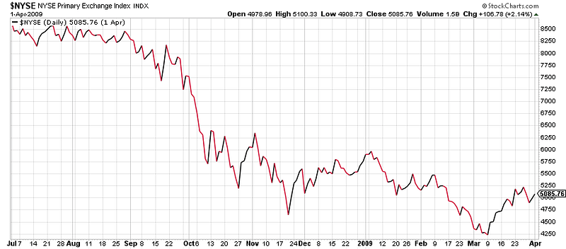
- Since 2008, there have been only two crises yielding more than 1500 new 52-week lows: the 2007–2008 financial crisis, and the March 2020 global event. When there have been 2000 or more new 52-week lows, something major has happened. Interestingly, in both cases, the actual Exchange index price did not bottom out the same day as the 52-week lows peaked, but later (see more detailed charts at the end of the article).
- Between these major crises there were smaller but significant events that resulted in a significant number of 52-week lows (1200, or nearly half the companies on the Exchange). In 2011, 2015–2016, and 2018, the Exchange index experienced significant price declines and the market represented good value.
- Historically, price declines and rebounds have more rounded tops (more gradual) but in the last two years, they are much sharper (more abrupt). Following the 2007–2008 financial crisis, it took the market over 4 years to return to pre-crisis levels, whereas following the March 2020 global event, it took the market less than one year to recover to pre-event levels. In the 2007–2008 financial crisis the decline occurred over a period of a year whereas in March 2020, the decline (35%) occurred over just one month!
- The slope of the recovery line since March 2020 and its sustained duration is without precedent in the last 13 years.
- Dad’s words were supported by the data.
So what are the characteristics of the 52-week low indicator that make it useful for deciding when to invest in the market?
First, it is regularly published. It requires no special knowledge to understand and no additional calculation to derive. It is simply a number anyone can look at.
Second, bear markets, which are defined as a “general decline in the stock market over a period of time,” historically have been short duration (on average 13 months in the time period from 1926–2014). This almost equals the duration of the 52-week low indicator (12 months) and explains why the number of 52-week lows can approach the total number of stocks on the Exchange at the end of a major bear market. When there is a crisis, prices fall quickly and this explains the punctuated appearance of this indicator as shown in the chart — either it is significantly “on” or essentially “off.”
Third, this indicator is useful for getting the attention of, and calling to action, “passive” investors like me (not interested in regularly studying the market). During such periods, one has a choice of what to buy (indexes, ETFs, or individual stocks), but the likelihood of finding price discounts is greater.
Lastly, recalling the likely pervasive “doom and gloom” when the 52-week low indicator spikes, it easy to get swept away by emotions during crises that cause sudden price declines in the market. In that moment, the 52-week low indicator serves as one’s objective reference point, an indicator of price reality and a reminder of potential investment opportunity. Just periodically checking the indicator during a crisis is all it takes to understand how the market overall is priced.
From all of this, a new learning emerged for me about the 52-week low indicator:
1000 new yearly lows — one eye open, one on the wallet.
2000 new yearly lows — both eyes open, wallet open.
Once the 52-week low indicator has signaled “buy now,” the next step is deciding what stocks to buy. In the next article, I will use a demo portfolio of stocks assembled last March 2020 for illustrating one possible buying strategy, and show how it has performed in the last year.
Additional charts
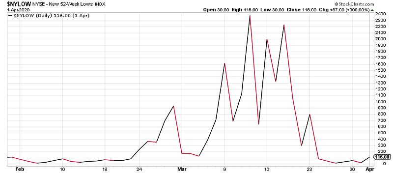
3. New York Stock Exchange 52-week lows February 1 to April 1, 2020 — number of 52-week lows on the right axis, date along the bottom.
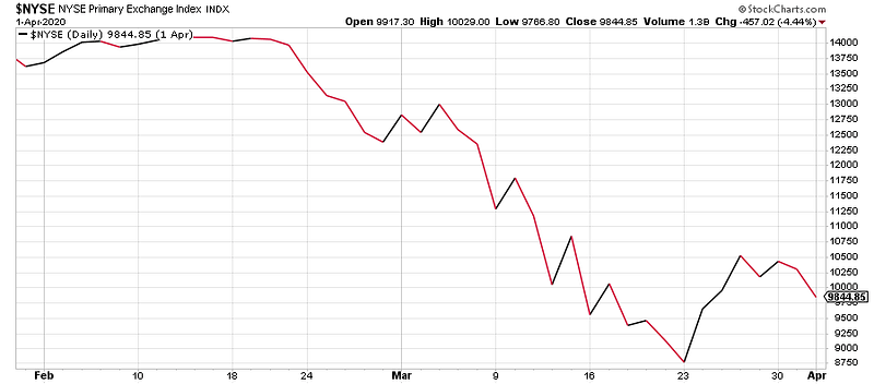
4. New York Stock Exchange index February 1 to April 1, 2020 — price on the right axis, date along the bottom. Index low on March 23.
5. New York Stock Exchange 52-week lows July 1, 2008 to April 1, 2009 — number of 52-week lows on the right axis, date along the bottom.
6. New York Stock Exchange index July 1, 2008 to April 1, 2009 — price on the right axis, date along the bottom. Index low on March 9, 2009.
Author’s disclaimer: This article is for informational purposes only. It is not intended to be used as financial advice. Please consult with your financial advisor before making any investments.


