
A Statistical Analysis of Salaries by Bristol Myers Squibb and Fulcroom Inc.
Context: For a prospective employee, perhaps the most important aspect of a job, some may argue, is the pay. This study analyzes the salaries received by workers employed by Bristol Myers Squibb (BMS) and Fulcroom, Inc. BMS is a global biopharmaceutical company that delivers innovative medical solutions to help patients prevail over major diseases. Similarly, Fulcroom, Inc. is a pharmaceutical company that specifically modulates gene expression to treat genetically defined diseases. This analytical comparison of two samples (15 observations from BMS and 13 observations from Fulcroom) ultimately finds that, for a prospective employee looking for a very large payout, Fulcroom is a better option due to its percentiles and high variability which indicate upward mobility; additionally, Fulcroom has higher trimmed means, which has been determined to be the most representative measure of central tendency.
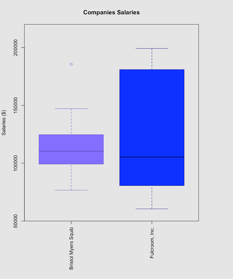
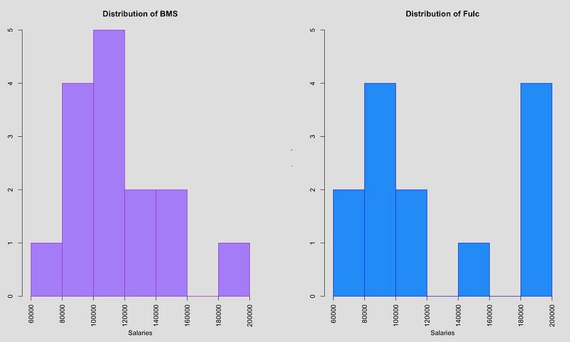
Analyzing the Boxplot: The top edge of the boxplot (third quartile) is farther from the median (second quartile) than is the bottom edge (first quartile), indicating a skew — specifically, Fulcroom’s salaries are heavily/substantially skewed right while BMS’s salaries are slightly skewed right. The boxplot also depicts a high outlier in the BMS distribution (as denoted by the small, purple circle). This outlier and the overall distribution shape will have important implications when determining the appropriate measure of center discussed in the next paragraph. The side-by-side boxplot also provides key insight on variability. We can see that Fuclroom’s salaries are extremely spread out: the interquartile range (IQR), or the spread between the 75th percentile and the 25th percentile, is much higher for Fulcroom ($102,845) than it is for BMS ($30,141). In the context of salaries, we can say that the middle 50% of Fulcroom’s salaries deviates by $102,845. Moreover, Fulcroom’s standard deviation (a measure of the dispersion of a dataset relative to its mean) is $50,656.22 while BMS’s standard deviation is $27,261.69. These findings illuminate that Fulcroom’s data does not cluster heavily around the mean, whereas BMS has a comparatively less variable data set. This large variability implies upward mobility, giving a prospective employee a large incentive to choose Fulcroom. While some may argue that this higher variability could mean less consistent data, the high variability implies that extreme values data values become more likely — and both the above boxplot and the below comparative histogram reveal that Fulcroom dominates BMS at these upper extreme values. For instance, Fulcroom’s 80th percentile is considerably high at $183,939.20 — that is, 80 percent of Fulcroom’s salaries are lower than $183,939.20 and 20 percent of Fulcroom’s salaries were higher than this value. For comparison, BMS’s 80th percentile is $131,504.60. Fulcroom’s salaries approach ~$190,000 as the values move towards the 85th and 90th percentiles, while BMS trails significantly at ~$145,000 at these same percentiles. In other words, Fulcroom high variability not only implies upward mobility but makes receiving a large salary (such as those high ones in the upper percentiles) much more likely, ultimately giving the ambitious, prospective employee vast potential for a large payout.
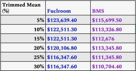
Validating the Trimmed Mean the Appropriate Measure of Central Tendency: The histogram reveals that the data tends toward a high value. Therefore, while the mean may have some value (for instance, it yields the sum of the salaries when multiplied by the number of observations), it is not a fully representative measure of the center because it gets significantly inflated by (or is “not resistant” to) the extreme data values (such as BMS’s upper outlier). On the other hand, while the median is typically used for skewed distributions (because it is “resistant” to the extreme data values), it does so at the expense of important statistical power in the context of salaries. The median, in essence, regards all data points (besides the middlemost value) as contaminated. If all the values above the median, for instance, were shifted up by any positive number, the median would remain unchanged. The median, therefore, leaves out information: it does not fully represent the data on the lower end of the distribution (ones typically classified as “entry-level jobs”) nor on the relatively upper end of the distribution (such as the more senior-level positions). These values comprise positions that are integral within the company, and thus the median is an invalid measure of center because it disregards vital information about the company’s salaries. With these ideas in mind, taking the trimmed mean is a compromise between the sensitive x̄ (sample mean) and the highly insensitive x̃ (sample median) and is, therefore, more comprehensively representative of our data in the context of salaries. In other words, a trimmed mean effectively allows us to eliminate less of the important data on the extreme ends than the median (the median in essence is an extreme trimmed mean), while not being fully inflated like the mean is. The table (right) summarizes the trimmed means of each company from 5% to 30%. As shown, Fulcroom (blue) has considerably higher trimmed means for all these values — in fact, all of Fulcroom’s trimmed means are greater than BMS’s trimmed means by at least $5,000, providing further numerical evidence that supports the original thesis.
Conclusion: To summarize, for a prospective employee looking for a large payout, Fulcroom Inc. is certainly a more suitable option due to its high upper percentiles and high variability that give employees upward mobility; Fulcroom also has comparatively higher trimmed means, which are the most accurate measure of center because they are essentially a compromise between the sensitive mean and insensitive median.
R Code:
## read csv
data = read.csv(“Company Salaries.csv”, stringsAsFactors = T)[c(1:3)]
data$color <-
## comparative boxplots w/ color coding (border + inside color)
plot(data$Company, data$Salary,
Vertical=TRUE,
xlab = “Salaries ($)”,
col=c(“mediumpurple1”,”dodgerblue”),
border = c(“darkorchid”, “blue”),
main = “Companies Salaries”)
## Upper Percentile Calculations
quantile(fulc, c(.8))
quantile(bris, c(.8))
quantile(fulc, c(.85))
quantile(bris, c(.85))
quantile(fulc, c(.90))
quantile(bris, c(.90))
## Histograms
hist(bris,
xlab = “Salaries”,
main = “Distribution of BMS”,
border = “darkorchid”,
col = “mediumpurple1”,
## adjust horizontal axis’ label’s position (default is mgp = c(3, x, y)
mgp=c(4,1,0))
hist(fulc, xlab = “Salaries”,
main = “Distribution of Fulc”,
border = “blue”,
col = “dodgerblue”,
ylim=c(0,5),
## adjust horizontal axis’ label’s position (default is mgp = c(3, x, y))
mgp=c(4,1,0))
library(“qcc”)
## establish variable
names(fulc) = c(“Analyst I”, “Sr. Analyst”, “Analytics Manager”, “Analytics Director”,
“VP Analytics”, “CEO”, “Sales Director I”, “Sales Director II”,
“VP Sales”, “Accountant”, “VP Info. Technology”, “Info. Technology I”,
“Info. Technology II”)
## Pareto Chart for Fulcroom data
pareto.chart(fulc,
cumprec = seq(0, 100, by = 25),
ylab =”Salary”,
main = “Fulcroom Salaries”,)
install.packages(“qcc”)
library(“qcc”)
names(bris) = c(“Research Invest. II”, “Assoc. Director”, “Research Scientist I”,
“Sr. Research Investigator”,”Sr. Research Biostat.”, “Scientist I”,
“Research Investigator I”, “Research Investigator”, “Director”,
“Sr. Research Investigator II”, “Assoc. Research Sci. II”, “Research Sci. II”,
“Manager”, “Principal Scientist”, “Project Manager”)
## Pareto Chart for BMS data
pareto.chart(bris,
cumprec = seq(0, 100, by = 25),
ylab =”Salary”,
main = “BMS Salaries”)
salaries = c(data$Salary)
bris = head(salaries, 15)
fulc = tail(salaries, 13)
par(mfrow=c(1,2))


