
A perfect way to load Images in React
Working with images in Next JS, caching and lazy loading- the proper way

We are available to help you out to transform your idea into a reality. Email us or reach the website to connect.
Under the hood
I was often asked the same question multilpe times about Working with images in Next JS. Does the number of images in the assets directory effects the bundle size and decreases the loading speed of react components. Well, your question is good and legitimate so you shouldn't be ashamed of asking the same. Today I will show you to work with images perfectly in React app.
Overview
We will be using the Image component provided by Next JS itself just like the router component. The Image component is quite important and useful. The Next JS Image component controls the caching, lazy loading, object-fit, & responsiveness of the images.
The Next JS Image component is basically an extended version of the browser img element. Following are the beneficial features provided by Next JS Image components —
- Automatic image optimization works with every image source from any CMS.
- Optimizing images during on-demand instead of build time.
- Images are lazy-loaded, loading only in the viewport images.
- Images layout are adjusted to increase the google search ranking.
Point number 3 clearly answer your question, it doesn’t matter if you are loading 3 images or 3 million all the images are rendered on-demand and doesn’t count in bundle size.
Getting Started
The next package simply exports the Image component from the image folder.
import Image from 'next/image';The repository I will be using is the one with Next JS and tailwind CSS already been installed and can be downloaded from the link below.
https://github.com/shreyvijayvargiya/iHateReadingLogs/tree/main/TechLogs/NextJSArchitectureNow you simply add the image to the public folder and use that path as the source of our Image component. The Image component folder takes the following props —
- layout: Decides the layout and responsiveness of image across devices of the different viewport.
- width & height: Dictates the height and width of the image component and it is required unless layout value is not
“fill” - loader: A custom function that gives all the required information about the image component.
- quality: The number ranges from 1 to 100 being 100 is the best and 75 is the default value
- priority: Once set the image is preload over all other images.
- unoptimized: Once set to true, the image will not be optimized, quality is not altered and no changes will be made.
- loading: Enum value and can be “eager” or “lazy”.
Writing Code
The Image component needs 2/3 required prop such as src, width and height. Please note width & height prop should be given unless the layout is given to “fill”. Otherwise, the layout “fill” property and width and height when set together will crash the Image component asking for the source file as an error.
// index.js inside pages
import Image from 'next/image';
// Considering mountain.png is inside public directory
<Image
alt="Mountains"
src="/mountain.png"
objectFit="fill"
layout="fill"
quality={100}
width={300}
height={300}
className="border border-gray-200 shadow-md rounded-md cursor
pointer p-2"
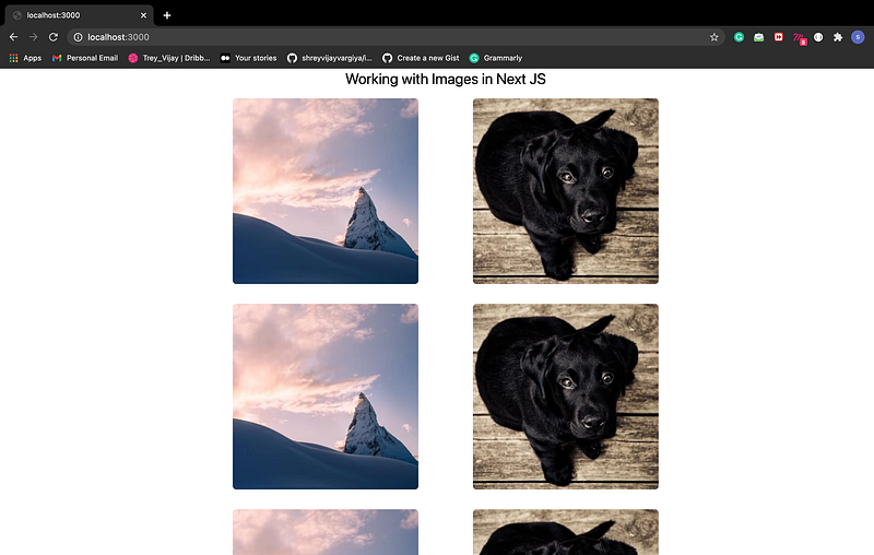
/>Final Product
Conclusion
Adding 3/4 lines of code using the Image component we are providing image optimization, cached images, lazy loading etc so much properties to all the images to our website. This not only improves the code but enhance the user experience because ultimately the faster the images load faster will be the response time to our webpage. Below is the link to the code repository for and more references.
References
Repository => https://github.com/shreyvijayvargiya/iHateReadingLogs/tree/main/TechLogs/ImagesInReactLinks =>
https://nextjs.org/docs/api-reference/next/image
https://nextjs.org/docs/basic-features/image-optimizationUntil, next time. Have a good day, People.