
A Guide to Strategic Color Choices
Mastering Strategic Hues for Emotional Impact in Design
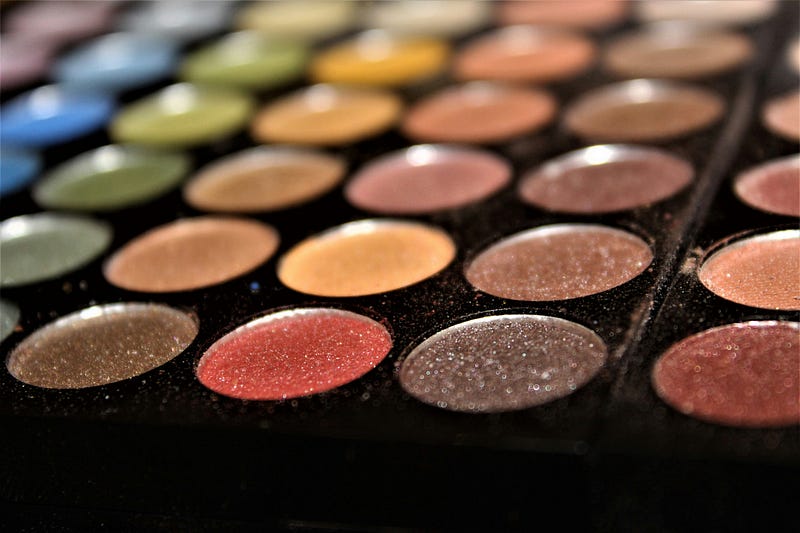
Color is more than just a visual component in the design industry; it’s a potent weapon that may affect user experiences, perceptions, and feelings. Beyond aesthetics, strategic color selections explore psychology to elicit particular feelings and reactions. Together, we will explore how color can be deliberately employed by designers to fascinate, engage, and make a lasting impression as we journey through the emotional palette.
Understanding Color Psychology: A Dive into Emotional Resonance
A interesting investigation into the complex interplay between colors and human emotions is color psychology. It explores the profound effects that various colors can have on our attitudes, actions, and perceptions. Warm hues, such blazing oranges and reds, have a remarkable power to arouse emotions in people, including warmth, passion, and vitality. Since these colors are frequently linked to energy and intensity, they are good options for designs that want to convey a sense of urgency or life.
On the other hand, cool hues — such as the peaceful blues and soothing greens — produce a calm, dependability, and peaceful ambiance. These hues are commonly used in contexts like medical facilities or technological interfaces where a calming feeling is desired. For designers, the psychological undertones present in every hue provide an endless array of creative options. Designers may make strategic decisions that harmoniously fit with the intended impact on the audience by understanding the emotional resonance that colors bring. This ensures that the visual experience is harmonious and emotionally impactful.
Colors have psychological effects that go beyond simple connections. Within a given hue family, different tones and tints can evoke different emotional reactions. Bright cherry red conveys energy and enthusiasm, whilst rich burgundy red may generate ideas of sophistication and luxury. With the help of this sophisticated toolkit and a detailed grasp of color psychology, designers can effectively manage the intricate relationship between colors and emotions. By delving into the complexities of color psychology, designers may create visually compelling narratives that hold the attention of viewers while also striking a deep emotional chord with them.
The Power of Red: Energetic, Bold, and Attention-Grabbing
In the field of design, the color red is a potent and striking element. Its innate passion, intensity, and urgency make it a priceless tool for brands looking to leave a memorable impression. Well-known companies, like Coca-Cola and Netflix, cleverly use red in their logos to create a feeling of excitement and grab the attention of viewers. When used strategically, red in design may give various aspects a bold and dynamic character. This makes red a great choice for calls to action or highlighting important information.
Beyond aesthetics, red has a deeper psychological significance that appeals to our most basic feelings and impulses. Because red has been demonstrated to raise heart rates and elicit a sense of urgency, it’s a powerful color choice for brands looking to inspire quick action. A well-placed red button in a user interface can direct users toward the actions they want to take, improving the user experience as a whole. Red is an exciting and attention-grabbing color, and designers can use this knowledge to strategically use it to create designs that captivate audiences and act as a catalyst for engagement.
Tranquil Blues and Greens: Creating a Sense of Calm and Trust
Blue and green colors are great tools in the designer’s palette because of their calming and reliable characteristics. This is especially true when trying to establish trust and foster a sense of peace. Well-known financial companies such as Chase and Bank of America purposefully use the color blue in their branding to communicate security, stability, and dependability. This deliberate use of color goes beyond branding and may be applied to a variety of design contexts, including websites and medical materials, where it is crucial to evoke sentiments of trust and tranquility.
When it comes to user experience, the thoughtful use of serene blues and greens can have a big impact on how customers view and use a product or service. For example, these colors are frequently used on healthcare websites to create a reassuring and cozy atmosphere. Blue and green have been shown in color psychology studies to have calming effects that can lower stress levels and improve user happiness in general. Equipped with this knowledge, designers can deliberately incorporate these colors into their works, establishing a feeling of peace and confidence that appeals to their target audience.
Balancing Act: The Harmony of Color Combinations
A harmonic and aesthetically beautiful arrangement in design requires a careful balancing act of color choices. In order to better understand the connections and interactions between various hues, designers frequently study color theory. The use of complementary colors, like red and green, which when combined produce a striking contrast, is one essential idea. The visual experience is made more exciting and energetic by this dynamic interplay.
Conversely, complementary color schemes, such as blue and purple, have a calming and unified effect. These color schemes have a smooth and appealing transition since the hues are next to each other on the color wheel. This is especially useful if you want to project a feeling of harmony or serenity. Armed with this knowledge of the interactions between colors, designers may play around with different combinations and make sure the chosen palette works well with the intended emotional impact of the design.
Case Studies: Real-World Examples of Emotional Design Mastery
By exploring real-world design examples, one can discover how to perfect color selection for emotional resonance. Consider the brilliant yellow McDonald’s golden arches, which are instantly recognizable. Yellow is a color that is strategically chosen since it is frequently connected to warmth, happiness, and positivity. McDonald’s takes use of this to create a welcoming environment by utilizing the psychological reactions that yellow triggers.
Similar to this, Starbucks has effectively tapped into the emotive power of color with its ubiquitous green branding. Green, a hue connected to nature and freshness, fosters a sense of community and a connection to organic materials. Starbucks presents itself as a location where people come together, and their use of green colors helps to reinforce this image. These case studies provide strong proof of how deliberate color selections may significantly impact consumer impressions and are essential to brand identity. Through examining these kinds of cases, designers may learn a great deal about the subtle effects color has on feelings and how successful a company can be with color.
Color is a powerful language that appeals to emotions directly; it’s not just about aesthetics. Designers can enhance their work, make lasting impressions on their audience, and create memorable experiences by becoming experts at the art of smart color selection. Careful color selection can produce an emotional resonance that is a powerful instrument that can elevate design beyond a visual endeavor to a profoundly meaningful statement.
If you enjoyed my article, I would greatly appreciate your support in my creative work. The easiest way to do so is by simply buying me a coffee. Thank you very much for your support.


