
A Deep Dive Into Flutter TextField
A tutorial to the power of TextFields in Flutter
This is the second article in a series of articles explaining in detail some of the widget Flutter offers and tips and tricks for them. In the last article, we explored the ListView widget in detail. In this article we go into the Flutter TextField widget comprehensively and find out the features and possible customisations of it.
Introduction to TextField
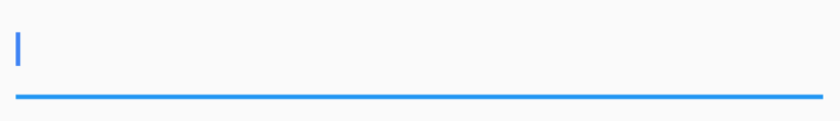
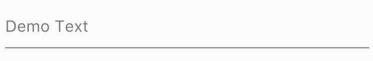
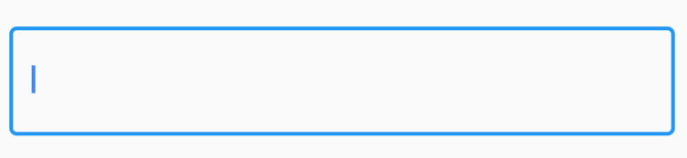
A TextField widget allows collection of information from the user. The code for a basic TextField is as simple as:
TextField()This creates a basic TextField:
Retrieving information from a TextField
Since TextFields do not have an ID like in Android, text cannot be retrieved upon demand and must instead be stored in a variable on change or use a controller.
- The easiest way to do this is to use the onChanged method and store the current value in a simple variable. Here is the sample code for it:
String value = "";TextField(
onChanged: (text) {
value = text;
},
)2. The second way to do this is to use a TextEditingController. The controller is attached to the TextField and lets us listen and control the text of the TextField as well.
TextEditingController controller = TextEditingController();TextField(
controller: controller,
)And we can listen to changes using
controller.addListener(() {
// Do something here
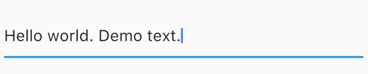
});And get or set values using
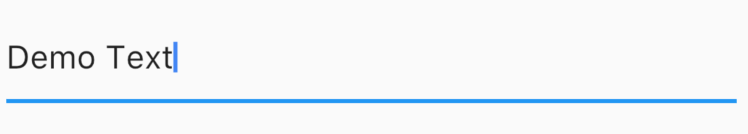
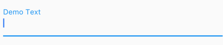
print(controller.text); // Print current value
controller.text = "Demo Text"; // Set new value
Other callbacks from the TextField
The TextField widget also provides other callbacks such as
- onEditingCompleted
- onSubmitted
onEditingComplete: () {},onSubmitted: (value) {},These are callbacks called on actions like when the user clicks the “Done” button on iOS.
Working with focus in TextFields
Having “focus” on a TextField means having a TextField active and any input from the keyboard will result in data entered in the focused TextField.
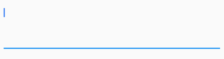
1. Working with autofocus
To autofocus on a TextField when the widget is created, set the autofocus field to true.
TextField(
  autofocus: true,
),
This sets the focus on the TextField by default.
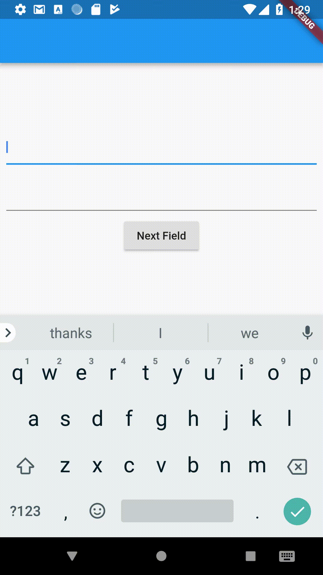
2. Working with custom focus changes
What if we want to change the focus on demand and not just autofocus? Since we need some way to refer which TextField we want to focus to next, we attach a FocusNode to the TextField and use it to switch the focus.
// Initialise outside the build method
FocusNode nodeOne = FocusNode();
FocusNode nodeTwo = FocusNode();
// Do this inside the build method
TextField(
focusNode: nodeOne,
),
TextField(
focusNode: nodeTwo,
),
RaisedButton(
onPressed: () {
FocusScope.of(context).requestFocus(nodeTwo);
},
child: Text("Next Field"),
),We create two focus nodes and attach them to the TextFields. When the button is pressed, we use FocusScope to request focus to the next TextField.
Changing Keyboard Properties for TextFields
A TextField in Flutter allows you to customise properties related to the keyboard as well.
1. Keyboard Type
A TextField allows you to customise the type of keyboard that shows up when the TextField is brought into focus. We change the keyboardType property for this.
TextField(
  keyboardType: TextInputType.number,
),
The types are:
- TextInputType.text (Normal complete keyboard)
- TextInputType.number (A numerical keyboard)
- TextInputType.emailAddress (Normal keyboard with an “@”)
- TextInputType.datetime (Numerical keyboard with a “/” and “:”)
- TextInputType.numberWithOptions (Numerical keyboard with options to enabled signed and decimal mode)
- TextInputType.multiline (Optimises for multi-line information)
2. TextInputAction
Changing textInputAction of the TextField lets you change the action button of the keyboard itself.
As an example:
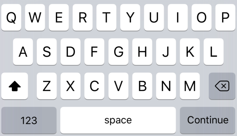
TextField(
  textInputAction: TextInputAction.continueAction,
),
This causes the “Done” button to be replaced by a “Continue” button:
Or
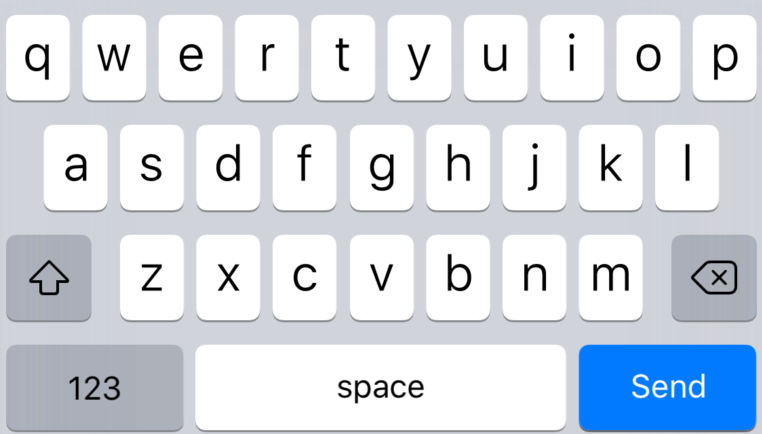
TextField(
  textInputAction: TextInputAction.send,
),
Causes
The complete list is too large to be displayed here, but do be sure to check it out.
3. Autocorrect
Enables or disables autocorrect for the specific TextField. Use the autocorrect field to set this.
TextField(
  autocorrect: false,
),
This will disable suggestions as well.
4. Text Capitalization
The TextField provides a few options on how to capitalise letters in the input from the user.
TextField(
  textCapitalization: TextCapitalization.sentences,
),
The types are:
- TextCapitalization.sentences
This is the normal type of capitalisation we expect, the first letter of every sentence being capitalised.
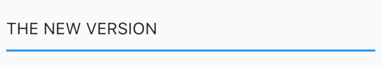
2. TextCapitalization.characters
Capitalises all characters in the sentences.
3. TextCapitalization.words
Capitalises the first letter of each word.
Text Style, Alignment and Cursor Options
Flutter allows customisation pertaining to the styling and alignment of text inside the TextField as well as the cursor inside the TextField.
Text alignment inside the TextField
Use the textAlign property to adjust where cursor is inside the TextField.
TextField(
  textAlign: TextAlign.center,
),
This causes the cursor and text to start in the middle of the TextField.
This has the usual alignment properties: start, end, left, right, center, justify.
Styling the text inside the TextField
We use the style property to change how the text inside the TextField looks. Use it to change the color, font size, etc. This is similar to the style property in the Text widget so we will not spend too much time exploring it.
TextField(
  style: TextStyle(color: Colors.red, fontWeight: FontWeight.w300),
),
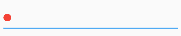
Changing the cursor in the TextField
The cursor is customisable directly from the TextField widget.
You are allowed to change the cursor color, width and radius of the corners. For example, here I make a circular red cursor for no apparent reason.
TextField(
  cursorColor: Colors.red,
  cursorRadius: Radius.circular(16.0),
  cursorWidth: 16.0,
),
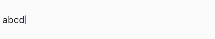
Controlling the Size and Maximum Length in a TextField
TextFields can control the maximum number of characters written inside it, the maximum number of lines and expand as text is typed.
Controlling max characters
TextField(
  maxLength: 4,
),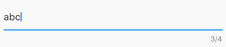
By setting the maxLength property, a maximum length is enforced and a counter is added by default to the TextField.
Making an expandable TextField
Sometimes, we need a TextField that expands when one line is finished. In Flutter it is slightly odd (yet easy) to do. To do this, we set maxLines to null, which is 1 by default. Setting to null is not something we’re very used to but nevertheless it’s easy to do.
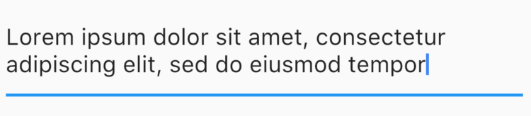
Note: Setting the maxLines to a direct value will expand it to that number of lines by default.
TextField(
  maxLines: 3,
)
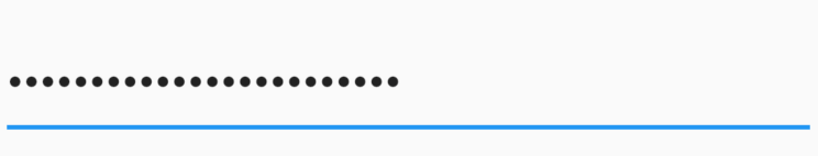
Obscuring Text
To obscure text in a TextField, set obscureText to true.
TextField(
  obscureText: true,
),
And Finally, Decorating the TextField
Till now we focused on the features Flutter offers for input. Now we’ll move to actually designing a fancy TextField and not saying no to your designer.
For decorating the TextField, we use the decoration property which takes an InputDecoration. Since the InputDecoration class is enormous, we’ll try to quickly go over most of the important properties.
Use the hint and label properties to give information to the user
Both hint and label are strings which help the user understand the information to be entered in the TextField. The difference is that a hint disappears once the user starts typing while a label floats over the TextField.
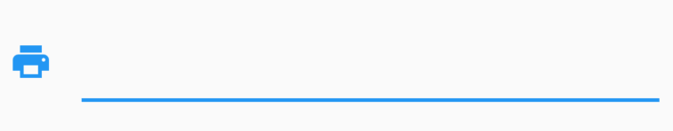
You can add icons using “icon”, “prefixIcon” and “suffixIcon”
You can add icons directly to TextFields. You can also use prefixText and suffixText for Text instead.
TextField(
  decoration: InputDecoration(
    icon: Icon(Icons.print)
  ),
),
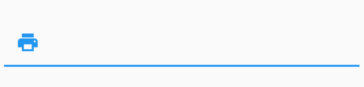
TextField(
  decoration: InputDecoration(
    prefixIcon: Icon(Icons.print)
  ),
),
Similarly for any other widget, use “prefix” instead of “prefixIcon”
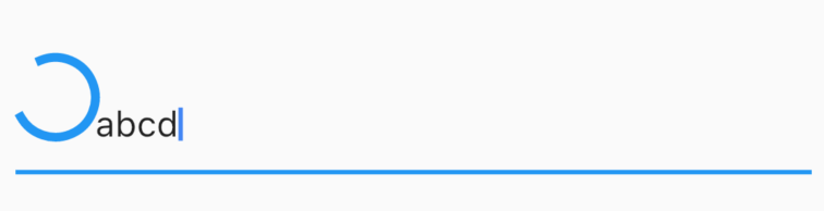
To use a generic widget instead of an icon, use the prefix field. Again for no apparent reason, let’s add a circular progress indicator in a TextField.
TextField(
  decoration: InputDecoration(
    prefix: CircularProgressIndicator(),
  ),
),
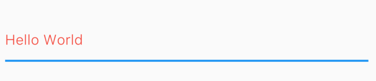
Each property like hint, label, etc has its respective style fields
To style a hint, use a hintStyle. To style a label, use a labelStyle.
TextField(
  decoration: InputDecoration(
    hintText: "Demo Text",
    hintStyle: TextStyle(fontWeight: FontWeight.w300, color: Colors.red)
  ),
),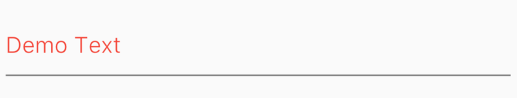
Note: Although I have done it in this example, generally do not change the hint colour as it is confusing to users.
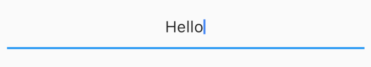
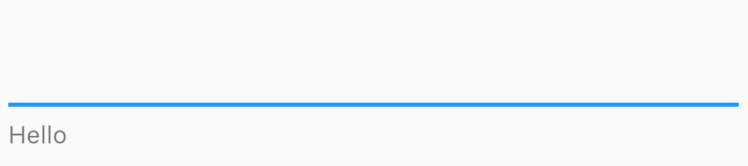
Use “helperText” if you do not want a label but you want a persisting message for the user.
TextField(
  decoration: InputDecoration(
    helperText: "Hello"
  ),
),
Use “decoration: null” or InputDecoration.collapsed to remove the default underline on a TextField
Use these to remove the default underline on a TextField.
TextField(
  decoration: InputDecoration.collapsed(hintText: "")
),
Use “border” to give a border to the TextField
TextField(
  decoration: InputDecoration(
    border: OutlineInputBorder()
  )
),
There is a vast amount of decoration you can do further, but we can’t go into everything in one article. But I hope this makes it clear to understand how easy it is to customise Flutter TextFields.
That’s it for this article! I hope you enjoyed it and leave a few claps if you did. Follow me for more Flutter articles and comment for any feedback you might have about this article.
Feel free to check out my other profiles and articles as well:


