
A Comprehensive Guide To Publishing Poetry On Medium
Best Practices, Tips & Tricks, and What Not To Do

This is for anyone who publishes poetry or plans to, on Medium.
Offline poetry is something different. The formatting options and creative iconography are endless. In our journals or on our typewriters, or even in a document, we can use spacing for emphasis. We can freely indent on a piece of paper the exact amount we think is necessary to tell a small part of the story, without using more words. But this is Medium.
When it comes to poetry on Medium, there aren’t many formatting options and I know you may think this is an odd thing to say, but I think that’s a good thing. A site like this is visually pleasing because of its consistency. Even though we are all different as writers, the limited formatting options make the screen pretty similar no matter who you are reading. Poets don’t like this.
Poets on Medium try to come up with ways to use formatting to enhance their work, but the truth is, there isn’t much you can do. And isn’t it a better thing that the full breadth of power has to come from our words on here? I think it is. Would I like an easier way to indent once in a while? Actually, no, but I bet some would. But we can only work with the options we are given.
Part of my goal in writing this is selfish. I edit and publish so much poetry between Assemblage and Loose Words, that I wanted to give an overview of the errors I see the most. And some of these things aren’t errors so much as oversights or just something missed when you are new to the platform. Either way, it will help you as much as it will help me. Hopefully more.
Titles
It doesn’t matter what format you prefer your titles to be in, but what does matter is your consistency. If you capitalize the first letter of every word in the title, do it for all of your poems. If you use all lower case letters, do it for all of your poems. If you use a capital letter to begin the title and then all lower case after, do it for all of your poems.
The Depth Of My Love The Depth of My Love The depth of my love the depth of my love
They are all fine and all can be a part of your poetic vision, but if you send one in like the top one and then your next one is like the bottom one, and there is no private note, I won’t know if you just missed it and made a mistake. Personally, I try to lock onto my contributor's styles, but when there is no consistency, it just makes me write private notes to confirm.
While we are still on titles, titles are important. Not in a clickbait type of way. Titles of poetry can either be directly referential or representative. What I mean is that your title may be found in the poem itself, which is always the case with my work, or it may be an overview of the feeling of the poem. But it’s not a throwaway. It’s the only thing that may draw someone in who hasn’t read you so it has to evoke something.
What Not To Do
- Don’t use ALL CAPS in your title. It’s like doing a poetry reading and YELLING the whole time. Unnecessary. We can hear you.
- Don’t try to get too cute. When you can’t settle on a title, find the best line in your poem and use that. Or the best word.
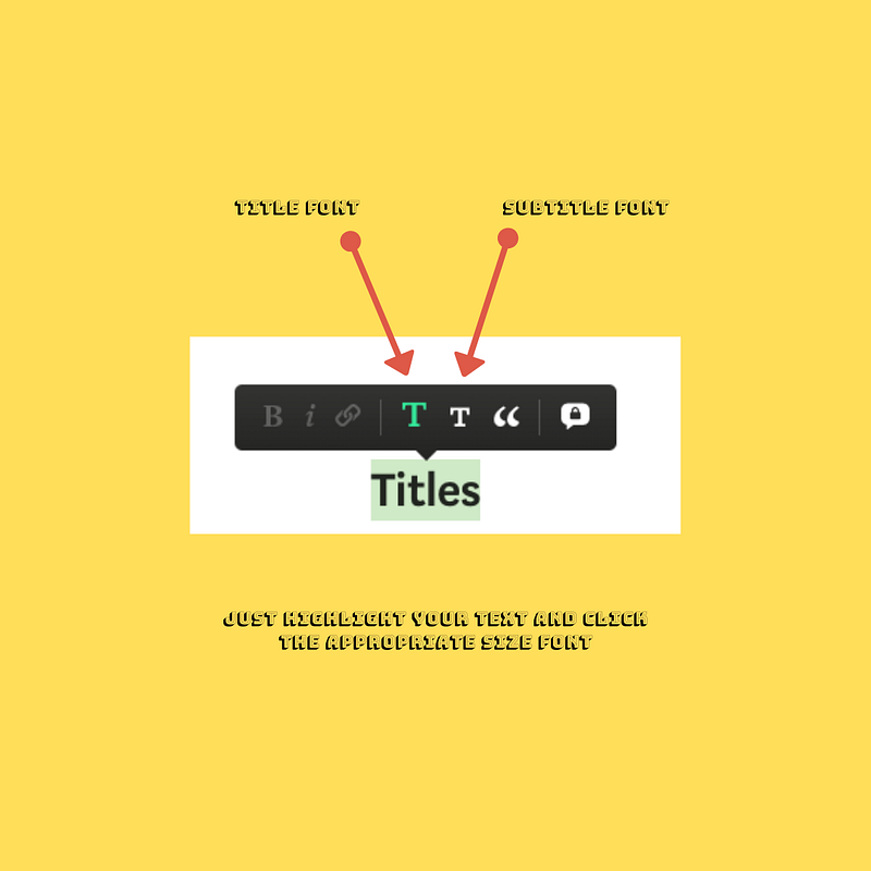
- Don’t forget that there is a font for your titles. Use Title font. The big T. See below.
- Don’t put a period at the end of your title. Titles don’t have periods at the end of them.
Subtitles
This is the underbelly of poetry on Medium. Oft-forgotten and ignored, the subtitle is more of a complement than an active participant in your poems online, but it is relevant. Many of us use markers as our subtitle, like the words A Poem or Poetry. This makes it easily identifiable to the reader as such and creates some sort of order between poetry and your other word scrawls.
One of the biggest errors I’ve found on submission is the disregard of the subtitle. When you start a poem and just type in the title and then add your cover image, the system will still assign you a subtitle. And this subtitle will be the first 100 or so characters of your poem, which makes it quite duplicitous. I would say more than 25% of the submissions I receive have not added their own subtitle. So I go into the poem and pull out one line and make that the subtitle.
Offline we don’t have poetic subtitles. They aren’t necessary or warranted. However, online they can serve our purposes of classification, amplification, or highlighting. One other oft-missed feature is the use of subtitle font (see image above). Subtitle font does not always auto-generate so many times you need to highlight your subtitle on the screen and then click the small T to activate subtitle font.
Subtitles also require consistency online. When you properly capitalize your title, but not your subtitle, then do that every time. If you use A Poem, use it every time. If you make your subtitle a sentence and use a period, then do that every time. Poetry is art and even if some of our formatting has been taken away online, we need to treat each byte as part of the whole. The subtitle is a small, but relevant byte.
What Not To Do
- Do not use by John Smith as the subtitle. That’s a double-dip and completely unnecessary since your name and face are always prominently featured.
- Repeat: Don’t try to get too cute. When you can’t settle on a title, find the best line in your poem and use that. Or the best word. Or just use A Poem or Poem or Poetry.
- Don’t forget to use subtitle font.
Cover Image
Offline, there is no reference to a cover image in most of our poems. We have no requirement to fill that a picture is necessary. But that’s why this is only about publishing poetry on Medium. You have to present it in the most visually pleasing way, but also comply with the standards set by the community.
All stories or poems on Medium should have a cover image. If not, they do not look right on your profile page or on a publication’s page. They throw off the formatting and look out of place. The only time I would say a cover image can be left out is if all of your poetry is only words and you post them all in your own publication. Visually, that would work.
But your cover image also has to work seamlessly with your poem. It is the first thing people notice, along with your title, so it has to be evocative of what they are going to read. As much as this is catering to the platform, you need to cater to the platform to get the most views for your work here.
Pro tip: never use an image from your keyword search in the Unsplash plug-in from the first five pages. Why? Because everyone uses those images. Make your search terms more robust or click through to page ten to find images you haven’t see on Medium before.
Formatting
Yes, there is a lack of poetic formatting options on Medium, but that doesn’t mean you need to force it. The visual display online is very important to readers, before they read the words, so some creative adjustments can become impediments to your views if you try too hard to replicate what you can do on paper.
New poets to the site often don’t know that they can single space their poetry and end up using paragraph spacing until someone tells them about Shift+Enter. To single space your poetry on a laptop or desktop you use Shift+Enter after each line and then Enter when you want a paragraph break.
Visually, paragraph spacing is hard on a reader because it’s much harder to find the rhythm of the poem. It’s also impossible to highlight. When you use paragraph spacing, readers can only highlight one line at a time and they will get tired of highlighting multiple lines when it should have just been single-spaced. It also just doesn’t look right. I’ve never read a poem as a reader on Medium that was fully paragraph spaced. There is no aesthetic to it for me.
Watch for errant spaces starting lines before you submit your poem. I think this occurs most frequently when people type on the app, but I often see random spaces at the beginning of a line. See below.
This is regular This is what I see a lot
It may not seem like a big deal, but it throws a reader’s eye off. If it’s purposeful, personally I don’t think it looks good or serves any purpose. Most readers will just think it was a mistake and possibly stop reading.
Side note: If you are doing anything unusual with formatting on purpose, but have not done it before, leave a Private Note if you are submitting the piece to a publication so the editor knows you did it intentionally. This goes for unusual capitalization, spacing, uses of symbols, etc.
What Not To Do
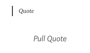
- Don’t do an entire poem in Pull Quote font. It’s tantamount to ALL CAPS. It seems like you are talking loudly or trying too hard to emphasize the entire poem at once. I do think the use of Pull Quote font here and there in poems can be interesting, but overuse is visually unappealing because of the centering.
- Don’t use the Quote font inside the poem as a formatting mechanism. It is best used after, as an explanation, or for a quote. It is Quote font after all.
Don’t use whatever this is in your poems. It makes it hard to highlight for your readers and the risk-reward ratio for readers of poetry is high on the risk side and low on the reward side. Visually, it is less appealing with less words so for poetry it can be like a clown with its hands up at the beginning of your wordsmithing. Another hey, look here moment, that can only take away from your words. I mean, really, how relevant is the enlarged capitalization of the first letter of the first word of a poem?
Editing
The use of the Grammarly plug-in can wreak havoc on poets on Medium, but it is still a useful tool to catch errors you may have missed. A lack of editing on a poem is a lack of care. With so few words, so few verses, there really should be no errors to speak of.
Going back to something I mentioned above, if you are using a unique spelling of a word or creating a fantasy word, leave a private note to the editor if you are submitting to a publication, or include an asterisk or descriptor at the end so readers don’t think you are having spelling or word-creation issues.
Too often poets forget that readers of poetry are not average Us Weekly readers, not that there’s anything wrong with that. But readers of poetry are usually poets or high-end readers who will focus on mistakes, misspellings, and errors and will stop reading because of it.
Tagging
This is another classification system that is unnecessary offline, but nevertheless something that should not be ignored online. You have five bites of the apple on Medium, take them all — but take them wisely. Use five tags that give you reach in form and content. Poetry should always be one of your tags. The rest are debatable.
Check what tags the publications you submit to use at the top of their header bar. There are usually five of them. The reason these are important is that when a reader clicks on say, Free Verse in the header bar of a publication, it will take them to all the poems tagged Free Verse. But never spam all of them. Use tags that enhance your poetry. Tags like Ode, Free Verse, Narrative, Haiku.
Tags are also a useful tool for publications that use your tags on Medium to generate hashtags when the poem is posted on Twitter. It will save the poster time if you have populated your tags with at least three content-based terms for use on social media. This increases the breadth of your reach and uses the technology baked into the system to your advantage while taking away nothing from the work itself.
What Not To Do
- Don’t use all Poetry tags. As in, don’t stuff the box with Poetry, Poetry on Medium, Poet, Poets on Medium, and Poem. That’s basically using the same tag for everything and giving you no ancillary reach based on content.
- Don’t use vanity tags that don’t have a lot of numbers attached to them. It’s a waste of a tag. I mean, don’t say it’s a #lifelesson if it isn’t, but don’t think you will start a new trend by tagging your story #lifebyjohnz23. You can do better for your words.

If You Liked This, You Might Like This
This is how I finish all of my poems, but I always, ALWAYS (caps intended) only add one piece and it is always one that would flow from the piece I wrote. I see a lot of people adding 3 or 4 choices for a reader to go to, but you have to realize that those are in addition to the 3–6 that Medium is suggesting right below yours. That’s a lot of choices.
Putting three links or more at the end of every poem is asking a lot of a reader. Say they liked your poem and want to read one more — now you’ve left them with a dilemma on which to choose instead of telling them that if you liked this, you might like this (ONE) as well. In my opinion, there is a big difference and it shows confidence in your work to point them to one that is similar, but just as good.
If you’ve ever seen a reader go from story to link and then from story to link in the next one and then again, you’ll know you’ve done it correctly. If you toss the kitchen sink at them at the end of every poem, you are just looking for them to shoot fish in a barrel. And they can do that on their own.
Calls to Do Anything
We are poets. Poetry is a niche. It’s asking a lot of anyone to sign up for a mailing list or to follow us on a platform where they will just see the same words linked. You can safely get your Instagram handle into your bio and stop posting it at the end of every poem.
And really, if you are a poet, do you really want followers on LinkedIn? You don’t need to try to push every reader to any platform you want. Again, it’s asking a lot and being a bit presumptuous that you would think that because they read one very good poem that they now want to follow you on four social networks. They don’t.
The End Bio
Many writers like to give a little bio about themselves at the end of every poem. Much of this is a rerun of what is in their Medium bio. Although it allows the reader to get a bit more information, it may come at the expense of your work, before they even read it. Follow me on this one.
When you add 50–100 words of bio to every poem, now you have a bunch of 2–3 min reads instead of 1–2 min reads. When readers are going on a poetry spree, it is highly possible they will avoid a 3 min read. It’s also disappointing when they are looking for a 2 min read and it turns out to be a micropoem with a long bio at the end.
You have a Medium bio. You don’t need this and if you think you do, make it much different than your bio up top. And shorter. Or just as short. Or not at all. After they’ve seen it once, it just becomes superfluous.
These are my opinions based on experience and through discussions with other poets on and off of Medium. Online poetry can be just as pleasing as reading it in a book, but only as long as the focus always remains on the words. The second we try to add too much to our words is the second we’ve lost our reader.
If there is anything you think I may have missed, please feel free to drop it into the comments and I will add it to the list if it warrants inclusion. And just because my personal preferences are different than yours, it should never color how you write poetry here. These are just best practices, tips & tricks, and what not to do in my opinion as a poetry connoisseur and online poetry editor on Medium.
If you liked this, you might like this as well:


