

A Collection of Advanced Data Visualization in Matplotlib and Seaborn
Make Your Storytelling More Interesting
Python has a few data visualization library. Arguably matplotlib is the most popular and widely used library. I have several tutorial articles on matplotlib before. This article will focus on some advanced visualization techniques. These plots and charts will provide you with some extra tools to make your reports or presentations of data in a more efficient and interesting way.
I am assuming that you already have learned the basic plots and charts in Matplotlib. If you need a refresher on some of them, please go through this article first:
I will use several different datasets for this article because different kind of plots works for different types of data. But I will try to stick to the same dataset as much as I can.
Let’s dive in!
Import the dataset first. Feel free to download this dataset for your practice:
import pandas as pd
import matplotlib.pyplot as plt
import seaborn as sns
d = pd.read_csv("USA_cars_datasets.csv")
d.head()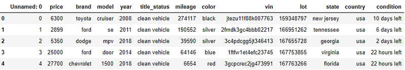
The dataset contains the brand of cars, price, model, year, mileage, and some other information. For the plots in this article, brand and price will be the focus.
Diverging bars with texts
This plot will show the diverging bars and the value of each bar. We will plot the mean price for each brand. First, find the mean price for each brand using the pandas groupby function:
import numpy as np
d1 = d.groupby('brand')['price'].agg([np.mean])
d1.columns = ['mean_price']
d1.head()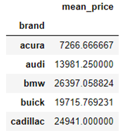
The data frame d1 contains the mean price for each brand. It requires the normalized values for a diverging plot. We will normalize the mean price and put it in a new column named ‘price_z’ in the d1 data frame:
x = d1.loc[:, ['mean_price']]
d1['price_z'] = (x - x.mean()) / x.std()
d1.sort_values('price_z', inplace=True)
d1.reset_index(inplace=True)
To plot the text plot we need x and y values as usual. But also an extra parameter that is the text that is to be plotted.
plt.figure(figsize=(14, 18), dpi=80)
plt.hlines(y=d1.index, xmin=0, xmax=d1.price_z)
for x, y, tex in zip(d1.price_z, d1.index, d1.price_z):
t = plt.text(x, y, round(tex, 2), horizontalalignment='right' if x < 0 else 'left', verticalalignment='center', fontdict={'color': 'red' if x < 0 else 'darkblue', 'size': 14})plt.yticks(d1.index, d1.brand, fontsize=12)
plt.title("Diverging text bars of car price by brand", fontdict={"size": 20})
plt.grid(linestyle = '--', alpha=0.5)
plt.show()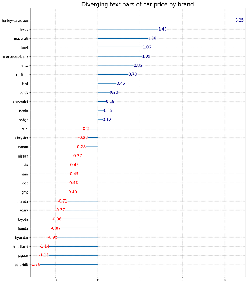
It can be further modified. Instead of using the lines, you can only put the numbers in bubbles.
d1['color'] = ['red' if x < 0 else 'darkblue' for x in d1['price_z']]plt.figure(figsize=(14, 16), dpi=80)
plt.scatter(d1.price_z, d1.index, s = 500, alpha=0.6, color=d1.color)for x, y, tex in zip(d1.price_z, d1.index, d1.price_z):
t = plt.text(x, y, round(tex, 1), horizontalalignment='center', verticalalignment='center',
fontdict={'color':'white'})
plt.gca().spines['top'].set_alpha(0.3)
plt.gca().spines['bottom'].set_alpha(0.3)
plt.gca().spines["right"].set_alpha(0.3)
plt.gca().spines["left"].set_alpha(0.3)plt.yticks(d1.index, d1.brand)
plt.title("Duverging Dotplot of Car Price by Brand", fontdict={'size':20})
plt.xlabel("Price")
plt.grid(linestyle='--', alpha=0.5)
plt.show()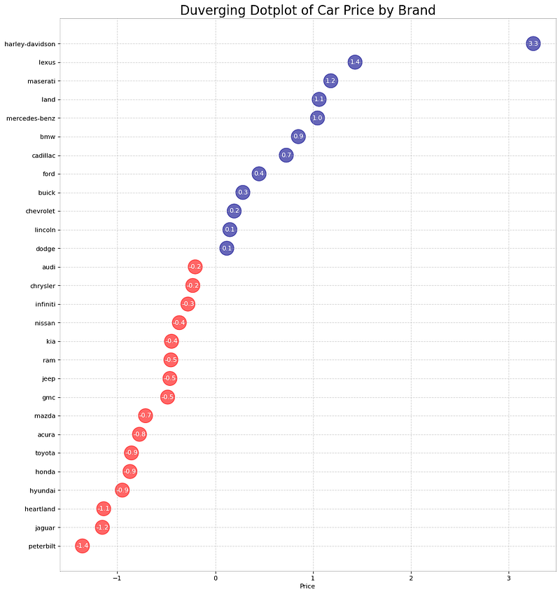
Types of Bar Plots
Bar plot is very common. It is hard to avoid bar plots while doing data storytelling. Here is a simple bar plot of the mean car price for each brand. In the later plot, we will improve it. I put the original numbers on each bar to make it more clear.
d2 = d1[:10]plt.figure(figsize=(20, 10))plt.bar(d2['brand'], d2['mean_price'], width=0.3)
for i, val in enumerate(d2['mean_price'].values):
plt.text(i, val, round(float(val)), horizontalalignment='center',
verticalalignment='bottom', fontdict={'fontweight':500, 'size': 16})
plt.gca().set_xticklabels(d2['brand'], fontdict={'size': 14})
plt.title("mean Price for Each Brand", fontsize=22)
plt.ylabel("Brand", fontsize=16)
plt.show()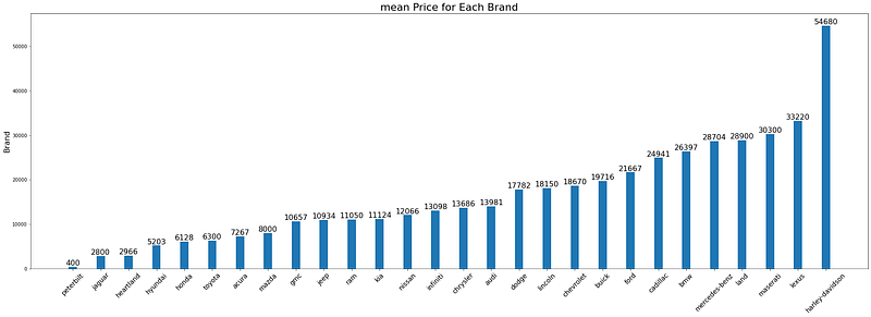
Here is an improved version of the bar plot. That serves the same purpose. But in my eyes, it looks nicer and cleaner.
fig, ax = plt.subplots(figsize=(28, 10))
ax.vlines(x=d1.index, ymin=0, ymax=d1.mean_price, color= 'coral', alpha=0.7, linewidth=2)
ax.scatter(x=d1.index, y=d1.mean_price, s = 75, color='firebrick', alpha = 0.7 )ax.set_title("Barchat for Average Car Price by Brand")ax.set_ylabel("Mean Car Price by Brand", fontsize=16)
ax.set_xticks(d1.index)
ax.set_xticklabels(d1.brand.str.upper(), rotation=60, fontdict={'horizontalalignment': 'right', 'size':14})for row in d1.itertuples():
ax.text(row.Index, row.mean_price+700, s=round(row.mean_price), horizontalalignment = 'center', verticalalignment='bottom', fontsize=14)
plt.show()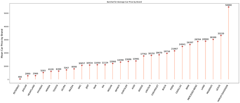
This dataset is very simple. But what if we have a bigger dataset, many categorical variables such as the NHANES dataset. I will import the NHANES dataset for the later plots. Here is the link to this dataset:
d = pd.read_csv('nhanes_2015_2016.csv')This dataset is too big. So I cannot show a screenshot like the previous one. Here are the columns:
d.columnsOutput:
Index(['SEQN', 'ALQ101', 'ALQ110', 'ALQ130', 'SMQ020', 'RIAGENDR', 'RIDAGEYR', 'RIDRETH1', 'DMDCITZN', 'DMDEDUC2', 'DMDMARTL', 'DMDHHSIZ', 'WTINT2YR', 'SDMVPSU', 'SDMVSTRA', 'INDFMPIR', 'BPXSY1', 'BPXDI1', 'BPXSY2', 'BPXDI2', 'BMXWT', 'BMXHT', 'BMXBMI', 'BMXLEG', 'BMXARML', 'BMXARMC', 'BMXWAIST', 'HIQ210'], dtype='object')The column ‘DMDEDUC2’ shows the education level of the population and ‘RIDRETH1’ shows the ethnic origin of the population. Both are categorical variables. The next plot will plot the number of each ethnic origin for each education level.
sns.catplot("RIDRETH1", col= "DMDEDUC2", col_wrap = 4,
               data=d[d.DMDEDUC2.notnull()],
               kind="count", height=3.5, aspect=.8,
               palette='tab20')
plt.show()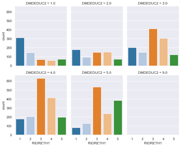
Each single bar plot shows the number of people in each ethnic group for a single education level. But when they are all side by side, it gives a comparative picture.
What if both the variable is not categorical?
In that case, a segregated violin plot will be more appropriate. We will show how to use violin plots for different numbers of variables. First, let’s plot the distribution of age for each education level.
plt.figure(figsize=(12, 4))
a = sns.violinplot(d.DMDEDUC2, d.RIDAGEYR)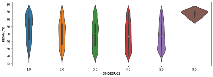
It shows the distribution of age for each education level. For example, in education level 1, we find more people above 60. In education level 5, you will find more people around 30.
It will be even more efficient to see the distribution of age of males and females separately.
d['RIAGENDRx'] = d.RIAGENDR.replace({1: "Male", 2: "Female"})plt.figure(figsize=(12, 4))
a = sns.violinplot(d.DMDEDUC2, d.RIDAGEYR, hue=d.RIAGENDRx, split=True)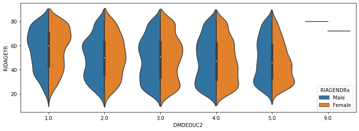
You have the distribution of age for males and females of each education level.
Let’s add one more variable to it. What if I want the same information as the previous plot for each ethnic group.
sns.catplot(x='RIDAGEYR', y="DMDEDUC2", hue='RIAGENDR', col="RIDRETH1",split=True,
           data = d[d.DMDEDUC2.notnull()], col_wrap=3,
           orient="h", height=5, aspect=1, palette='tab10',
           kind='violin', didge=True, cut=0, bw=.2)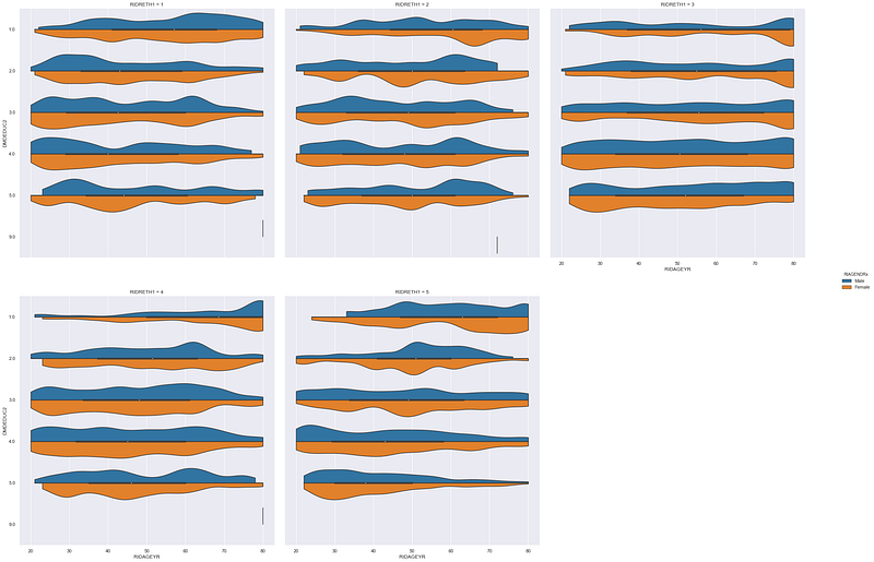
Look, how much information is packed in this one plot!
The last one for this article is not as informative as the previous few plots. But it looks nice in a report. Plus provides a very clear vision about the distribution of a categorical variable. That is a waffle chart.
For this demonstration, I will make a waffle chart that will show the count of people at each education level. We worked a lot with the education level of people in this article. But we never checked the proportion of the population in each education level.
You may have to install ‘pywaffle’ for this.
d11 = d.groupby('DMDEDUC2').size().reset_index(name='count')from pywaffle import Wafflen_categories = d11.shape[0]
colors=[plt.cm.inferno_r(i/float(n_categories)) for i in range(n_categories)]fig = plt.figure(FigureClass=Waffle,
plots={
'111':{
'values': d11['count'],
'labels': ["{0} ({1})".format(n[0], n[1]) for n in d11[['DMDEDUC2', 'count']].itertuples()],
'legend': {'loc': 'upper left', 'bbox_to_anchor': (1.05, 1), 'fontsize': 12},
'title': {'label': 'Number of People in Each Education Level', 'loc': 'center', 'fontsize': 18},
},
},
rows = 15,
columns = 60,
colors=colors,
figsize=(30, 12)
)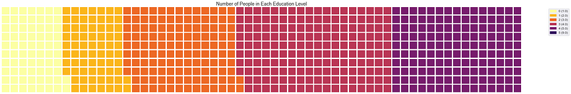
It gives a very clear vision about the proportion of the population in each education level. Though the bar plot can do this as well. But it’s just another interesting choice. Waffle charts can also be developed without ‘pywaffle’.
Conclusion
I hope all these visualization techniques provide you with some more choices for better and efficient storytelling. There are numerous numbers of visualization techniques in python. Please look at my other visualization tutorials (links below) for some more options.
Feel free to follow me on Twitter and like my Facebook page.