
A coder’s guide to colors — stop using RGB and use this instead
Rather than becoming an expert at color theory, here’s how you can easily wield colors like a designer.
Part I. Don’t use RGB Unless you’re an expert in color theory.
Pop Quiz: Without cheating, describe what color this hex code is likely to represent: #03A87C? Here’s a hint: RGB(3, 168, 124) (did that help at all?)
— The answer: ¡uoʇʇnq ʍoןןoɟ ǝɥʇ ɟo uǝǝɹƃ ǝɥʇ s,ʇI
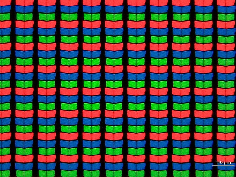
What you’re communicating to your machine is the intensity of red, green, and blue light per pixel on RGB display. If you’re not an expert at additive color mixing, you likely won’t be able to predict what color combos will give the exact color you’re looking for. In the most basic sense, combinations of these three primary colors are used to generate the 16M+ colors we commonly see in our displays.
About this series
In this series, I’ll be breaking down the mystique of choosing the right colors for the job. The goal is to give you the practical tools to make it look like you hired a designer to pick your color schemes. When your designs look good, we all win!
- Part 1: Don’t use RGB unless you’re an expert in color theory
- Part 2: How to steal a color palette from nature.
What the hex?
Here’s the rule to learn so that you can reject it properly (if you know what hex color codes are all about, skip to the next section).
Hexadecimal “digits” represent the 16 values included from 0 to 15, where instead of adding a “1” to the 10’s place when we pass the number 9, we keep counting higher in the 1’s place as if there were six additional digits that represented the numbers 10–15. Since we don’t have those numbers built into our keyboards, hex just uses a=10, b=11, c=12, d=13, e=14 and f=15. So that gives us 0, 1, 2, 3, 4, 5, 6, 7, 8, 9, a, b, c, d, e, f.
Hexadecimal lets us represent 3 digit values using only 2 digits. For example: 255 becomes FF.
Defining colors with hex
Colors are created through channel mixing. When you see a color written in hex ( i.e.#AABBCC), what you’re seeing are the channel intensities for red (AA), green (BB) and blue (CC) pixels, divided from 0–255 (00–FF) steps. Zero is ‘off’, and there are 255 distinct intensity differences all the way up to full brightness.
This amount of variation is where 16M+ color displays come from, since there are 255 × 255 ×255 = 16,581,375 different combinations you can create by varying the intensity of each channel or sub-pixel.
Whatever happened to predictability?
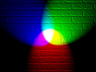
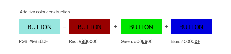
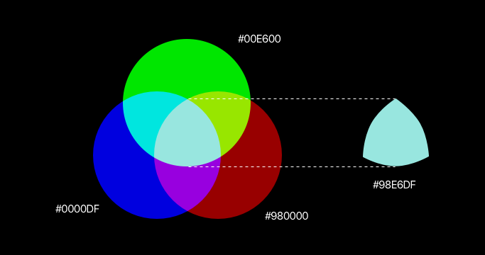
In the images below, the button on the left results from the additive mixture of the three colored buttons on the right. Who’d have known that dark red, bright green and intense blue would result in a light wintergreen? And therein lies the problem with RGB. It is not at all intuitive. You can’t predict what colors were mixed together just by looking at the end color, and you can’t tell what end color you’ll get just by looking at the primary colors.
With additive light theory, #FFFFFF or RGB(255, 255, 255) (full intensity across all channels), gives us pure white light, while #000000 or RGB(0, 0, 0)(all channels off), creates blackness.
Knowing these basics about RGB now, it should be easy to understand that #FF0000 is pure red, #00FF00 is pure green, and #0000FF is pure blue.
A single, last takeaway is that whenever all channels are the same intensity (excluding black and white mentioned earlier), the end result is one of 253 shades of grey (e.g. #333333 is a darkish grey, #C3C3C3 is a lightish grey).
Use HSL instead
If you want to make your life easier, and be able to choose colors that look good together, choose HSL or Hue, Saturation, Lightness. Period. End of article… (Well, OK. I’ll explain a little more).
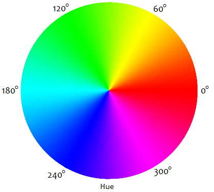
Hue is the color chroma we’re talking about: redness, greenness, blueness, orangeness, fuscianess, pinkness, etc. From 0–360 degrees, there’s a circle that starts on red, ends on red, and has all the colors of the rainbow in between.

Saturation is the fullness of the color from grey to fully saturated. This is a scale from 0%–100% saturation. The less saturated, the paler the hue is, the more saturated, the more intense the hue is.
Lightness is how near to black or full brightness the color should be, also on a scale of 0%–100%. At 100% lightness, you’ve got white, at 0% you’ve got black.
This is not difficult. In fact it should just be the way.
How to use this info
Starting with everything set to 0, if you only adjust the lightness, here’s what you will get.
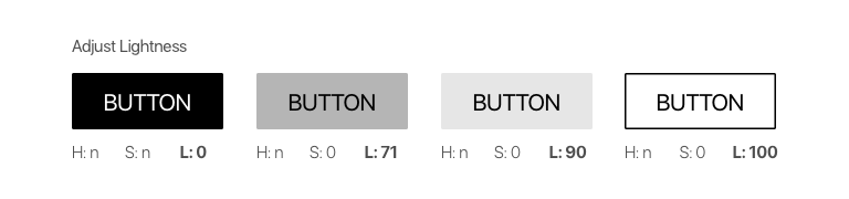
Notice that for 0 lightness, it doesn’t matter what your hue and saturation are, you’ll have full black without any light.
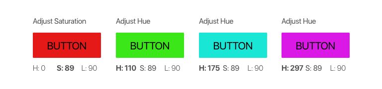
Now, we’ll pick the 3rd button from above, and increase the saturation from 0 to 89. With Hue still set to 0, we end up with a fairly intense, fairly bright red color. When we adjust the hue alone, keeping the brightness and saturation the same, we have 360 different hues to play with.
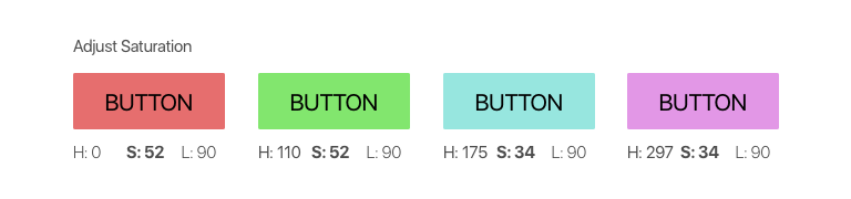
Taking these same hue values, if we adjust the saturation only, we’ll end up with 100 softer or bolder variations of each hue. Here, they’re less intense, slightly muted versions of the above colors. They have a softer feel. The closer saturation gets to 0, the more colorless or grey they’ll begin to look.
Using our third button again, if we make small adjustments to the hue, saturation and brightness together, we’ll be able to make a family of button styles that can be used for the same call to action element:
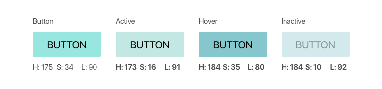
As you can see, the principles behind HSL allow you to have fine-grained control over every aspect of your color choices without having to rely on designers or preset color tables. Most importantly, the results are somewhat predictable! If you want a brighter red, change the lightness, if you want it softer, lower the saturation, more blue? Find the hue you want it to be, and so on and so forth.
If you have the option, there’s never really any reason to choose RGB over HSL unless you need low-level control over the light intensities at the sub-pixel level. Otherwise, it makes the most sense to adjust colors in ways that center around human-perception, and not in ways that suit hardware display capabilities.
Coming up in this series
Later in this series, I’ll explain how to create color themes with base, highlight, accent, and tone colors that can be used to theme entire apps or web pages, why you rarely see actual black in the world, what color combinations not to use, and more.
Happy Coloring!


