
A better graph view with Capacities
Graph views in PKM apps are cool. I love them, and I’m not afraid to admit that I think it was the graph feature that sold me on Obsidian and Logseq in 2021 when I really began my PKM journey and moved away from Notion.
There’s also a lot of conversation about whether the graph view is actually useful. For me, it’s useful for visualising links and finding outliers but it doesn’t easily go beyond that. I stand by what I’ve said in the past though that not every product feature has to uphold a standard of productivity, some are just cool, and that’s meant that the usefulness of the graph hasn’t really crossed my mind. It’s a visual representation of the knowledge journey I’ve been on for the last few years, which gives me an almost emotional attachment to it. I’m proud of my notes and knowledge and I like seeing it transformed into my graph.
However, my eyes were recently opened to how graph views could both be cool but also useful. Once again, Capacities has blown me away with the settings they have built-in to their app.
In Capacities, I can see the context of the connection. This context is provided by what I put in the properties. Metadata in general is so powerful, and this is the visual representation of it.
Here’s what this looks like.
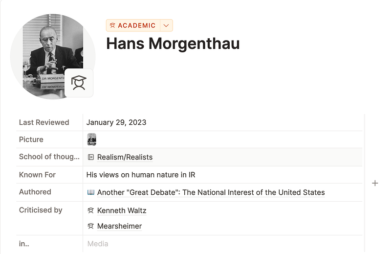
The metadata I have input for Morgenthau is below. I have created these page properties myself in my custom content type called Academics. The things I want to know about every academic is put into the metadata. It gives me a uniform template of the information I want to fill out and it reminds me to do it!
This metadata is then transformed onto the zoomed-in graph,:
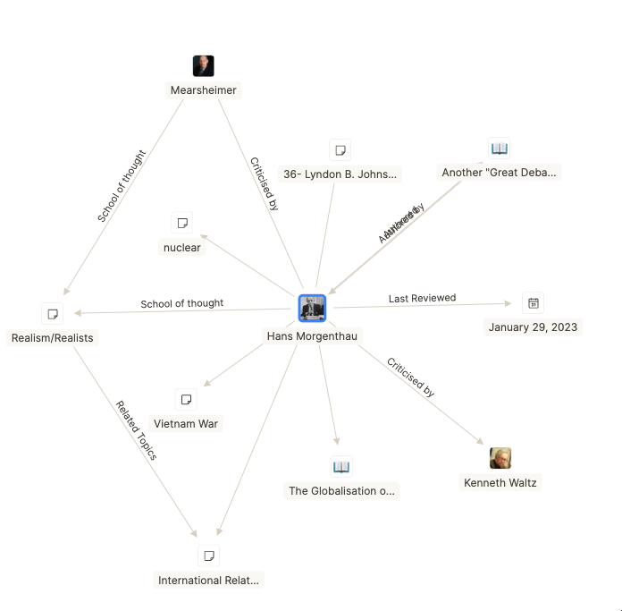
I don’t have to think about the connection between Morgenthau and Mearsheimer, because the line is labelled with the answer. This is (from the user end) such a simple addition but it just elevates the graph. I don’t need to go into the nodes to find out what the connection is, it’s just there.
There are two other things to point out about Capacities’ graph view.
- It has the icons
This is super visually appealing to me in general, but it also serves to give you even more context to your graph, because some icons denote which content type the node belongs to. For example, you can see the book called ‘The Globalisation o…’, the book icon tells me it’s part of my media content type.
This doesn’t seem to work on all content types (e.g Lyndon B. Johnson belongs to the People content type, and The Vietnam War belongs to the Topics content type but they have the same icon), but either way this is still more context than the Obsidian or Logseq version would give.
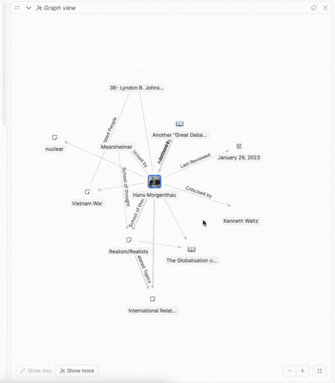
2. You can also choose how much of the graph you see, with the show more/less buttons.
I always start with the minimum view, zoom in, explore, and then zoom out and add more links. I think this bridges the gap between the small local view and then the enormous fully linked global view. It just makes sense to have control in this way!
I’ve said many times in other posts that Capacities just wants to help you out, and I think this is a key contributor to that. From a user perspective, it’s such a simple addition but it transforms graph view from cool and simple, to super cool, aesthetic and useful, which is a great combination to be :)
Have you tried Capacities yet?


