
A Beginner’s Guide to Understanding Typefaces
Demystifying Fonts and Letterforms — Your Gateway to the World of Typography
Typography is the silent but effective storyteller in the enormous field of design, influencing the visual language of everything from books to websites. The concept of typefaces, or the wide variety of fonts that give text its distinct character, is at the center of this complex world. Knowing fonts is an essential first step for anyone new to the field of design as it teaches them the fundamentals of letter communication. Come along as we explore the subtleties that turn everyday text into a visual masterpiece as we unpack the complexities of typefaces.
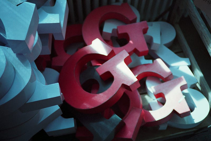
The Basics: Serif vs. Sans Serif
The basic contrast between serif and sans serif typefaces is the basis of typeface classification. Classics like Times New Roman are prime examples of serif typefaces, which feature tiny decorative strokes at the ends of characters called serifs. Because of these small details, serif fonts are often used in print and editorial settings because they lend text a feeling of tradition and formality.
Conversely, sans serif fonts — which are represented by modern choices like Arial — eschew these decorative embellishments in favor of a sleek and understated look. Sans serif fonts have a crisp, contemporary look that makes them ideal for digital platforms, signage, and designs that value simplicity and minimalism. More than just a matter of taste, the choosing between serif and sans serif is a design tactic that helps content creators match their visual language to the desired tone and objective of their work.
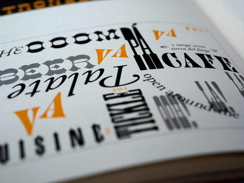
Hierarchy and Emphasis: Understanding Typeface Variation
Typefaces reveal a range of styles and weights in the complex dance of typography, giving designers a sophisticated arsenal to create visual hierarchy and highlight important components in a design. Among other things, bold and italic variations show up as effective tools for manipulating contrast and directing the viewer’s attention through the story.
Because of their increased weight and prominence, bold typefaces are useful for drawing attention to and emphasizing headings or focus points. They give some elements a bit more boldness and make them stand out from the rest of the text. However, italicized versions add a feeling of movement and emphasis, offering a stylistic refinement that denotes significance or diversity.
Mastering the subtleties of a musical composition is similar to learning the skill of typeface variety. The same way that a composer uses different notes and rhythms to inspire feelings, a designer deliberately uses diverse typeface types to produce visual harmonies that the audience can relate to. Useful typeface variety is a potent narrative tool that guarantees information is not simply transmitted but experienced, whether it’s for emphasizing a call to action, setting headers apart from body text, or adding personality to a design. When it comes to typography, the deft use of various weights and styles turns text into a visual symphony in which every note is crucial to the overall composition of a powerful and cohesive design.
The Anatomy of Type: Letters, Baselines, and Kerning
To fully understand the complexities of typeface design, one must undertake an anatomical investigation that reveals the structural elements influencing text’s readability and visual appeal. This glossary contains important concepts like ascenders, descenders, and kerning, which are skills that provide designers a sophisticated understanding of letterforms.
The upward-extending portions of letters that go above the x-height are called ascenders, and they add to the text’s vertical rhythm. Conversely, descenders lend a vertical dynamic to the letters by falling below the baseline. A balanced and aesthetically pleasing typography relies heavily on the interaction of ascenders and descenders to make sure that no letter stands out or interferes with the text’s flow.
Kerning is a painstaking art in and of itself, where the ideal visual harmony is achieved by varying the spacing between individual characters. Designers can remove uncomfortable gaps or crowding by precisely adjusting the spacing between letters, resulting in a text that flows and makes sense. Kerning is a critical component of readability enhancement, particularly in display typefaces and headlines where exact spacing is required to preserve a clean and businesslike appearance.
An understanding of typeface anatomy gives designers a toolkit for exact control over text’s visual subtleties. Similar to how a physician comprehends the complexities of the human body, a designer skilled in kerning, ascenders, and descenders can analyze the visual terrain of typography and make sure that each letter works in unison with the composition as a whole. This degree of accuracy and focus on detail enhances the text’s artistic appeal and intelligibility, turning it from a simple verbal expression into a visual feast. Within the field of design, the structure of typefaces serves as the basis for the creativity of typography.
Choosing the Right Typeface for the Message
The option of which font to use becomes crucial in the maze of fonts and has a significant impact on how a message is understood. It’s a strategic choice that affects how the content is seen and resonates emotionally, not just a matter of personal taste.
Classic serifs are frequently used in formal papers where a sense of tradition and gravitas is needed. Classic typefaces that set the standard for formal correspondence, scholarly articles, and legal documents are Times New Roman and Garamond, which radiate sophistication and authority.
On the other hand, sans serif typefaces are more common in the digital world because of their emphasis on modernity and slick looks. Fonts such as Futura, Helvetica, and Arial are popular choices for websites because of their minimalist appeal and clear lines, which show information in a way that is both easy to read and current.
There is a wide variety of fonts available in the vast universe of typefaces, each with an own personality and tone. In the search for the ideal typeface, experimentation becomes a designer’s ally since it enables them to match the visual language with the intended emotional tone and target audience. Bold display typefaces can bring flair and energy to advertising materials, while playful scripts can infuse a feeling of informality and originality.
The challenge for designers navigating this world of limitless options is to select a typeface that not only looks good but also effectively conveys the required message. As a silent partner in the narrative, typography helps to shape the reader’s experience and amplifies the content’s overall impact. The typeface selection acts as the conductor’s baton in the design symphony, purposefully and precisely guiding the visual narrative.
Web-Safe Fonts and Responsive Design
The importance of web-safe typefaces in creating a smooth and aesthetically pleasing online experience cannot be emphasized as our digital footprint grows. A crucial component of flexible design in a time when consumers interact with content on a variety of sizes, from large desktop monitors to small mobile screens, is font selection.
Web-safe fonts — classics like Georgia, Helvetica, and Arial — have gained this reputation by being widely accessible and producing consistently good results on a variety of devices. These typefaces serve as trustworthy representatives, guaranteeing that the typographic integrity that designers intended to be preserved is maintained across all devices that view the material.
Designing layouts that fluidly adjust to different screen sizes and resolutions is the core of responsive design. The readability of the content is crucial in this situation. In this case, the web-safe fonts that were selected serve two purposes: they maintain readability on both large desktop monitors and portable devices while also offering a unified visual identity.
Think about the simple elegance of Arial, a sans-serif typeface that remains readable at smaller sizes. Helvetica is readable at a range of sizes thanks to its clear lines and adaptability. The legibility of serif fonts and the flexibility needed for online material are combined in Georgia, a serif typeface made specifically for the screen.
When choosing web-safe fonts carefully, a designer can demonstrate their vision in the ever-changing world of digital design, where user experiences span several devices. It’s an assurance that whichever screen it appears on, the material will be aesthetically pleasing, readable, and accessible. When used in conjunction with responsive design principles, web-safe fonts guarantee that typography will always be an accessible and interesting part of our online experiences.
studying typefaces is like studying the alphabet of visual communication for someone who is just starting out in the huge field of design. Every typeface has its own personality, from the classic elegance of serifs to the modern minimalism of sans serifs. Through deciphering the subtleties of typefaces, designers may mold messages, arouse feelings, and produce visually striking stories. Accept typography as an art form, and let the letters on the page to communicate ideas in a language that is not limited by words.
If you enjoyed my article, I would greatly appreciate your support in my creative work. The easiest way to do so is by simply buying me a coffee. Thank you very much for your support.