
A beginner’s guide to Design Tokens
Heard people talking about “Design tokens” but don’t really know what they are, or how to use them? You’re in the right place.
Here you’ll learn the basics of what design tokens are, how they’re used, their benefits, and some tools and resources that can help. But first, let’s start with a quick story.
A common situation
You’re a product designer, working on a smallish new product, without an existing design system in place. You have a brand color which is a bright blue color (#3640F5). You use this color in a variety of places across products, back-end systems, and your website: Heading text, primary button backgrounds, secondary button text, link text, etc.
These colors will be scattered throughout your design files, and through the code your engineers are working with. In CSS, they may look something like:
h1 { color: #3640F5 }
button.primary { background-color: #3640F5 }
button.seconary { color: #3640F5 }
a { color: #3640F5 }
Note: The ‘code’ throughout this article has been simplified to be easier to read.
You already have some efficiency benefits by using CSS properly. All the primary button background colors can be changed in one place, for instance. Same for your links, headings, etc. Over time though, humans gonna be human.
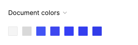
Maybe a designer selects a blue by eye, which looks similar, but is actually #4254F5. It goes unnoticed and makes its way into the code. Similar things happen a few more times, and you end up with five different shades of blue and a palette that looks like this.
One of the other designers working on the website doesn’t know which to use for a link, so they pick one that looks nice and move on. This happens over and over, adding little pieces of complexity and design debt each time.
Your company then announces a rebrand, with a new green brand color, and you realize that because these values are all completely different, you can’t search and replace them easily.
You don’t know which are intentional, and which are just accidents, and need to make judgment calls on all of them. You have meetings with the other designers on the team to try and agree on which blue’s to change to the new brand color, and which should be kept for things like info styles or links. You try to convince your team that you need engineering resources to help clean things up. You win some of these battles; you lose others. You maybe get things into a slightly better situation at the end of the rebrand project, and then in a few months or years, you’re back in the same situation.
Design tokens can help you manage and avoid some of the issues outlined here. But first…
What are design tokens?
A basic design token is a variable with a unique name that is assigned a simple value. You can think of a token as the source of truth for a part of a design that’s reusable or composable.
You can use a token by referencing the token’s name where you would normally enter a value.
This is a color token:
primary = #3640F5Tokens at this level are similar to Styles in Figma or Sketch, but more powerful and flexible (we’ll dig into how a bit later). They are most frequently used for colors, sizes, padding, opacities, borders, font sizes/weights, etc.
As an engineer implements a design, they would instead do this:
h1 { color: primary }
button.primary { background-color: primary }
button.seconary { color: primary }
a { color: primary }
In your design tool of choice, you’d have a style defined with the same name, which is shared across your whole team or company.
Now, when a rebrand rolls around, you change your brand color in one place, and everything else changes. When an engineer looks at your design files, they know exactly which tokens to use, because they have the same names as they do in code.
Design tokens as a system or approach though are much more than this however. Design tokens should inform how you communicate as a cross-functional team, how you approach design decisions, and how you scale those decisions to your entire product suite.
Color scales and palettes
Most design systems include some basic color palettes that everything else is built from. As your design system tries to accommodate many designers, components, interfaces, and themes, you’ll find that trying to add colors as they are needed quickly becomes incoherent and difficult to manage.
A common approach is to have some common hues, including your brand colors and accent colors, as well as some basic hues for things like errors, warnings, success, and neutral colors. Each of these hues will then have a scale of luminosity, indicated by a number that indicates how light or dark it is. In Castor’s palette, neutral-100 is a very light grey, neutral-500 is a mid grey, and neutral-900 is a very dark grey. Some systems will use 0 to 100 as a scale, it’s totally up to you.
Alias tokens
Tokens can refer to specific values, but they can also refer to other tokens. We sometimes refer to these as aliases, as they are the same value, but known by another name. They can also be called references, in that they reference the value of another token. They can even refer to other alias tokens.
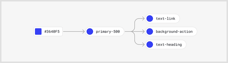
In the example above, we see our same primary token defined, but then three additional alias tokens, one for text links, one for the background of buttons, and one for heading text.
All of these have the same blue value, so why have these duplicates?
As your system becomes more complex, say 20–30 colors, you will end up with 4 or 5 different shades of the same color hue, and you get into a similar situation where designers or engineers can’t remember which ones to use for which contexts. This is especially true with shades of grey for backgrounds, borders, shadows, etc as the variations can be so subtle. By adding meaning and context to the names, you can make the intended use of colors very clear to all people involved.
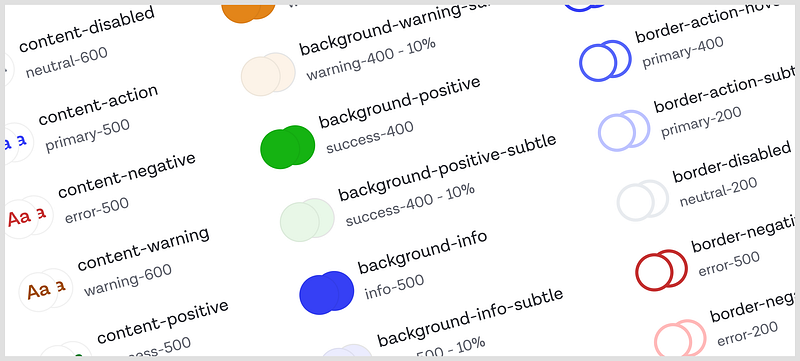
Some examples: text-body, text-secondary,background-card, text-link, border-separator. Hopefully, it’s fairly obvious where you might use these colors. Because these types of tokens contain meaning that indicates their use, we sometimes call these semantic tokens or semantic aliases.
Another common alias type is the component token. Rather than broader semantic names, they have names extremely specific to a component, for example, input-background-hover, or button-secondary-border-focus. This makes for easier naming decisions, and can allow you to hide away a lot of component complexity from palettes designers are using day to day.
Dark mode & themes
This is the topic of a whole other article, but a huge benefit to using tokens is being able to create and manage dark and light mode UI a lot easier. You do this through smart uses of aliases. You create aliases for everything you need a swappable color for (probably all your aliases and component tokens), e.g. background-main for your background.
In your light theme, you would set this token as an alias to a light grey, and a dark grey for your dark theme.
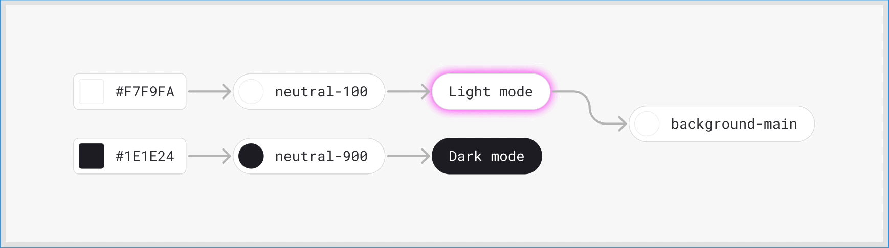
Then, either via a plugin or in code, you can swap the theme, and the colors will be associated with the correct values. Because the semantic alias names stay the same regardless of which mode you’re in, it makes many design decisions easier over time, and it’s easier to scale.
What are the downsides to using tokens?
Design tooling is still pretty poor
Currently, no popular design tools support design tokens natively in a way that’s as powerful as tokens in code. Aliases as a concept are basically non-existent. There are some plugins you can use to bridge some of these gaps, which I’ll mention at the end of the article, but they are often limited by the tools themselves.
Adding to the system can be slow
If you want to add new colors or tokens, you need a robust process and solid naming conventions so that things don’t get out of hand and become a nightmare to maintain. This can slow people down (and in some ways, is designed to do just that so the system doesn’t get out of hand). Because of this, tokens are often better suited for established products with solid UI patterns. Let people experiment outside the token system if they need.
Having said that, there are valid uses of tokens and design systems that can accelerate experimentation, but you’ll want different processes and expectations for that kind of work, with less emphasis on consistency, and more on speed. It will also entirely depend on how familiar everyone is with using the system. Use the tools you can work quickest in, and if this is your design system, great!
Up-front investment can be significant
A good design tokens system requires quite a lot of up-front investment. Establishing your naming conventions, coming up with a palette that supports your existing product designs, and migrating existing systems to tokens, are all big investments that shouldn’t be done without thought, and collaboration. A poor token system can be more detrimental to a team than no system at all.
A few closing thoughts
If you have a product or team which has a genuine need for a design system, design tokens should be a fundamental part of that system. Consider different approaches to naming and structuring your tokens, and choose an approach that meets the needs of your team. Don’t over-engineer them.
Invest in processes to manage change, and initial audits to ensure your tokens are fit for purpose and will meet the needs of your design team.
Build the token system collaboratively with your engineering team. It’s a system just as much for them as it is for designers, and tokens become much more powerful when you connect the dots between teams.
Tools & resources
Figma plugins
Figma Tokens — A plugin that lets you effectively add token functionality for more than just what styles support within Figma. It’s the most popular and most actively developed plugin right now and is very powerful if you and your team really commit to using it.
Themer — A plugin that only supports styles within Figma, but lets you switch between dark and light themes dynamically using semantic tokens. Good if you want something lightweight, but still want to rely on Figma’s native style features for now.
Code
Style dictionary — A system developed by Amazon for managing and using design tokens in your codebase.
Theo — A system developed by Salesforce for managing and using design tokens in your codebase.
Further reading
Thanks for reading. If you get value from stories like this and want unlimited access to all the content on Medium, consider becoming a Medium member. It only costs $5 a month, and that money will help support me, and other writers you read on Medium.
If these articles are relevant to your job, you might even be able to justify it as a learning & development expense! Food for thought.


