
A Beginner’s Guide to CSS Grid and Flexbox: Building Modern, Responsive Layouts
In the shifting sands of web development, mastering CSS Grid and Flexbox can feel a bit like taming wild horses. Trust me, I’ve been there, and it wasn’t always a walk in the park. But fear not! In this article, we’re going to delve deep into the world of these two powerful layout models, breaking down their complexities into digestible bites. Welcome to my personal exploration of CSS Grid and Flexbox, filled with struggles, victories, and plenty of code snippets.
Part 1: Enter the Flexbox
Flexbox, short for Flexible Box Module, is a one-dimensional layout method designed to distribute space along a layout’s cross axis or main axis. With it, we can easily manage the sizes, positions, and space between elements, even when their sizes are unknown or dynamic.
Let’s take a look at an example. Here’s a basic HTML structure we’re going to use:
<div class="container">
    <div class="item">1</div>
    <div class="item">2</div>
    <div class="item">3</div>
</div>
We can make this a Flex container by applying display: flex in our CSS.
.container {
    display: flex;
}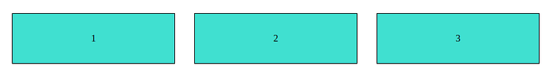
Just like that, our items line up neatly in a row, equally sharing the space of their parent container. Ah, the power of Flexbox! I still remember the first time I saw the magic happen, and the sense of wonder it filled me with.
If you want your items to stack vertically, change the flex direction to column. Add flex-direction: column to your container.
.container {
    display: flex;
    flex-direction: column;
}
In my early years of web development, I’d have had to do this with floats and positions, and let me tell you, that wasn’t nearly as simple or intuitive.
Part 2: Embracing the CSS Grid
Next up, CSS Grid, a powerful two-dimensional layout system. I remember when I first ventured into Grid territory — it was as if I had discovered a new dimension. It allows us to position items both vertically and horizontally at the same time, perfect for complex web designs.
Let’s start with the same HTML structure as above. This time, we’re going to make our container a Grid container.
.container {
    display: grid;
    grid-template-columns: repeat(3, 1fr);
}
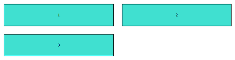
Here, we’re defining our grid with three equally sized columns. You’ll see that our items are now positioned in a three-column grid.
<div class="container">
    <div class="item">1</div>
    <div class="item">2</div>
    <div class="item">3</div>
</div>
To control the rows, you can add grid-template-rows. If we want two rows:
.container {
    display: grid;
    grid-template-columns: repeat(2, 1fr);
    grid-template-rows: repeat(2, 1fr);
}
Grid introduced the fr unit, which stands for “fraction”. This unit allows you to set the size of a grid track as a fraction of the free space of the grid container.
Wrapping Up: Flexbox, Grid, and the Future of Layout
In the landscape of modern web design, CSS Flexbox and Grid are not just tools, they’re game changers. They’ve redefined how we approach layout design, providing us with flexibility and power that was hard to imagine a few years ago.
From the initial excitement of seeing Flexbox align elements in a snap, to the awe of positioning items on a two-dimensional plane with Grid, my journey has been filled with learning, discovery, and more than a few ‘aha!’ moments.
My hope is that this guide not only introduces you to the power of Flexbox and Grid, but also sparks a sense of curiosity and excitement for the possibilities they open up. So go forth, experiment, break things, fix them and in the process, create something beautiful and unique. The world of modern web layouts is now your playground.
And remember, it’s not just about mastering tools or technologies, but about using them to create better, more immersive web experiences.
Here are some resources to help you further dive into CSS Grid and Flexbox:
- CSS-Tricks Guide to Flexbox: This comprehensive guide provides an overview of all the different parts of Flexbox with interactive examples.
- CSS-Tricks Guide to Grid: Similar to the Flexbox guide, this resource offers an in-depth look at CSS Grid with numerous examples.
- MDN Flexbox Documentation: Mozilla’s documentation on Flexbox is a great place to start if you’re looking for a thorough and reliable guide.
- MDN Grid Layout Documentation: The Mozilla Developer Network (MDN) provides detailed and easy-to-understand documentation on CSS Grid Layout.
- Flexbox Froggy: A fun game to learn and practice Flexbox.
- Grid Garden: A game by the same creators as Flexbox Froggy, but this time, you’re learning CSS Grid.
- Flexbox Course: A free video course to help you master Flexbox.
- Grid Course: A free video course on mastering CSS Grid.
Enjoyed the read? For more on Web Development, JavaScript, Next.js, Cybersecurity, and Blockchain, check out my other articles here:
If you have questions or feedback, don’t hesitate to reach out at [email protected] or in the comments section.
[Disclosure: Every article I pen is a fusion of my ideas and the supportive capabilities of artificial intelligence. While AI assists in refining and elaborating, the core thoughts and concepts stem from my perspective and knowledge. To know more about my creative process, read this article.]
Thank you for reading until the end. Please consider following the writer and this publication. Visit Stackademic to find out more about how we are democratising free programming education around the world.