
How to Use Sankey Chart to Report Business Earnings via Python Plotly? Part 2
Previously on How to Use Sankey Chart to report business earnings via Python Plotly? Part 1, we used AMD’s quarterly income statement to show you how to build a Sankey Chart. In this article, we will continue to discuss on how to report these components dynamically by sourcing the data from the live source instead of static numbers.

Getting components via yahooquery
Step 1: As our previous article is based on the FY23Q2 earning, so we need to pull the data to meet the criteria of ‘asOfDate’ == 2023–06–30.
from yahooquery import Ticker
t = Ticker('AMD')
df = t.income_statement(frequency='q')
filter = df['asOfDate'] == '2023-06-30'
df_fy23q2 = df.loc[filter].T
Step 2: Convert financial data and store them into dictionaries. (We will talk about how to get the revenue by segments in the future.)
df_Total_Revenue = df_fy23q2.loc['TotalRevenue']/1000000000
df_COGS = df_fy23q2.loc['CostOfRevenue']/1000000000
df_GP = df_fy23q2.loc['GrossProfit']/1000000000
df_Total_Operating_Expenses  = df_fy23q2.loc['OperatingExpense']/1000000000
df_OL = df_Total_Operating_Expenses -  df_GP
df_RD  = df_fy23q2.loc['ResearchAndDevelopment']/1000000000
df_Amortization  = df_fy23q2.loc['Amortization']/1000000000
df_SGA  = df_fy23q2.loc['SellingGeneralAndAdministration']/1000000000

Segments = {'Data Center': 1.3, 'Client': 1.0 , 'Gaming': 1.6 , 'Embedded': 1.5 }
Total_Revenue = {'Total_Revenue': df_Total_Revenue}
COGS = {'COGS': df_COGS }

GP = {'Gross Profit': df_GP}
OL = {'Operating loss': df_OL}

Total_Operating_Expenses = {'Operating Expenses': df_Total_Operating_Expenses}
Operating_Expenses = {'RD': df_RD, 'Amortization': df_Amortization , 'SGA': df_SGA}
Creating dynamic nodes and flows
label
list(Segments.keys()) +
# ['Data Center', 'Client', 'Gaming', 'Embedded']
list(Total_Revenue.keys())  +
# ['Total_Revenue']
list(COGS.keys()) +
# ['COGS']
list(GP.keys()) +
# ['Gross Profit']
list(OL.keys()) +
# ['Operating loss']
list(Total_Operating_Expenses.keys()) +
# ['Operating Expenses']
list(Operating_Expenses.keys())
# ['RD', 'Amortization', 'SGA']
source
list(range(len(Segments))) +
# [0, 1, 2, 3]
[len(Segments)] * (len(COGS) + len(GP)) +
# [4, 4]
[label.index('Gross Profit')] +
# [6]
[label.index('Operating loss')] +
# [7]
[label.index('Operating Expenses')] * len(Operating_Expenses)
# [8, 8, 8]
target
[label.index('Total_Revenue')] * len(Segments)  +
# [4, 4, 4, 4]
[label.index('COGS')] +
# [5]
[label.index('Gross Profit')] +
# [6]
[label.index('Operating Expenses')] * (len(GP) + len(OL))  +
# [8, 8]
[label.index(expense) for expense in Operating_Expenses.keys()]
# [9, 10, 11]
value
list(Segments.values()) +
# [1.3, 1.0, 1.6, 1.5]
list(COGS.values())  +
# [2.916]
list(GP.values())  +
# [2.443]
list(Total_Operating_Expenses.values()) +
# [2.463]
list(OL.values()) +
# [0.02]
list(Operating_Expenses.values())
# [1.443, 0.481, 0.547]
OK, let’s plot it out.
link = dict(source = source, target = target, value = value)
node = dict(label = label, pad=50, thickness=1)
data = go.Sankey(link = link, node=node)

# plot
fig = go.Figure(data)
fig.show()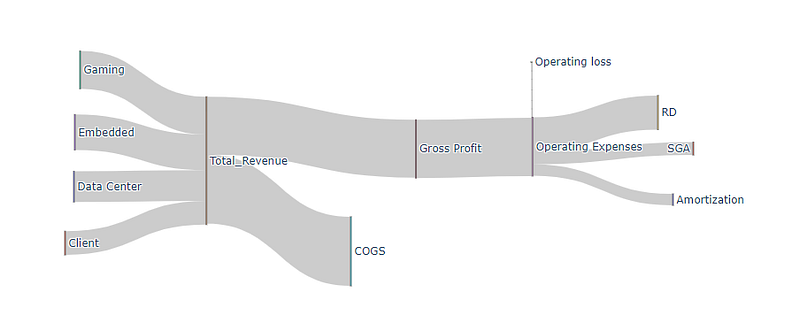
We will discuss more on how to report these components dynamically and source the data from the live source instead of using static numbers.
Enjoy it! If you want to support Informula, you can buy us a coffee here :)
Thank you and more to come :)


