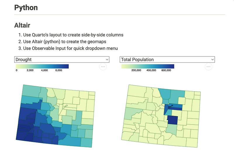
Using Altair to Build a Dynamic, Interactive Choropleth Map
Altair and Vega have been beefing up geomapping capabilities. Choropleth maps are simple ways to show geographic patterns by adding colors to often municipal/geopolitical boundaries. Let’s get started.

Encountering the dataset
Colorado EnviroScreen
In my search for healthcare-related datasets, I stumbled onto this particular dataset of Colorado’s “EnviroScreen” https://teeo-cdphe.shinyapps.io/COEnviroScreen_English/
Their own description from the website:
Colorado EnviroScreen is an interactive environmental justice mapping tool and health screening tool for Colorado. It was developed for the Colorado Department of Public Health and Environment (CDPHE) by a team from Colorado State University. Colorado EnviroScreen Version 1.0 launched on June 29, 2022.
Environmental health? Map? Count me in.
Problem: the data output doesn’t do the data work justice
One of my LinkedIn buddies actually raised the initially issue with this particular dataset and the website in a post.
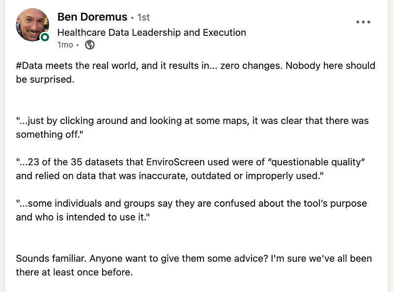
After performing the painstaking task of collecting the data, cleaning it up, to be limited by the design of the dashboard is like plating a chef’s meal on a paper plate.
The R Shiny App
Not to throw shade at the team who created this application (they were tasked with compiling the data, which is probably much tougher work, but the dashboard is what the world sees), but the choropleth map they have in R… just doesn’t do all that data work justice ☹: ️
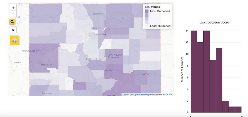
So let’s give this dataset a chance to shine, because I do feel like there’s good data within it.
Back to the drawing board: Altair
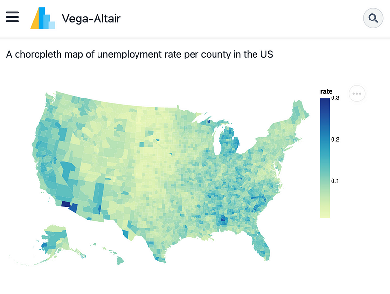
I’ve been doing a ton of Altair work for my day job and Altair is my current data visualization library of choice. https://altair-viz.github.io/gallery/choropleth.html. The example choropleth map already looks better than R Shiny:
Let’s get started.
Step 1: Download the data
- https://teeo-cdphe.shinyapps.io/COEnviroScreen_English/
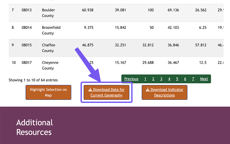
- Scroll down and click “Download Data for Current Geography”
Step 2: Load the data
I am a big Polars fan. Load this data. Few things:
import polars as pl
import altair as alt
from vega_datasets import data
import polars.selectors as cs

# Altair by default ships with 5000 row limit.
# It can handle a lot more than that.
alt.data_transformers.disable_max_rows()

# There are pairing of columns for many measures
# For the sake of keeping this article short, excluding "Percentile" columns
# 1) "... Score"
# 2) "... Percentile"
colorado_enviro = (
    pl.read_csv("data/County_data.csv", null_values="NA")
    .select(~cs.contains("Percentile"))
)
colorado_enviro.head()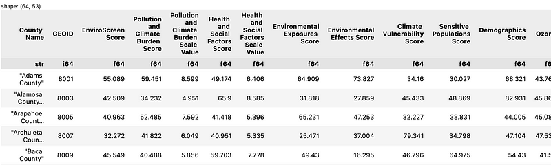
This is a typical dataframe suited for tabular display, where you can examine each county’s metrics.
This is also a terrible dataframe for data visualization. Let’s pivot it into “tidy” or long data frame where each metric-value pair gets a row.
Step 3: Prepare the Data for Data
Polars has a melt() method that has pretty much the same usage pattern as Panda’s melt() . If you don’t know what melt()is, it’s effectively a reverse of a pivot().
The 4 columns I need for plotting:
County Name: Colorado’s county namesGEOID: Just by experience, I know these are Federal Information Processing Standards (FIPS) County IDs, which helps unify U.S. Counties (many counties have same names across different states, e.g. https://en.wikipedia.org/wiki/List_of_the_most_common_U.S._county_names)Measure: Will effectively turn all the column names from thecolorado_envirodataframe into a string.Value: The values corresponding to each metric will be in this column.
plot_df = (
    colorado_enviro
    .drop("area")
    .melt(id_vars=["County Name", "GEOID"],
          value_name="Value",
          variable_name="Measure")
    .with_columns(
        pl.col("Value").cast(pl.Float64),
    )
)
plot_df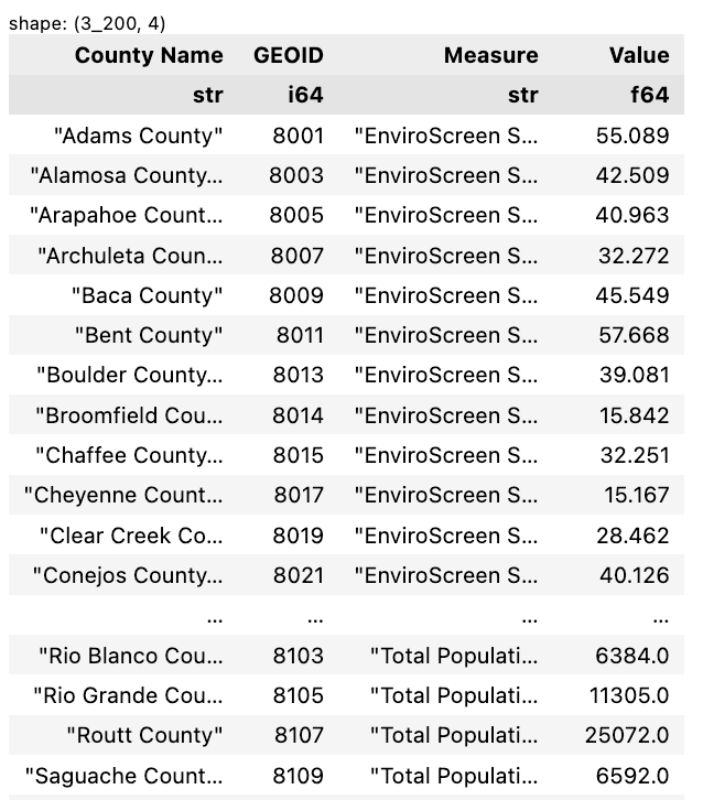
Step 4: Load the Shapefile (TopoJSON)
There is a nicely compiled and accessible repository called vega-datasets that you can install from pypi ( pip install vega-datasets).
Loading the typically annoying-to-find county-level shapefiles is piece of cake using vega-datasets. (You can potentially enter, states instead of counties for the state-level shapefiles.) This loads up topojson object that Altair/Vega natively supports using alt.topo_feature()
from vega_datasets import data

counties = alt.topo_feature(data.us_10m.url, "counties")
counties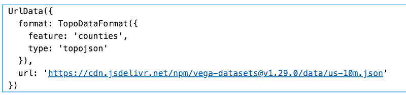
Step 5: Plot 1 Measure: Total Population (county)
For our initial plot, I’ll just filter the plot_df for Total Population .
We’ll closely follow the tutorial code from Altair website and change the necessary code to match our column headers. A lot of magic happens with transform_lookup() where GEOID gets “joined” to counties topoJSON object’s “id” key.
Bottomline is that it add another “column” called geo to our plot_df which contains the polygons that draw the county boundaries.
We can use mark_geoshape() to map the encoding channel shape to the “geo” column in our transformed data.
state_fig = (
    alt.Chart(plot_df.filter(pl.col("Measure")=="Total Population"))
    .mark_geoshape(strokeWidth=1, stroke="darkgreen")
    .encode(
        shape="geo:G",
        color="Value",
        tooltip=["County Name", "GEOID", "Measure", "Value"],
    )
    .transform_lookup(
        lookup="GEOID",
        from_=alt.LookupData(data=counties, key="id"),
        as_="geo"
    )
    .project(type="albersUsa")
    .properties(width=400)
)
state_fig
Tada:

Step 6: Dynamic Dropdown Selector for Measures
Altair/Vega allows very basic configuration and additional of selection drop-down:
# List of all unique Measures
measures = plot_df.select("Measure").unique().to_series().to_list()

# Create drop-down, using the "measures" list
input_dropdown = alt.binding_select(options=measures, name='Measure')

# Creating a binding "selection" object in Vega
# which is mapped filter the "Measure" field in the data
selection = alt.selection_point(fields=['Measure'], bind=input_dropdown)

state_fig = (
    alt.Chart(plot_df)   # Note I removed the .filter()
    .mark_geoshape(strokeWidth=1, stroke="darkgreen")
    .encode(
        shape="geo:G",
        color="Value",
        tooltip=["County Name", "GEOID", "Measure", "Value"],
    )
    .transform_lookup(
        lookup="GEOID",
        from_=alt.LookupData(data=counties, key="id"),
        as_="geo"
    )
    .transform_filter(   # transform_filter() allows dynamic selection
        selection
    )
    .add_params(   # add_params() make "selection" variable available to chart
        selection
    )
    .project(type="albersUsa")
    .properties(width=400)
)
state_fig
Summary
There you have the basics.
Feels like it’s a much more responsive and sleeker, portable data.
I will follow up with Part 2 in trying to make this all available as an hostable file using Quarto, which supports Altair and Vega via R, Python, or Observable: