
Monte Carlo Simulation
Part 2: Risk Analysis

In the previous article of this series, we defined a Monte Carlo Simulation (MCS) as “a sampling experiment whose aim is to estimate the distribution of a quantity of interest that depends on one or more stochastic input variables”. We build a mathematical model of the problem under study and estimate its outcomes through repeated sampling. The method provides a distribution of simulated outcomes from which charts and summary statistics can be easily obtained.
On the other hand, risk is defined as the probability of occurrence of an undesirable outcome. Quantitative risk analysis is a numerical procedure for estimating the risk of any project by numeric resources.
So, if a Monte Carlo Simulation provides a range of possible outcomes and their corresponding probabilities, we can use it to quantitatively account for risk in decision making.
We will illustrate a Monte Carlo simulation to account for risk in an investment project.
Risk Analysis for an Investment Project
Mayor investment projects, return on a stock portfolio, planning construction time schedules, and equivalents are classical situations where a risk analysis is mandatory. We must be able to answer questions such as: What is the probability that the costs will outweigh the benefits? What is the probability that we will incur a financial loss? What is the probability that the project will be completed on time? We should have estimators of these questions before we invest the first dollar.
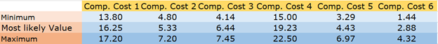
Let’s suppose that the decision to implement an important investment project is in our hands. The project has six cost components: international tradable goods, local tradable goods, labor, equipment and machinery, land acquisition, taxes, and financial costs. The sum of these components results in the final cost of the project.
Our first task is to obtain an estimate of the most likely value of each of these costs. Table 1 shows the most likely values for each cost component. The corresponding total cost is 54.56 MM U$S.

Of course, if we are absolutely certain of the accuracy of our cost calculations, the only remaining task is to sum the six components to show the final cost. But this situation rarely arises in practice when the project is of a certain size. In a real project, every component will show a certain degree of randomness, and we must perform a risk analysis to quantify the probability of undesirable outcomes.
In the absence of rigorous data, it is customary to use a triangular distribution as a rough approximation of the unknown input distributions. The triangular distribution depends only on three parameters: the minimum (a), the most likely ©, and the maximum (b). The distribution is simple, flexible, and it can assume a variety of shapes.
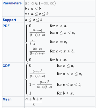
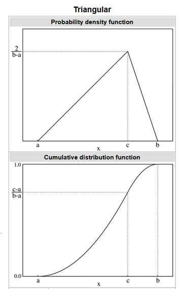
Table 2 shows the value of the parameters for each cost component.
Python code for a MCS
The following Python code allows us to develop an MCS with a statistic summary and a frequency histogram:
First, we imported the Numpy library as np, Scipy for some statistics calculations, and Matplotlib and PrettyTable for the final outputs.
@author: darwt
"""
# Import Modulesimport numpy as npfrom scipy import stats
from scipy.stats import sem
from scipy.stats import percentileofscoreimport matplotlib.pyplot as plt
from prettytable import PrettyTable
your_path = your path The three following lists describe the parameters for the triangular distribution:
minimum   = [13.80, 4.80, 4.14, 15.00, 3.29, 1.44]
most_like = [16.25, 5.33, 6.44, 19.23, 4.43, 2.88]
maximum   = [17.20, 7.20, 7.45, 22.50, 6.97, 4.32]
Sum_most_like = sum(most_like)
Number_of_Component_Costs = 6To obtain valid results with an MCS, we need to make a very large number of replications. We also defined the level of confidence for our Confidence Interval (CI).
Number_of_Replications = 3000confidence = 0.95The logic behind the MCS is described in the following lines of code:
list_of_costs = []
for run in range(Number_of_Replications):
    acum_cost = 0
    for i in range(Number_of_Component_Costs):
        cost = np.random.triangular(minimum[i],
                                    most_like[i],  maximum[i], 1)
        acum_cost +=cost

    Total_Cost = round(float(acum_cost),1)

    list_of_costs.append(Total_Cost)
We used Numpy and Scipy to obtain a summary of key descriptive statistical measures, particularly a Percentile Table.
media = round(np.mean(list_of_costs),2)
stand = round(np.std(list_of_costs),2)
var   = round(np.var(list_of_costs),2)
std_error = round(sem(list_of_costs),2)
median = round(np.median(list_of_costs),2)
skew = round(stats.skew(list_of_costs),2)
kurt = round(stats.kurtosis(list_of_costs),2)dof = Number_of_Replications - 1
t_crit = np.abs(stats.t.ppf((1-confidence)/2,dof))half_width = round(stand *t_crit/np.sqrt(Number_of_Replications),2)
inf = media - half_width
sup = media + half_width
inf = round(float(inf),2)
sup = round(float(sup),2)t = PrettyTable(['Statistic', 'Value'])
t.add_row(['Trials', Number_of_Replications])
t.add_row(['Mean', media])
t.add_row(['Median', median])
t.add_row(['Variance', var])
t.add_row(['Stand Dev', stand])
t.add_row(['Skewness', skew])
t.add_row(['Kurtosis', kurt])
t.add_row(['Half Width', half_width])
t.add_row(['CI inf', inf])
t.add_row(['CI sup', sup])
print(t)percents = np.percentile(list_of_costs,[10, 20, 30, 40, 50,
60, 70, 80, 90, 100])p = PrettyTable(['Percentile (%)', 'Cost'])
p.add_row([' 10 ', percents[0]])
p.add_row([' 20 ', percents[1]])
p.add_row([' 30 ', percents[2]])
p.add_row([' 40 ', percents[3]])
p.add_row([' 50 ', percents[4]])
p.add_row([' 60 ', percents[5]])
p.add_row([' 70 ', percents[6]])
p.add_row([' 80 ', percents[7]])
p.add_row([' 90 ', percents[8]])
p.add_row([' 100 ', percents[9]])
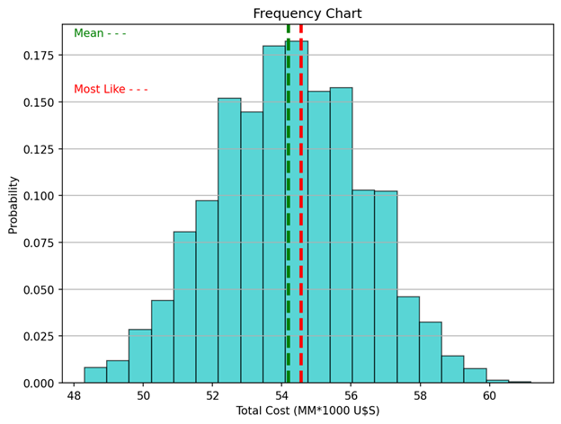
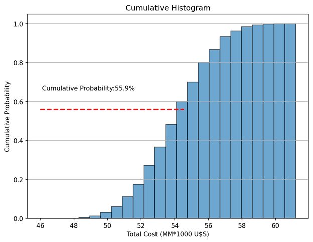
print(p)Finally, we draw two charts: a histogram of the outcome variable (Total Cost) including a green vertical line indicating the media, and another vertical line (in red) indicating the most likely value. The second chart is a cumulative histogram indicating the probability that the final cost will be lower than the most likely value.
percentile_of_most_like = round(percentileofscore(list_of_costs, Sum_most_like),2)n_bins = 20fig, ax = plt.subplots(figsize=(8, 6))
ax.hist(list_of_costs, histtype ='bar', bins=20, color = 'c',
edgecolor='k', alpha=0.65,
density = True) # density=False show countsax.axvline(media, color='g', linestyle='dashed', linewidth=3)
ax.axvline(Sum_most_like, color='r',
linestyle='dashed', linewidth=3)
ax.text(48,0.185, 'Mean - - -', color = 'green' )
ax.text(48,0.155, 'Most Like - - -', color = 'red' )ax.set_title('Frequency Chart')
ax.set_ylabel('Probability')
ax.set_xlabel('Total Cost (MM*1000 U$S)')
ax.grid(axis = 'y')plt.show()fig, ax = plt.subplots(figsize=(8, 6))
n, bins, patches = ax.hist(list_of_costs, n_bins,
density=True, histtype='bar',
cumulative=True, edgecolor='k',
alpha = 0.65)
ax.hlines(percentile_of_most_like/100, 46, Sum_most_like,
color='r', linestyle='dashed', linewidth=2)
ax.text(46 + 0.1, percentile_of_most_like/100 + 0.1,
'Cumulative Probability:' + str(percentile_of_most_like) +'%',rotation=360)ax.set_title('Cumulative Histogram')
ax.set_ylabel('Cumulative Probability')
ax.set_xlabel('Total Cost (MM*1000 U$S)')
ax.grid(axis = 'y')plt.show()Analysis
We made 3000 replications appending the total cost of each replication to a list (list_of_costs.append(Total_Cost). Then, we calculated the key descriptive statistical measures:
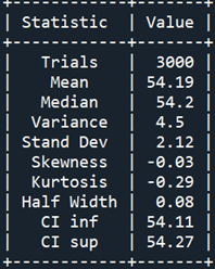
Table 3 shows that the mean and the median have practically the same value, the half-width interval is almost negligible, and the distribution has zero skewness and almost zero kurtosis.
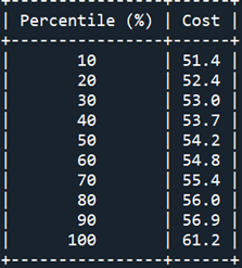
Table 4 shows the Percentile Report. We see that the chance that the total cost will be less than 53.0 MM U$S is equal to or less than 30%.
Figure 1 shows the distribution of our outcome (Total Cost) as a histogram with 20 bins. The mean cost and the most likely one are indicated with green and red vertical lines respectively. Remember that a histogram provides a visual representation of the distribution of a dataset: location, spread, skewness, and kurtosis of the data. Clearly, the appearance of the distribution matches the values indicated in the Statistic Report.
Questions involving risk can be answered with a cumulative histogram (Fig. 2). The red horizontal line corresponds to the percentile of the most likely value. There is a 44.1% (100–55.9) probability that our forecasted costs will be exceeded. Now, we can numerically assess the risk associated with our investment project.
Properly developed, a Monte Carlo Simulation is a relatively simple numerical technique that allows a risk analysis to be performed on highly challenging projects.
Don’t forget to tip the author, particularly if you add this article to a list.