
8 Tweaks To Beautify Your Slides So That You Seem More Badass
Lessons from an ex-McKinsey management consultant
Have you ever struggled to get your slides to be “just right”?
While others appear to create beautiful slides with minimal effort?
Pretty slides do justice to your message. They help emphasize what’s important. But it can be such a time drag. I used to spend hours and hours before I figured out which edits work and which edits don’t.
Improve yours today with these 8 design tweaks:
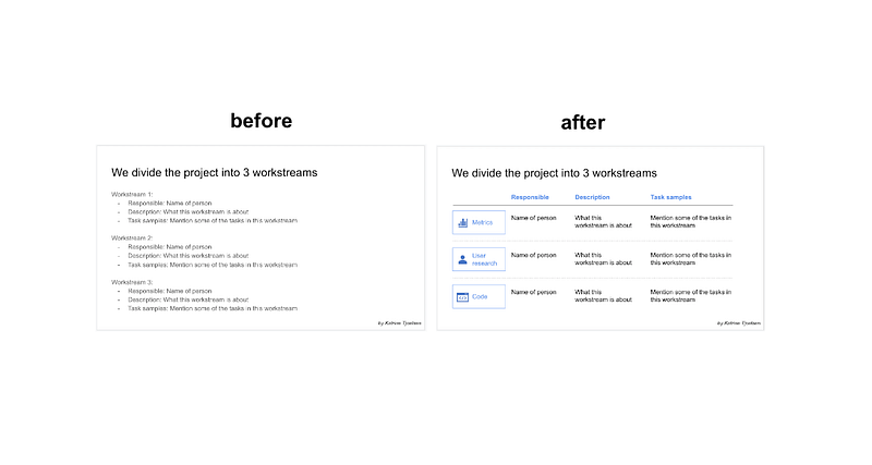
1. Turn lists into tables (when appropriate)
Ever created slides that are dumps of text? Look for opportunities to structure the information into a table instead
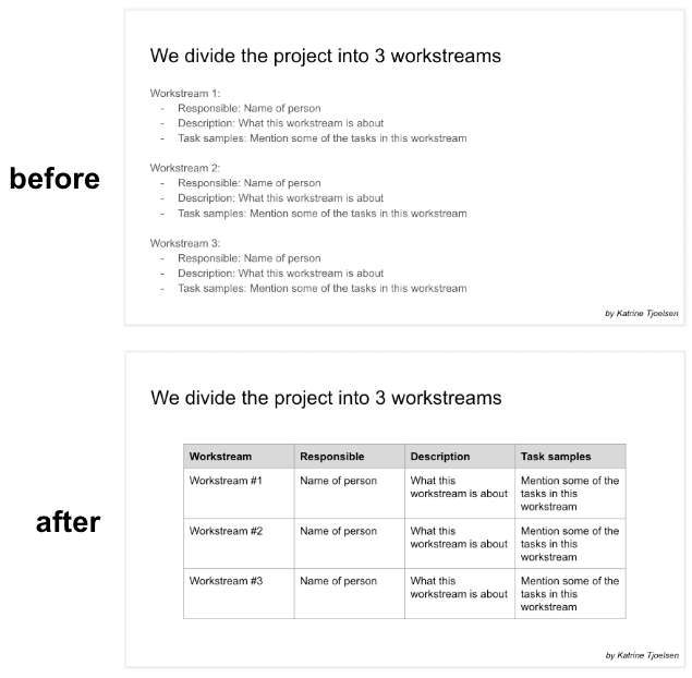
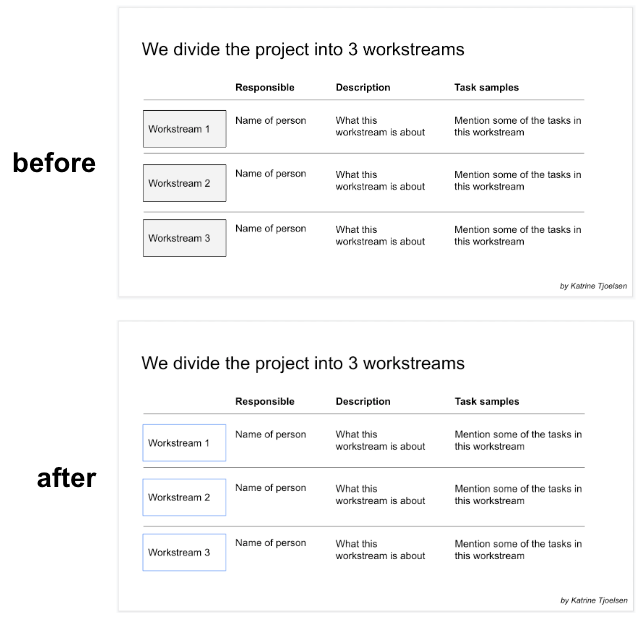
2. Create your own tables with lines and text boxes for ultimate creative control
Like this:
While this first iteration of our custom table doesn’t look beautiful, we’ll now use our tweaks to improve it.
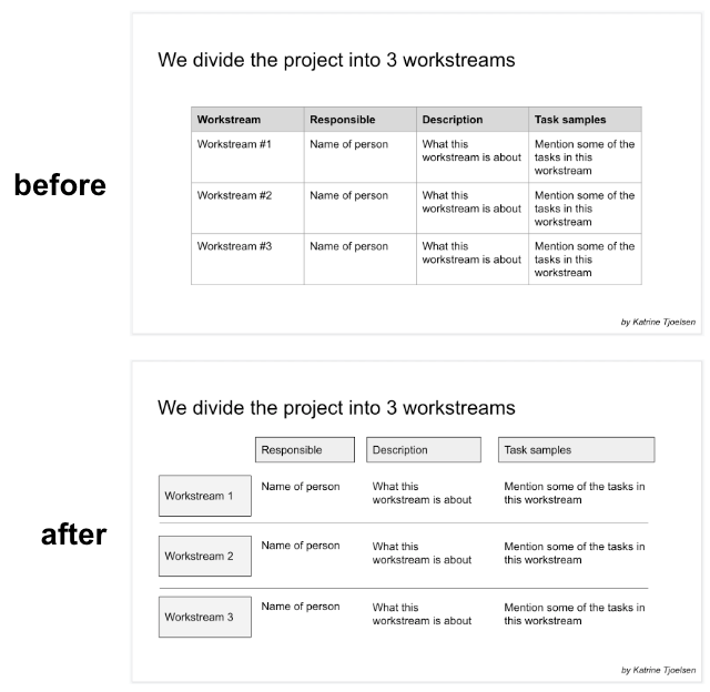
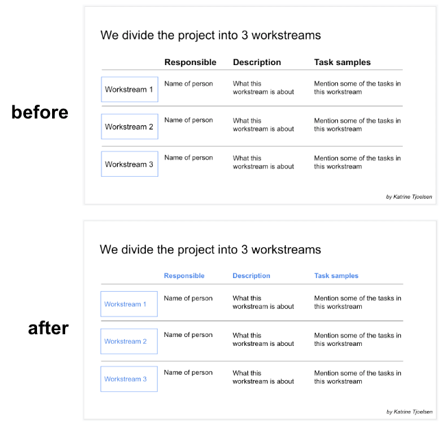
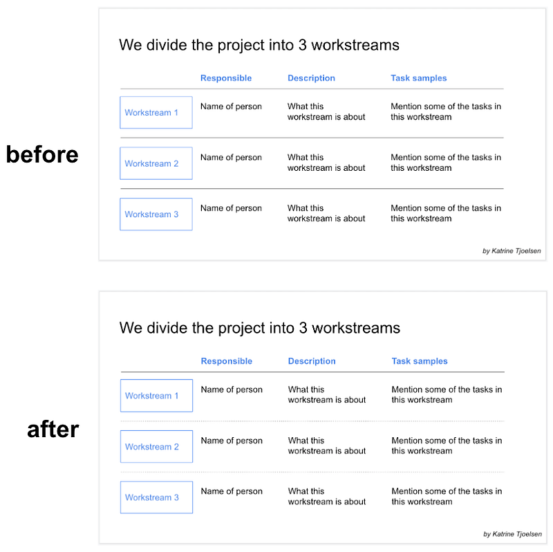
3. Use lines, not boxes, for column headers
And bold the column headers. Look how much cleaner this looks?
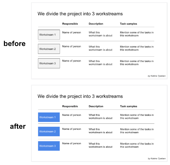
4. Don’t do gray borders on light gray boxes
Instead, try removing the fill color and giving the border a different color:
Another twist is to give the box a color (with no border) and make the text white:
5. Use color for emphasis instead of using font size
Different font sizes can get messy, although they’re sometimes appropriate.
I prefer to make all the text the same size, and use color instead for emphasis:
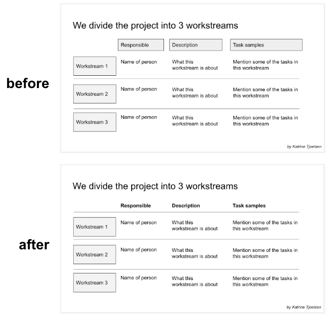
6. Align and distribute all content
As we’re working, text boxes inevitably end up misaligned and unevenly spaced.
And it looks more professional when it’s sorted:
How to align in Google Slides
- Select all items in a row, then click Arrange → Align → Top.
- And select all items in a column, then click Arrange → Align → Left.
How to distribute items evenly vertically in Google Slides
- Select all items in a row, then click Arrange → Group. Do this for each row.
- Then select all relevant rows and click Arrange → Distribute → Vertically
7. Make divider lines dotted instead of solid
This removes a distraction from the content (the divider lines) and creates a distinction between the divider lines and the header line.
8. Liven it up with icons
A few, relevant, well-placed icons make the slide pop.
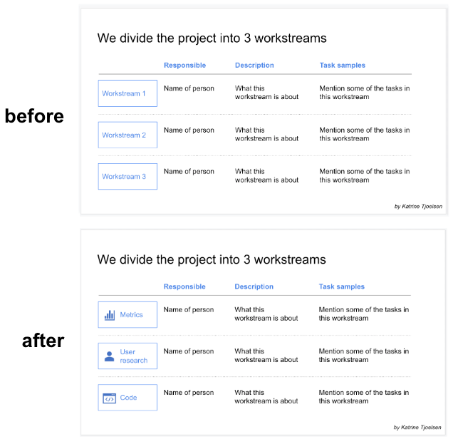
If you’re using Microsoft PowerPoint, you can add icons in seconds by clicking Insert → Icons.
Now go make kickass slides for your next presentation 🚀