
8 Powerful Python Libraries to Create Block Diagrams and Flowcharts
From Simple Charts to Complex Diagrams: Python Libraries You Need

In this article, we have gathered 8 different Python libraries that can generate block diagrams 📊 and flowcharts based on provided data.
The data we are using comes from a fictional clothing brand, Syntra , where we demonstrate the steps of web scraping for Syntra . We have applied these steps in our Python libraries to showcase how flowcharts and block diagrams would look, helping you get familiar with these hidden gems . Each Python library we have used is distinct, effective, and simple to use for data scientists and data analysts 📈. These libraries can be incorporated into your daily workflow, and with just a few simple steps, you can generate any flowchart or block diagram you need . These libraries will help you achieve your goal with ease.
data = {
    'Determine the Target Data'
    'Examine the Webpage Structure'
    'Select a Web Scraping Tool'
    'Prepare Your Development Setup'
    'Retrieve the Webpage Source'
    'Parse and Extract the Desired Information'
    'Manage Pagination for Multiple Pages'
    'Save the Extracted Data'
    'Follow the Website’s Robots.txt Guidelines'
    'Implement Error Management and Rate Limiting'
}
1. We Tried Cairo for Flowcharts and Block Diagrams — Here’s How It Looks!
The flowchart we have generated below using Cairo is kind of monotonous in color, with vertically placed horizontal blue rectangles linked with bars to each other.
If you are looking for something like this for your project, then Cairo is the way to go.
What I have experienced with Cairo is that it saves a lot of time. Instead of sitting and drawing everything manually, I was able to accomplish it with just a simple line of code.
Plus, Cairo gives us the option to save the output in multiple formats such as PDF, PNG, JPG, and SVG. By making a few changes in the code, we can further modify the flowchart according to our preferences, such as changing the shapes, colors, and fonts. For example, we have defined the dimensions of the boxes here.
Dimensions for boxes Box width = 300 Box height = 40 x margin = 50 y margin = 50 y pos = y margin
import cairo
from PIL import Image
# Define the process steps
steps = [
"Determine the Target Data",
"Examine the Webpage Structure",
"Select a Web Scraping Tool",
"Prepare Your Development Setup",
"Retrieve the Webpage Source",
"Parse and Extract the Desired Information",
"Manage Pagination for Multiple Pages",
"Save the Extracted Data",
"Follow the Website's Robots.txt Guidelines",
"Implement Error Management and Rate Limiting"
]# Set image dimensions and scaling
DPI = 300
scale_factor = DPI / 72.0
WIDTH, HEIGHT = 800 * scale_factor, 1000 * scale_factor# Create the Cairo surface and context
surface = cairo.ImageSurface(cairo.FORMAT_ARGB32, int(WIDTH), int(HEIGHT))
context = cairo.Context(surface)
context.scale(scale_factor, scale_factor)# Drawing styles
context.set_line_width(1.5)
context.set_font_size(10)# Box dimensions and position
box_width, box_height = 300, 40
x_margin, y_margin = 50, 50
y_pos = y_margin# Define monotone blue color for boxes
blue_color = (0.2, 0.4, 0.8)# Loop to draw steps as boxes
for step in steps:
context.set_source_rgb(*blue_color)
context.rectangle(x_margin, y_pos, box_width, box_height)
context.fill()# Add text inside the rectangle (White text)
context.set_source_rgb(1, 1, 1)
context.move_to(x_margin + 10, y_pos + box_height / 2 + 4)
context.show_text(step)y_pos += box_height + 20# Add arrows between the boxes
context.set_source_rgb(0, 0, 0)
for i in range(len(steps) - 1):
start_x = x_margin + box_width / 2
start_y = y_margin + box_height + i * (box_height + 20)
end_y = start_y + 20
context.move_to(start_x, start_y)
context.line_to(start_x, end_y)
context.stroke()# Save and display the image
surface.write_to_png("web_scraping_flowchart.png")
Image.open("web_scraping_flowchart.png").show()
Here’s another one, generated after making a few changes in the code section.

2. Why Is Waffle the Best Choice for Color-Coded Data Visualization in Flowcharts?
Waffle is another great algorithm visualization tool for Python, perfect for creating flowcharts and block diagrams, as you can see in the image below. The flowchart we generated displays data in a color-coded format. Each color is associated with a specific step, and the next box contains a description of that step.
This color-coded grid pattern is a clear way to represent decision-making processes which is commonly used in education, medicine, and machine learning projects.
the graph can be useful for showcasing work progress with different shades of color to indicate stages, and it’s even valuable in the finance field.
What I am experiencing here: Instead of expressing work progress in words or graphs, with just a few steps, we can visualize it using colors — for example, darker colors can represent harder work.
Waffle is also resizable and adjustable in shape, size, and orientation (both vertical and horizontal). If you are looking for a powerful tool for data visualization, Waffle is an excellent choice.
!pip install matplotlib pywaffle

# Import libraries
from pywaffle import Waffle
import matplotlib.pyplot as plt

# Define the process steps
data = {
    "Determine the Target Data": 10,
    "Examine the Webpage Structure": 10,
    "Select a Web Scraping Tool": 10,
    "Prepare Your Development Setup": 10,
    "Retrieve the Webpage Source": 10,
    "Parse and Extract the Desired Information": 10,
    "Manage Pagination for Multiple Pages": 10,
    "Save the Extracted Data": 10,
    "Follow the Website's Robots.txt Guidelines": 10,
    "Implement Error Management and Rate Limiting": 10,
}

# Create a Waffle chart using a single subplot (simplified version)
fig = plt.figure(
    FigureClass=Waffle,
    values=data,
    labels=[f"{key}" for key in data.keys()],
    rows=5,
    figsize=(15, 8),
    legend={
        'loc': 'upper left',
        'bbox_to_anchor': (1.05, 1),
        'fontsize': 8
    },
    starting_location='NW',
    block_arranging_style='snake'
)

# Add title
plt.title("Web Scraping Process with Waffle", fontsize=16)

# Display the plot
plt.show()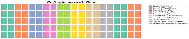
Here is another PNG we generated while making some changes in the code below.

3. Seaborn Isn’t Meant for Flowcharts — But We Gave It a Try!
Seaborn is one popular library for data visualization, well-known for representing data in high-quality graphical formats. The image below showcases the data with a high-quality graphical representation.
While Seaborn is not typically used for block diagrams and flowcharts, we have tried to use it here for a flowchart. Technically, Seaborn is used for high-quality graphical documentation with minimal code, producing outstanding results.
Matplotlib played a crucial role here. As you can see in the code section, Matplotlib enhances the customization options for Seaborn. Seaborn adds color schemes, while Matplotlib allows for size adjustments, such as setting the figure size (plt.figure(figsize=(10, 6))) and adding titles with font size customization (e.g., "Web Scraping Process with Seaborn").
In conclusion, Seaborn can be used for flowcharts and block diagrams, but its level of customization depends on Matplotlib.
!pip install seaborn matplotlib

# Import libraries
import seaborn as sns
import matplotlib.pyplot as plt
import pandas as pd

# Define the process steps as a DataFrame
data = {
    "Step": [
        "Determine the Target Data",
        "Examine the Webpage Structure",
        "Select a Web Scraping Tool",
        "Prepare Your Development Setup",
        "Retrieve the Webpage Source",
        "Parse and Extract the Desired Information",
        "Manage Pagination for Multiple Pages",
        "Save the Extracted Data",
        "Follow the Website's Robots.txt Guidelines",
        "Implement Error Management and Rate Limiting",
    ],
    "Weight": [10] * 10,  # Assign equal weight for each step
}

df = pd.DataFrame(data)

# Create a horizontal bar plot
plt.figure(figsize=(10, 6))
sns.barplot(
    data=df,
    x="Weight",
    y="Step",
    palette="viridis",
    orient="h"
)

# Add labels and title
plt.title("Web Scraping Process with Seaborn", fontsize=16)
plt.xlabel("Weight", fontsize=12)
plt.ylabel("Steps", fontsize=12)
plt.grid(axis="x", linestyle="--", alpha=0.7)
plt.tight_layout()

# Display the plot
plt.show()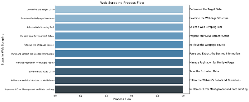
4. Did You Know Plotly Can Be Useful for Block Diagrams and Flowcharts?
The data you can see below is plotted in a pattern, with an inclined line and fine dots, and each step is named from top to bottom, leading towards the final steps. Plotly is a library used to plot data on various charts, and it is extremely useful for data scientists and analysts in data visualization. It can mark real-time progress in analysis across various fields.
For example, Plotly can be helpful for guiding the next project strategy for your client by visualizing it on a drawing page, which can then be exported in PDF, PNG, or other formats (e.g., Data Cleaning → Feature Engineering → Model Training → Model Deployment). This makes it easier for the client to outline the project plan. With a few simple changes, you can even make the plot clickable, hoverable, and animated, adding extra interactivity.
import plotly.graph_objects as go

# Define the steps in the web scraping process
steps = [
    'Determine the Target Data',
    'Examine the Webpage Structure',
    'Select a Web Scraping Tool',
    'Prepare Your Development Setup',
    'Retrieve the Webpage Source',
    'Parse and Extract the Desired Information',
    'Manage Pagination for Multiple Pages',
    'Save the Extracted Data',
    'Follow the Website’s Robots.txt Guidelines',
    'Implement Error Management and Rate Limiting'
]

# Define the coordinates for plotting (x, y positions for each step)
x_coords = [0, 1, 2, 3, 4, 5, 6, 7, 8, 9]
y_coords = [9, 8, 7, 6, 5, 4, 3, 2, 1, 0]

# Create a scatter plot to represent the flowchart
fig = go.Figure()

# Add steps as scatter points
fig.add_trace(go.Scatter(
    x=x_coords,
    y=y_coords,
    mode='markers+text',
    text=steps,
    textposition='top center',
    marker=dict(size=12, color='blue', symbol='circle'),
))

# Add arrows to simulate connections between steps (creating the flow)
for i in range(len(x_coords) - 1):
    fig.add_trace(go.Scatter(
        x=[x_coords[i], x_coords[i + 1]],
        y=[y_coords[i], y_coords[i + 1]],
        mode='lines+text',
        line=dict(color='gray', width=2, dash='dot'),
        showlegend=False
    ))

# Update layout for better visuals
fig.update_layout(
    title='Web Scraping Process Flowchart',
    showlegend=False,
    xaxis=dict(showgrid=False, zeroline=False),
    yaxis=dict(showgrid=False, zeroline=False),
    plot_bgcolor='white',
    height=600,
)

# Show the figure
fig.show()
5. It Was Difficult, But We Still Tried Creating a Block Diagram in Matplotlib
The image below is generated using Matplotlib, which is primarily designed for 2-dimensional plotting. While it is not specifically meant for creating flowcharts and block diagrams, it is excellent for plotting data and works well for specialized documentation and research, generating high-quality data graphs, similar to Plotly.
We have tried to demonstrate its capabilities here. You can see nodes connected with bars, where each node represents a step in the flow.
However, what I observed here is that it can be challenging to identify the exact path. Although we can infer that the higher nodes might represent the start and the lower nodes might indicate the end, this limitation arises because Matplotlib is better suited for graph-based layouts rather than flow-based representations.
While Matplotlib offers full customization, but it is better suited for graph visualizations. In the case of block diagrams, we’ve used different code to achieve a clearer result.
import matplotlib.pyplot as plt
import networkx as nx

# Define the steps and connections between them
steps = [
    'Determine the Target Data',
    'Examine the Webpage Structure',
    'Select a Web Scraping Tool',
    'Prepare Your Development Setup',
    'Retrieve the Webpage Source',
    'Parse and Extract the Desired Information',
    'Manage Pagination for Multiple Pages',
    'Save the Extracted Data',
    'Follow the Website’s Robots.txt Guidelines',
    'Implement Error Management and Rate Limiting'
]

# Create a directed graph
G = nx.DiGraph()

# Add nodes (steps)
for step in steps:
    G.add_node(step)

# Define the flow (edges)
edges = [
    ('Determine the Target Data', 'Examine the Webpage Structure'),
    ('Examine the Webpage Structure', 'Select a Web Scraping Tool'),
    ('Select a Web Scraping Tool', 'Prepare Your Development Setup'),
    ('Prepare Your Development Setup', 'Retrieve the Webpage Source'),
    ('Retrieve the Webpage Source', 'Parse and Extract the Desired Information'),
    ('Parse and Extract the Desired Information', 'Manage Pagination for Multiple Pages'),
    ('Manage Pagination for Multiple Pages', 'Save the Extracted Data'),
    ('Save the Extracted Data', 'Follow the Website’s Robots.txt Guidelines'),
    ('Follow the Website’s Robots.txt Guidelines', 'Implement Error Management and Rate Limiting')
]

# Add edges (flow between steps)
G.add_edges_from(edges)

# Set up the layout of the graph
pos = nx.spring_layout(G, seed=42)

# Create the plot
plt.figure(figsize=(10, 8))

# Draw the nodes and labels
nx.draw_networkx_nodes(G, pos, node_size=2000, node_color='skyblue')
nx.draw_networkx_labels(G, pos, font_size=10, font_weight='bold', font_color='black')

# Draw the edges with arrows
nx.draw_networkx_edges(G, pos, edgelist=edges, width=2, edge_color='gray', arrowstyle='->', arrowsize=20)

# Add title and adjust plot
plt.title("Web Scraping Process Flowchart", fontsize=16)
plt.axis('off')  # Hide axes

# Save the plot as an image
plt.savefig('/content/web_scraping_flowchart_matplotlib.png')

# Display the plot
plt.show()

# Provide the image path for download
print("Flowchart image saved at /content/web_scraping_flowchart_matplotlib.png")
6.Why Is Graphviz Called the King of Flowcharts and Block Diagrams?
Graphviz can be considered a great library in Python for creating block diagrams and flowcharts.
The image below was generated using Graphviz. It features vertically placed horizontal elliptical circles with clear, readable information.
We simply inserted the data for the web scraping steps and applied some logic to connect each block using dot.edge(steps[i], steps[i + 1]). We also adjusted the blocks according to the keywords within them and set the layout from left to right using dot.attr(rankdir='LR'). This process gave us a clean block diagram that is useful for documentation, decision-making, flowcharts, and more.
from graphviz import Digraph

# Data for the web scraping steps
data = {
    'Determine the Target Data': 1,
    'Examine the Webpage Structure': 1,
    'Select a Web Scraping Tool': 1,
    'Prepare Your Development Setup': 1,
    'Retrieve the Webpage Source': 1,
    'Parse and Extract the Desired Information': 1,
    'Manage Pagination for Multiple Pages': 1,
    'Save the Extracted Data': 1,
    'Follow the Website\'s Robots.txt Guidelines': 1,
    'Implement Error Management and Rate Limiting': 1
}

# Create a Digraph object
dot = Digraph(format='png')
dot.attr(rankdir='LR')  # Layout direction (Left-to-Right)

# Add nodes for each step in the web scraping process
for step in data:
    dot.node(step, step)

# Create edges between nodes to represent the order of tasks
steps = list(data.keys())
for i in range(len(steps) - 1):
    dot.edge(steps[i], steps[i + 1])

# Render and display the diagram
dot.render('web_scraping_process', view=False)

from IPython.display import Image
Image(filename='web_scraping_process.png')
7. How Is PyDot’s Code for Vertical Diagrams Heavily Inspired by Graphviz?
The block diagram we have generated below is simple and easy to understand. As you can see, the elliptical shapes are connected one by one in a vertical structure, similar to what we achieved with Graphviz. This is because PyDot is a Python interface to Graphviz and heavily relies on the Graphviz tool.
We used the same input that we used for the other libraries, encoded them, and generated a straightforward, though somewhat monotonous, vertical flow block diagram. However, we can make adjustments in the code.
For example, if we need a horizontal layout instead of vertical, we can easily make that change as well.
import pydot
from IPython.display import Image

# Data for the web scraping steps
data = {
    'Determine the Target Data': 1,
    'Examine the Webpage Structure': 1,
    'Select a Web Scraping Tool': 1,
    'Prepare Your Development Setup': 1,
    'Retrieve the Webpage Source': 1,
    'Parse and Extract the Desired Information': 1,
    'Manage Pagination for Multiple Pages': 1,
    'Save the Extracted Data': 1,
    'Follow the Website\'s Robots.txt Guidelines': 1,
    'Implement Error Management and Rate Limiting': 1
}

# Create a PyDot graph object
graph = pydot.Dot(graph_type='digraph', rankdir='TB')  # 'TB' for top-to-bottom (vertical layout)

# Add nodes for each step in the web scraping process
for step in data:
    graph.add_node(pydot.Node(step, label=step))

# Create edges between nodes to represent the order of tasks
steps = list(data.keys())
for i in range(len(steps) - 1):
    graph.add_edge(pydot Edge(steps[i], steps[i + 1]))

# Render the graph to a PNG image
graph.set_graph_defaults(size="10,15")  # Make the output taller
graph.write_png("web_scraping_process_pydot_vertical.png")

# Display the image
Image(filename='web_scraping_process_pydot_vertical.png')
8. Can NetworkX Be Used for Flowcharts and Block Diagrams?
The flowchart below was generated using NetworkX, where each step is demonstrated as a node connected to one another, moving downward to indicate the final step.
With NetworkX, you can generate various forms of flowcharts, including directed, undirected, or even nodes with multiple directions.
So, if you’re looking for a way to direct your block diagram in node form for client projects, NetworkX can be a great option.
import networkx as nx
import matplotlib.pyplot as plt

# Data for the web scraping steps
data = {
    'Determine the Target Data': 1,
    'Examine the Webpage Structure': 1,
    'Select a Web Scraping Tool': 1,
    'Prepare Your Development Setup': 1,
    'Retrieve the Webpage Source': 1,
    'Parse and Extract the Desired Information': 1,
    'Manage Pagination for Multiple Pages': 1,
    'Save the Extracted Data': 1,
    'Follow the Website\'s Robots.txt Guidelines': 1,
    'Implement Error Management and Rate Limiting': 1
}

# Create a directed graph
G = nx.DiGraph()

# Add nodes and edges to the graph
steps = list(data.keys())
G.add_nodes_from(steps)
for i in range(len(steps) - 1):
    G.add_edge(steps[i], steps[i + 1])

# Set positions for nodes to make it vertical
pos = {node: (0, -i) for i, node in enumerate(steps)}

# Draw the graph
plt.figure(figsize=(10, 15))  # Adjust the figure size for better visibility
nx.draw(
    G,
    pos,
    with_labels=True,
    node_size=5000,
    node_color='lightblue',
    font_size=10,
    font_color='black',
    font_weight='bold',
    arrowsize=20
)

# Show the graph
plt.title("Web Scraping Process (Vertical Flow)", fontsize=16)
plt.axis("off")
plt.show()
9. FusionCharts Python

FusionCharts Python is an interesting case because, despite its name, it is not actually a Python library. Instead, it is a Java library. However, there is a strong connection between this Java library and Python, especially for tasks like designing web dashboards, which makes the process easier by significantly reducing the amount of Java code required.
The GIF I have added here was generated using code that actually integrates HTML and Java data. We used the same input data from the web scraping process for Syntra, the fictional clothing brand, to generate the diagram and flowchart you see below. I’ve included one of the images here as an example.
To run the code below, we used Notebook++.
# HTML + JavaScript code to render FusionCharts Sankey Chart
html_code = """
<!DOCTYPE html>
<html lang="en">
<head>
    <meta charset="UTF-8">
    <meta name="viewport" content="width=device-width, initial-scale=1.0">
    <title>Web Scraping Flowchart</title>
    <script src="https://cdn.fusioncharts.com/fusioncharts/latest/fusioncharts.js"></script>
    <script src="https://cdn.fusioncharts.com/fusioncharts/latest/fusioncharts.theme.fusion.js"></script>
</head>
<body>
    <div id="chart-container">Loading chart...</div>
<script type="text/javascript">
const chartData = {
chart: {
caption: "Web Scraping Steps",
subcaption: "Step-by-Step Flowchart",
theme: "fusion"
},
nodes: [
{"id": "A", "label": "Determine the Target Data"},
{"id": "B", "label": "Examine the Webpage Structure"},
{"id": "C", "label": "Select a Web Scraping Tool"},
{"id": "D", "label": "Prepare Your Development Setup"},
{"id": "E", "label": "Retrieve the Webpage Source"},
{"id": "F", "label": "Parse and Extract the Desired Information"},
{"id": "G", "label": "Manage Pagination for Multiple Pages"},
{"id": "H", "label": "Save the Extracted Data"},
{"id": "I", "label": "Follow the Website’s Robots.txt Guidelines"},
{"id": "J", "label": "Implement Error Management and Rate Limiting"}
],
links: [
{"from": "A", "to": "B", "value": 1},
{"from": "B", "to": "C", "value": 1},
{"from": "C", "to": "D", "value": 1},
{"from": "D", "to": "E", "value": 1},
{"from": "E", "to": "F", "value": 1},
{"from": "F", "to": "G", "value": 1},
{"from": "G", "to": "H", "value": 1},
{"from": "H", "to": "I", "value": 1},
{"from": "I", "to": "J", "value": 1}
]
}; const fusioncharts = new FusionCharts({
type: 'sankey',
renderAt: 'chart-container',
width: '100%',
height: '600',
dataFormat: 'json',
dataSource: chartData
}); fusioncharts.render();
</script>
</body>
</html>
"""# Render the HTML and JavaScript
display(HTML(html_code))
Hey there, I’m Ajay — a passionate engineer, writer on Medium, and a huge Python enthusiast. Thanks for sticking with me till the end! If you enjoyed this content and want to support my work, the best ways are:
- Drop a Clap 👋 and share your thoughts 💬 below!
- Follow me here on Medium.
- Connect with me on LinkedIn.
- Follow me on X here
- Join my email list so you never miss another article.
- And don’t forget to follow Top Python Libraries for more stories like this.
Thanks again for reading! 😊


