
How to use Heat Maps in Google Data Studio
New Feature: Using Heat Maps in Data Studio
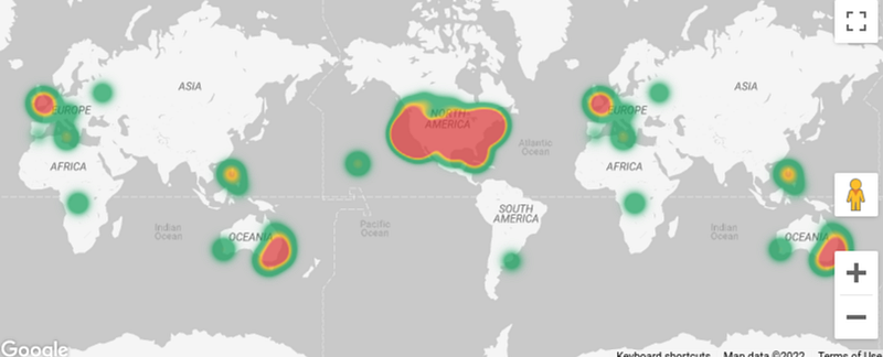
A cool new update that you might have been waiting for as long as I have. In Google Data Studio you can now use Heat Maps based on Google Maps. I think this is another fantastic update. Other BI tools have been offering this for a while. Now my favorite solution Data Studio finally gets it too. Here you can find the release [1].
Example with San Francisco Trees
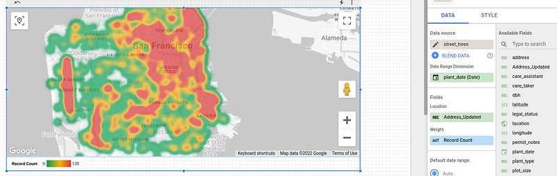
I used the San Francisco Trees public dataset as an example. If you want to try it out, you can find it here[2].
After you have added the data source in Data Studio, you can easily view a Heat Map of where most of the trees are located in San Francisco — Awesome :). Small note: I concatenated the address field with the string “San Francisco”, so the results are more accurate.
Feel free to try it out for yourself. Once again, I think this is great news from Data Studio, especially in the area of Big Data, which makes it possible to visualize large amounts of data in an easily readable way.
For more practical data visualization tips, feel free to check out this article here.
Sources and Further Readings
[1] Google, Release Notes (2022)
[2] Google, Cloud Marketplace (2022)


