
6 Visualization Tricks with Python to Handle Ultra-Long Time-Series Data
Simple ideas using a few lines of Python code to deal with a long time-series plot

Typically, a time-series plot consists of an X-axis representing the timeline and a Y-axis showing data values. This visualization is common in showing the progress of data over time. It has some benefits in extracting insight information such as trends and seasonal effects.
There is a concern when dealing with an ultra-long timeline. Even though long time-series data can be easily fitted into a plotting area using data visualization tools, the result can be messy. Let’s compare the two samples below.
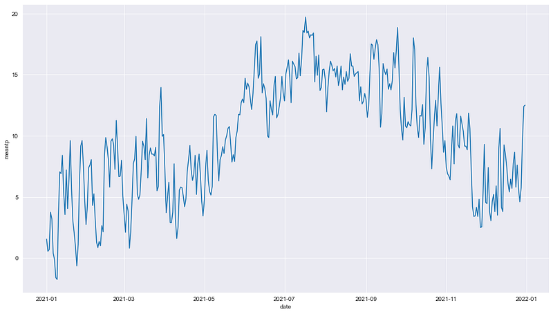
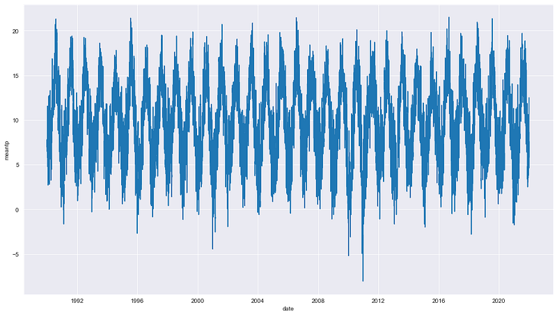
While we can see the details on the first chart, it can be noticed that the second one is too dense to read due to containing long time-series data. This has one major drawback in that some interesting data points may be hidden.
To solve the problem, this article will guide six simple techniques that help present long time-series data more efficiently.
Get Data
For example, this article will use Dublin Airport Daily Data, which contains meteorological data measured at Dublin Airport since 1942. The dataset consists of daily weather information, such as temperature, wind speed, pressure, etc.
For more information about Dublin Airport’s daily data, see the About the dataset section below.
Start with import libraries
import numpy as np
import pandas as pd
import matplotlib.pyplot as plt
import seaborn as sns
import plotly.express as px
import plotly.graph_objects as go
%matplotlib inlineRead the CSV file
df = pd.read_csv('location/file name.csv')
df['date'] = pd.to_datetime(df['date'])
df.tail()
Explore data
df.info()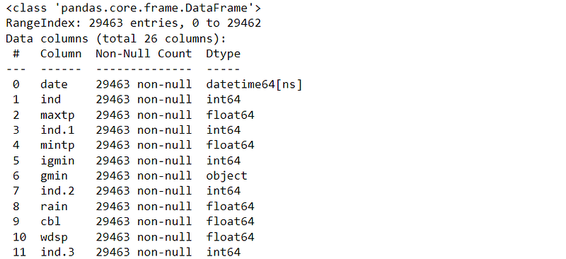
Fortunately, with a quick look, the dataset has no missing values.
Prepare data
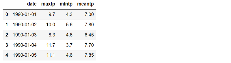
We will work with the maximum and minimum temperature data. The period used is from 1990 to 2021, which is 32 years in total. If you want to select other variables or ranges, please feel free to modify the code below.
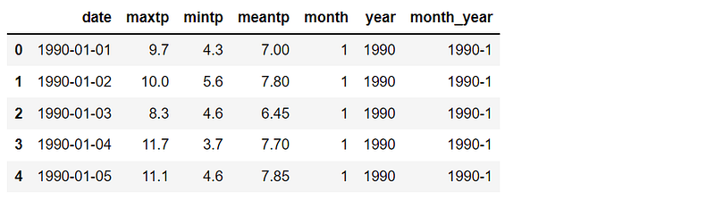
Create month, year, and month-year columns for use later.
Plot the time-series plot
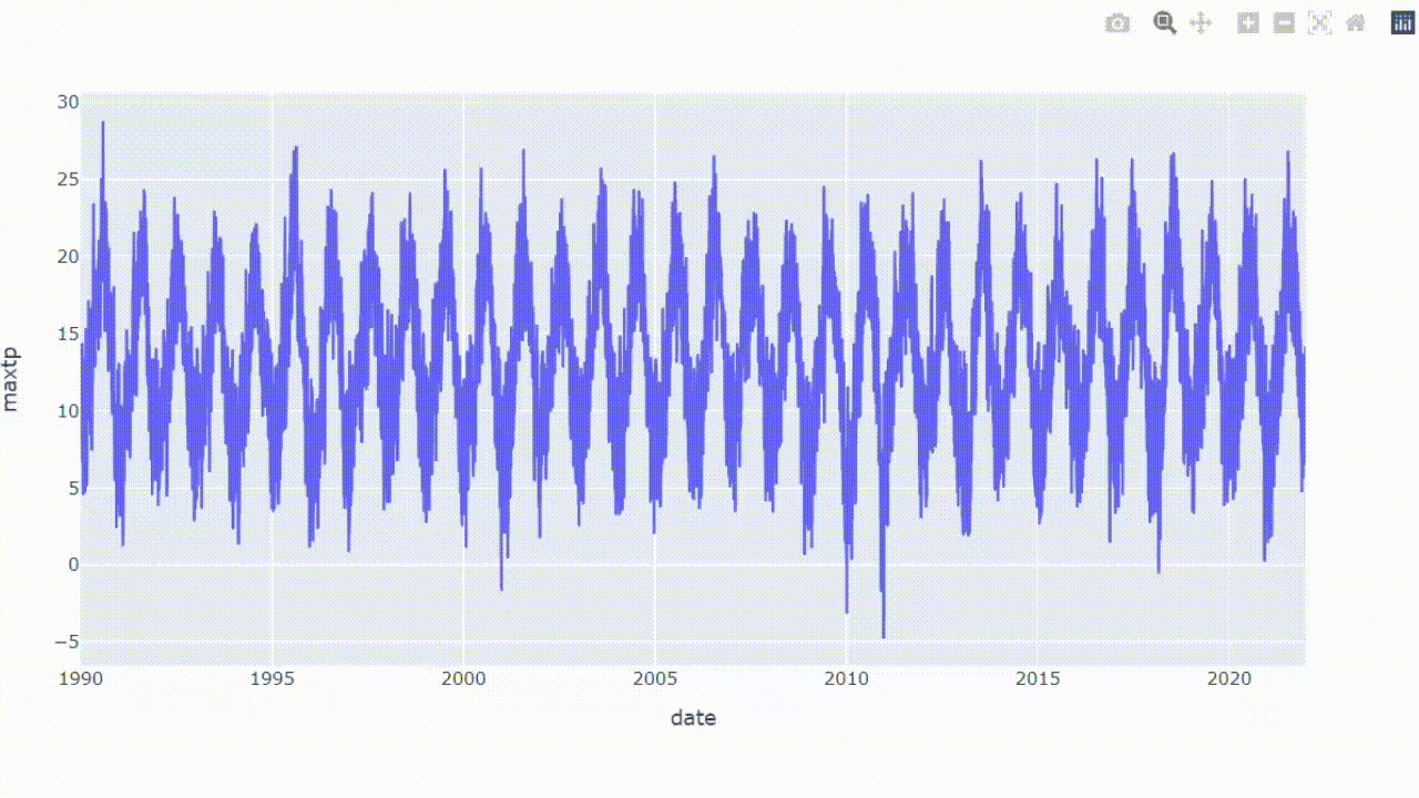
From the DataFrame, the code below shows how to plot a basic time-series plot. The result can be compared later with other visualizations in this article.
plt.figure(figsize=(16,9))
sns.set_style('darkgrid')
sns.lineplot(data=df_temp, y='meantp', x ='date')
plt.show()As previously mentioned, the obtained chart is too dense. In the next section, let’s see how we can deal with the problem.
Visualizations to handle ultra-long time-series data
6 simple tricks can be applied to present a long time-series plot:
- #1 zoom in and zoom out
- #2 focus on what matters
- #3 draw lines
- #4 use distribution
- #5 group by and apply a color scale
- #6 circle the line
Trick #1: Zoom in and zoom out
We can create an interactive chart in which the result can be zoomed in or zoomed out to see more details. This is a good idea to expand a dense area on the chart. Plotly is a helpful library that will help us create an interactive chart.
From the DataFrame we have, we can directly plot a simple interactive time-series plot with just one line of code.
px.line(df_temp, x='date', y='meantp')Voila!!
From the result, we can see the overall data while being able to zoom in on the area that we want to expand.
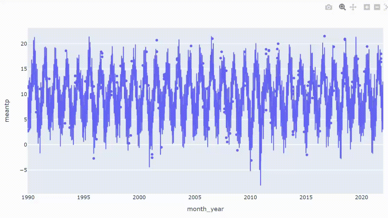
Trick #2: Focus on what matters
In case some values are needed to be paid attention to, highlighting the data points with markers can be a good solution. Adding scatters to an interactive plot has benefits in marking interesting or critical data points and zooming in to see more details.
Now let’s add scatters to the previous interactive plot. For example, we will focus on the average temperature higher and lower than 20.5°C and -5°C, respectively.
df_dot = df_temp[(df_temp['meantp']>=20.5)|(df_temp['meantp']<=-5)]fig = px.line(df_temp, x='date', y='meantp')
fig.add_trace(go.Scatter(x =df_dot.date, y=df_dot.meantp,
mode='markers',
marker=dict(color='red', size=6)))
fig.update_layout(showlegend=False)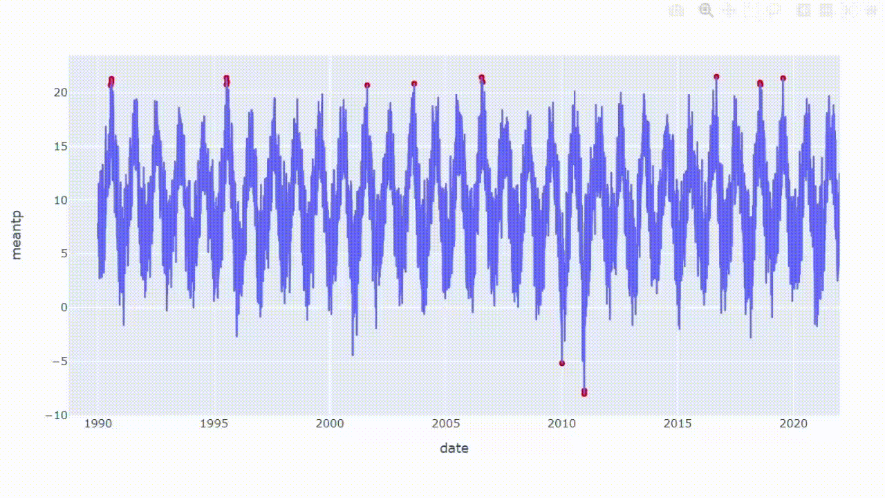
Trick #3: Draw lines
Like the previous technique, drawing lines can separate specific data values if some areas need to be focused on. For example, I will add two lines to separate the day with average temperatures higher and lower than 20.5°C and -5°C.
fig = px.line(df_temp, x='date', y='meantp')fig.add_hline(y=20, line_width=1.5,
line_dash='dash', line_color='red')
fig.add_hline(y=-5, line_width=1.5,
line_dash='dash', line_color='red')
fig.update_layout(showlegend=False)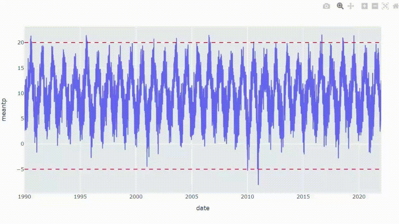
From the result, we can focus on data points above or under the lines.
Trick #4: Use distribution
A box plot is a method for demonstrating data distribution through their quartiles. The information on a box plot shows the locality, spread, and skewness. This plot is also helpful in distinguishing outliers, data points that stand out significantly from other observations.
Since the DataFrame is already prepared, we can directly plot the box plot with just one line of code.
px.box(df_temp, x='month_year', y='meantp')Trick #5: Group by and apply a color scale
Basically, this method converts a time-series plot into a heat map. The result will show the overall average monthly temperatures in which we can compare the magnitude of data by using the color scale.
To facilitate the plot, the DataFrame is needed to be converted into two dimensions. First, let’s group the DataFrame by year and month.
df_mean = df_temp.groupby(['year','month']).mean().reset_index()
df_mean.head()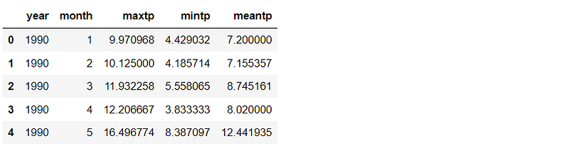
Unstack the DataFrame
df_cross = df_mean.set_index(['year','month'])['meantp'].unstack()
df_cross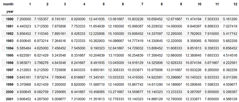
Use Plotly to plot the heat map with just one line of code.
px.imshow(df_cross, height=700, aspect='auto',
          color_continuous_scale='viridis')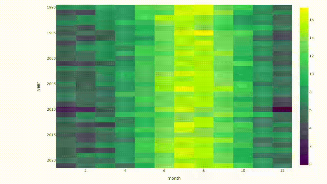
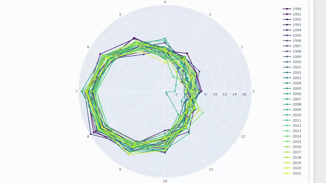
Trick #6: Circle the line
When visualizing time-series data, it’s common to think about continuous lines moving over time. By the way, we can change the point of view. These lines can be plotted in a circular graphic, like moving them on a clock. In this case, a radar chart can be a good choice.
Theoretically, a radar chart is a visualization used to compare data in the same categories. We can apply the concept by plotting the months around the circle to compare the data values at the same time of the years.
Prepare a list of months, years, and colors for use in the next step.
months = [str(i) for i in list(set(df_mean.month))] + ['1']
years = list(set(df_mean.year))
pal = list(sns.color_palette(palette='viridis',
n_colors=len(years)).as_hex())Use the for loop function to plot the lines on a radar chart.
fig = go.Figure()
for i,c in zip(years,pal):
    df = df_mean[df_mean['year']==i]
    val = list(df.meantp)*2
    fig.add_trace(go.Scatterpolar(r=val, theta=months,
                                  name=i, marker=dict(color=c)))
fig.update_layout(height=800)
Creating an interactive radar chart allows the result to be filtered, and the information can be shown by hovering the cursor over data points.
Summary
A time-series plot is a helpful chart that can extract insightful information such as trends or seasonal effects. However, showing ultra-long time-series data with a simple time-series plot can result in a messy chart due to the overlapping area.
This article has shown 6 visualization ideas to plot the long time-series data. We can make the result reader-friendly by using interactive functions and changing the point of view. Moreover, some methods also help focus on important data points.
Lastly, these methods are just some ideas. I am sure that there are other visualizations that can also be used to solve the problem. If you have any suggestions, please feel free to leave a comment.
Thanks for reading.
These are other data visualization articles that you may find interesting:
- 8 Visualizations with Python to Handle Multiple Time-Series Data (link)
- 9 Visualizations with Python that Catch More Attention than a Bar Chart (link)
- 9 Visualizations with Python to show Proportions instead of a Pie chart (link)
- Maximizing Clustering’s Scatter Plot with Python (link)
About the dataset
Dublin Airport Daily Data is retrieved from www.met.ie, copyright Met Éireann. The dataset is published under Creative Commons Attribution 4.0 International (CC BY 4.0). Disclaimer from the source: Met Éireann does not accept any liability whatsoever for any error or omission in the data, their availability, or for any loss or damage arising from their use.
Reference
Wikimedia Foundation. (2022, September 23). Time Series. Wikipedia. Retrieved September 29, 2022, from https://en.wikipedia.org/wiki/Time_series
Dublin Airport Daily Data. Data.Gov.IE. (n.d.). Retrieved September 29, 2022, from https://data.gov.ie/dataset/dublin-airport-daily-data?package_type=dataset


