
6 Things That You Probably Didn’t Know You Could Do With Pandas
Some hidden treasures of Pandas library.

With its powerful and flexible functionalities, Pandas has become an indispensable tool for data scientists and analysts.
Referring to the statistics reported by PyPI, can you imagine that Padnas receives over 3M downloads daily?
Of course, this statistic gives very little information about the number of users. Nonetheless, it does highlight its widespread popularity.
While many of its users are already aware of its fundamental features, there are still many hidden gems in pandas that you probably aren’t aware of.
Thus, in this blog, I’ll share six interesting things you can do with Pandas, that can supercharge your data analysis.
Let’s begin 🚀!
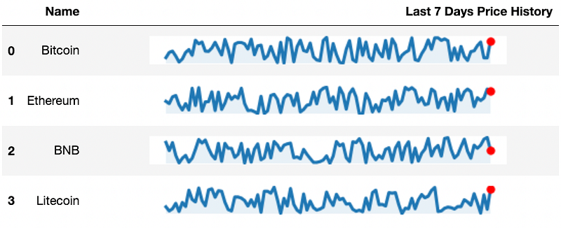
#1) Display plots in a DataFrame column
Jupyter is a web-based IDE. Thus, whenever we print a DataFrame, it is rendered using HTML and CSS.
This allows us to format the output just like any other web page.
One interesting way to format this is by embedding inline plots which appear as a column of a dataframe, also called sparklines, to get something like this:
So how to create one, you may ask? Let’s look at it below.
Let’s look at the imports first:
Next, let’s create a dummy dataset:
Corresponding to the four rows, we have a list of randomly generated price histories.
Now, our objective is to add a line plot in each row. Thus, we can create a function and use the apply() method.
Now, as mentioned above, Jupyter renders a DataFrame using HTML.
Thus, if we can figure out a way to provide some HTML as a cell’s value which refers to an image, Jupyter can render it and display the corresponding line plot.
Here’s the code which will do that for us:
While the plotting part is pretty obvious, let’s focus on what the last four lines of code (not including comments here) are meant for.
The objective is to convert the plot into an image that can be displayed on a web page.
Thus, The first line creates a new BytesIO object img. BytesIO is a class in the io module that creates an in-memory bytes buffer.
The second line saves the plot generated by matplotlib to the img object as a PNG image using the savefig method of the figure object fig.
The third line encodes the content of the img object as a base64 string using the b64encode function from the base64 module. The resulting base64 string is then decoded into a Unicode string using the decode method with the utf-8 encoding.
Finally, the last line returns an HTML <img> tag with the source attribute set to the base64-encoded image string. When this string is rendered on a web page, it will display the image generated by matplotlib.
Finally, we create the line by calling the method on each row of the dataframe.
Overall, sparklines are an excellent tool for quickly conveying trends and patterns in data, and they can be especially useful when you wish to display a lot of information in a small space.
#2) Write Your Own Flavor Of Pandas
Whenever we call an existing method on a Pandas DataFrame, say df.rename(), it’s evident that the rename() method is defined in the DataFrame class.
But what if you wish to attach a custom method to the DataFrame object, say, df.my_method(). This is totally possible.
Fortunately, Pandas is a highly customizable library, and many ways exist to extend its functionality to meet your needs.
One popular approach is to use the pandas-flavor library. It allows you to define and attach custom Pandas methods to the DataFrame object.
You can install it as follows:
Next, let’s write a custom method in a file my_pandas.py.
Now consider that you have the following DataFrame:
Finally, we can import the custom methods file my_pandas.py, and it will attach the new method to the DataFrame object:
This is super useful to streamline your Pandas workflow. With this, you can create functions tailored to your specific use case and make your data analysis tasks more efficient and intuitive.
#3) Create a DataFrame from a list of DataClass objects
A Pandas DataFrame is often created from a Python list, dictionary, by reading files, etc.
However, did you know you can also create a DataFrame from a list of Dataclass objects?
Assume you have the following dataclass Point:
Let’s create a bunch of objects from this class.
Now, if we pass this list of dataclass objects to the pd.DataFrame method, we get a DataFrame as an output:
This approach can be super useful when working with data classes, as it provides a straightforward way to create a pandas DataFrame from a collection of instances.
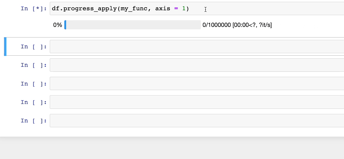
#4) Display the progress bar while applying a function using Apply()
While applying a method to a DataFrame using apply(), we don’t get to see the progress and an estimated remaining time.
However, this can be important when working with large datasets or complex operations. This is because it gets difficult to know how much longer it will take to finish.
Moreover, a progress bar can make it easier to decide whether to wait for the operation to complete or interrupt it and try a different approach.
To resolve this, instead of using the apply() method, you can use progress_apply() from tqdm.
First, integrate it with Pandas as follows:
Now, if we use df.progress_apply(), we get:
#5) Add captions to a DataFrame
When presenting data in a DataFrame, adding captions to your tables can provide additional context and make your data more understandable instead of adding markdown cells in a jupyter notebook.
With Pandas’ styling API, you can add captions to a DataFrame. Let’s look at an example below:
For instance, consider we have the following DataFrame:
Next, we invoke the set_caption() method on a DataFrame’s style accessor, as shown below:
As shown above, the DataFrame now appears with a caption.
Overall, adding captions allows us to briefly describe the DataFrame, its purpose, and any other pertinent information that can help users understand the data more quickly and easily.
#6) Format a DataFrame’s Preview
When we print a DataFrame, it appears as a collection of raw numbers (or strings).
For instance, consider the following DataFrame:
In this case, the columns of our data have some intrinsic unit of measurement, which is essential for the reader to know. But this is nowhere to be seen in the data.
Yet again, with the styling API, you can format the output preview of a DataFrame, as shown below:
Now, it is much more evident what the individual values mean, which was missing in the default preview.
Additionally, you may also explore the open-source package PrettyPandas, which extends the styler class with many more interesting utilities.
Conclusion
With this, we come to the end of this blog.
Congratulations on learning six super cool ways to supercharge your Pandas workflow.
I hope you learned something new.
Thanks for reading!
Found this blog interesting?
If you want to learn more such elegant tips and tricks about Data Science and Python, I post an informative tip daily on LinkedIn.
You can find all the tips I have posted in My LinkedIn Post Archive. You can follow me on LinkedIn to see all future posts.
Alternatively, you can also receive them via email by subscribing below:


