
6 Reasons I Love Bokeh for Data Exploration with Python
Bokeh has been around for years but I only recently really discovered it and it didn’t take long to become my favorite Python visualization library. Here’s six reasons why.

What Is Bokeh and what makes it different?
Quickly before jumping into it let’s do the obligatory introduction paragraph where I introduce you to the topic. Remember the dark ages where all we had was Matplotlib? Bokeh is another visualization library, with the real differentiating factor (for me at least) being that it focuses on visuals for a web browser. While you can still save figures as a .png or .jpeg, the real power of Bokeh is that because it renders in the browser (with Javascript) you can easily add interactivity and mimic super powerful tools like D3 without having to go through the painful process of learning D3. There also has clearly been a lot of work to make Bokeh work seamlessly with Pandas to go along with an intuitive API. In summary, Bokeh is an easy to use plotting libary that works well with Pandas, and makes things super shareable. Sound cool? Read on!
Data and Jupyter Notebook for this Article
This Github Repo has a Jupyter Notebook and the raw data we will be using in this article. The data comes from Craigslist apartment listings over the last few weeks in New York City. Specifically we will use Bokeh to look at the relationship between price and square footage of the apartment. We will start with a basic scatter plot and along the way enhance our basic chart using features from Bokeh and mention other useful features. Let’s get to the reasons Bokeh is awesome (first two steps set the stage and then we actually start plotting).
1 — Bokeh Works Great in Jupyter Notebooks
from bokeh.io import output_notebook
output_notebook()
If I spent as much time with my mom as I did in Jupyter Notebooks I’d be son of the year material. Obviously if you’ve been reading, I’ve already told you that you can follow along in the Jupyter Notebook within the repo I linked to. If Bokeh didn’t work well with Jupyter that be quite a stupid thing to say. Luckily, it works great in Jupyter and really makes your visuals standout compared to the standard Matplotlib chart (in my opinion). It’s particularly nice when you want to add some interactivity (zoom in on charts, add filters, add tooltips/hovers, etc), which we discuss later. It’s fairly simple as well, just add the code above and your plots will render nicely in Jupyter. The other thing I like to add is a scaling mode when you instantiate the figure as it will fill up the entire notebook window, so you no longer need to specify a size.
figure=(sizing_mode='stretch_width')2 — Themes
Themes basically let you tell Bokeh “I always want my plot to use size 14 font in the title, hide the ugly grid lines, and always make my axis labels size 12 font and bold”. If you are lazy and neurotic about your plots like me then this is a Godsend because you don’t need to do much of any styling each time you make a plot and they just come out beautiful by default. Here’s an example of a Theme from the Jupyter Notebook.
from bokeh.io import curdoc
from bokeh.themes import Themecurdoc().theme = Theme(json={'attrs': {# apply defaults to Figure properties
'Figure': {
'toolbar_location': None,
'outline_line_color': None,
'min_border_right': 10,
'sizing_mode': 'stretch_width'
},'Grid': {
'grid_line_color': None,
},
'Title': {
'text_font_size': '14pt'
},# apply defaults to Axis properties
'Axis': {
'minor_tick_out': None,
'minor_tick_in': None,
'major_label_text_font_size': '11pt',
'axis_label_text_font_size': '13pt',
'axis_label_text_font': 'Work Sans'
},
# apply defaults to Legend properties
'Legend': {
'background_fill_alpha': 0.8,
}}})You can go to the Bokeh documentation to see all the different options, but generally it just aligns with how you do the commands in Bokeh. You essentially just give it a dictionary of values and it will automatically apply these are you create charts. For example, within “Title” we set the font size to always be 14pt. This allows full customization of your plots and you only have to do it once! Generally this is the first thing I specify when beginning a notebook or a script where I am using Bokeh plots. Themes save you time — use them!
3— Ease of Integration with Pandas
Every morning I brew a nice cup of coffee and type in import pandas as pd, it’s sort of my morning routine. If you are like me, and live and die with Pandas, then Bokeh is your new best friend. Bokeh uses something called a ColumnDataSource, which while it doesn’t have to be a Pandas dataframe, it works wonderfully with it. You can read the full documentation if you are interested, but basically it turns your Pandas dataframe into a weapon of mass plotting. The basic steps I follow are:
- Get my data into a clean and tidy pandas dataframe
- Create a ColumnDataSource with that dataframe
- Plot away with ease!
Here’s a super simple example to get us started (available in the Jupyter Notebook and Github Repo linked to in the intro) that looks at apartment prices vs. apartment square footage.
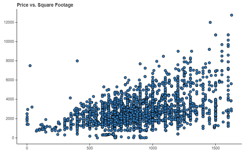
Personally I find this much easier and intuitive than Matplotlib, and it also comes out prettier in a Jupyter Notebook. Basically what this does is it lets Bokeh know you are going to be using this Pandas dataframe as the source for your plots. When you actually plot something in your figure (p.scatter) and say x=’area’ and y=’price’ you are just saying what columns within your dataframe Bokeh should go and look at to get this data. Thus it sees ‘area’ and ‘price’ specified and it will go through each row in your dataframe and plot these pair points. This makes creating plots with Pandas both intuitive and quick.
The other great aspect is this lets you leverage features in Pandas to enhance your plots. That is, any column in your dataframe can be used! Let’s create a ‘color’ column that maps the number of bedrooms to a color. We can then use this new column as an option to color our scatter plot. Specifically here check out lines 9 and 10, and then in line 22 we say use this column to color our chart.
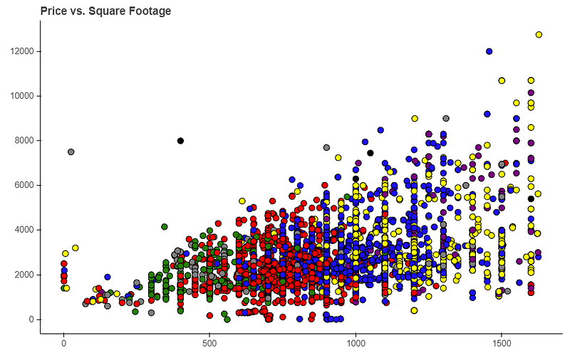
One key thing to remember, which I often forget, is if you add a column to your Pandas dataframe you need to recreate your ColumnDataSource. In this example, we now create a new color column, so the previous ColumnDataSource, which was created before we had this column, wouldn’t have our color feature. Once you do that then it is as simple as passing the color=’color’ into the scatter method and Bokeh know’s to go look up the color in the aptly named ‘color’ column. There’s lots of other ways to utilize this type of stuff, such as with sizing by the number of occurrences, but I will leave that to you in an additional exercise. The point is if you can create it in Pandas then you can utilize it in a Bokeh plot!
4— Exporting to HTML is a Breeze
Sharing Bokeh plots with a colleague or on a web application is a breeze as it can be easily exported to something HTML code can use. If you are interested in using these charts in production on a website or sharing them in an HTML file then you should definitely read up on this documentation. If you want to see a real life version of how this looks in practice check out this Game Of Thrones data from a little web app I built or this static S3 website using Democratic primary data. All of those charts are made in Bokeh using the method below. Here’s how to do it:
- Import the components feature. This is what lets you turn that figure into a script and div in HTML.
from bokeh.embed import components- Create your plot in Bokeh as you would normally
- At the end add the following code, where p is your figure object
script, div = components(p)
return script, div
The first line gives you a chunk of Javascript that has everything you need for your plot (including the data) and a div element where the chart will be put into. That’s it! Again, this code is no longer dependent on your data source! Take that script and div, plop it somewhere into an HTML file, and you now have a fully exportable chart. If you are familiar with Django I often pass the script and div from the views.py file to the HTML and then can use it in my template files, but there are many ways to utilize this. If you often share data in HTML then Bokeh is the best Python has to offer in my opinion.
5— Intelligent Suggestions on Errors
If I was the Python Czar with the ability to create laws for all Python libraries this is definitely one I would implement. With Bokeh if you are trying to edit something with your plot, such as changing the axis label, and you put in the wrong command, Bokeh will tell you suggestions for what it think you meant.
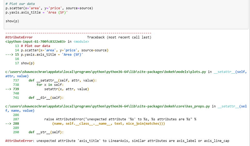
Notice here I said p.yaxis.axis_title, but it is in fact p.yaxis.axis_label. If you look in the AttributeError it will give you suggestions that are closest to what it thinks you are trying to do. Generally this works incredibly well and saves you a ton of time on asking google “Changing axis title in Bokeh”. If someone could implement this in Matplotlib I would be forever in your debt as I don’t even want to know how much time I’ve spent doing that. But in seriousness, this is an awesome feature, especially if you are often switching between different visualization libraries.
6— Easy Interactivity
A really nice feature of Bokeh is how easy it is to add interactivity to our charts. By default you get tools on the right of a chart that lets you do a bunch of things out of the box.
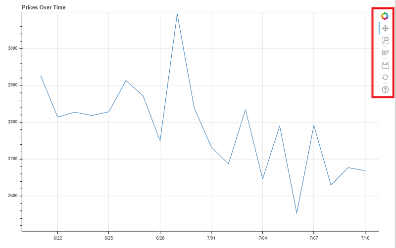
For example, if you select the zoom button you can draw a box around any area of the chart you want to focus on.
Notice how it also updates the x and y axis’ to focus on our specified area, all with no additional code. But that’s just the beginning of interactivity in Bokeh. Let’s go over how you can also add those cool little tooltips like in Tableau with not too much effort. To create these (well, there are multiple ways) you need to use the HoverTool.
from bokeh.models import HoverToolNow I like to get a little fancy with my HoverTools and add some custom HTML to give it a little pizzazz. If you aren’t feeling that brave then you can see some simpler examples in the Bokeh Docs, but if you can handle some elementary HTML, then continue with me my friends. Let’s build on the scatter plot we last used with the additional colors.
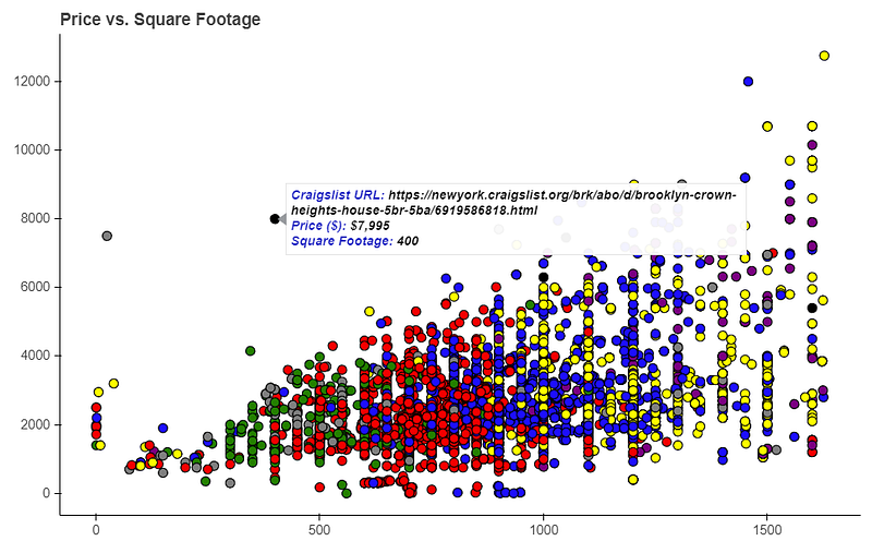
We really want to focus on lines 24 and beyond since I discussed the previous stuff a few steps ago. Here’s what’s going on:
- Bokeh allows you to pass HTML as a string, so we creatively make a variable called tooltips
- The divs are just to hold our tooltip data, I made one div for each line in our tooltip, but you don’t have to do this.
- Each div has two parts: a header and the actual data, each within
tags. So the first
is the “Craigslist URL”, “Price ($)” or “Square Footage” header in each line.
- The second
is the actual data, which again Bokeh makes incredibly easy to access. Because we are using a ColumnDataSource we just put in @columnname to get the data in there. For example, in the first div I use @url to have it grab the URL of that points row in our data. Notice how we can get data points not even being plotted, as it just pulls from the column in the same row as our data. We do the same for price and square footage. You can even format your incoming data, which I show with the {0,0}, which adds the comma separator at the thousands in the price and square footage. There are a lot of formatters but the common ones are for dates, decimals and percentages.
- That’s it! Wonderfully interactive tooltips in just a few lines! You can do some really awesome stuff with Tooltips, but this should be enough to get your imagination sparked. This gives your notebook you share with a colleague that extra little oomph to let them play with your data.
If you go to Bokeh’s gallery there are tons of ways to add interactivity, and make full on dashboards, so this is just a taste. If you are interested in creating truly interactive plots Bokeh is one of my favorite options on the market right now, especially if you want to avoid the dark, cold and evil world of Javascript.
Summary
That’s it! Hopefully if you are new to Bokeh this gives you a taste of its awesome power. I still use Matplotlib and Seaborn for some things (boxplots, distribution plots) but most of the time now I am a full on Bokeh advocate. Give it a whirl, you may be soon too! Happy learning!