
6 examples of beautiful Marimekko charts (a.k.a. mosaic plots) & 2 examples with D3 code!
Double-duty examples of Marimekkos that are both beautiful and interesting, plus tips on when to use them
What’s a Marimekko chart? 🤔
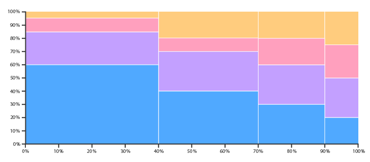
The easiest way to understand any graph type or visual is to look at it, so let’s take the blank example above.
A few things you might notice right off the bat:
- It looks like a bar chart (or a column chart).
- It looks like a stacked bar chart, a 100% stacked bar chart.
- But both the width and height of the bars vary…so it’s like a 2D stacked bar + column chart, where both axes are 100% stacked.
And voila, there you go! That’s a Marimekko chart (or, if you prefer, mosaic plot): a two-dimensional stacked chart where both the column widths and bar heights are scaled to 100%, so the proportions of the two variables dictate how tall and wide the rectangles are.
If you’re a graph nerd, here’s how you might define a Marimekko chart in terms of other graph types:
- a two-way, 100% stacked bar graph (since in addition to showing data via varying heights, you also get the added dimension of data via varying column widths; in other words, both the x- and y-axes are 100% stacked)
- a heat map where the x- and y-axes have meaning based on size
- a “slice and dice” treemap
And here’s a long list of other names a Marimekko chart could go by:
a mosaic plot, matrix chart, stacked spinogram, spineplot, olympic or submarine chart, a Mondrian diagram, or even shortened to just mekko chart
What are the gotchas for Marimekkos? 🤨
The biggest flaw of a Marimekko chart, like any non-traditional chart type, is that it can be hard to read, especially if you have tons of segments. In those cases, consider using alternatives (some possible choices are in the examples below!)
Another downside is that it can be hard to make comparisons between segments (e.g. between the rectangles), since they’re not placed on the same baseline/zero-axis line. So generally, Marimekko charts are better for giving a broad overview of the data, where you can get a general sense of proportions by taking in the size of the segments/rectangles.
So…what are they actually good for? 😅
Some times when Marimekko charts are good options (and maybe more exciting or novel than other graph types!):
- When you want to make a comparison of a part to a whole
- When you have hierarchical data (i.e. data with some parent-child relationships)
- When you want to give a general overview of data you’re going to dive deeper in, especially if it’s one or both of the segments you use in the Marimekko
- When you want to show the interplay of two categories — one great example of this is using a Marimekko to show sales data, e.g. sales for the year by region and by product line
- When you want to show visual weight / make an immediate visual impact (taking advantage of the preattentive attribute of size), like if you’re telling a story about how your company needs to diversify sales and revenue away from a certain product line, especially within a certain geography and want an impactful visual to kick off the story (to continue with the bolded example above)
(note that the bullets above aren’t necessarily mutually exclusive)
The Tableau blog also has a great example of how Marimekko charts can get around Simpson’s paradox (but if you’re not interested, feel free to just skip to the examples!):
Let me tell you a story using a famous example of Simpson’s paradox (also known as the Simpson-Yule effect). Briefly stated, Simpson’s paradox is where a trend appears in one direction when we look at the data as a whole, and then the trend reverses direction when we look at groups of the data (or vice versa).
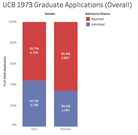
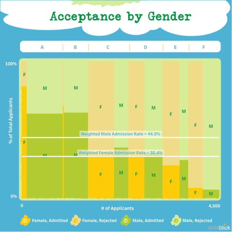
In the early 1970s, there was a gender-bias lawsuit against the Graduate Division of the University of California Berkeley charging that women were being discriminated against in the admissions process. On an overall basis, the data seemed to agree. In the fall of 1973, there were 3,421 females and 8,442 males admitted, with admission rates of roughly 35% and 44% each:
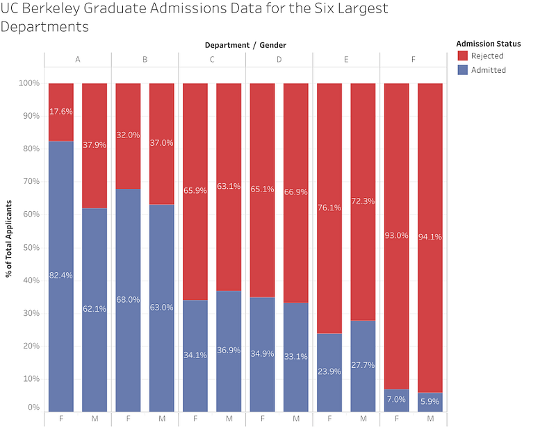
A group of UC Berkeley faculty and staff obtained detailed admissions data and came to a different conclusion. [emphasis mine] The group’s famous paper concluded that at the department level, there was a small but significant bias in graduate admissions in the opposite direction toward women.
If we break down the data by department for the six largest departments, we can see that different story. In four of the six largest departments, there was actually a higher proportion of women admitted than men, though for the overall acceptance, women had a lower admission rate:
Why the apparent paradox? The reason is due to a hidden lurking variable, in this case the number of women and men applying to each department. Here’s a set of stacked bars that show the number of women and men applying:
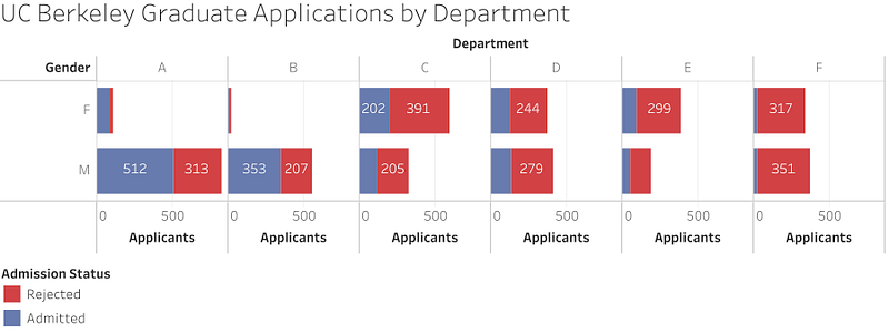
There are many more men than women applying to departments A and B, and that is weighting the results. Seeing the relationship between the number of applicants and admission rate in two separate charts is harder to tease out. This is where the Marimekko plot can come into play since it lets us display both measures at once.
(interactive version of the above plot is on Tableau Public)
With the Marimekko plot, the weighting that creates Simpson’s paradox becomes really apparent. In departments A and B, there’s a high admission rate for both genders and a much larger proportion of male applicants. That effectively pulls up the overall admission rate for men while in other departments, there’s a lower admission rate for men and a more equal proportion of male and female applicants.
The good stuff: 6 examples of Marimekko charts
Some of these images are downsized in the article, so please visit the source to see it in its original and full (and occasionally interactive) glory :)
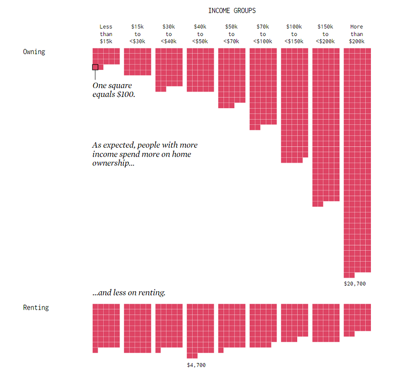
What do people at different income levels spend on various things?
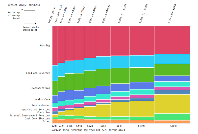
The article on FlowingData also goes deeper into each of these segments, like this one pasted below on housing, so I encourage you to read the full post.
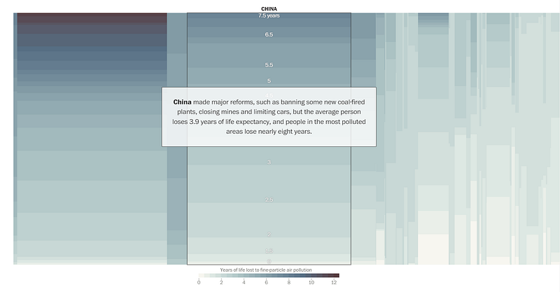
Which countries lose the most years of life due to air pollution? (Interactive)
This interactive data story from the Washington Post is so informative. And also scary. Here’s how they introduce it:
How many years do we lose to the air we breathe?
The average person on Earth would live 2.6 years longer if the air contained none of the deadliest type of pollution, according to researchers at the University of Chicago’s Energy Policy Institute. Your number depends on where you live.
The beginning of the post is a walkthrough of the chart, highlighting specific countries while giving context and calling out certain data. It serves as an introduction to the chart, before they set you free and let you explore it however you want (which I think is really smart for a complex chart type like this that could be off-putting or overwhelming). They also orient you as to how they organized everything:
We sized countries by population and sorted them by their average pollution in 2016.
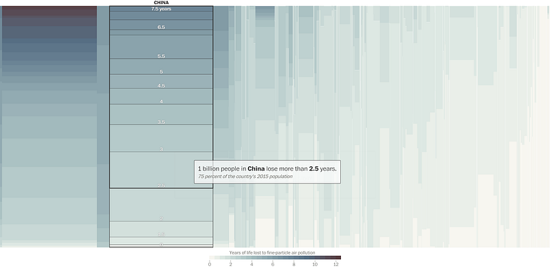
They start with a close up on China:
China made major reforms, such as banning some new coal-fired plants, closing mines and limiting cars, but the average person loses 3.9 years of life expectancy, and people in the most polluted areas lose nearly eight years.
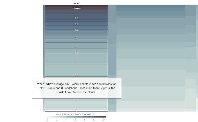
And then jump to India:
While India’s average is 5.3 years, people in two districts east of Delhi — Hapur and Bulandshahr — lose more than 12 years, the most of any place on the planet.
Then they cover Nepal (sorry, I’m going to make you go to the Post’s site to see the visuals because honestly, they deserve the views):
Nepal has the highest average particle concentration of any country, and it cuts 5.4 years off the average lifespan. Most of the worst places are along its border with India.
And then the US:
The average U.S. resident loses less than a year to tiny-particle pollution, thanks to policies that date to the 1970s. People in Fresno County, Calif., can expect to lose two years of life, the highest number in the country.
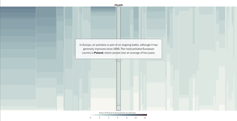
And then Europe:
In Europe, air pollution is part of an ongoing battle, although it has generally improved since 1998. The most polluted European country is Poland, where people lose an average of two years.
And then finally, they set you free to explore and interact with the chart however you want, looking at any country’s data:
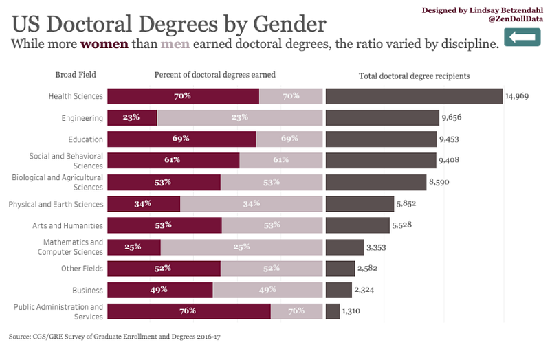
How do Ph.Ds. in the US breakdown by gender and field?
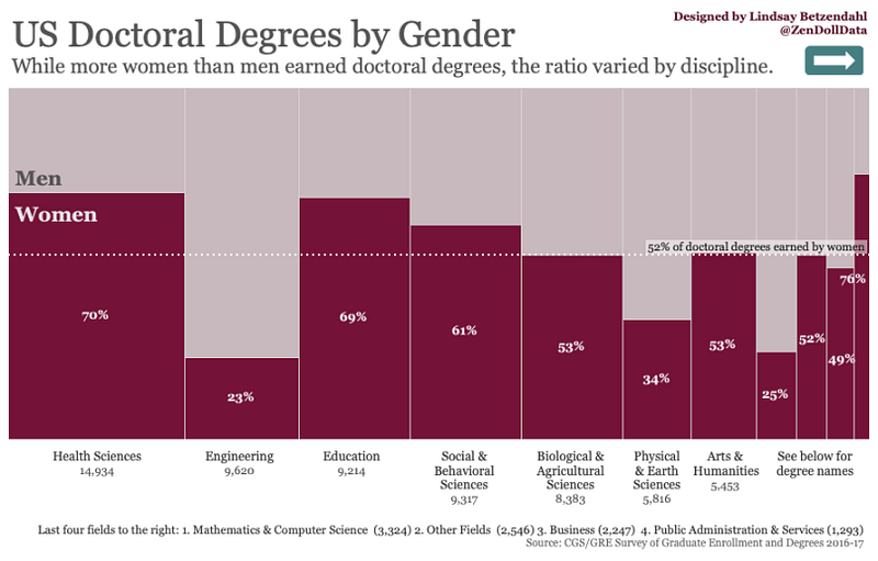
This one was built in Tableau and there’s an interactive version you can play with!
The author of the blog post also goes through how she created the chart in Tableau, and then shares two alternatives to using a Marimekko to show this data:
- A gradient color bar chart
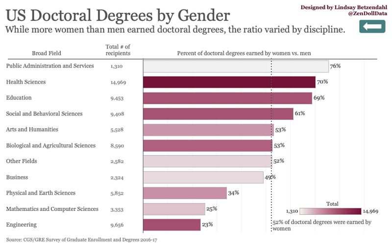
- A “marginal histogram” (a histogram side-by-side with the 100% stacked bar chart)
How much do men work in a year (for pay) versus women, and how has that changed over time?
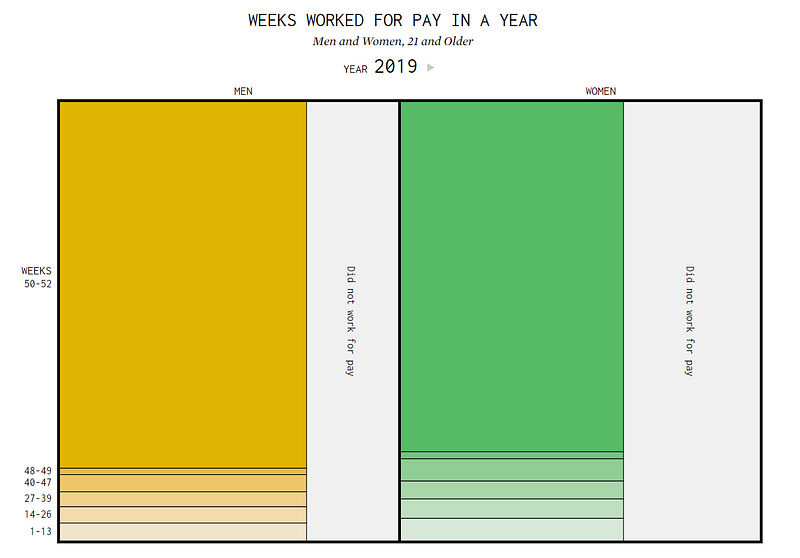
If you visit the full article for this, you can interact with the time scale by hitting play on the graph, and you can watch the segments shift as time goes from 1960 to 2019.
Some of the takeaways from FlowingData (from the text of their article):
Over the years, more women have entered the workforce while the percentage of men has gone down slightly.
You can see people working more weeks out of the year, especially for women. In 1960, about 42% of women and 87% of men 21 and older worked at least one week out of the year. In 2019, about 62% of women and 73% of men 21 and older worked at least one week.
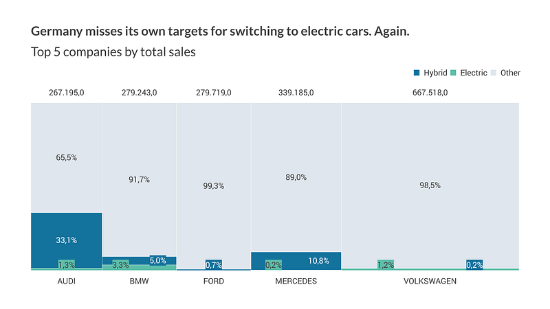
What’s the market share of German cars across car companies and engine type?
For all the news we see on electric vehicles, they’re still a very small percentage of many car manufacturers’ sales. (Note that this graph shows sales figures for new cars in 2019.)
How do pregnancy outcomes vary as a mother gets older?
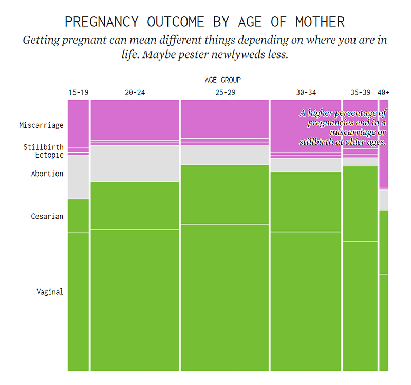
Another well-designed chart from FlowingData. They include a description on how to read it as well:
The width of the columns represents the percentage of pregnancies for the age group. The height of each stacked rectangle represents the percentage of pregnancies that ended with corresponding outcome, in a given age group. The full range of both dimensions is 0% to 100%.
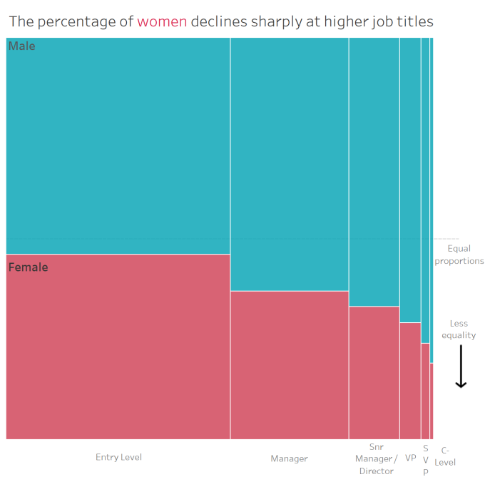
How does gender representation vary across different levels of seniority and job titles?
For the technical folks: D3 code examples for Marimekko charts
Last but not least, here are two resources with D3 code samples for creating Marimekko charts:
📣 A shameless plug
If you liked this post (in other words, if you got all the way to this point), here are a few other posts you might like:
You can also follow Visual Analytics Field Notes (this publication) for more posts in the future, or tweet me @minnatwang if you have requests for future posts 😊
And finally, if you liked this post, hit that applaud 👏🏼 button! It’ll help me know what articles resonate the most, so I can write more like them. (And then you can come back, read more, and applaud more — it’s a vicious cycle, I know.)


