avatarUzman Ali

Free AI web copilot to create summaries, insights and extended knowledge, download it at here

2534

Abstract

b>Simplilearn Completion Certificate</b></figcaption></figure><h1 id="5e68">2. Data Science: Visualization by Harvard University</h1><p id="5897">This course is one of a kind. It covers the basics of data visualization and exploratory data analysis having a duration of 8 weeks.</p><h2 id="180e">By the end of this course, You‘ll learn —</h2><p id="20f0">✅Data visualization principles and statistical programming using R ✅How to communicate data-driven findings ✅How to use ggplot2 to create custom plots ✅Weaknesses of several widely-used plots and why you should avoid them</p><p id="eabd"><b>💻Skill level: </b>Beginner to Intermediate 👨‍🎤Click <a href="https://pll.harvard.edu/course/data-science-visualization?delta=4"><b>here</b></a> to get started.</p><h1 id="0489">3. Share Data Through the Art of Visualization</h1><p id="ce95">More than 300k are already enrolled in this course, they are achieving their goals with the help of Google. This is the 6 course in the Google Data Analytics series on Coursera. Become Google Data Viz certified for free.</p><h2 id="3010">By the end of this course, You‘ll learn —</h2><p id="076c">✅Describe the use of data visualizations to talk about data and the results of data analysis ✅Identify Tableau as a data visualization tool and understand its uses ✅Explain what data-driven stories are including reference to their importance and their attributes ✅Explain principles and practices associated with effective presentations</p><p id="1546"><b>💻Skill level: </b>Beginner 👨‍🎤Click <a href="https://www.coursera.org/learn/visualize-data"><b>here</b></a> to get started.</p><h1 id="bb20">4. Data Visualization in Python Masterclass™️ for Data Scientists by Udemy</h1><p id="da11">The only way to truly learn how to use <b>Matplotlib for Data Visualization with Python</b> is by actually getting your hands dirty and trying out the features yourself. That’s where this course comes in!</p><h2 id="149e">By the end of this course, You‘ll learn —</h2><p id="9e2e">✅Create sub-plots using Matplotlib. ✅Create 3D plots using Matplotlib. ✅Learn how to plot images using Matplotlib. ✅Create various types of visualizations. ✅Load Data from Excel or Text Files</p><p id="461e"><b>💻Skill level: </b>Python Beginner 👨‍🎤Click <a href="https://www.udemy.com/course/matplotlib-for-data-visualization-with-python-programming-language/?ranMID=39197&amp;ranEAID=Vrr1tRSwXGM&amp;ranSiteID=Vrr1tRSwXGM-MZrjZrq0LVa0n_MkFMEs9A&amp;LSNPUBID=Vrr1tRSwXGM&amp;utm_source=aff-campaign&amp;utm_medium=udemyad

Options

s"><b>here</b></a> to get started.</p><figure id="436a"><img src="https://cdn-images-1.readmedium.com/v2/resize:fit:800/1*gxgrPCstOSuANrmWxGS-hw.jpeg"><figcaption><b>Python Visualization</b></figcaption></figure><h1 id="aae7">5. Fundamentals of Data Visualization by Coursera</h1><p id="3ddb">This course explores the design, and evaluation of visualizations. By combining aspects of computer graphics, HCI, and data science, you will gain hands-on experience with creating visualizations, using EDA tools.</p><h2 id="a69f">By the end of this course, You‘ll learn —</h2><p id="e2ba">✅Develop a toolkit for exploring and communicating complex data using visualization ✅Produce basic data visualizations using a chosen dataset ✅Compare methods for visualizing data and understand how these methods may guide users toward different conclusions ✅Evaluate how effectively a visualization conveys target data</p><p id="b6d0"><b>💻Skill level: </b>Intermediate 👨‍🎤Click <a href="https://www.coursera.org/learn/fundamentals-of-data-visualization"><b>here</b></a> to get started.</p><h1 id="2add">6. Data Analysis and Visualization by Udacity</h1><p id="22ad">In this course, you will gain practical experience with real-world data through case studies and hands-on work using R.</p><h2 id="c55b">By the end of this course, You‘ll learn —</h2><p id="21a6">✅Data Preprocessing ✅Data Processing ✅Data Visualization ✅ Logistic, Linear Regression, and Regularization</p><h2 id="a138">Prerequisites and requirements, before this Course —</h2><p id="e587">✅Basic Programming experience ✅Mathematics: basic linear algebra, calculus, introductory probability ✅No background in machine learning is required</p><p id="d66f"><b>💻Skill level: </b>High<b> </b>Intermediate 👨‍🎤Click <a href="https://lnkd.in/dEKkDnF5?trk=public_post-text"><b>here</b></a> to get started.</p><figure id="5c51"><img src="https://cdn-images-1.readmedium.com/v2/resize:fit:800/1*NKIJ4GbweBxJcH-letePwA.jpeg"><figcaption></figcaption></figure><p id="c6a3">If you enjoyed this.</p><ol><li><a href="https://readmedium.com/cb65ee296b9e"><b>Follow me</b></a><b> </b>for <i>more (updates on tips and ideas)</i></li><li><a href="https://medium.com/m/signin?actionUrl=%2F_%2Fapi%2Fsubscriptions%2Fnewsletters%2Fb9a7d8b9ca86&amp;operation=register&amp;redirect=https%3A%2F%2Fmedium.com%2F%40uzmanali&amp;newsletterV3=cb65ee296b9e&amp;newsletterV3Id=b9a7d8b9ca86&amp;user=Ali+Uzman&amp;userId=cb65ee296b9e"><b>Subscribe</b></a><b> </b>here for email updates</li></ol></article></body>

6 Best and Free Data Visualization Certifications to Add to Your Resume

📊You will be nailing every dashboard by Mastering Data Viz with these courses

Welcome Data Learners and Wizards! In this article, you will be unlocking the power of data visualization.
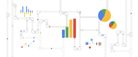
Why data Viz?

Understanding data without visualization is like trying to drive a car blindfolded — sure, it’s possible, but you’re just asking for a messy disaster !😁

Remember —

When it comes to data visualization. Seeing is believing, and having a good laugh along the way makes the journey all the more enjoyable!

The ability to effectively communicate insights through compelling visualizations is a highly sought-after skill that can set you apart from the competition.

With the right knowledge, you can leverage this growing demand to your advantage.

That’s precisely why I am presenting these 6 courses as your definitive guide to your resume.

Each course has been chosen based on its reputation, quality of instruction, and the practical skills it imparts in your career.

To you folk, these courses offer a wealth of knowledge that will equip you with the necessary skills to succeed. So, if you start your journey with all seriousness, in almost 10 weeks you will be nailing every dashboard🤝.

Let’s get started then!

Data Visualization — Thumbnail

1. Introduction to Data Visualization

This course by Simplilearn is 9 hours of self-paced lessons.

By the end of this course —

Utilizing tools like Tableau, Power BI, Excel, R, and Python, you will master the art of creating impactful visualizations. You will have a clear-cut understanding of how to derive meaningful conclusions from data.

💻Skill level: Beginner 👨‍🎤Click here to get started.

Simplilearn Completion Certificate

2. Data Science: Visualization by Harvard University

This course is one of a kind. It covers the basics of data visualization and exploratory data analysis having a duration of 8 weeks.

By the end of this course, You‘ll learn —

✅Data visualization principles and statistical programming using R ✅How to communicate data-driven findings ✅How to use ggplot2 to create custom plots ✅Weaknesses of several widely-used plots and why you should avoid them

💻Skill level: Beginner to Intermediate 👨‍🎤Click here to get started.

3. Share Data Through the Art of Visualization

More than 300k are already enrolled in this course, they are achieving their goals with the help of Google. This is the 6 course in the Google Data Analytics series on Coursera. Become Google Data Viz certified for free.

By the end of this course, You‘ll learn —

✅Describe the use of data visualizations to talk about data and the results of data analysis ✅Identify Tableau as a data visualization tool and understand its uses ✅Explain what data-driven stories are including reference to their importance and their attributes ✅Explain principles and practices associated with effective presentations

💻Skill level: Beginner 👨‍🎤Click here to get started.

4. Data Visualization in Python Masterclass™️ for Data Scientists by Udemy

The only way to truly learn how to use Matplotlib for Data Visualization with Python is by actually getting your hands dirty and trying out the features yourself. That’s where this course comes in!

By the end of this course, You‘ll learn —

✅Create sub-plots using Matplotlib. ✅Create 3D plots using Matplotlib. ✅Learn how to plot images using Matplotlib. ✅Create various types of visualizations. ✅Load Data from Excel or Text Files

💻Skill level: Python Beginner 👨‍🎤Click here to get started.

Python Visualization

5. Fundamentals of Data Visualization by Coursera

This course explores the design, and evaluation of visualizations. By combining aspects of computer graphics, HCI, and data science, you will gain hands-on experience with creating visualizations, using EDA tools.

By the end of this course, You‘ll learn —

✅Develop a toolkit for exploring and communicating complex data using visualization ✅Produce basic data visualizations using a chosen dataset ✅Compare methods for visualizing data and understand how these methods may guide users toward different conclusions ✅Evaluate how effectively a visualization conveys target data

💻Skill level: Intermediate 👨‍🎤Click here to get started.

6. Data Analysis and Visualization by Udacity

In this course, you will gain practical experience with real-world data through case studies and hands-on work using R.

By the end of this course, You‘ll learn —

✅Data Preprocessing ✅Data Processing ✅Data Visualization ✅ Logistic, Linear Regression, and Regularization

Prerequisites and requirements, before this Course —

✅Basic Programming experience ✅Mathematics: basic linear algebra, calculus, introductory probability ✅No background in machine learning is required

💻Skill level: High Intermediate 👨‍🎤Click here to get started.

If you enjoyed this.

  1. Follow me for more (updates on tips and ideas)
  2. Subscribe here for email updates
Data Visualization
Data Science
Data
Free
2023
Recommended from ReadMedium