
3 Metrics for Engineering Team Success Other Than Velocity
Looking past Velocity

Update: I gave a talk on this topic for PyOhio2022. The video is available here.
If you have worked in an Agile software development environment, you are probably familiar with the idea of measuring a team’s Velocity.
Velocity is a metric that can be measured in story points or hours, and it can help answer if the team is working at a steady rate, as well as give an idea about how much work the team can deliver over an iteration.
For example, if a team has maintained an average velocity of 25 points per sprint for the past few sprints, you can generally assume that they will keep a similar velocity, as long as nothing drastically changes (new project or tools, changing team members, etc.). While other factors may come into play, this means that it will take them roughly 4 sprints to finish a project that has been estimated to contain 100 points worth of user stories.
Velocity is an important metric to a lot of software teams, but in my experience, it’s often been the most important metric to management — often at the expense of missing out on the rest of the story.
Here are some other software metrics to consider when looking at your team’s data.
Earned Business Value
Perhaps you’ve run into the case where your team has a high, steady velocity and work is getting done, but your clients (or your sales team) aren’t seeing the value of what’s being added to the system.
Sometimes this may mean that your team is focusing on not-always-visible tech debt or small bug fixes — and both of those are good things! However, you want to make sure to balance your refactoring work with work that brings value to your product’s stakeholders.
One way to do this is to use Earned Business Value (EBV) for each of your stories. To use this metric, you must assign each of the outstanding stories for your product a point value out of an overall allotment of points.
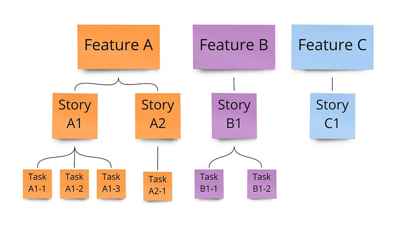
As an example, let’s say that there are 3 upcoming features on your product roadmap: Feature A, Feature B, and Feature C. Each feature is made up of a subset of smaller user stories, but they are of differing complexity.
Working with your stakeholders, you decide how many points are available. This can be an arbitrary number, but you might make it big enough so you don’t end up with half points. For this example, we’ll use 1000 points.
Now, your stakeholder goes through and assigns points values to the various work items. Points are assigned to the smallest units of work based on how much value completing each task will bring to the business. Each item’s parent value is the sum of its children’s values.
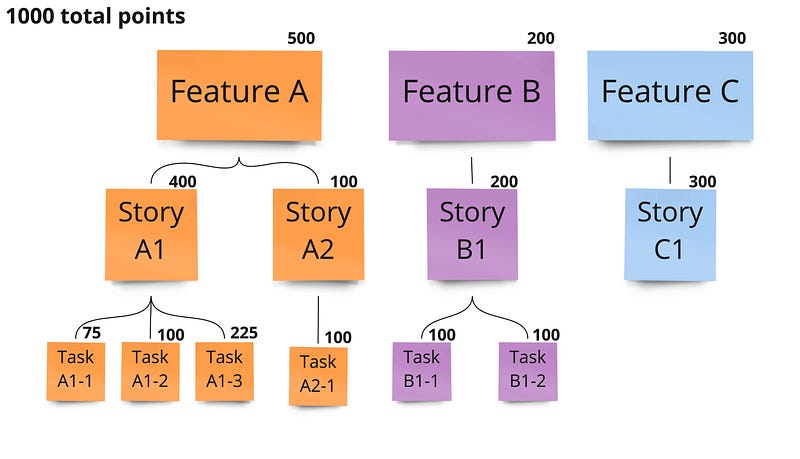
In this example, it’s clear that the team should start with Feature A, followed by Feature C, and then Feature B. However, it may be the case that since Story A1 unlocks most of Feature A’s value, Story A2 might be able to be postponed until after Features B & C are completed.
Much like velocity, EBV can help you create burnup/burndown charts, but instead of just points worked, you also get visibility into how much product value has been delivered.
One downside to using EBV is that it requires a stakeholder with the knowledge to assign values to stories to be actively engaged in the development process. In lieu of an active stakeholder, you may try assigning your stories a score using the MAUT technique to determine a relative priority.
Lead Time
Update: This story previously reported this metric as Cycle Time, but what I’ve described here is closer to Lead Time. Cycle Time is the throughput of your team’s processes (not counting backlogs or time spent with other teams), and is a part of the overall Lead Time. Thanks to Nikola B for catching this!
Perhaps your team is finishing their average of 25 story points every sprint, but your stakeholders are complaining that their items are never getting finished. When this happens, you may want to check your Lead Time.
Lead Time is the average time it takes to complete a single work item; it starts when the item is created and ends when the item matches your definition of done. In the example above, you may be doing plenty of work each sprint, but if you’re only working on stories that were created two years ago, your lead time is really long.
By knowing your Lead Time, you’re able to estimate when a unit of work might be completed. If your Lead Time for normal priority items is four weeks, it’s likely that a new normal priority story will be done in about four weeks.
Calculating the standard deviation of your Lead Time can be useful too. Take the following stories, for which we have recorded their lead time in days.
- The average lead time is 20 days (or 4 weeks)
- The standard deviation is about 4.5 days, which we can round up to 1 week
This means that most of your stories fall within a time of 3–5 weeks. This can both help you plan future work, as well as identify stories that are outliers (taking less than 3 weeks or more than 5 to complete) that you may want to examine — or throw out of future calculations. This would include story #5 in the example above, which only took 2 weeks to complete.
Cumulative Flow
If your team is delivering 25 points per sprint, do the points completed add up smoothly throughout the sprint, or does the number magically jump from 3 points completed to 25 in the last two days of the sprint? Ideally, the number of points would grow throughout the sprint, but by examining the Cumulative Flow of your project, you can help identify bottlenecks in your process.
Cumulative Flow diagrams can be confusing to read at first but can offer a lot of useful information. Let’s take the following sprint as an example. This table shows how many stories were in each status on any given day of the sprint. (Note that there are originally 10 stories, but an 11th story is added on the 6th day of the sprint.)
In the table above, the team has five process buckets: Backlog, In-Progress, Reviewing, Pre-Release, and Completed. As the sprint progresses, work items move from the Backlog and finally make their way to being completed. The following Cumulative Flow chart shows that graphically.
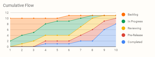
What can this chart tell us about this sprint?
- On any given day, we can see how the work items are distributed. For example, on day 6 it’s easy to see that we have work in all 5 stages in completion and that most of it is In-Progress.
- Since both Reviewing and Pre-Release are fairly narrow with a wider queue growing behind them, this may be indicative of bottlenecks, although you should compare with other sprint data to be sure.
- The width of the bands can tell you how long items are spending in a certain state and help you determine the biggest components of your overall Cycle Time.
Cumulative Flow works well with other metrics, such as Cycle Time or Lead Time, because it lets you see which portions of the process are taking the most time. This allows you to target problem areas; if “Testing” is the portion of the process taking the most time, maybe your team would benefit from an extra Test Engineer.
Disclaimers
- For most software metrics to make sense, the team has to stay stable. This means that you can’t add or remove team members or take a team that has spent the last year working on Stack A and suddenly assign them to work on Stack B and expect the same results.
- The most useful metrics may change depending on a team’s function. If you have a team that works primarily in defect resolution, their priorities (and therefore their metrics) will look different from a team that primarily focuses on delivering new features and functionality.
- All metrics have pros and cons — and there are different ways to interpret data. This is one of the reasons that it’s good to use different metrics to get different views of what’s happening within your team and don’t rely too much on any single metric.
I hope you have found this helpful, and I’d be curious to know if you have a favorite metric on your development team.


