
5 Ways to Make Labels Accessible for Input Controls — and 3 Ways Not to
If you’re a web developer and you’re confused about accessibility standards, this article is for you.

The current WCAG (Web Content Accessibility Guidelines) 2.2 standards are written by principle, not by control. So, instead of a section on textboxes or buttons, there are sections on the “Perceivable” and “Operable” principles.
I’ll use my experience as a developer and an accessibility tester to help you get your labels accessible for screen readers.
Quick disclaimer: There is more to getting your labels accessible than what’s included here, such as color contrast, size, positioning, consistent formatting, and predictability. However, this article will focus on labels that screen readers can consume properly.
See Understanding Success Criterion 3.3.2: Labels or Instructions for referencing the guidelines provided in this article.

To test my examples, I’ll use Freedom Scientific’s JAWS (Job Access With Speech) screen reader on Chrome. JAWS is the most popular screen reader out there. It isn’t free; but there are other screen readers that are, such as NVDA or Apple VoiceOver (native to Mac OS).
Side note: Unfortunately, screen readers do not always interpret markup the same way. In fact, they may not read the same page on a different browser the same way. Your best bet is to use native HTML controls whenever possible.
An input control (textbox, radio button, checkbox, etc.) without a label is not accessible. There are no exceptions. But you do have a few choices for how you label them.
There are two types of accessible labels for input controls: traditional and hidden labels. These aren’t conventional names; it’s just what I call them. There are two traditional labels and three hidden labels.
These labels are in order with the first being the most recommended method. ARIA attributes are last because they should be a last resort for labeling input controls. I’ll explain when we get there.
Traditional Labels
A traditional label is a visible <label> element programmatically assigned to an input control. These labels are easy to implement and, unless you add some weird CSS and/or JavaScript, will provide accessible labels every time.
Traditional labels can be assigned explicitly or implicitly.
1. Use an Explicit Label
To explicitly assign a label to an input control, use the for attribute on the <label> element and set its value to the id attribute of the control. For textboxes, the markup looks like this:
<label for="txtLastName">Last Name: </label>
<input id="txtLastName" type="text"/>
The markup renders on the browser like this:
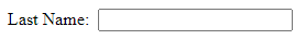
This is the cleanest, most reliable way to label your controls. JAWS reads the textbox like this: “Last Name colon Edit. Type in text.”
Side note: Notice I used a colon (:) after the text “Last Name”. It doesn’t matter whether you use one or not. Just make sure your labels are consistent throughout (they either all have a colon or they all don’t).
2. Use an Implicit Label
To implicitly label an input control, wrap the control in a <label> element like this (markup and rendering):
<label>Last Name: <input id="txtLastName" type="text"/></label>JAWS also reads this textbox as “Last Name colon Edit. Type in text.”
Both implicit and explicit labels are accessible and render the same way; however, I recommend an explicit label whenever possible. Some screen readers can provide inconsistent results when implicit labels are used and it can prevent headaches if you ever do any automated testing.
Side Note: Click the label of a control to easily check you’ve labeled it properly. If the corresponding input control receives focus, you’ve made the association correctly. Unfortunately, this little trick doesn’t work on hidden labels.
Hidden Labels
A hidden label is… hidden. This can be achieved by visually hiding a <label> element or with ARIA attributes. You have to take great care with hidden labels as it’s easier to make a mistake.
So, why would you use a hidden label? Because sometimes a traditional label doesn’t make sense. Take a look at this markup:
<label for="txtSearch">Search:</label>
<input id="txtSearch" type="text"/>
<button id="btnSearch" type="submit">Search</button>
And here’s what the browser renders:
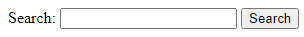
Redundant, right? You probably even winced at it. Fortunately, we don’t have to do this to have an accessible textbox.
JAWS check (on Chrome): When the textbox receives focus, it reads the following: “Search colon Edit. Type in text.”
So, we want to hide the label; but we also want the screen reader to read the same way.
We can use a hidden label here because the context of the two controls sufficiently communicates the purpose of each. In this case, the context is the proximity of the textbox and the Search button to one another.
Guideline: Use hidden labels only if the context of the control is visually apparent
3. Use a “Screen Reader Only” Label
You can create a CSS class to take the <label> element out of the page visually but retain it for screen readers. Take a look at this CSS declaration:
.screenReaderOnly {
 border: 0;
 clip: rect(0 0 0 0);
 height: 1px;
 margin: -1px;
 overflow: hidden;
 padding: 0;
 position: absolute;
 width: 1px;
 }
This style will completely remove any element from view. Now, for any <label> element you want to hide, give it the .screenReaderOnly class and it will still be consumed by screen readers.
Look at this markup:
<label for="txtSearch" class="screenReaderOnly">Search: </label>
<input id="txtSearch" type="text"/>
<button id="btnSearch" type="submit">Search</button>
With the CSS class properly implemented, the browser renders this:
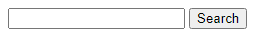
JAWS check: “Search colon Edit. Type in text.”
Nice! So, when the textbox receives focus, the screen reader will read the hidden label as if it were not hidden.
Side Notes:
If your site uses the Bootstrap framework, this is already built-in. For Bootstrap 4 and earlier versions, you can use the
.sr-onlyclass and for Bootstrap 5, use the.visually-hiddenclass.
If you want to do the reverse (make an element visually available but hide it from screen readers), add the following HTML attribute to the element:
aria-hidden="true". This is handy for decorative elements such as icons that don’t represent essential information.
Do not use
{display: none}or{visibility: hidden}to hide labels because they will hide them from screen readers.
A Word About ARIA Attributes
ARIA attributes have no visual effect on their elements; but they make a world of difference for those with screen readers. The attributes aria-label and aria-labelledby allow a user with a screen reader to consume input controls as if they had traditional labels.
As I said earlier, be careful with hidden labels — especially ARIA attribute labels. It’s important to understand their purpose. These attributes aren’t just an alternative to the title attribute.
As Attila Vágó stated in his article Accessibility is Hard — Careful With Them ARIA Labels!, “an aria-label does not mean it provides additional information. It does exactly the opposite. It overrides the meaning of your component entirely.”
To demonstrate that, take a look at this markup where I use an explicit label and an aria-label attribute:
<label for="txtLastName">Last Name: </label>
<input id="txtLastName" aria-label="Surname" type="text" />
JAWS Check: “Surname Edit. Type in text.”
Yikes! As you can see, the traditional label’s text (“Last Name: ”) is completely ignored and the aria-label overrides it.
Guideline: ARIA labels should only be used if traditional labels are not an option.
4. Use an Aria-label Attribute
Use the aria-label attribute to give the hidden label some text like you would a traditional label. You can enter any text as the value for aria-label, keeping in mind it should properly describe the control and be consistent with the text of other <label> elements on the site.
<input id="txtSearch" type="text" aria-label="Search" />
<button id="btnSearch" type="submit">Search</button>
JAWS check: “Search Edit. Type in text.”
5. Use an Aria-labelledby Attribute
The aria-labelledby attribute is really handy when there is an element on the page that can serve as a label for your control. Add the aria-labelledby attribute to the control and set its value to the id attribute of the element serving as the label.
Look at this example:
<input id="txtSearch" type="text" aria-labelledby="btnSearch" />
<button id="btnSearch" type="submit">Search</button>
JAWS check: “Search Edit. Type in text.”
Side notes:
This attribute uses the British spelling of “labelled”, not the US spelling (“labeled”); so make sure you’ve spelled it with two “L”s.
If you have two elements you want to serve as the label for a control, put the
idvalues of both as the value ofaria-labelledby, separated by a space. You may need to use this method if you have input controls in a grid or table. Use theidattribute of the relevant<th>elements.
How Not to Label Controls
We’ve covered ways to make your labels accessible to screen readers. Now let’s cover some ways that are not accessible. It’s not wrong to utilize any of these to add information about the controls; but they are not appropriate for labels.
1. The Title Attribute is Not a Label
You should avoid the title attribute as a label because screen readers do not always consume it, which makes the control inaccessible.
However, you can use the title attribute as a means to provide additional, non-essential information.
2. The Placeholder Attribute is Not a Label
The placeholder attribute, like the title attribute, is not a label and should never serve as one. Screen readers do not always consume the placeholder; and the placeholder disappears when a textbox receives input — so even sighted users will no longer be able to see the placeholder.
Like the title attribute, the placeholder attribute can be used to provide non-essential information.
Side notes:
I’m aware of the “floating label” placeholder. The problem is it’s rarely (if ever) accessible. Even Bootstrap’s floating label isn’t (as of v5.0.2). Screen readers will read it correctly, but the label violates color contrast guidelines (light gray text over a white background) once the control receives focus. What’s worse is they do this with the label’s opacity, which isn’t always caught by automated accessibility tools.
As Adam Silver states in his article “Floating labels are problematic”, “People may skip the field [that uses a placeholder] thinking it’s completed already. When they submit, they will see an error which needs fixing. This is frustrating and time consuming.”
3. The Aria-describedby Attribute is Not a Label
The aria-describedby attribute is mostly for instructions for the control. This can be for character limits or formatting requirements, like this example:
<label for="txtEmployer">Employer: </label>
<input id="txtEmployer" type="text" aria-describedby="descEmployer" />
<span id="descEmployer">Limit to 30 characters</span>
JAWS check: “Employer colon Edit. Limit to 30 characters. Type in text.”
This attribute is necessary for custom or third-party controls if it reacts to keyboard or focus events differently than native HTML controls. In this case, provide the instructions on the page in an element with an id attribute (usually a div or span). Then, set the value of aria-describedbyto the id of the element with the instructions.
Final Thoughts
While this tutorial focuses mostly on screen readers, remember that WCAG standards help you accommodate users with varying disabilities. This includes those with dexterity challenges, cognitive challenges, and color blindness among others.
So, don’t make your controls tiny (dexterity), help the user avoid mistakes when they enter information into your forms (cognitive), and don’t use color as the only means to communicate information (color blindness).
I’ll add a few links to free accessibility tools. These are helpful; but as you know, automated testing doesn’t catch everything.
Links
- WCAG 2.2 Standards
- WCAG 3.0 Standards (unfinished working draft)
- TGPi ARC Toolkit (browser extension)
- ANDI (bookmarklet, best used for US Section 508 compliance testing)
- Accessibility Insights (browser extension)
- WebAIM Contrast Checker (website for checking color contrast)
- W3C WAI Tutorials