
5 Useful Visualizations to Enhance Your Analysis
Use Python’s statistical visualization library Seaborn to level up your analysis.

Introduction
Seaborn has been around for a long time.
I bet it is one of the most known and used libraries for data visualization because it is beginner friendly, enabling non-statisticians to build powerful graphics that help one extracting insights backed up by statistics.
I am not a statistician. My interest in the subject comes from Data Science. I need to learn statistical concepts to perform my job better. So I love having easy access to histograms, confidence intervals, and linear regressions with very low code.
Seaborn’s syntax is very basic: sns.type_of_plot(data, x, y). Using that simple template, we can build many different visualizations, such as barplot, histplot, scatterplot, lineplot, boxplot, and more.
But this post is not to talk about those. It is about other enhanced types of visualizations that can make a difference in your analysis.
Let’s see what they are.
Visualizations
To create these visualizations and code along with this exercise, just import seaborn using import seaborn as sns.
The dataset used here is the Student Performance, created by Paulo Cortez and donated to UCI Repository under the Creative Commons license. It can be directly imported in Python with the code below.
# Install UCI Repo
pip install ucimlrepo

# Loading a dataset
from ucimlrepo import fetch_ucirepo

# fetch dataset
student_performance = fetch_ucirepo(id=320)

# data (as pandas dataframes)
X = student_performance.data.features
y = student_performance.data.targets

# Gather X and Y for visualizations
df = pd.concat([X,y], axis=1)

df.head(3)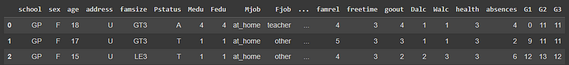
Now let’s talk about the 5 visualizations.
1. Stripplot
The first plot picked is the stripplot. And you will quickly see why this is interesting. If we use this simple line of code, it will display the following viz.
# Plot
sns.stripplot(data=df);
Wow! It is almost like the Pandas' df.describe() plotted. On the x-axis, we see all the numerical variables. The y-axis is the values that each of those variables is ranging. So, looking at the picture, we ca quickly get some interesting insights.
- We have a low incidence of outliers, at least visually speaking.
- Most of the numerical variables are ranging from 0 to 5. And this makes sense since the documentation of the data shows that those variables were categorized. So, the best here would be to transform them to the
categorytype. - The students in this dataset are between 15 to 23-ish years old.
- The distributions of the First Period (
G1) and Second Period (G2) grades are very similar.
Notice how much information we were able to get just from this plot, which is created with one line of code. Amazing!
Certainly, there is much more to explore about this graphic. We can add some other arguments and make it enhanced. Let’s make a graphic of failures versus the final grade G3 and separate by school.
sns.stripplot(data=df, x='failures', y='G3', hue='school', dodge=True);Here is the result.
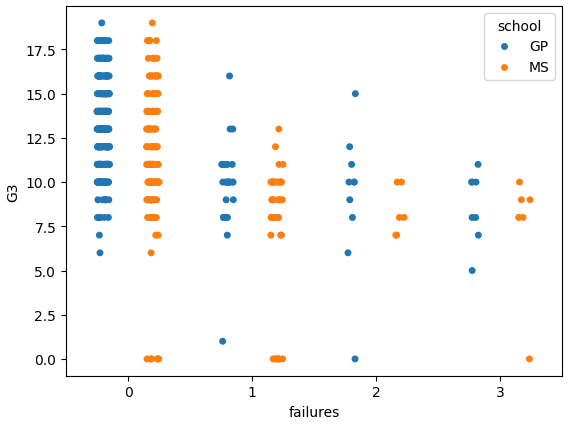
Nice! We can see that the students with fewer failures are getting higher grades, as expected. And both schools are pretty similar in terms of performance.
Let’s move on.
2. Catplot
Well, well… We have created the stripplot, but that’s only for the numerical variables. What about the categorical ones?
That is where catplot comes in handy. This one will plot the observations by category. If we want to check grades by school, it’s easy like this.
#CatPlot
sns.catplot(data=df, x='school', y='G3');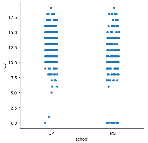
By default, it will show the scatters jittered by category. But we can change to other types, like bar, box, violin, just using the kind argument.
#Plot
sns.catplot(data=df, x='school', y='G3', kind= 'box');
sns.catplot(data=df, x='school', y='G3', kind= 'bar');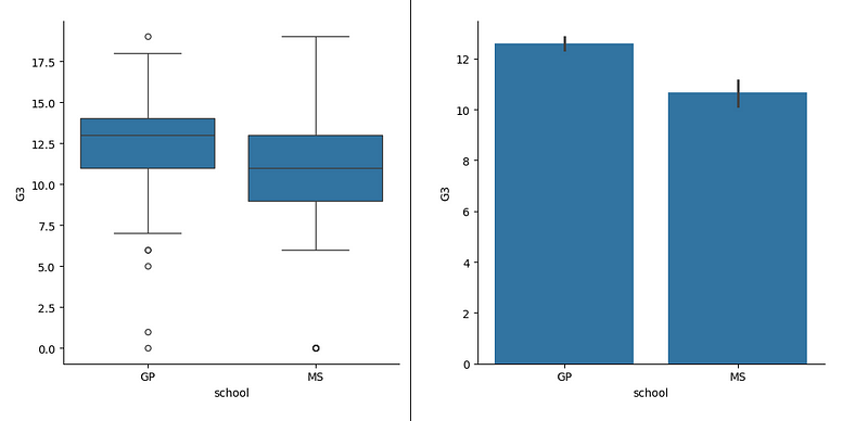
Now look how the box plot does not show precisely what’s the distribution. This is a discussion that has been increasing. People have a hard time understanding box plots, especially those who are not familiar with statistics. Thus, the default for this type of plot is the scatter.
But even for who know the percentiles concept and are comfortable looking at a box plot find it difficult to know how much data lies within the whiskers of the box.
So, the seaborn folks tried to solve that with the next plot to be presented. the enhanced box plot.
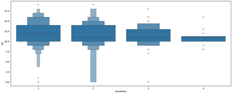
3. Boxenplot
The boxenplot is an enhanced box plot. That is because it does not have the whiskers and the size of the box varies according to the amount of data in each percentile. Let’s plot one.
# BoxenPlot
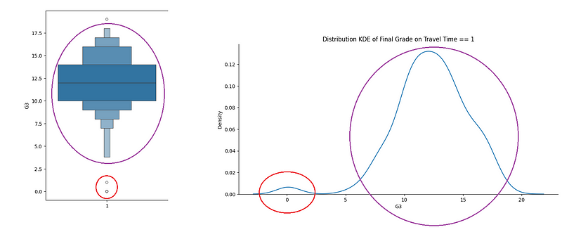
sns.boxenplot(data=df, x= 'traveltime' , y='G3');Looking at the next picture, we see that the box changes width according to the amount of observations on each percentile. The travel time category 1 (less than 15 minutes) has the majority of the data points in the middle, between 10 and 14, and the distribution looks very similar to normal.
If we isolate the grades on the Travel Time == 1, we will see the next graphic.
sns.displot(df.query('traveltime == 1'),
              x='G3', kind='kde', aspect=2)
plt.title('Distribution KDE of Final Grade on Travel Time == 1');
Observe that this is very relatable to the first on the left-side boxenplot: a couple of points isolated at the bottom followed by a close to normal distribution.
This is an enhancement for the box plot indeed. But we still have more graphic types to study. Moving forward.
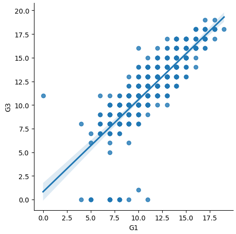
4. lmplot
The lmplot, shorter for Linear Model plot, is the easiest way to create a visual simple linear model of a dataset. If we want to check the relationship between Grade 1 and the Final Grade, this is the code to visualize the linear model.
sns.lmplot(data=df, x="G1", y= 'G3')And the result displayed.
But this is not the best of this function. We can add hue to simulate a multilevel regression. In this case, we can see that both sexes are performing similarly, so it wouldn’t make sense to create a hierarchical linear model based on that category.
sns.lmplot(data=df, x="G1", y= 'G3', hue='sex')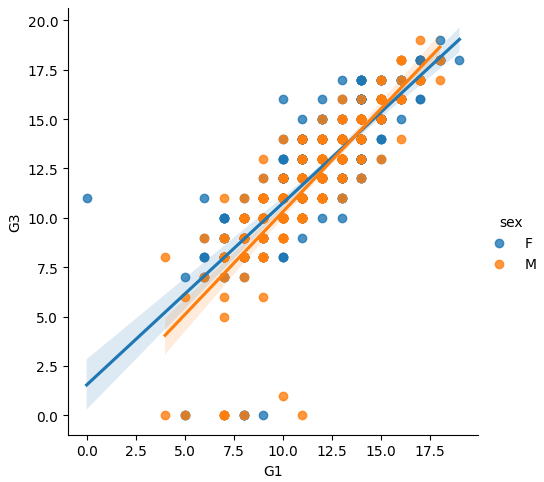
Additionally, it is simple enough to add columns comparing different linear models against the target variable. For example, let’s add models for different schools using the argument col.
sns.lmplot(data=df, x="G1", y= 'G3', hue='sex', col='school')
Very useful plot for a deeper analysis.
Now let’s look at the last type in this post.
5. residplot
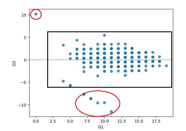
The residplot is to plot the residuals of a linear regression. But, why is that important?
Well, one of the tests we do with linear model residuals is homoscedasticity, or just make sure that the residuals are homogeneous, to make it simpler. If we are analyzing a relationship that follows a line (linear), then it makes sense that the errors also follow a line, being within a certain range. So, when we look at the residplot, we want to see a rectangular shape, with similar variances up and down.
sns.residplot(data=df, x="G1", y= 'G3')Looking at the residuals of the linear model of Grade 1 predicting the final grade, we would see an almost homogeneous set, but with a few deviances.
Before You Go
Great. Now we are equipped with another 5 graphic types that we can use for our analysis.
A good Exploratory Data Analysis takes time, as many questions appear along the way and enrich our understanding of the data. So, it is important to have a couple of enhanced tools to deep dive in questions that need more work.
stripplot: Helps you to visualize the data points as a whole. It’s like thedescribefunction visualization.catplot: similar to the stripplot, but for categories. Can be in many forms, like points, bar, box.boxenplot: Enhancement of the boxplot, filling gaps like “how much data is there in the whiskers”.lmplot: Quick simple linear model that can be created for two variables. Works to visualize multilevel regression as well, using the argumenthue,and also can create facet grid with the argumentcol.residplot: Nice to look at the residuals of a linear model and check where deviances to the homoscedasticity of the residuals are happening.
If you liked this content, follow me.
Also, find me on LinkedIn, here.


