
5 Simple Steps to Master React Native Layout Development
The essential skills for anyone who would like to build their first mobile app

Speaking of mobile app development, setting up screen layout is the very first step prior to coding any logic. It is the key knowledge for anyone who would like to learn how to write mobile app.
The use of flexbox and style makes the UI setup incredibly easy for React Native development. Also, it is the fundamental knowledge you need to acquire if you are interested in building your own mobile app.
In fact, learning screen layout and arrangement in React Native is easy and straightforward. You will be able to get familiar with it quickly if you’ve grasped the key concepts.
In this article, I will go through several steps that help you master this skill. To better illustrate the ideas, I will take the Disney Plus app as a real-life example as we analyse and build screen layout of a sample app.
Why React Native?
React Native is a powerful tool when it comes to mobile app development. The advantage of building both Android and iOS app based on a single set of source codes undeniably shortens time to market and reduces development cost.
The programming skill in Kolin or Swift is not a must for mobile app development. Instead, React Native mobile app is built using Javascript or Typescript which is already a common programming language for front-end development as well as Node.js backend coding. It is highly recommended if you just begin to learn how to build mobile app.
Step #1 — Learn Flexbox layout by exploring on Yoga Playground
Let’s begin with the concepts on how to define the size, alignment and position.
The arrangement of screen layout in React Native is primarily based on Flexbox. Yoga playground provides an incredible platform for us to get familiar with how the flexbox works.
When visiting the playground, a box is displayed with 3 children nodes inside.
Dimensions
The box size is defined by width and height attribute. Flexbox supports the size of fixed value, percentage and relative ratio. The playground only supports the size of fixed values.
You can also adjust the size of child nodes by clicking on one of the child nodes and update the attributes.

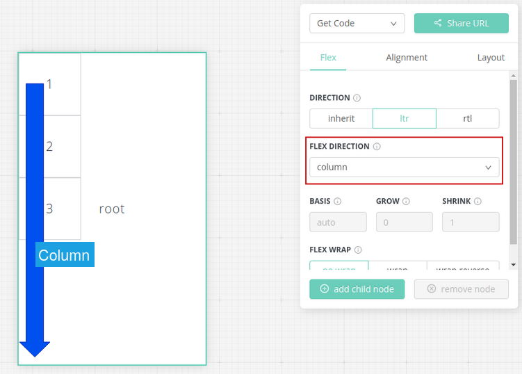
Main Axis & Cross Axis
Child nodes are arranged along the main axis which is defined by Flex Direction. The example below defines the column as the main axis.
On the contrary, example below shows the child nodes are arranged if Flex Direction is Row

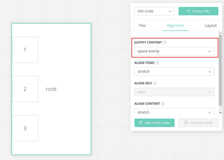
Layout Alignment
Justify Content aligns items along the main axis. A list of available options such as flex-start, center, flex-end, etc. The example below arrange child nodes with space evenly on the column main axis.
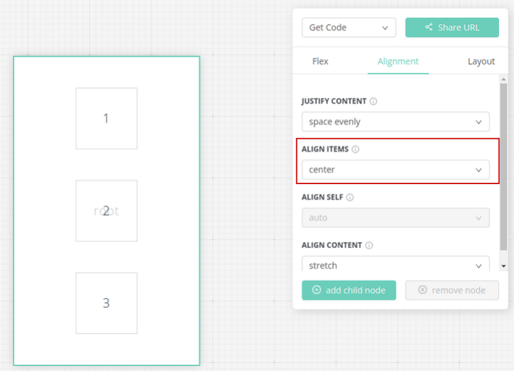
With the column as the main axis, the cross axis is row. Conversely, the cross axis is column if the main axis is row. It is important to be clear about the main axis and cross axis as you work on flexbox layout.
Align Items is similar to Justify Content but it defines the alignment along the cross axis instead of the main axis. The example below arranges items to the center along the cross axis row.
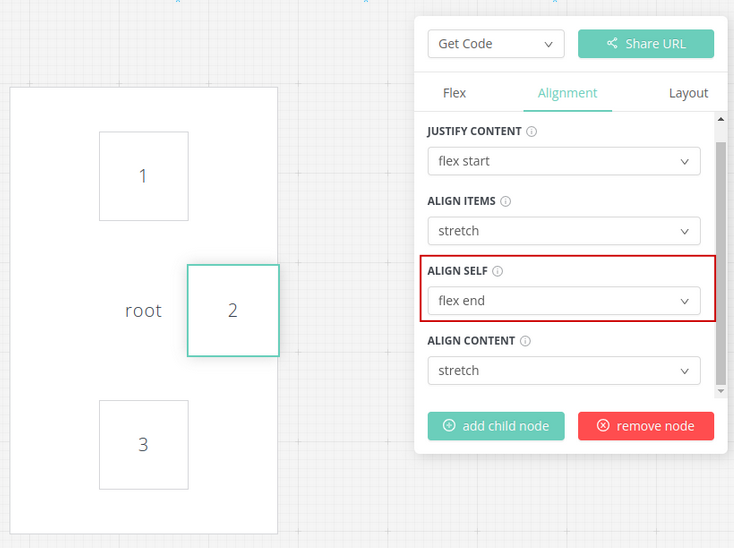
Sometimes, you may need to override the alignment settings for an individual item. What if we would like to set the alignment of only box 2 to be flex end without affecting alignment of other boxes?
The solution is to select box 2 and then update Align Self to be flex-end. This attribute allows us to override the parent’s alignment settings.
Item Wrapping
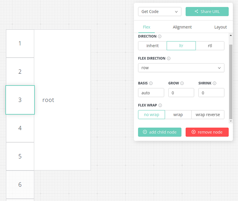
Typically, an app shows a number of items such as pictures, cards, etc. If the number of items is more than the length of the main axis, the layout shrinks child nodes in order to fit into the limited space. It is because the default settings of the playground set Shrink = 1 applied to all child nodes, meaning that all child nodes are shrunk with the same ratio settings in order to fit into the parent container.
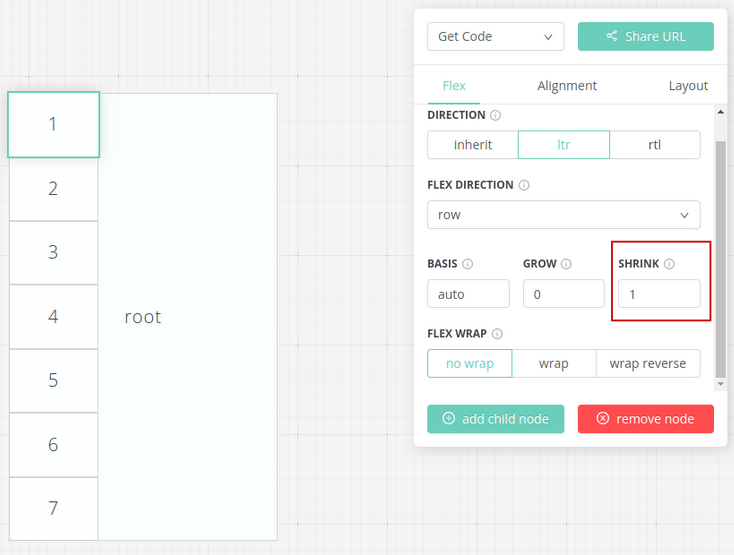
Updating Shrink = 0 to all child nodes, you will notice that some child nodes are placed outside of the parent as child nodes are no longer shrunk.
How to show all items without shrinking? The alternative is to wrap items along the across axis by settings Flex Wrap to wrap
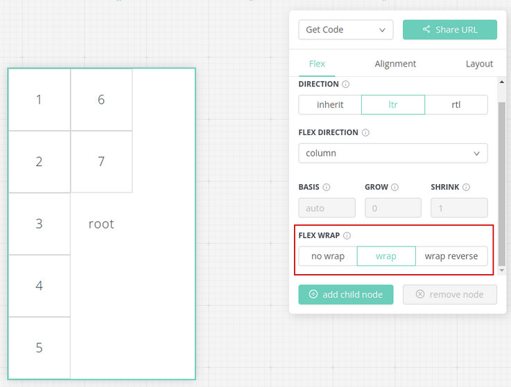
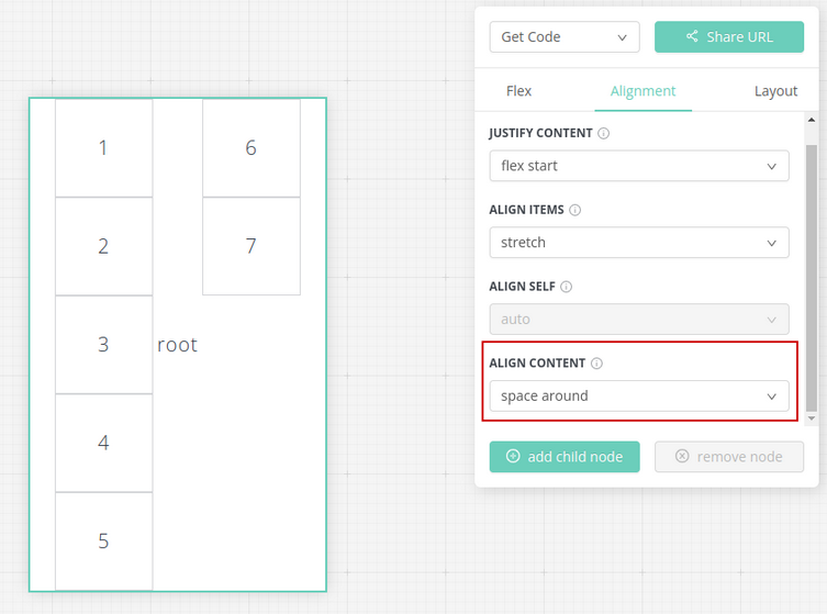
When items are wrapped, Align Items attribute for cross axis alignment is no longer effective. Instead, flexbox refers to another attribute called Align Content.
This example shows the cross axis alignment for the wrapped items using Align Content = space around
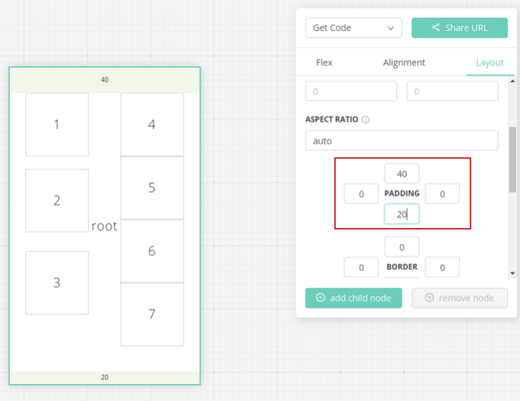
Spacing
More adjustment on spacing such as padding and margin. Adding margin to box 2 if you would like to have space to put it apart from other items.
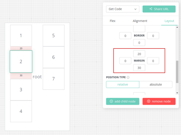
Padding is another way to insert spaces to keep child items from the boundary.
Step #2 — Create a sample app layout — Disney Plus
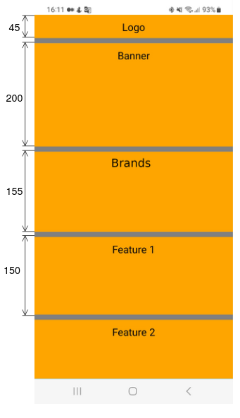
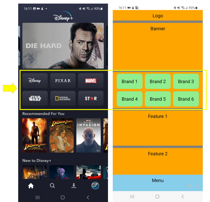
The concepts of flexbox can be applied to most mobile apps in real-life. Taking Disney Plus as an example. The main axis of the overall layout is in a column direction. We can easily identify the UI segment from the logo from the top, banner, brands, a list of features and then a footer menu. Each segment takes up a full screen width.

To replicate the same layout, the first step is to define the root container style:
- Flex direction = column
- width = 100% of the screen
The grey background color is to make it easy to visualize the layout.
rootContainer: {
 backgroundColor: 'grey',
 flexDirection: 'column',
 width: '100%'
}
Next, define a list of segments with dimensions inside the root container. In React Native, component
The sample code below adds child container inside the root container for each segment.
import { View, Text, StyleSheet } from 'react-native'

export const Layout = () => (
  <View style={styles.rootContainer}>
     <View style={styles.logo}><Text style={styles.label}>Logo</Text></View>
     <View style={styles.banner}><Text style={styles.label}>Banner</Text></View>
     <View style={styles.brand}><Text style={styles.label}>Brand</Text></View>
     <View style={styles.feature}><Text style={styles.label}>Feature 1</Text></View>
     <View style={styles.feature}><Text style={styles.label}>Feature 2</Text></View>
     <View style={styles.feature}><Text style={styles.label}>Feature 3</Text></View>
  </View>
)
With the default width 100% of the parent container, we just need to define the height of each segment. Introducing top margin to add spaces between components. Here is the list of stylesheet definition for the containers:
 rootContainer: {
   backgroundColor: 'grey',
   flexDirection: 'column',
   width: '100%'
},
logo: {
 backgroundColor: 'orange',
 height: 45,
},
banner: {
 backgroundColor: 'orange',
 height: 200,
 marginTop: 10
},
brand: {
 height: 155,
 backgroundColor: 'orange',
 marginTop: 10
},
feature: {
 backgroundColor: 'orange',
 height: 150,
 marginTop: 10
}
On the mobile device, the segments are shown with an orange background that visualises the layout components.
Step #3 — Enable scrolling
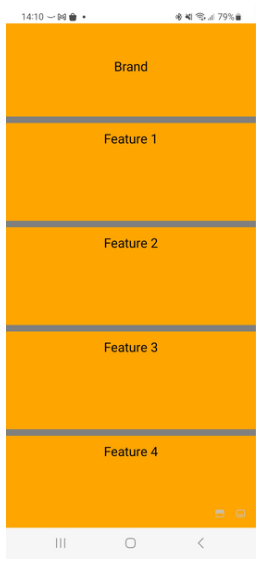
Quickly, we have an overall layout now. You may notice that the segment of Feature 3 is not visible as the screen is not long enough to display it.
The feature of scrolling is a common technique to handle lengthy content in a confined screen size. It is dead easy to enable scrolling in React Native. Replace the root container
import { View, Text, StyleSheet, ScrollView } from 'react-native'

export const Layout = () => (
  <ScrollView
      style={styles.rootContainer}
      showsVerticalScrollIndicator={false}>
      <View style={styles.logo}><Text style={styles.label}>Logo</Text></View>
      <View style={styles.banner}><Text style={styles.label}>Banner</Text></View>
      <View style={styles.brand}><Text style={styles.label}>Brand</Text></View>
      <View style={styles.feature}><Text style={styles.label}>Feature 1</Text></View>
      <View style={styles.feature}><Text style={styles.label}>Feature 2</Text></View>
      <View style={styles.feature}><Text style={styles.label}>Feature 3</Text></View>
      <View style={styles.feature}><Text style={styles.label}>Feature 4</Text></View>
  </ScrollView>
)
With the
Step #4 — Absolute position for footer menu
If you look closer at the screen layout mockup and the real Disney Plus app, then you will notice one item is missing in the screen layout. Yes, the footer menu. The problem is that the menu bar should always be visible and you should not need to scroll to the bottom in order to reach the menu.
Although the feature of positioning is not available on the yoga playground, flexbox allows us to specify the position of an individual component within a parent container. The position can be relative. For example, the position of the child node is defined relative to its parent node with left and top attributes.
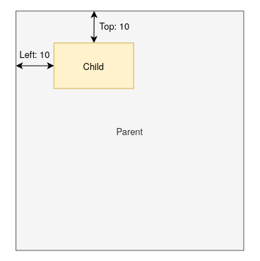
Alternatively, absolute position is the fixed position you would like to put the target component. To make sure the footer menu is always at the bottom of the screen, set the position to be absolute with bottom = 0 with style below:
menu: {
position: 'absolute',
bottom: 0,
backgroundColor: 'skyblue',
height: 70,
Width: ‘100%’
}
Refer to the official documentation for the positioning in the layout.
The menu bar should be located outside the scrolling view. Here is the updated layout definition:
import { View, Text, StyleSheet, ScrollView } from 'react-native'

export const Layout = () => (
  <View style={styles.rootContainer} >
    <ScrollView showsVerticalScrollIndicator={false}>
      ...
      ...
    </ScrollView>
    <View style={styles.menu}><Text style={styles.label}>Menu</Text></View>
  </View>
)
As the height of the footer menu bar is 70 pixels, it takes up a certain area of the screen layout. As a result, the Feature 4 is not fully displayed if you scroll to the bottom because part of it is blocked by the menu bar.
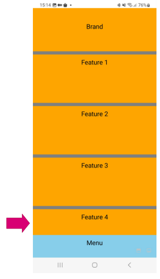
The issue can be solved by adding a space holder item which has the same height as the menu bar. The extra space enables the view to scroll further down in order to fully display the last component in the scroll view.
<View style={styles.rootContainer} >
 <ScrollView showsVerticalScrollIndicator={false}>
     …
     …
     <View style={{height: 70}} />
 </ScrollView>
 <View style={styles.menu}><Text style={styles.label}>Menu</Text></View>
</View>
Step #5 — Wrapping Brand Items with spaces
We explored the flex wrap feature in the yoga playground in the previous section. Flexbox layout is able to wrap items in the direction of the cross axis if the main axis does not have enough space to accommodate the child nodes.
Let’s apply it to the segment that lists out the icon of brands below:

To define the layout, put all 6 brands as individual view items inside the segment.
<View style={styles.brand}>
   <View style={styles.brandItem}>
      <Text style={styles.label}>Brand 1</Text>
   </View>
   <View style={styles.brandItem}>
      <Text style={styles.label}>Brand 2</Text>
   </View>
   <View style={styles.brandItem}>
      <Text style={styles.label}>Brand 3</Text>
   </View>
   <View style={styles.brandItem}>
      <Text style={styles.label}>Brand 4</Text>
   </View>
   <View style={styles.brandItem}>
      <Text style={styles.label}>Brand 5</Text>
   </View>
   <View style={styles.brandItem}>
      <Text style={styles.label}>Brand 6</Text>
   </View>
</View>
Enable flex wrap = ‘wrap’ and set the alignment to be ‘center’ for both main axis and cross axis. Keep in mind that alignContent is used instead of alignItems because we are aligning the wrapped items.
rowGap & columnGap are the additional attributes to fine tune the space between the wrapped items.
brand: {
 height: 155,
 flexDirection: 'row',
 flexWrap: 'wrap',
 rowGap: 10,
 columnGap: 10,
 justifyContent: 'center',
 alignContent: 'center',
 backgroundColor: 'orange',
 marginTop: 10
}
The mockup now looks good. Brands are arranged accordingly with spacing.
Final Thoughts
As you can see, the flexbox layout in React Native is easy to follow. The overall layout is ready with just a few steps. This article covers the most commonly used features of the layout style setup. Always refer to the official documentation as there are more features that you may find useful.


