avatarMinna Wang

Free AI web copilot to create summaries, insights and extended knowledge, download it at here

3695

Abstract

-d_1280&key=a19fcc184b9711e1b4764040d3dc5c07&type=text%2Fhtml&schema=vimeo" allowfullscreen="" frameborder="0" height="720" width="1280"> </div> </div> </figure></iframe></div></div></figure><p id="029f">And here’s a photograph of the artwork and the artist (although I highly recommend the video since, you know, you can’t see the art <i>moving</i> in the photo):</p><figure id="957c"><img src="https://cdn-images-1.readmedium.com/v2/resize:fit:800/0*42VvibZjRS9Fqdgf.jpg"><figcaption>Source: <a href="https://hakaimagazine.com/article-short/amplifying-data-through-art/">David Bowen / Gunnar Knechtel Photography via Hakai Magazine</a></figcaption></figure><h1 id="6790">How one artist spends her income, by Danica Phelps</h1><p id="0a61">From <a href="https://www.theatlantic.com/entertainment/archive/2015/05/the-rise-of-the-data-artist/392399/">a 2015 article in <i>The Atlantic</i></a> about “data artists” (note I added some line breaks for readability):</p><blockquote id="aa83"><p>One of the earliest examples of the genre is Danica Phelps.</p></blockquote><blockquote id="17bc"><p>In July 2008, two months before Lehman Brothers filed for bankruptcy, <a href="http://www.danicaphelps.com/wp-content/uploads/2010/09/2008NYTimes071108.pdf"><i>The New York Times</i> wrote</a>, “For the last decade, Danica Phelps has chronicled her personal and financial lives with an exhaustive system of lists and charts accompanied by diagrams of colored stripes.”</p></blockquote><blockquote id="a222"><p>Her ongoing project, titled <a href="http://www.danicaphelps.com/"><i>Income’s Outcome</i></a>, tracks the money generated by each of her drawing’s sales.</p></blockquote><blockquote id="b5a2"><p>Every time somebody buys a piece from the series, Phelps creates a new series of drawings, depicting what she bought with the money from the previous transaction. The drawings reflect how consumption and debt are intricate parts of our personal identity.</p></blockquote><blockquote id="3ba5"><p>Phelps has also painted every dollar <a href="http://www.danicaphelps.com/archives/809">in her bank account</a>, as well as gray strips for every dollar she owes her bank for her mortgage — 627,000 grey lines.</p></blockquote><blockquote id="c86d"><p>According to Phelps, <i>Income’s Outcome</i> is meant to question how we assign value and meaning to the purchases we make. In light of the 2008 market crash, the series is a critique of fairly banal activities — buying things and borrowing for a home — but both of which cause anxiety and fear in modern life.</p></blockquote><blockquote id="9605"><p>Art critics <a href="http://www.danicaphelps.com/wp-content/uploads/2012/02/2012-Two-coats-of-Paint-January-19.pdf">have likened</a> Phelps to On Kawara, as she also documents the passage of time — but in this series she does so through money. “When I started showing my work, I put the price right on the drawing,” she recalled. “In my first exhibition, there were pieces ranging from 7 to 1600, based on how much I liked the drawing.”</p></blockquote><p id="3d2a">Here’s an image of <i>Income’s Outcome</i>:</p><figure id="504c"><img src="https://cdn-images-1.readmedium.com/v2/resize:fit:800/0*5pCb2voLZNtmJiE8.jpg"><figcaption>Source: <a href="https://www.theatlantic.com/entertainment/archive/2015/05/the-rise-of-the-data-artist/392399/">Danica Phelps via The Atlantic</a></figcaption></figure><h1 id="69d4">Ten million different perspectives of New York, by Refik Anadol</h1><p id="cfe9">Refik Anadol creates “data sculptures,” large-scale video art he builds by applying machine learning algorithms to pools of data. One is a compilation of ten

Options

million photos of New York from different people. From <a href="https://www.wired.com/story/artist-refik-anadol-turns-data-art-help-ai/">a WIRED article</a>:</p><blockquote id="197c"><p>Anadol explains his creative process in <a href="https://www.wired.com/video/watch/obsessed-how-this-guy-uses-machine-learning-to-create-installations">a new WIRED video</a>. It features works including <i>Machine Hallucination</i>, a 360-degree video installation made from 10 million photos of New York. Anadol used machine learning to group photos and morph between them, creating flickering images of the city as recorded by many different people. “It’s kind of like a collective memory,” he says. “A building in New York can be explored from multiple angles, from different times of the year.”</p></blockquote><p id="376f">The article also talks about other projects by the artist:</p><blockquote id="017f"><p>Anadol has also used his data sculptures to look inward, inside the human brain. After discovering his uncle did not recognize him due to the onset of Alzheimer’s, the artist teamed up with neuroscientists to gather a new source of data. “I thought of the most precious and most private information that we hold as humanity,” he says.</p></blockquote><blockquote id="c243"><p>The scientists used a hat studded with electrodes to capture the brain activity of people reflecting on childhood memories. Anadol turned the data into hypnotically moving fluids shown on a 20-foot-tall LED screen.</p></blockquote><blockquote id="d296"><p>One theme of Anadol’s work is the symbiosis and tension between people and machines. The artist says his work is an example of how AI — like other technologies — will have a broad range of uses. “When we found fire, we cooked with it, we created communities; with the same technology we kill each other or destroy,” Anadol says. “Clearly AI is a discovery of humanity that has the potential to make communities, or destroy each other.”</p></blockquote><p id="56e2">Here’s the video from WIRED where Anadol explains his creative process (or you can <a href="https://www.wired.com/video/watch/obsessed-how-this-guy-uses-machine-learning-to-create-installations">watch it on WIRED’s site</a> and also get the transcript):</p> <figure id="2f54"> <div> <div> <img class="ratio" src="http://placehold.it/16x9"> <iframe class="" src="https://cdn.embedly.com/widgets/media.html?src=https%3A%2F%2Fwww.youtube.com%2Fembed%2FI-EIVlHvHRM%3Ffeature%3Doembed&amp;display_name=YouTube&amp;url=https%3A%2F%2Fwww.youtube.com%2Fwatch%3Fv%3DI-EIVlHvHRM&amp;image=https%3A%2F%2Fi.ytimg.com%2Fvi%2FI-EIVlHvHRM%2Fhqdefault.jpg&amp;key=a19fcc184b9711e1b4764040d3dc5c07&amp;type=text%2Fhtml&amp;schema=youtube" allowfullscreen="" frameborder="0" height="480" width="854"> </div> </div> </figure></iframe></div></div></figure><p id="35eb">And here’s a TED talk Anadol gave in August 2020:</p> <figure id="684f"> <div> <div> <img class="ratio" src="http://placehold.it/16x9"> <iframe class="" src="https://cdn.embedly.com/widgets/media.html?src=https%3A%2F%2Fwww.youtube.com%2Fembed%2FUxQDG6WQT5s%3Ffeature%3Doembed&amp;display_name=YouTube&amp;url=https%3A%2F%2Fwww.youtube.com%2Fwatch%3Fv%3DUxQDG6WQT5s&amp;image=https%3A%2F%2Fi.ytimg.com%2Fvi%2FUxQDG6WQT5s%2Fhqdefault.jpg&amp;key=a19fcc184b9711e1b4764040d3dc5c07&amp;type=text%2Fhtml&amp;schema=youtube" allowfullscreen="" frameborder="0" height="480" width="854"> </div> </div> </figure></iframe></div></div></figure></article></body>

5 pieces of art created with data

Art installations, interactive analyses, music, and more

How our diets contribute to climate change, by Laurie Frick

This is how Laurie Frick describes this project on her blog:

My projects use data to tell a story that unfolds over time, the viewer is initially struck by colorful pattern that feels organic and handmade.

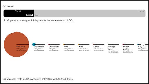
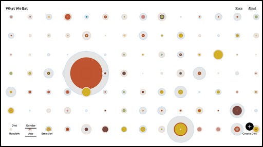
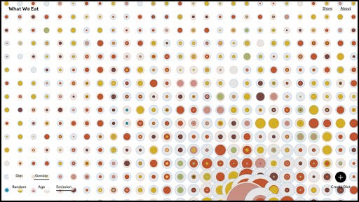
This year I completed an interactive online project for Google Arts & Culture in London to highlight their environmental initiative. “What We Eat” used actual daily diets of thousands of people from the US, France and UK measured by the CO2 carbon footprint of each food item turned it into colorful pattern, the viewer could also create their own diet to compare. It’s a subtle way to show the dramatic difference for food choices.

Play with the interactive visual here.

Source: Laurie Frick via Experiments with Google

Music generated by plants, by Plantwave

Specifically, the music is generated when you put two electrodes on a plant’s leaves and the electrodes pick up slight electrical differences.

Their website is supposed to have a snake plant streaming live from LA, but the player doesn’t work for me. Luckily, you can still catch a clip of “plant music” on this Instagram post of theirs. 🎵

Source: Plants.fm via Instagram

Recreating the movement of the ocean, by David Bowen

From Hakai Magazine:

David Bowen’s tele-present water uses live data from US National Oceanic and Atmospheric Administration buoys to re-create the movement of the surface of the ocean.

Here’s a video of the art installation alongside the part of the ocean it’s recreating:

And here’s a photograph of the artwork and the artist (although I highly recommend the video since, you know, you can’t see the art moving in the photo):

Source: David Bowen / Gunnar Knechtel Photography via Hakai Magazine

How one artist spends her income, by Danica Phelps

From a 2015 article in The Atlantic about “data artists” (note I added some line breaks for readability):

One of the earliest examples of the genre is Danica Phelps.

In July 2008, two months before Lehman Brothers filed for bankruptcy, The New York Times wrote, “For the last decade, Danica Phelps has chronicled her personal and financial lives with an exhaustive system of lists and charts accompanied by diagrams of colored stripes.”

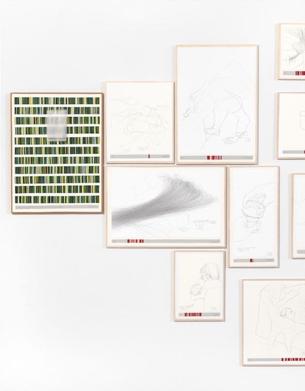
Her ongoing project, titled Income’s Outcome, tracks the money generated by each of her drawing’s sales.

Every time somebody buys a piece from the series, Phelps creates a new series of drawings, depicting what she bought with the money from the previous transaction. The drawings reflect how consumption and debt are intricate parts of our personal identity.

Phelps has also painted every dollar in her bank account, as well as gray strips for every dollar she owes her bank for her mortgage — 627,000 grey lines.

According to Phelps, Income’s Outcome is meant to question how we assign value and meaning to the purchases we make. In light of the 2008 market crash, the series is a critique of fairly banal activities — buying things and borrowing for a home — but both of which cause anxiety and fear in modern life.

Art critics have likened Phelps to On Kawara, as she also documents the passage of time — but in this series she does so through money. “When I started showing my work, I put the price right on the drawing,” she recalled. “In my first exhibition, there were pieces ranging from $7 to $1600, based on how much I liked the drawing.”

Here’s an image of Income’s Outcome:

Source: Danica Phelps via The Atlantic

Ten million different perspectives of New York, by Refik Anadol

Refik Anadol creates “data sculptures,” large-scale video art he builds by applying machine learning algorithms to pools of data. One is a compilation of ten million photos of New York from different people. From a WIRED article:

Anadol explains his creative process in a new WIRED video. It features works including Machine Hallucination, a 360-degree video installation made from 10 million photos of New York. Anadol used machine learning to group photos and morph between them, creating flickering images of the city as recorded by many different people. “It’s kind of like a collective memory,” he says. “A building in New York can be explored from multiple angles, from different times of the year.”

The article also talks about other projects by the artist:

Anadol has also used his data sculptures to look inward, inside the human brain. After discovering his uncle did not recognize him due to the onset of Alzheimer’s, the artist teamed up with neuroscientists to gather a new source of data. “I thought of the most precious and most private information that we hold as humanity,” he says.

The scientists used a hat studded with electrodes to capture the brain activity of people reflecting on childhood memories. Anadol turned the data into hypnotically moving fluids shown on a 20-foot-tall LED screen.

One theme of Anadol’s work is the symbiosis and tension between people and machines. The artist says his work is an example of how AI — like other technologies — will have a broad range of uses. “When we found fire, we cooked with it, we created communities; with the same technology we kill each other or destroy,” Anadol says. “Clearly AI is a discovery of humanity that has the potential to make communities, or destroy each other.”

Here’s the video from WIRED where Anadol explains his creative process (or you can watch it on WIRED’s site and also get the transcript):

And here’s a TED talk Anadol gave in August 2020:

Data
Data Visualization
Art
Visualization
Design
Recommended from ReadMedium