
5 Extremely Useful Plots For Data Scientists That You Never Knew Existed
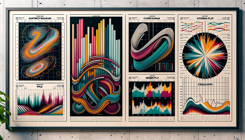
Here are the 5 charts/ plots that are less popular but are quite impressive when used to visualise data.
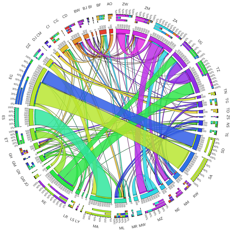
1. Chord Diagram
This is used to represent the connections/ relationships between data in a matrix format.
The diagram consists of a circle whose circumference is divided into different segments that are connected using arcs (or chords) that represent the relationships between the segments.
The thickness of the arc is proportional to the significance of the relationship.
.png)
When To Use?
Use a chord diagram when you aim to provide a visually intuitive representation of the relationship between different entities in your data.
Some examples are:
- Social networks
- Genomics data
- Traffic flow data
- Trade relationships data
How To Use?
Use the Holoviews & Bokeh libraries to create a beautiful Chord diagram.
In the example below, we create one that demonstrates the trade relationships between 5 different countries.
import holoviews as hv
from holoviews import opts
import pandas as pd
import numpy as np
hv.extension('bokeh')

# Sample matrix representing the export volumes between 5 countries
export_data = np.array([[0, 50, 30, 20, 10],
                        [10, 0, 40, 30, 20],
                        [20, 10, 0, 35, 25],
                        [30, 20, 10, 0, 40],
                        [25, 15, 30, 20, 0]])

labels = ['USA', 'China', 'Germany', 'Japan', 'India']

# Creating a pandas DataFrame
df = pd.DataFrame(export_data, index=labels, columns=labels)
df = df.stack().reset_index()

df.columns = ['source', 'target', 'value']

# Creating a Chord object
chord = hv.Chord(df)

# Styling the Chord diagram
chord.opts(
    opts.Chord(
        cmap='Category20', edge_cmap='Category20',
        labels='source', label_text_font_size='10pt',
        edge_color='source', node_color='index',
        width=700, height=700
    )
).select(value=(5, None))

# Display the plot
chord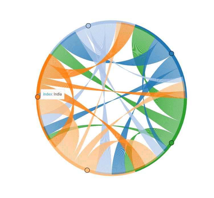
Documentation
Check out the documentation to learn more:
2. Sunburst Chart
This chart is used to plot and visualise hierarchical data/ tree-like data in a circular layout.
The chart is in the form of multiple rings where each represents a level in the hierarchy.
The centre of the chart is the root / top level in the hierarchy.
Each segment or sector of a ring represents a node at that level of hierarchy.
The size of each segment/sector is proportional to its value relative to its siblings.
When To Use?
Use Sunburst charts to plot hierarchical data such as for:
- File systems
- Website navigation paths
- Market segmentation
- Genomic data
How To Use?
plotly library in Python provides an easy way to plot these.
We use Plotly Express, a high-level interface to Plotly, to create an interactive Sunburst chart visualizing the 2007 Gapminder dataset.
Our chart hierarchically organizes countries within continents, sized by their population and colours them by life expectancy.
import plotly.express as px
import numpy as np

df = px.data.gapminder().query("year == 2007")

fig = px.sunburst(df, path=['continent', 'country'],
                  values='pop',
                  color='lifeExp',
                  hover_data=['iso_alpha'],
                  color_continuous_scale='RdBu',
                  color_continuous_midpoint=np.average(df['lifeExp'], weights=df['pop']))
fig.show()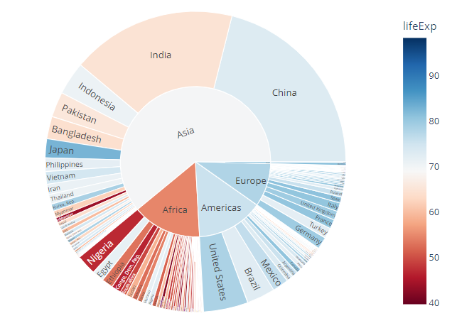
Documentation
Check out the documentation to learn more:
3. Hexbin Plot
This is a 2D Histogram plot where the bins are hexagons and different colours are used to represent the number of data points in each bin.
When To Use?
The plot is used to analyze the relationship between two data variables (or Bivariate data).
It is a great alternative to Scatter plots when plotting large amounts of data points.
When one has a lot of data points to plot, a Hexbin plot helps in better visualisation as these data points would otherwise overlap and obscure each other in a traditional scatter plot.
How To Use?
Matplotlib provides a method shown below, to create Hexbin plots with ease.
In the following example, we create a hypothetical Hexbin plot that aims to reveal potential correlations between poor air quality (using the Air Quality Index/ AQI) and increased hospital visits.
import matplotlib.pyplot as plt
import numpy as np

# Simulating environmental data
aqi = np.random.uniform(0, 300, 10000)
hospital_visits = aqi * np.random.uniform(0.5, 1.5, 10000)

# Creating the hexbin plot
plt.hexbin(aqi, hospital_visits, gridsize=30, cmap='Purples')

# Adding a color bar on the right
cb = plt.colorbar(label='Count')

# Setting labels and title
plt.xlabel('Air Quality Index (AQI)')
plt.ylabel('Respiratory-related Hospital Visits')
plt.title('Environmental Health Impact Analysis')

# Show the plot
plt.show()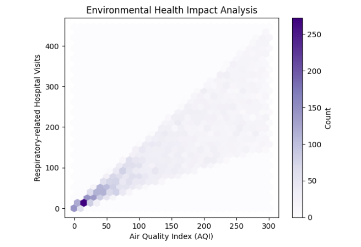
Documentation
Check out the documentation to learn more:
4. Sankey Diagram
This diagram represents the movement/ flow of quantities between different stages or parts of a system.
A Sanket Diagram consists of Nodes and links between them.
The width of each link is proportional to the flow quantity.
The diagram also represents the direction of flow.
When To Use?
The plot can be used to visualise data such as follows:
- Supply chain/ Logistics data
- Traffic flow data
- Data flow
- Energy flow data
How To Use?
Plotly library can be used to create a Sankey diagram as shown below.
The following code represents the energy flow from production sources to consumers in a small city.
import plotly.graph_objects as go

labels = ["Coal", "Solar", "Wind", "Nuclear", "Residential", "Industrial", "Commercial"]

source = [0, 1, 2, 3, 0, 1, 2, 3]
target = [4, 4, 4, 4, 5, 5, 5, 5]
value = [25, 10, 40, 20, 30, 15, 25, 35]

# Create the Sankey diagram object
fig = go.Figure(data=[go.Sankey(
    node=dict(
        pad=15,
        thickness=20,
        line=dict(color="black", width=0.5),
        label=labels
    ),
    link=dict(
        source=source,
        target=target,
        value=value
    ))])

fig.update_layout(title_text="Energy Flow in Model City", font_size=12)
fig.show()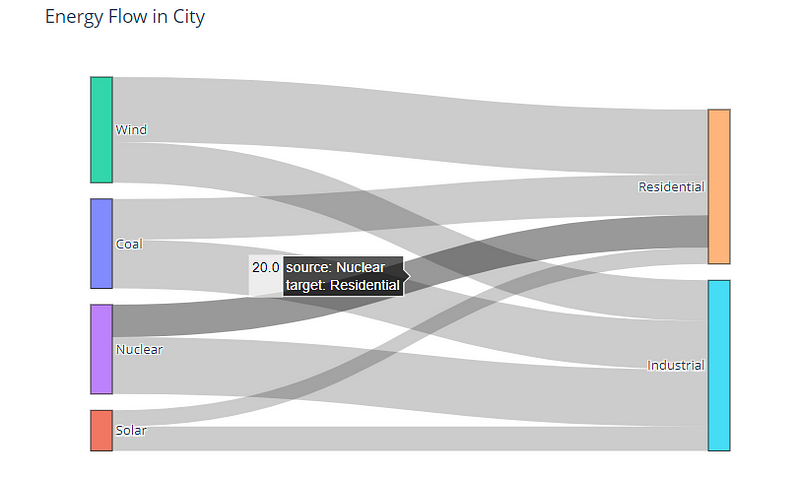
Documentation
Check out the documentation to learn more:
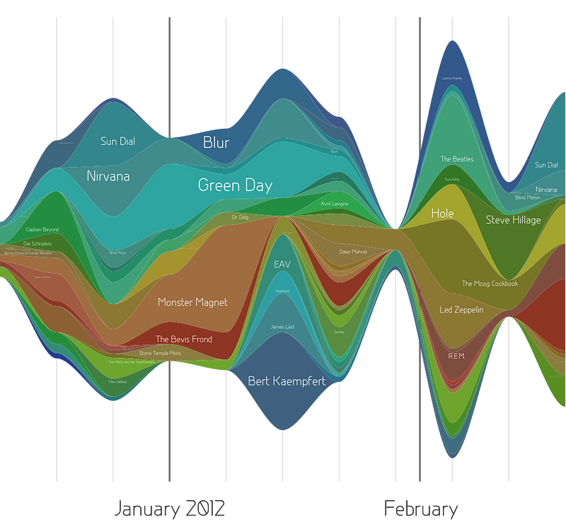
5. Stream Graph/ Theme River
A Stream Graph (also called Theme River) is a form of stacked area graph created around a central axis that results in a flowing shape.
Each stream on the graph represents a time series associated with a category and is differently color-coded.
When To Use?
The plot can be used to visualise Time series data such as follows:
- Popularity trends
- Financial data
- Website traffic data
- Sales/ Marketing data
How To Use?
The Altair data visualisation library can be used to plot a Stream Graph as follows.
In the example below, we plot unemployment data across multiple industries in 10 years.
!pip install vega_datasets altair
import altair as alt
from vega_datasets import data

source = data.unemployment_across_industries.url

alt.Chart(source).mark_area().encode(
    alt.X('yearmonth(date):T',
        axis=alt.Axis(format='%Y', domain=False, tickSize=0)
    ),
    alt.Y('sum(count):Q', stack='center', axis=None),
    alt.Color('series:N',
        scale=alt.Scale(scheme='category20b')
    )
).interactive()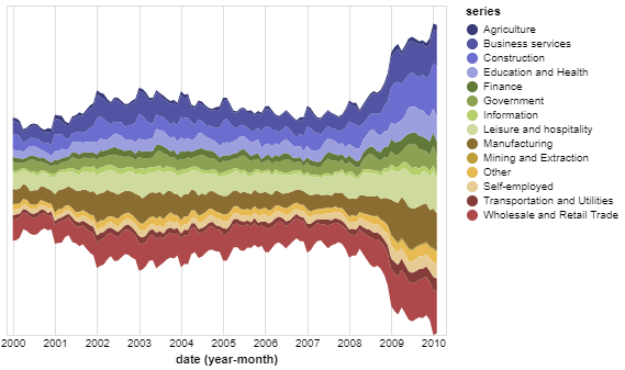
Documentation
Check out the documentation to learn more:
If you found the article valuable and wish to offer a gesture of encouragement:
- Clap 50 times for this article
- Leave a comment telling me what you think
- Highlight the parts in this article that you resonate with
Subscribe to my Substack newsletters below:
Check out my books below:
If you enjoyed this article, consider trying out the AI service I recommend. It provides the same performance and functions to ChatGPT Plus(GPT-4) but more cost-effective, at just $6/month (Special offer for $1/month). My paid account to try: [email protected] ( password: aMAoeEZCp4pL ), Click here to try ZAI.chat.