
5 Biases & Fallacies Data Scientists Should Beware of (and How to Avoid Them)
Common mistakes to look out for in your career

Introduction
One of the hardest things about working with data is dealing with the fallacies and biases that plague both the data itself as well as how we interpret the data. Because of the hundreds of biases and fallacies that exist, most of us are guilty of making false conclusions and creating biased models.
In this article, I wanted to talk about 5 of the most common biases and fallacies that all data scientists should look out for and how to actually avoid them.
With that said, let’s dive into it!
Be sure to SUBSCRIBE here to never miss another article on data science guides, tricks and tips, life lessons, and more!
1. Novelty Bias
What is it?
Novelty bias is when customers engage with a new feature or product because it’s new, but not necessarily because they like it or because it’s valuable. For example, if a new button shows up on the YouTube home page, it’s very likely to get a lot of clicks initially because users are curious as to what the button does. When novelty bias is present, it’s likely that the treatment group gets more engagement than the control group in the beginning, but it’s not the real effect.
How to solve for it
Instead of analyzing all customers with the same time period (start and end time), you can conduct a cohort analysis based on when customers get assigned to the treatment group and see whether this effect wears off with time. If it does, then it’s likely that the experiment had novelty bias present.
2. Data Dredging
What is it?
Data dredging refers to wrongfully conducting data analyses by performing many statistical tests on the same set of data and only reporting those that come back with significant results. By repeatedly using the same data for multiple statistical tests, it increases the likelihood that a test will come out as statistically significant by chance (if the alpha is 0.05, then there’s a 5% chance of a type 1 error).
How to solve for it
There’s no perfect way to solve for it, but the simplest solution is to conduct randomized out-of-sample tests, also known as cross-validation. Like validating a machine learning model, you would split your data prior to testing hypotheses. Then, you would use the first half to create hypotheses and use the second half to validate your hypothesis.
Be sure to SUBSCRIBE here to never miss another article on data science guides, tricks and tips, life lessons, and more!
3. Cherry-picking
What is it?
Cherry picking in statistics refers to selecting or “picking” information that supports your position even though there’s clear evidence that contradicts your stance.
This is really common when decision-makers want to launch a feature or a product. It’s common for them to pick whatever insights look positive to support their decisions, which violates the principles of statistical testing.
How to solve for it
Before testing any hypothesis that you have, whether it be for a product feature or something else, decide on one to three core metrics that you’ll use to determine whether it’s a success or not. Notice that I emphasized that you should decide on these metrics prior to testing your hypothesis.
Don’t move the goal posts just because you want to push your agenda. If you see something interesting, investigate it, treat it as a new assumption, and don’t make your decision based on an unexpected change.
4. Danger of Summary Metrics
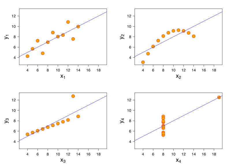
In the 1970s, the statistician Francis Anscombe put together four data sets that have the same mean, variance, and correlation. Yet when you look at the graphs above, it’s clear that they’re completely different. This is meant to show the danger of relying solely on summary metrics.
How to solve for it
Get into the habit of looking at your data through percentiles or deciles instead of just the mean. As well, if possible, try to look at your data through graphs (histograms, scatterplots).
4. False Causality
What is it?
False causality occurs when one assumes that causation exists because correlation exists. An example of false causality is if I assume that I get a headache in the morning whenever I sleep with my shoes on. Where in reality what’s actually happening is that whenever I drink too much, I forget to take my shoes off and wake up with a hangover.
How to solve for it
To solve for this, never assume that a correlation implies causation. Instead, you need to further validate your hypotheses with controlled experiments.
Be sure to SUBSCRIBE here to never miss another article on data science guides, tricks and tips, life lessons, and more!
5. Simpson’s Paradox
What is it?
Simpson’s paradox is a phenomenon when a trend appears in different subsets of data but disappears or reverses when the subsets are combined.
To give an example, Berkeley University was accused of sexism in the 1970s because female applicants were had a lower acceptance rate than males. But after digging into it a bit more, they found that for individual subjects the acceptance rates were actually higher for women than men. The paradox was caused because a greater proportion of the female applicants were applying to highly competitive subjects where acceptance rates were much lower for both genders.
How to solve for it
Break down all of your metrics into their constituent elements. For example, if you’re looking at company revenue, you should break down revenue by sources, and also tie it with their associated costs. That way, you mitigate the risk of making false conclusions about how your business is performing.
Thanks for Reading!
Be sure to SUBSCRIBE here to never miss another article on data science guides, tricks and tips, life lessons, and more!
Not sure what to read next? I’ve picked another article for you:
and another one:
Terence Shin
- If you enjoyed this, SUBSCRIBE to my Medium for exclusive content!
- Likewise, you can also FOLLOW me on Medium
- Follow me on LinkedIn for other content