
5 best practices to design a brand logo with SEO support
It’s all about the brand’s story, scalability of design, SEO keyword development, brand identity, testing & iterating
To have the opportunity to design a brand logo is the most rewarding part of a designer’s career. At least, it is for me. To contribute to a company’s brand recognition with a logo seen on products, spaces, and other materials is an amazing culmination of all our talents.
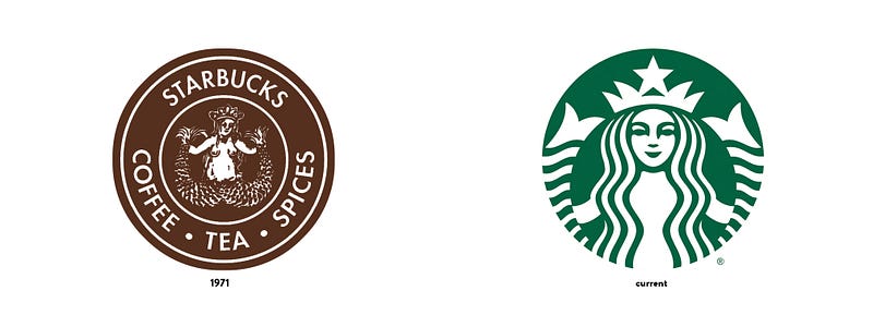
Think of the folks who designed the Starbucks mermaid siren. Since Starbucks’ launch in 1971, the logo has been iterated many times and has grown to become a ubiquitous symbol for innovative beverages and food experiences.
1. Tell the brand story with a scalable and adaptable design
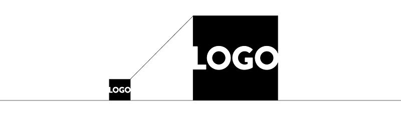
Simplicity in logo design is a good starting concept. To design in the cleanest and simplest fashion emphasizes the logo’s impact. If a logo is too complex, it will be difficult to feature it on different platforms and screens.
However, other factors must be taken into account. For instance, does the logo represent the company with a single graphic icon (think Airbnb), or is it a representation of a company’s name (think UBER), or, is it both, icon and name (think FedEx)?
These considerations need to be taken into account at the onset of the design phase. Clients need to be encouraged to remain open to many different logo design possibilities, however, scalability and adaptability factor high in the list of executable must-haves.
A look at the Starbucks story
The clarity of Starbuck’s contemporary logo hits all the points of corporate recognition and scalability. It is a fantastic company icon instantaneously recognized and appreciated, loyal customer or not.
But there is more to the story than meets the eye.
The woman in the logo tells the brand story
But who is she, the mermaid who has been delivering cups of goodness since 1971 to hundreds of thousands of customers around the world?
“She’s the siren. She is not a real person, but we kind of think of her as one. She’s the biggest symbol of our brand, … She’s the face of it…,” states Steve Murray in the company’s site page Starbucks Stories & News.[2]
The proof of the successful implementation of Starbucks’ logo lies in its versatility. Not only is the logo scalable and adaptable to various backgrounds (as outlined in the brand guides), it is also translatable to other forms of production, such as this embroidery design for clothing.
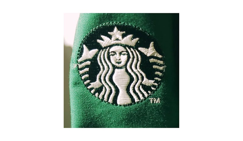
Simplicity is expressed through a hi-contrast design. The shapes of the symbol are clean, abstracted, and scalable.
Pro tip: Just when you think you nailed the logo design, see if you could still edit out an element. Check if that element is really necessary. If it’s not needed or doesn’t add anything tho the design, remove it. Repeat this until you are sure that all remaining elements are essential.
2. Develop an index of descriptive keywords in tandem with the logo design
Keywords are words and phrases that users type into search engines to find the content they are looking for.
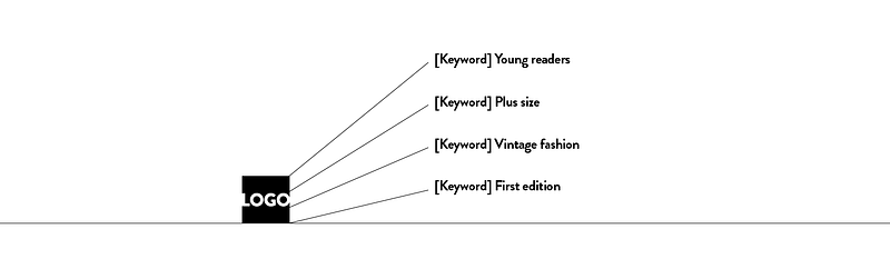
Developing an index of keywords describing your business is crucial for appearing in the search results. Being findable is the first step to attract traffic to your site or app.
A keyword index needs to match your brand’s industry and niche, the brand name and offerings. It can include modifiers, for instance, location or age group, rendering the keywords more specific. This is a collaborative effort that involves the stakeholders’ input and user feedback.
Keywords should be prioritized by the value they can add to the company’s mission. For instance, if we are designing for a fashion house, then we’d might add ‘fashion’ to the SEO index, but if we design a logo for a yoga line of clothing, then sportswear, activewear, or athletic clothing is more on point.
Keywords help you understand what people are searching for. The audience will connect to the brand via a SEO keyword searches, and vice versa, the company reaches out to its audience by providing keywords in the metadata.
If we look at how users connect to UBER with a search term, we find the following keywords: Taxi near me, Cab(s) near me, Uber driver, Uber eats driver, Uber estimate, Uber customer service number.[3]
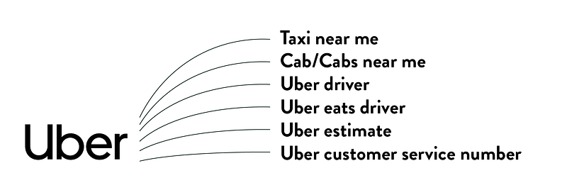
In Uber’s list of top-ranked search keywords, location in terms of proximity ranks very high.
Pro tip: SEO keywords need to convey the brand’s core essence, underlining what the audience is searching for. It is not only about being found on the net, it is about speaking your audience’s language.
3. Optimize your logo file name and alt text
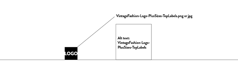
The optimization of your logo file name is a most important SEO tool. Rather than name the logo file logo.jpg, or image.png, describe it using SEO keywords and the brand name.
An SEO-optimized logo name needs to include the company’s top branch of business and its descriptive identifiers. For instance, the logo for a health and fitness business offering wellness and personal trainers to clients could be named WorldOfFitness-logo-Wellness-HealthCoaching-PersonalTrainers.jpg. This is a much more searchable logo name that indexes the world of fitness with the company’s specific offerings.
In the alt text, describe the logo file with the SEO keywords to search engines and users. This helps users with visual impairments or users who are using screen readers to access your website understand what the logo stands for.
Pro tip: Avoid using generic or irrelevant SEO terms. Be as specific as possible about the brand’s offerings in the keywords.
4. Design in the brand’s colors and fonts
Brand colors convey the brand’s personality, mood, and tone. Brand colors need to have been established before the logo design exploration. Colors speak directly to our audience. Most effective colors representing the brand emerge out of research, such as competitive analyses and user testing.
Brand colors need to present a harmonious palette. One or two (at most) colors are prioritized as the primary brand color(s), with one to two more as secondary accent colors.
Colors and typography establish design consistency and brand identity across all digital implementation and other marketing materials.
For an effective brand type identity, stylistically relevant fonts need to be chosen. It is important to recognize the difference between non-serif and serif fonts and how they can serve the brand’s image.
Apply the principles of font hierarchy of scale, weight and case across textual elements.
Pro tip: Test your logo color composition with users for contrast, readability, harmony and brand recognition.
5. Test the brand logo on different backgrounds and devices, then iterate, test again, iterate again, and so on
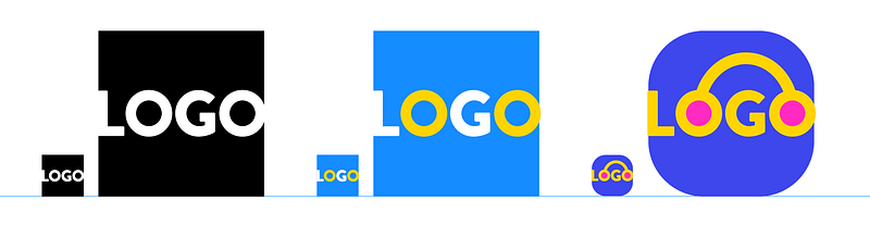
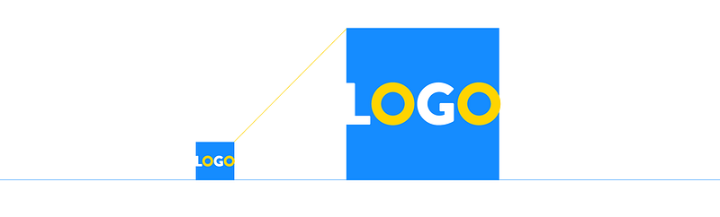
Testing, iterating, testing, iterating, this loop of development is part of the design journey. Testing the logo on different backgrounds and devices in different sizes is a crucial step in understanding what works well for the user in different scenarios and situations.
The logo needs to be visible and eye-catching in color and black and white. It needs to be legible on different textures and backgrounds, scalable and compatible on different devices, screens, and wearables.
Test your logo in a mock-up design, such as a cover or poster design, and import it to your mobile. See how the size of the logo within a brand asset corresponds to legibility.
Pro tip: Think about animation possibilities for the logo. Can you envision a useful and attractively animated build for the logo?
To wrap up
- Simplicity of design is a great entry point when starting the logo design phase. However, stay open-minded throughout the logo design process and review all design options. This can include icon development, custom fonts, or both.
- Develop an index of descriptive keywords in tandem with the logo design. Keywords drive the SEO searches.
- SEO-optimization of the logo file name and alt text is absolutely necessary to be discoverable on the net.
- Optimize your brand colors and fonts in your logo design for readability, contrast, and harmony.
- Test, iterate, test, iterate. Do not hesitate to open your designs to user feedback.
Thank you and enjoy the most rewarding process of logo design!
References:
[1] Starbucks Creative Expression, logo design and history: https://creative.starbucks.com/logos/
[2] Starbucks Stories: https://stories.starbucks.com/stories/2016/who-is-starbucks-siren/#
[3] Source UBER SEO keywords identified: https://moz.com/domain-analysis/uber.com


