
48 Data Visualizations That Load In A Single Line of Code
How you can pull one of a few dozen example political, sporting, education, and other data visualizations on-the-fly.
TLDR: If you’re bored with the same old example data visualizations — bookmark this article. It’ll show you nearly 50 examples you may not have previously worked with. Each example loads in one line of code.
A library of code examples that load data, and produce a viz, in one line of code (if you can forgive line continuation).
Examples draw from politics, education, health, sports, technology, and also just for funsies. As a data scientist this is a library I’ve needed handy but didn’t have. So I wrote it for myself and others. Please enjoy.
Introduction
Programming languages and statistical computing can be a tricky business. Especially when working on-the-fly within teaching, training, demonstration, and testing scenario. Data sets are not always so easy to come by so quick… and even more work away is the code to quickly analyze data. Let these examples be a library and cookbook for you that partially solves those problems with teaching data analysis within programming languages.
For teaching, training, demonstration, and testing purposes it is often handy to have a chance to load a data visualization quickly. Most data visuals will require the raw data, which these code examples also load. Each example loads the raw data and produces the data visualization in one line of code.
Not easy to get much more handy than that.
Of all the data visualization tools available, this article focuses on providing examples with Seaborn and also the Pandas plotting methods. The focus is not on clean “Pythonic” PEP compliant code conventions. The focus is hacking out functional examples of data visualizations that work in a single line of cate.
Imports
The following imports support these visualizations.
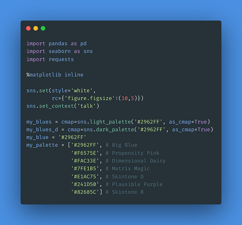
In these imports are the usual suspects including pandas (popular for data science, statistical analysis, data processing, and analyzing data) — seaborn (a data visualization software) — and requests (which serves data acquisition).
The %matplotlib inline code may be optional depending in your environmental setup. Two of my favorite aspects of this set-up code is also the sns.set_context('talk') line that bumps up the size of default font options — I like the way these context results look in Medium articles.
This code also specifies a few palettes which match my own personal palette.
As you read further, keep in mind that this article is not about writing “good code.” It is about quick examples that can produce a data visualizations on-the-fly for teaching, training, demonstration, and testing purposes.
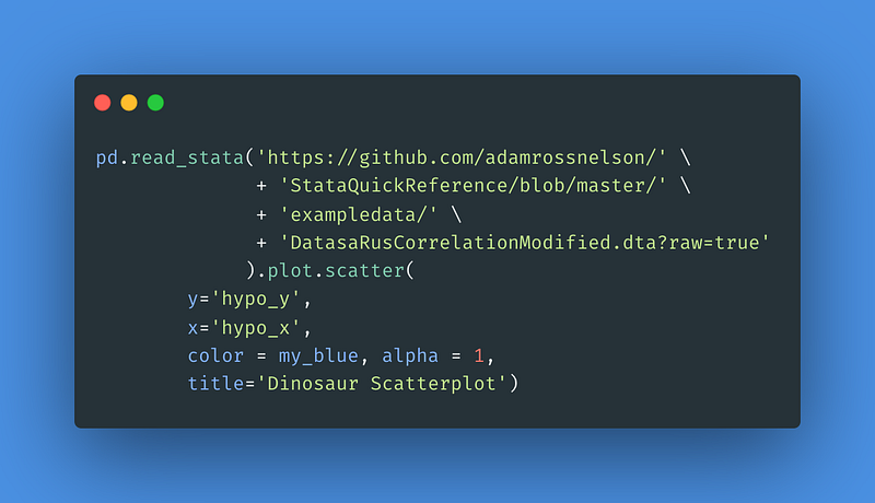
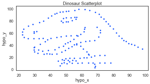
1 DinosaRus Data Set
Here you will find a data visualization of a dinosaur. When teaching data analysis and data mining I like to ask students “is there a relationship here?” When looking at the correlation coefficient, the answer is no. But then, you see there is a relationship. The dinosaur relationship.
For the result:
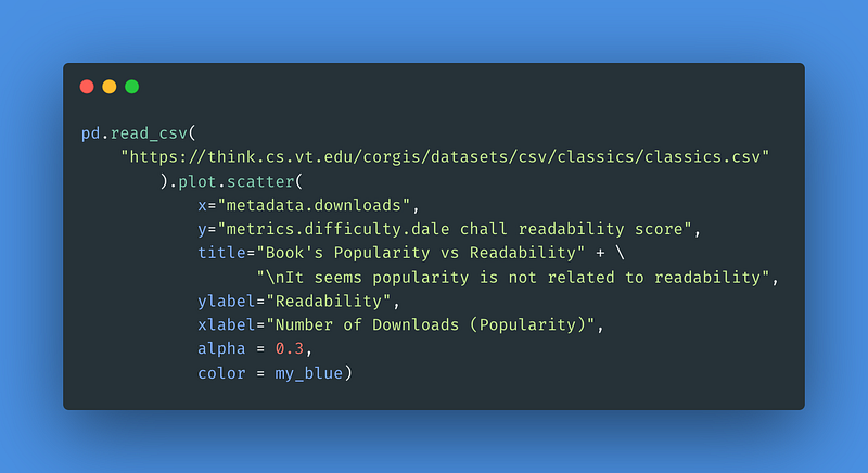
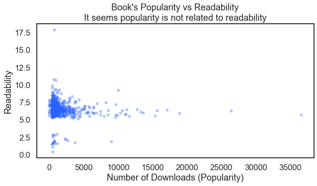
2 Book Popularity vs Readability
Is there a relationship between a book’s popularity and its readability? From a data set at Virginia Tech we can take a look at a scatter plot to find out. An important aspect of this code is the alpha = 3.0 option which gives a better understanding how dense the individual data points are.
For the result:
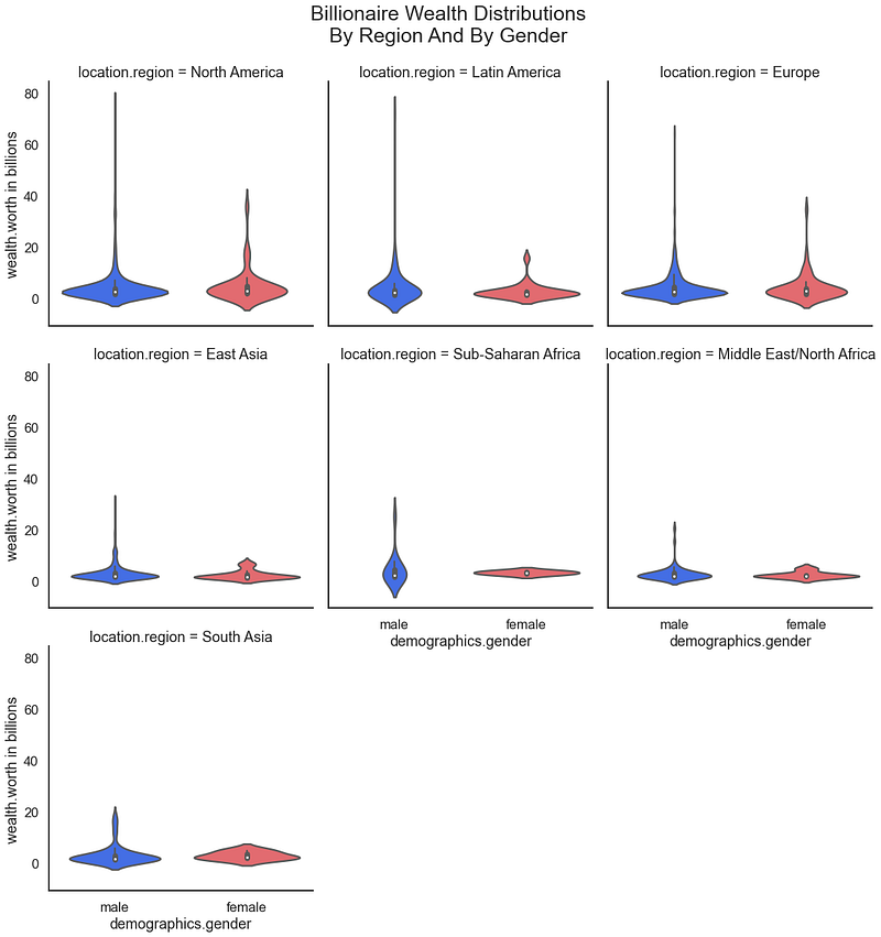
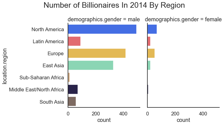
3–5 Billionaires Data Visualizations
Again referencing data sets from Virginia Tech, we can review the distribution of wealth among billionaires broken out by gender and region.
For the result:
Another method of looking at these billionaire data would be to have a bar chart. Here we look to chart the number of billionaires by region and gender.
For the result:
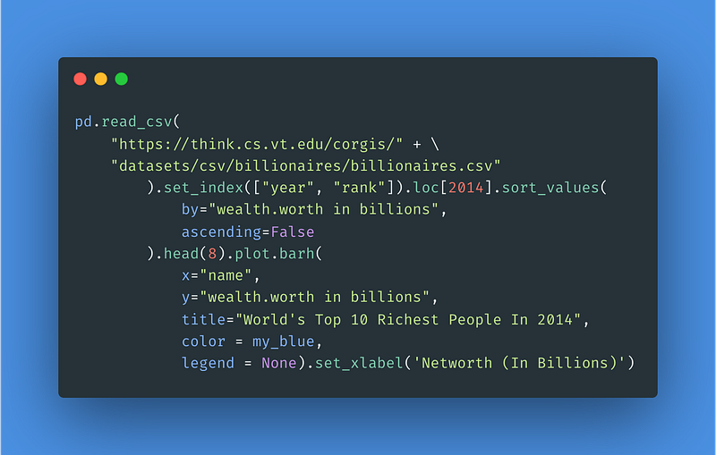
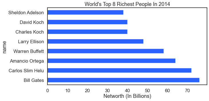
Nex in this data analysis how about a look at the top eight wealthiest billionaires?
For the result:
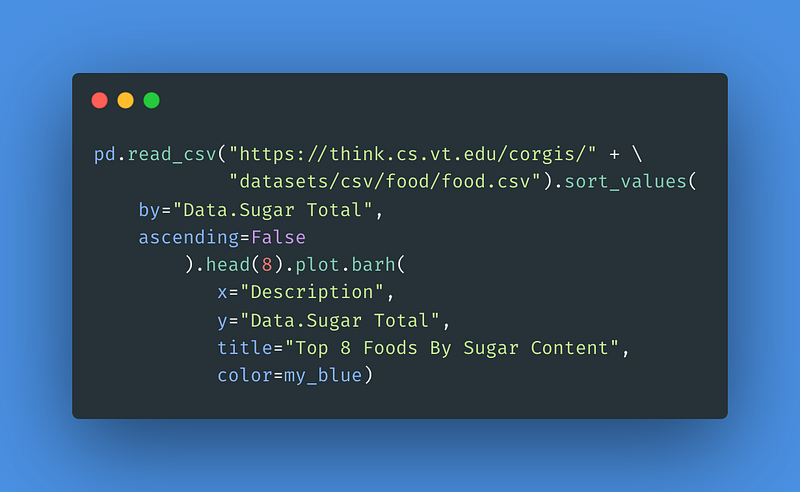
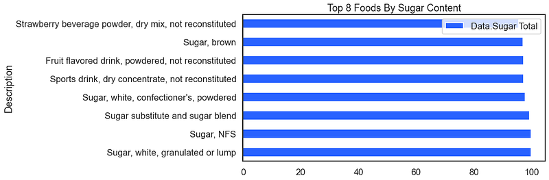
6–7 Food Data Visualizations
Moving on to a new type of data set but staying with the Virginia Tech data collection we can apply our visualization methods to to food data. Are you hungry yet? Here we look at the top ten foods that are most sugary.
For the result:
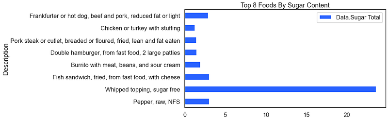
The above visual works because the data are already pre-sorted. A clever technique when exploring a data set on the fly is to use the pd.sample() method instead of the pd.head() method. When using the pd.sample(8) method instead you get a version of the following (your results will be different because we have disregarded the random seed).
For the result:
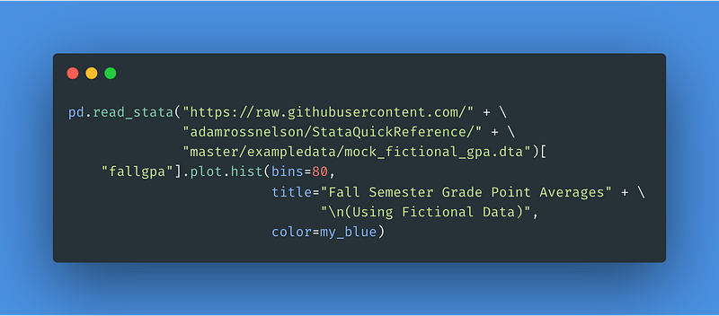
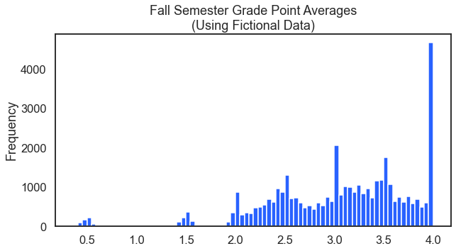
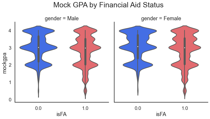
8–10 Fictional Grade Point Average
I’ve always been fascinated with the distribution of grade point averages GPAs. They tend to have spikes or modes at the whole and half numbers. You can see this distribution from the following code.
In preparation for a deeper statistical data analysis it would be smart to look at how the distribution might be different by gender and also whether that student receives financial aid.
For the result:
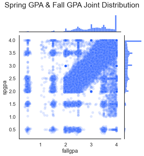
A related question might be if there is a relationship between fall and spring grade point averages. This data analysis asks if fall grade point average might predict spring grade point average (it does).
For the result:
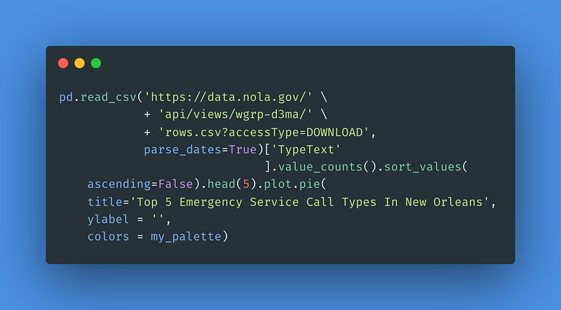
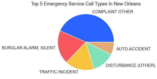
11 Emergency Service Calls In New Orleans
The city of New Orleans serves to the public municipal data for use by data scientists, data analysts, and other data professionals. These data provide excellent fodder for anyone interested in conducting training, testing, or demonstrations related to the data analysis process. The code here displays the top five emergency service call types in New Orleans as a pie chart.
For the result:
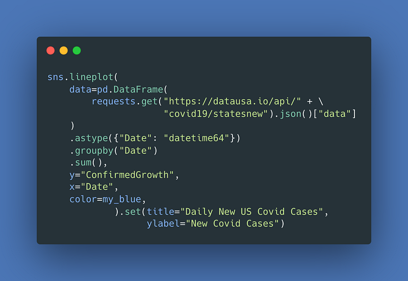
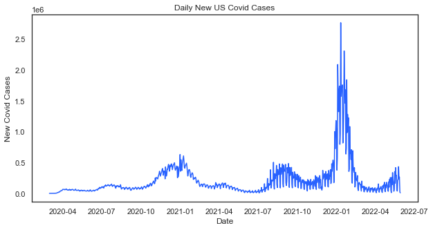
12–14 Coronavirus Data
Daily New Covid Cases In The U.S. — One of the most requested data visualization themes from clients recently has been Covid-related trends. Here is one that loads in a single line of code using data from datausa.io.
For the result:
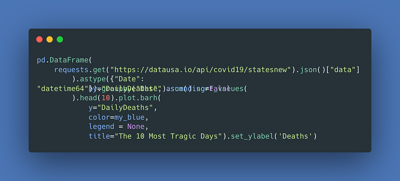
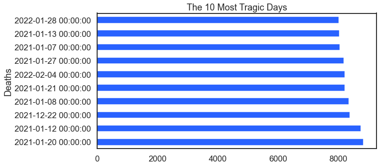
This visualization takes the same Covid data and identifies the 10 most tragic days.
For the result:
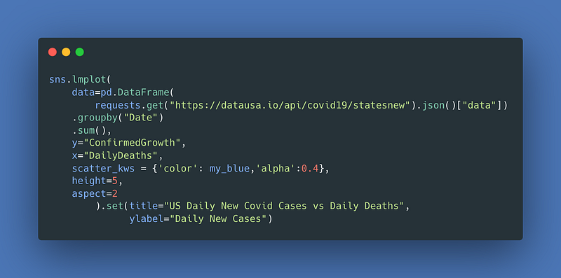
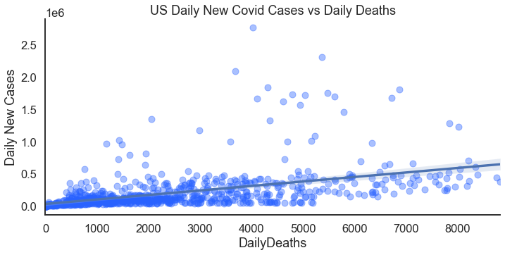
Just a few adjustments lets you compare the relationship between new cases and deaths.
For the result:
15–18 Sports Data
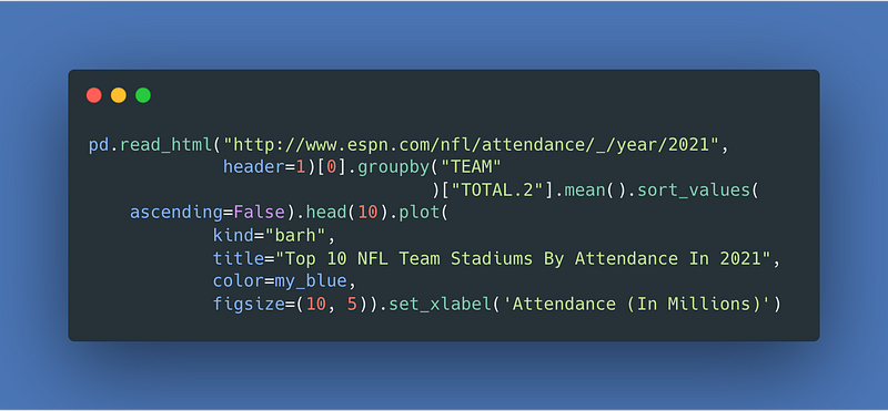
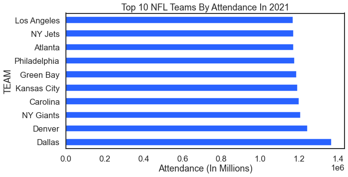
The world of sports is a rich source of data. Grabbing sports data for swift demonstrations, examples, training, and testing purposes is an easy way to go. Here we start with data from ESPN. This first sorts example shows stadium attendance by sports team in 2021. Who wants to cook up a figure that shows the Covid dip?
For the result:
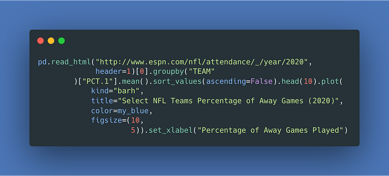
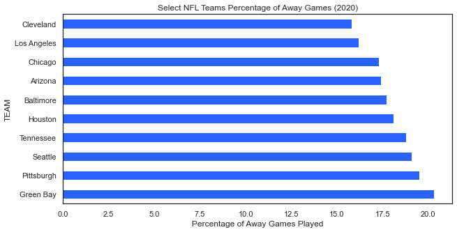
The next example also from ESPN shows the proportion of games played away for each NFL team.
For the result:
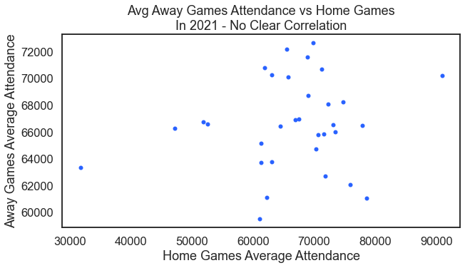
Could there be a correlation between average attendance at away games and the average attendance at home games? It seems no there is not.
For the result:
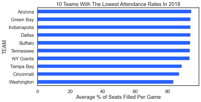
On the other end of the analysis are teams with low attendance. Here we look at the ten teams with the lowest attendance rages in 2018.
For the result:
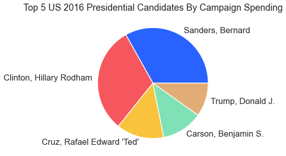
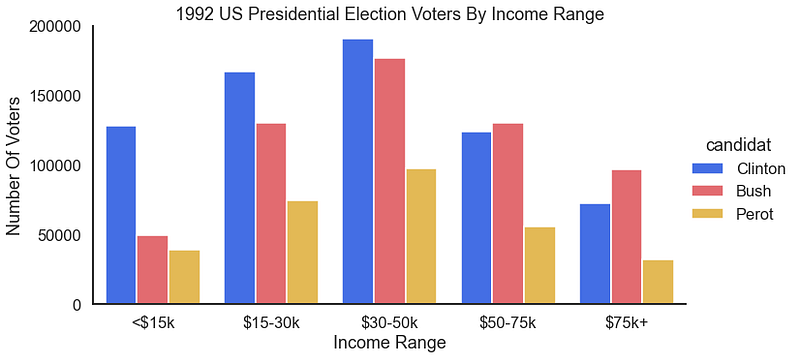
19–21 Politics Data
This article wouldn’t be complete without some visuals from politics. Not unlike sports, politics provide a rich data source, too. Here we start with data from Tableau and visualize spending in presidential campaigns.
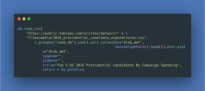
For the result:
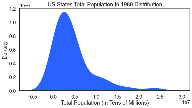
Under politics data I include a visual from U.S. Census data. This one is nice to have in the library because it shows how to do a kde plot as an area plot.
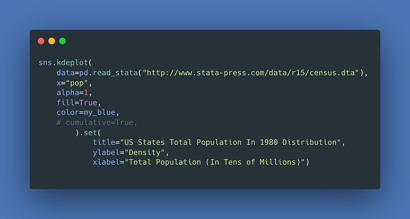
For the result:
How about a look at what age groups vote for which candidates. This simple bar chart does that for us.
For the result:
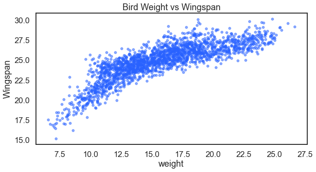
22–29 Fake Bird & Real Penguins Data Visualizations
I’ve previously written about making these fake birds data. I also used these fake bird data to demonstrate k-nearest neighbors. Here is another opportunity to explore the data more visually. Note: the relationships in these fake data are exaggerated (because it is fake data). First let us look at if there is a potential relationship between a bird’s weight and its wingspan.
For the result:
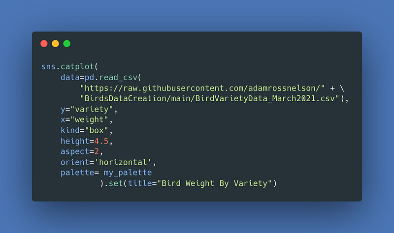
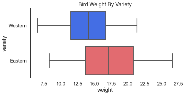
Next we can see if birds differ in weight by region. I love love love a good categorical box plot, personally!
For the result:
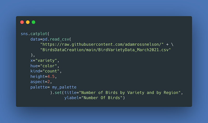
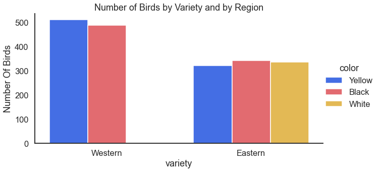
This regional difference looks interesting. Are there other differences? Perhaps the distribution of variety differs by region, too?
For the result:
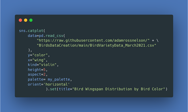
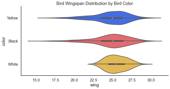
Taking a closer look at the wingspan, it might be interesting to see if the wingspans differ by variety. Spoiler alert: I bet they do! Almost as much as a good horizontal box plot, I also love a good violin plot.
For the result:
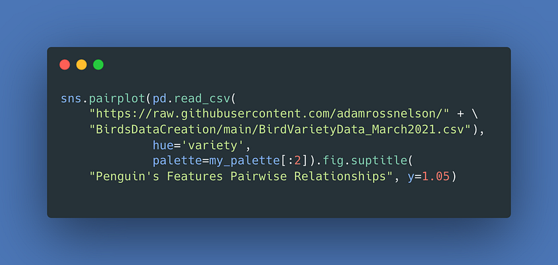
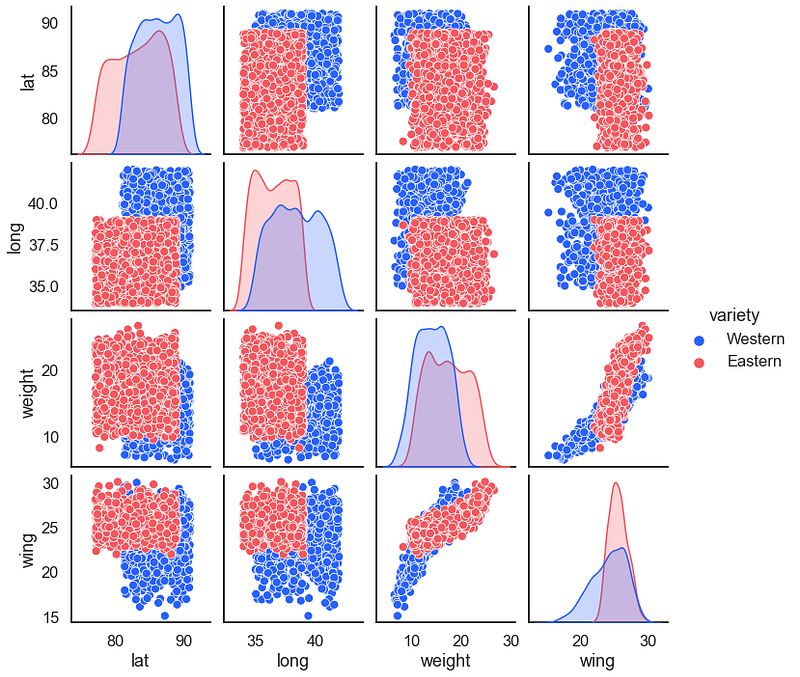
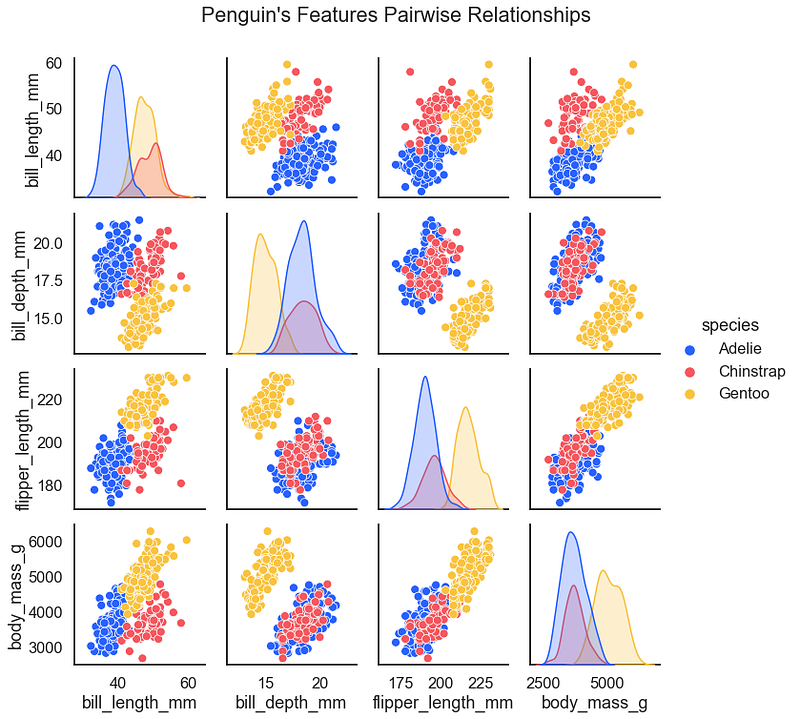
The Seaborn Penguins is similar to the fake birds data. Both work well as testing data for classification problems. One of the first steps in classification machine learning or artificial intelligence is to examine a hued pair plot. First, a pairplot for the fake birds.
For the result:
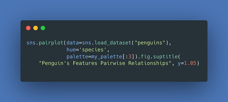
Next, as promised is the pairplot for the adorable penguins.
For the result:
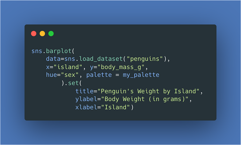
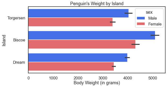
For some more fun with the penguins we can also look at how their body weight may differ based on the island they call home.
For the result:

The orient = 'h' option changes the orientation for the result:
30–35 Air Travel & Automobile Data
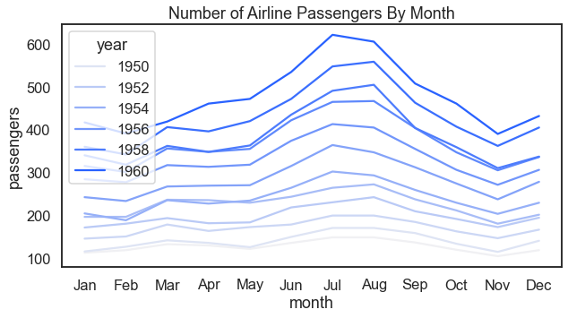
Before moving on to more extensive automobile examples below, here we look at a visual that examines how the number of passengers changes over the course of a year and also over the course of several years.
For the result:
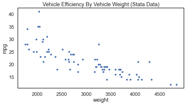
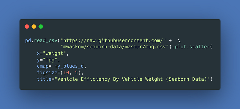
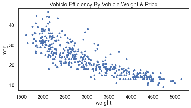
For anyone who has studied statistics with me, one of my favorite data visualizations is to scatter vehicle weight and vehicle efficiency. Where we set vehicle efficiency as the outcome variable on the y-axis and vehicle weight as the input variable on the x-axis. The functional form of these data make sense to me (and I hope it makes sense to others). That makes a go-to for me when teaching many analytical techniques.
There are at least two data sources that can do this for us. First, I will show the result with Stata’s auto.dta data. Further below you can see the result with Seaborn’s mpg.csv data.
For the result:
Now with Seaborn instead.
For the result:
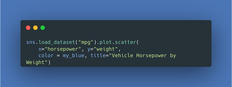
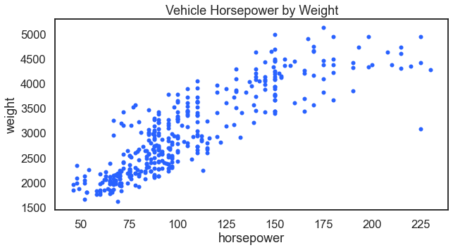
Related, it makes sense that a vehicles horsepower would also relate to its weight. A vehicle will need more power as it gets heavier.
For the result:
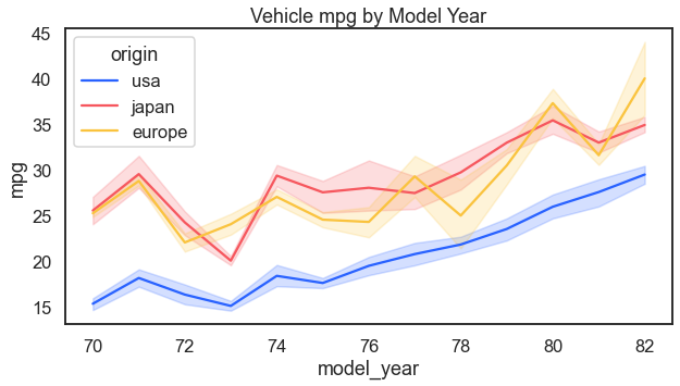
Another question could be whether efficiency has improved over time. It has.
For the result:
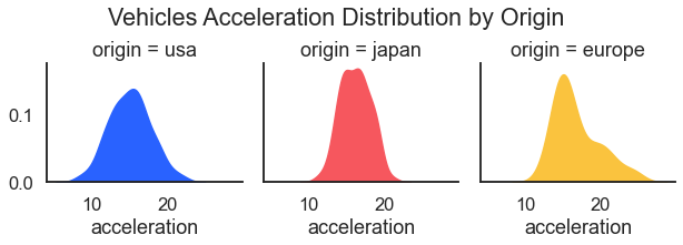
Before moving onto health data, just a bit more with autos. Here we look at how acceleration differs by source of manufacture.
For the result:
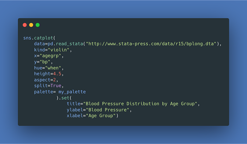
36–43 Health Data
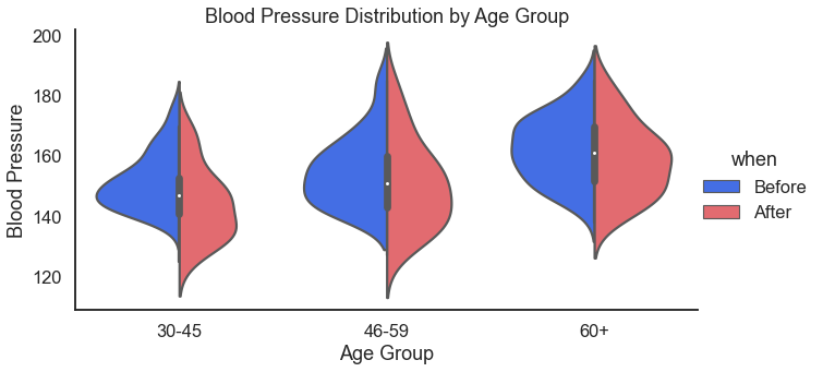
Health is a good place to go for demonstration, example, testing, and training data. Here we kick the health category off with blood pressure data. We use violin plots to look at blood pressure by age group and also by gender.
For the result:
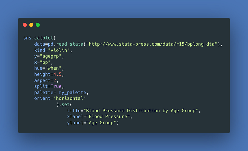
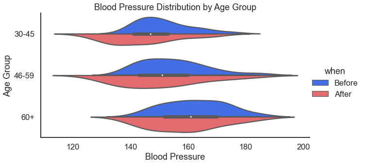
For those that prefer the horizontal orientation. I usually do prefer horizontal because I read left to right — just seems more intuitive to me. I also like horizontal because I think it fits better in documents and presentations.
Do this by adding the orient='horizontal' argument.
For the result:
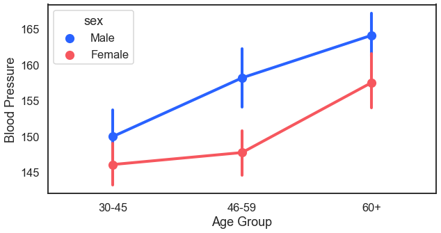
Another way to look at blood pressure by age would be to do a margin plot. Sometimes this is called point plot. Essentially, in this plot we plot the average (with confidence intervals) of blood pressure by age and then connect it with a trend line.
For the result:
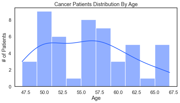
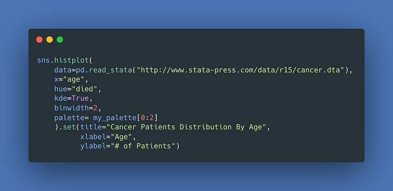
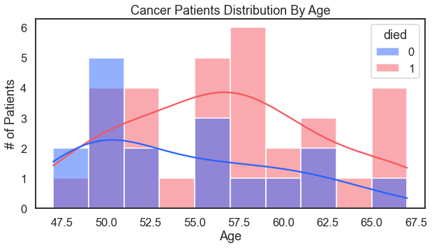
Cancer patients by age (with the assist of a trusty histogram). That includes a kde density line.
For the result:
Add survival to the hue argument for a more nuanced analysis.
For the result:
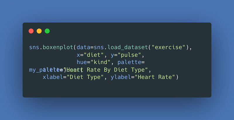
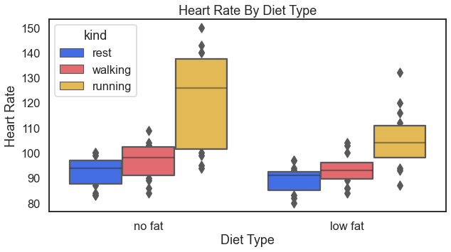
Another look at cardiovascular health could be to look over heart rates by diet types.
For the result (I’m going to start eating less fat):
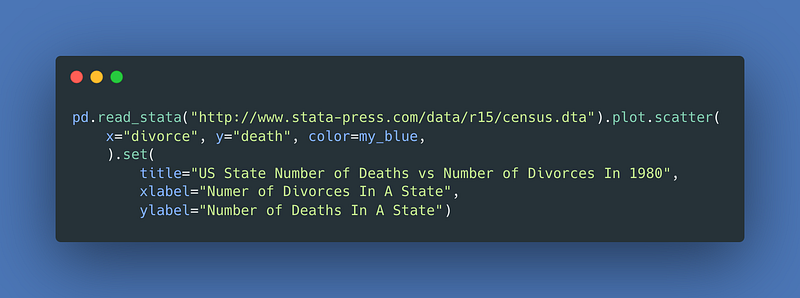
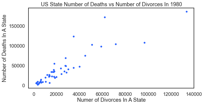
To continue with the health examples, this plot that looks at a state’s number of deaths and that state’s number of divorces. Misleading visual alert: Of course this visual shows a relationship — because as population increases in any state — so too will the number of deaths and divorces. Look below for a hacked up solution that produces a proper analysis.
For the result:
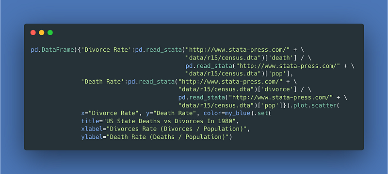
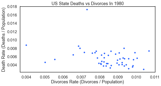
For a proper analysis, we need death and divorce rates. We need to normalize the data by dividing by the state’s population. The following code example (not pretty — not good code) does the job in one line. This visual is probably this article’s best example of how not to code. In actual practice the coding techniques here have serious limitations. Its one (and really only) benefit is that it produces the visual in one line of code.
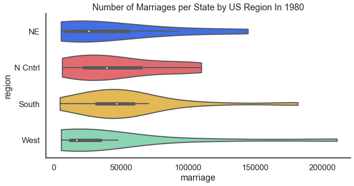
44 Marriage Data
Moving a way from health data in the previous section, but making a connection to the divorce data that we compared with death rates, how about we look at marriages. Also returning to the census data introduced above in the sections on politics we look at the number of marriages U.S. States but by region.
For the result:
45–47 Employment Data
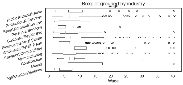
The popular National Longitudinal Survey of Women 1988 data provides a good source of data for a boxplot chart that helps examine how wages differ across industries.
For the result:
Continuing with the employment data comes this article’s first look at a strip plot. Some find strip plots hard to understand. They’re not so tough. A strip plot is a scatter plot but where one of the two variables is categorical. I particularly find strip plots where the x variable is ordinal and the range of that ordinal is small (less than 15–20 points). For example:
For the result:
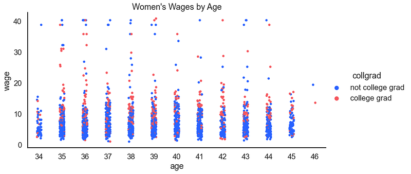
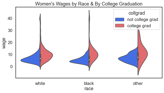
How about the distribution of wages, by race, and also by college graduation status?
For the result:
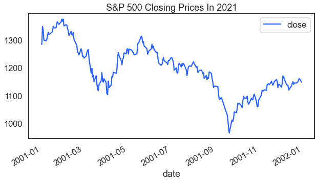
48 Finance Data
A library of data visualizations that didn’t include a reference to finance, economic, of stock data would be sad. Here is a look at S&P 500 index closing prices over time.
For the result:
Limitations
This article has a few limitations and caveats.
Style
The code examples in this article break many coding style conventions. Do not use this article as a model for style.
Line Continuation
For a few examples this article uses line continuation. In Python the backslash \accomplishes line continuation. Line wrap (or line continuation), for purposes of this article, does not count as a second line of code.
String Concatenation
In order to make the code look good here on the Medium platform and to avoid odd line-wrapping the article also uses string concatenation in a few places.
Indexing Lists Tables Lists
As you can read in the documentation for pd.read_html()this code returns a list of Pandas data frames. The list index in square brackets following pd.read_html()[i], here where i represents an index on the list is what finds the data frame of interest.
This article also uses requests.get().json() or requests.get().json()[data] to grab and identify json data from online. In a few examples above, the square bracket notation isolates the data of interest.
Thanks For Reading
Are you ready to learn more about careers in data science? I perform one-on-one career coaching and have a weekly email list that helps data professional job candidates. Contact me to learn more.
Send me your thoughts and ideas. You can write just to say hey. And if you really need to tell me how I got it wrong I look forward to chatting soon. Twitter: @adamrossnelson LinkedIn: Adam Ross Nelson.