4 PowerBi Hacks to Take Note Of For Your Next Dashboard
I bet you didn't know these!

Powerbi has many different functionalities that a user can exploit.
But how well do you know the various functions that they have to offer?
In this article, I hope to uncover a few more tricks that helped with my day-to-day work and I hope they can provide some help for you too.
Let’s jump in.
Adding search for your slicers
Sometimes it is necessary to use the slicer function to enable a view of the dashboard based on certain filters.
However, your slicer might have many different options to choose from. This might make it difficult for the user to navigate between option
Luckily there is a bonus feature within the slicer where you can add a search bar, making it easier to search for various options within your filter.
Here’s how we do it.
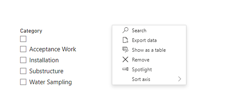
- Click on the three dots on your slicer
- You will see a search option pop up from the list as shown below. Select it.
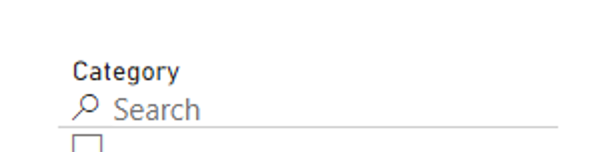
- Now you will be able to type in the value that you would like as shown below.
Fit to page for embedding dashboards
More often than not, we need to embed our dashboards onto other platforms and we need to ensure that we have the right type of view when it's being embedded.
I had cases where the view was either too zoomed in or too small for the user to see, and it was causing more complications.
One way to standardise this is to set the page view to fit to page.
Here’s how to do it.
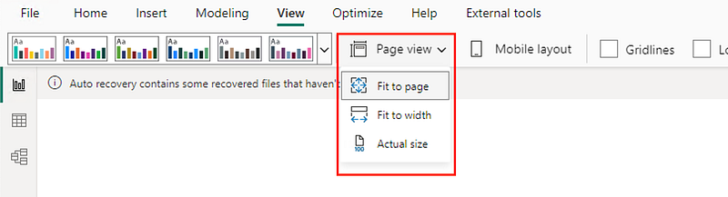
- Go to the top ribbon and select View.
- go under page view and select fit to page as shown below.
It should now resolve the issue if your view looks different.
If it's still not up to your expectations, you can try selecting the other views to see if there is a better fit.
Custom sort of legend
There might be cases where the legend of your chart may require a sort, to showcase the values properly.
One example could be showing counts groups of counts and we would ideally want to show them in ascending order.
For example, we might have something like “1–5”, “5–10”, “11–20”,20 or more”.
In this case, the legend might not show it properly since usually it takes it based on alphabetical order.
There is a cool way to mitigate this that can be done within the table. Here’s how it's done.
- Go to the table view of the table in question
- Select the column that needs sorting
- Under column tools, there is an option as highlighted below to sort the column by another column. Choose the corresponding column and it will resolve this issue.

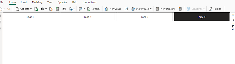
Adding a page navigator for your pages
It’s sometimes easier to navigate between pages through the main page instead of the tabs at the bottom.
This might be even more helpful when you need to embed your dashboard somewhere else, and it will make life a lot easier, as you technically then just need to embed one view instead of all your tabs.
Here’s how you can do that.
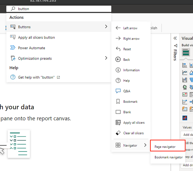
- Search for the button in the search
- Go down to Navigator and select Page Navigator like what you see below.
- You can copy and paste the visual onto all your tabs so that you now have a top bar menu to navigate to and from.
- Hidden pages will not be shown here so that makes it easier.
I hope these tips and tricks will help you for your next dashboard!
You can check out more about DAX in this article here.
Till the next one!