
4 Reasons To Move The Mac Dock To The Side
Here’s why I’m a complete convert to putting the Dock on the left-hand side on the screen
I’d always thought there was something wrong with people who put the Mac Dock on the side of the screen. Desperate attention seekers suffering from a deficit of parental love or some such. I was wrong. Spectacularly so.
For the past few months I’ve been working with the Dock stuck to the left-hand side of the screen and it’s a much better way of working — partly because of my slightly peculiar screen set-up, but mostly because it is just better for several reasons, which I’ll elaborate on here.
1. It’s a better use of screen space
Screens are generally landscape format — more wide than deep. Yet, we generally browse web pages, email and documents by reading from top to bottom. That puts a higher premium on vertical screen space, so why waste some of that by having the Dock occupying the foot of the screen?
2. It doesn’t get in the way of vertical screen set-ups
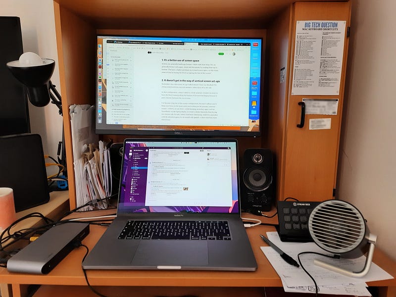
Remember that odd screen set-up I talked about? I have my MacBook Pro sitting underneath my external monitor, rather than off to the side.
In that configuration, which I admit is a little unusual, it makes no sense to have the Dock running along the bottom of the external display because it puts a barrier between the two screens.
I’ve become a big fan of this screen configuration, because it allows you to keep your focus on the main work you’re doing on the primary, external screen — which is at eye level — whilst keeping secondary apps (such as TweetDeck or Slack) on the laptop display. It creates a better hierarchy than having two screens side-by-side, which I find more distracting. And I’m a journalist with the attention span of a six-month-old spaniel — I don’t need any more distractions.
3. It creates symmetry with desktop icons on the right
By default, the Mac aligns desktop icons on the right-hand side of the screen. Since I’ve bought the Mac, I’ve become a bit obsessive about desktop tidiness, only keeping a strip of essential shortcuts and folders down the right. With the app windows sitting between the Dock on the left and the icons on the right, it creates a neat symmetry and gives me quick access to the things I need most often.
4. It forces you to be picky
If any of the reasons on this list are a bit of a stretch, it’s this one, but…
One of the disadvantages of having the Dock on the side is that it’s smaller, there’s less space for icons to stretch out. When I had my Dock along the foot of the screen, I whacked pretty much every installed program in there, because there was space. That’s not so easy with the condensed space down the side, unless you go for stupidly small icons.
However, I don’t think that’s necessarily a bad thing. There’s probably only half a dozen apps that you use on a daily basis, and the rest can be easily found with Spotlight search or Launchpad.
Apps aren’t children. Being forced to pick your favourites isn’t a moral vacuum.


