
3 Ways to smooth the Price Waves (with Python)

Photo by driawanadipra605711 on Vecteezy.com
When performing visual technical analysis, developing trading strategies, or strategy validation it can be very helpful to reduce the volatility and noise of a price chart in order to be able to be able to clearly recognize trend lines, levels of support and resistance and pivot points.
This story is solely for general information purposes, and should not be relied upon for trading recommendations or financial advice. Source code and information is provided for educational purposes only, and should not be relied upon to make an investment decision. Please review my full cautionary guidance before continuing.
In this post I would like to review three ways to smooth the price curve and discuss the pros and cons of each. We will also go over the implementation of each method in Python.
Here the three methods we will be using to smooth the price curve:
- Simple Moving Average
- Exponential Moving Average
- Kernel Regression.
Trade Ideas provides AI stock suggestions, AI alerts, scanning, automated trading, real-time stock market data, charting, educational resources, and more. Get a 15% discount with promo code ‘BOTRADING15’.
Simple Moving Average (SMA)
The Simple Moving Average (SMA) simply takes the prices over a certain period of time and divides the sum of the prices by the number of periods.
The SMA has the advantage that it is very simple to understand and to calculate.
Formula:
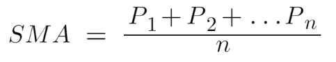
In order to be able to create a continuous SMA curve, we simple calculate the rolling SMA for each data point starting at the point of the SMA window (n) at which we have all the prices to calculate the SMA.
As we move forward to the next data point, we calculate the new SMA by simply removing the last price value and adding the new price value to the SMA formula.
3 and 20 period SMA of 100 days Tesla stock, 1 day period
Here and example of a 3 period (orange line) and 20 period (purple line) SMA. As you can see the 3 period SMA is much closer to the actual price line and nicely smooths out the extreme values.
The 20 period SMA smooths the curve even more and removes almost all the noise. However, we also see a considerable amount of lag due to the large window.
Exponential Moving Average (EMA)
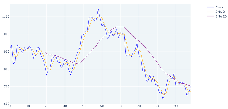
The Exponential Moving Average (EMA) is a moving average that employs a smoothing factor used to place more emphasis on the most recent price points and reduce emphasis on the past price points.
In comparison to the SMA, the EMA weights recent prices more heavily, which gives all data equal weight.
Formula:

For a shorter-period EMA, the weighting given to the most recent price is greater than for a longer-period EMA. For a 10-period EMA, for example, an 18.18 percent multiplier is applied to the most recent price data, whereas the weight for a 20-period EMA is only 9.52 percent.
3 and 20 period EMA of 100 days Tesla stock, 1 day period
When comparing the EMA to the SMA it becomes apparent that the 3 period EMA (light blue) creates a curve that is much tighter fitting to the actual curve due to the emphasis on the more recent prices. Still you see some lag in the 3 period EMA and a lot of lag in the 20 period EMA (dark green).
Kernel Regression
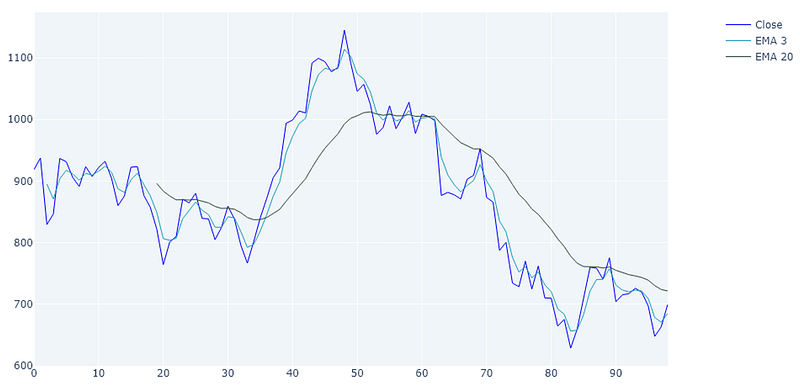
Kernel Regression is a statistics technique to estimate the expectation of a variable based on an input. So, in our case we are trying to estimate the price value (y) based on a given period in time (x).
There are several different Kernel regression approaches such as Nadaraya–Watson kernel regression, Priestley–Chao kernel estimator or Gasser–Müller kernel estimator.
The basic formula is actually quite simple, stating that the expectation of the value of Y in relation to X can be calculated using a Kernel function (m) using X as an input.
The Kernel function itself can get quite complex but in the case of the Nadaraya–Watson kernel regression approach it is simply the local averages of the Y values (Prices).
To explain the details of the Kernel Regression theory would extend past the scope of this article but if you are interested in learning more, here is a good introductory article.
The statsmodel KernelReg function which we was used to generate the graphs below uses the Nadaraya–Watson kernel regression.
Kernel regression least squares of 100 days Tesla stock, 1 day period
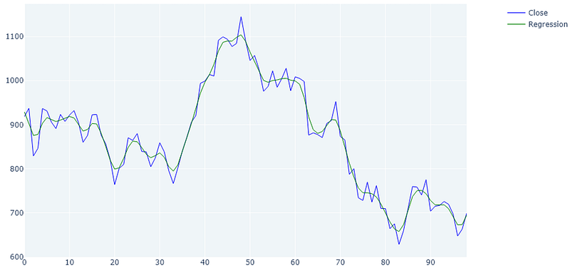
What is apparent when reviewing the Kernel regression curve is that it produces the most tight fitting curve which also reduces the noise and extremes.
You can also see that there is virtually no lag at all. This comes in handy when calculating entry and exit points, calculating trends, or support and resistance levels.
Another thing to point out here is that when using the regression method, there is not initial lag to calculate the first x values. The green line starts right at the beginning.
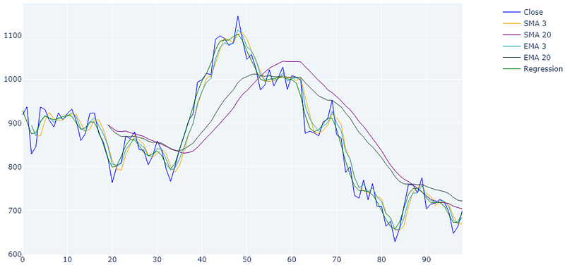
Combined Example
And here the comparison between all three: SMAs, EMAs and Kernel regression in the same diagram. I admit the diagram is a little busy hopefully you can see the differences between the methods.
Implementation
Here the implementation of the three methods in Python.
You can download the complete script from my blog ‘The Algorithmic Trading Blog’.
First, we need to import the required libraries. You may have to install some of these in your environment.
from datetime import datetime
import numpy as np
import pandas as pd
import datetime
import matplotlib.pyplot as plt
import plotly.graph_objects as go
from plotly.subplots import make_subplots
from statsmodels.nonparametric.kernel_regression import KernelReg
import pandas_ta as ta
from yahoo_fin import stock_info as si
from pandas.tseries.holiday import USFederalHolidayCalendar
from pandas.tseries.offsets import CustomBusinessDay
US_BUSINESS_DAY = CustomBusinessDay(calendar=USFederalHolidayCalendar())
Here a function to fetch daily data for a stock from Yahoo Finance. This is just retrieving some data to play with.
def load_daily_data_from_yahoo(symbol):
    # Download data
    try:
        today = datetime.date.today()
        today_str = today.strftime("%Y-%m-%d")
        start_date = today - (100 * US_BUSINESS_DAY)
        start_date_str = datetime.datetime.strftime(start_date, "%Y-%m-%d")
        df = si.get_data(symbol, start_date=start_date_str, end_date=today_str, index_as_date=False)
        return df
    except:
        print('Error loading stock data for ' + symbol)
        return Nonedef load_daily_data_from_yahoo(symbol):
    # Download data
    try:
        today = datetime.date.today()
        today_str = today.strftime("%Y-%m-%d")
        start_date = today - (100 * US_BUSINESS_DAY)
        start_date_str = datetime.datetime.strftime(start_date, "%Y-%m-%d")
        df = si.get_data(symbol, start_date=start_date_str, end_date=today_str, index_as_date=False)
        return df
    except:
        print('Error loading stock data for ' + symbol)
        return None
The next function calculates the SMAs and EMAs using pandas and pandas ta.
def calculate_tis(df):
    #  SMA
    df['SMA_3'] = df['close'].rolling(3).mean()
    df['SMA_20'] = df['close'].rolling(20).mean()
# EMA
df['EMA_3'] = ta.ema(df['close'], length=3)
df['EMA_20'] = ta.ema(df['close'], length=20) return dfThe next function calculates the kernel regression values. Here I used the KernelReg function of the statsmodel library.
def calculate_kernel_regression(df):
    close_df = df['close']
# Use Kernel Regression to create a fitted curve
bandwidth = 'cv_ls'
kernel_regression = KernelReg([close_df.values], [close_df.index.to_numpy()], var_type='c', bw=bandwidth)
regression_result = kernel_regression.fit([close_df.index]) # Get smoothed close prices
smoothed_prices_df = pd.Series(data=regression_result[0], index=close_df.index) return smoothed_prices_dfHere we create a function to visualize the plots using the matplotlib library. You can comment out the different lines to see individual plots.
def create_plot(df, smoothed_prices_df):
    fig = make_subplots(rows=1, cols=1, subplot_titles=[], \
                        specs=[[{"secondary_y": True}]], \
                        shared_xaxes=False, row_width=[1.0])
    #  Close
    fig.add_trace(
            go.Scatter(x=df.index, y=df['close'], line=dict(color="blue", width=1), name="Close"), row=1, col=1)
# SMAs
fig.add_trace(
go.Scatter(x=df.index, y=df['SMA_3'], line=dict(color="orange", width=1), name="SMA 3"), row=1, col=1) fig.add_trace(
go.Scatter(x=df.index, y=df['SMA_20'], line=dict(color="purple", width=1), name="SMA 20"), row=1, col=1) # EMAs
fig.add_trace(
go.Scatter(x=df.index, y=df['EMA_3'], line=dict(color="#219ebc", width=1), name="EMA 3"), row=1, col=1) fig.add_trace(
go.Scatter(x=df.index, y=df['EMA_20'], line=dict(color="#344e41", width=1), name="EMA 20"), row=1, col=1) # Kernel Regression
fig.add_trace(
go.Scatter(x=df.index, y=smoothed_prices_df, line=dict(color="green", width=1), name="Regression"), row=1, col=1)
    fig.update_layout(
        title={'text': f"SMA, EMA, Kernel Regression", 'x': 0.5},
        autosize=True,
        width=1000, height=600,
        xaxis={"rangeslider": {"visible": False}},
        plot_bgcolor="#EFF5F8")
    fig.update_yaxes(visible=False, secondary_y=True)
file_name = f"sma_ema_kernel_regression.png"
fig.write_image(file_name, format="png")Finally, the main function, which calls all the previous helpers in sequence.
# MAIN
if __name__ == '__main__':
    symbol = 'TSLA'
    df = load_daily_data_from_yahoo(symbol)
    if df is None:
        print('Unable to fetch price info')
        exit(0)
# Calculate SMAs and EMAs
df = calculate_tis(df) # Calculate Kernel Regression
smoothed_prices_df = calculate_kernel_regression(df) create_plot(df, smoothed_prices_df)Wrapping Up
This post was intended to present three different methods of reducing the volatility of a price curve in order to create a smoother curve which can be used for a variety of purposes such as visual technical analysis, pivot point calculation, trend calculation, or calculating entry and exit signals.
I hope you found this post worth your time. Thanks for reading.
You can support my writing for free using this link. Don’t miss another story — subscribe to my stories by email. For more premium content, check out my ‘B/O Trading Blog’ on Substack.
This post contains affiliate marketing links.
Have a great day!


