
3 Design Misconceptions You Should Get Rid Of
As designers, we pride ourselves on challenging the status quo. We ask so many questions, dig deep and come up with unexpected solutions. Yet we also blindly follow best UX practices and ‘rules of thumb’. In this article I’ll walk you through common design misconceptions, and who knows, maybe you’ve been following them for a while.

The 3 Click Rule.
It seems like an obvious one, yet it’s 2020 and I still hear about the 3 click rule in the context of best practices. Every time, I try my best to not roll my eyes.
It is an unofficial web navigation rule which states that users should be able to find any information on your website within 3 clicks. If they can’t, it’s suggested that users will get frustrated and lost, eventually abandoning your website never to return. Bye-bye conversions! 👋
It is hard to track back to the exact date when this was coined, but it started to gain traction after being mentioned by Jeffrey Zeldman in his popular 2001 book, “Taking Your Talent to the Web”.
I guess the key to the rule’s popularity is in its beautiful simplicity. It’s easy to remember, and it doesn’t include any technical or psychological mumbo-jumbo, helping it get wide adoption among managers and executives. You count clicks and your website navigation works just like magic. ✨
Limitations of the 3 Click Rule
The thing is that this rule has been never backed with actual data on user behaviour. In his article from 2003, Joshua Porter writes that there is zero correlation between clicks and user satisfaction rate whatsoever. In 2006, in the book “Prioritising Web Usability”, Hoa Loranger and Jakob Nielsen share results of a study stating:
Users would rather have several links telling them they’re headed the right direction at each step than think through just two or three lengthy lists of links and hope they guess the right place to click.
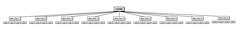
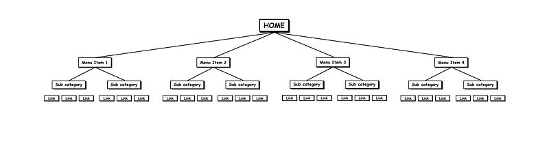
Information Architectures designed with the 3 Click Rule in mind can become extremely wide, thereby overwhelming users with an abundance of options accessible in 3 clicks or less. This is especially evident when talking about complex web applications:
Users don’t care how many times they clicked while cognitive load is low. Rather than counting clicks while you design, put your effort into creating a strong information scent. Provide your users with helpful UI coordinates:
- Where am I? - How do I go back? - Where can I go?
If you’re still counting clicks, it’s probably a good time to stop and focus on solving actual design problems.
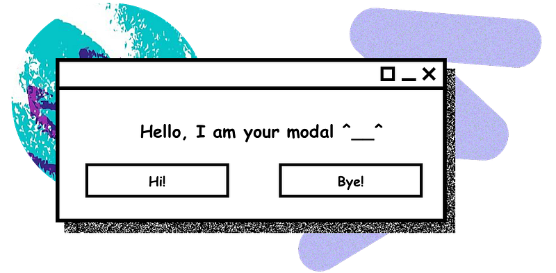
Modals are absolute evil and should never be used.
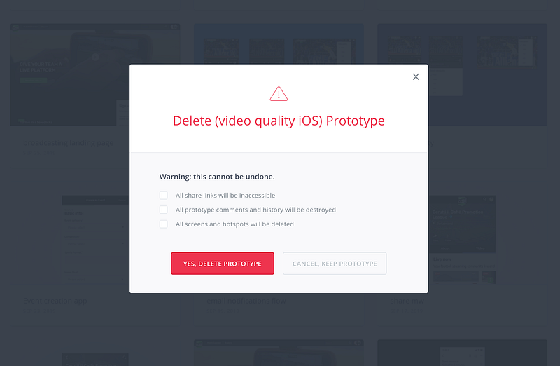
This is my second favourite statement in the design field. Modal windows are horrible, they interrupt the user’s workflow, demand attention and block important information on the screen.
The belief is that when users see a modal, they get scared and completely forget what they’ve been doing. Apparently this results in them leaving your website or application, and probably causes them to throw their device through the window afterwards, just to cope with frustration. Such exaggerations mean designers avoid using modal windows at all costs, even if it means that all interactions will happen on the data-heavy interface.
Modals vs Non-modals
Modal windows are dialogues that appear on top of the main content and move the system into a special mode (hence the name) requiring user interaction. Such dialogues disable the main content until the user explicitly interacts with it. They might require a simple interaction like pressing a button “Confirm”, or they might have a form inside.
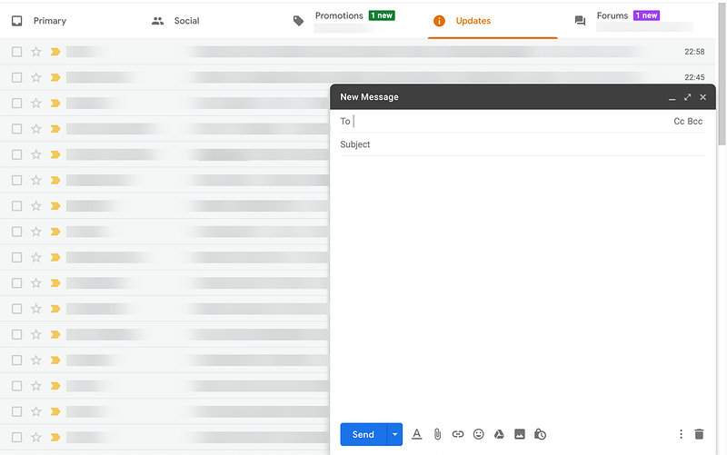
Non-modal windows are dialogues or windows that don’t prevent users from accessing the main content. The user can continue interacting with the main UI while the dialogue is open.
So are modals bad?
The answer is modals are completely normal and probably won’t go anywhere in the next 5–10 years. However, you need to be very careful when you’re using them. Consider alternative options — if the challenge you’re facing cannot be solved without a modal, then go fo it.
When is it acceptable to use them?
- To break down a complex workflow
- To make sure the user receives and/or acts on critical information
- To narrow user’s attention for a specific task in data-heavy UI
- When you need the user to act on something, but also need to keep him or her in the same context.
Some general rules for modals:
- Make sure that the modal is user-triggered.
- Try to stay consistent within the application so your UI remains predictable, and the user can create a clear mental model.
- Make sure it can be closed by clicking outside the modal window.
- Keep background behind the modal semi-transparent, so your user will keep the feeling of context.
For these cases use non-modal instead:
- Non-critical system messages
- User feedback forms
- Account creation messages
- GDPR consent (do get advice from the legal team first for this one)

Menus should have no more than 7 items.
In 1956 one of the founders of cognitive psychology, George A. Miller, published an article in Psychological Review. It was called “The Magical Number Seven, Plus or Minus Two: Some Limits on Our Capacity for Processing Information” and sparked many discussions around the limits of human cognition. It is also referred to as ‘Miller’s Law’, or a ‘Magic Rule of 7+/- 2’.
The rule states that a human’s short memory holds only 7 +/- 2 pieces of information. UX professionals widely use it when designing navigations and organising information. While there are limitations to our short memory, Miller never stated in his paper that a perfect amount of information can be shown in a given place. He later on stated:
“…the point was that 7 was a limit for the discrimination of unidimensional stimuli (pitches, loudness, brightness, etc.) and also a limit for immediate recall, neither of which has anything to do with a person’s capacity to comprehend printed text”
Following this principle is therefore useless in the best case scenario, and can be harmful in the worst. If, with the 3 click rule, a very wide navigation is created, the 7+/- 2 brings another extreme: a very narrow and deep navigation.
In reality, users don’t need to remember menu items or all the possible categories an application might have. They just need to be able to easily find the menu. Recognition over recall.
Here are some basic guidelines:
- Use clear navigation labels
- Run card sorting workshops with your users or stakeholders to create categories that make sense not only to you.
- Make sure that the information scent is strong
- Give user hints about visited links, previous searches, etc.
- Never rely on short-term memory.
Summarising all of the above
The main problem with UX rules is that they are too absolute, while in reality, it is never so simple and always depends on a variety of factors. That’s why you might not get desirable results by applying all the “best known practices”. Following Amazon, Google, Booking, or the way any other big company does things may not work either.
As a designer, you should be a critical thinker, and always check the data behind the statements — even when it comes to UX rules. 🙌


