
27 DATA VISUALIZATION BOOKS THAT EVERYONE SHOULD READ
Books offer wisdom that we ourselves might need years to figure out and writing about 27 good books seems to be an irksome job because on the way I might miss an opportunity to describe some books better. I will try to make this list as comprehensive as possible and will add only those books that have been important for me and I think of them as must read for you. This will be the best collection and you won’t regret reading any of the book because these are priceless. These data visualization books are actually packed with information covering data representations,Storytelling, and a variety of widely-used information’s and standards.Each of them has deeply touched me and spurred me on in my data journey I’ll give short summary of all the books along with the name and author of the books to make it easy for you to decide if they are useful for you or not.Please do not consider the order of titles as rankings for the books. These books have individually played different pivotal roles in Data World. Lets go through each of these books that can make your way much clearer, promising and easier.All these books based on relevance, popularity, ratings, and ability to add business value. Each book listed has a minimum of 50 Amazon user reviews and a rating of 3.0 or better.
1. THE VISUAL DISPLAY OF QUANTITATIVE INFORMATION AUTHOR — EDWARD R. TUFTE
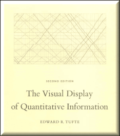
The classic book on statistical graphics, charts, tables. Theory and practice in the design of data graphics, 250 illustrations of the best (and a few of the worst) statistical graphics, with detailed analysis of how to display data for precise, effective, quick analysis. Design of the high-resolution displays, small multiples. Editing and improving graphics. The data-ink ratio. This is the second edition of The Visual Display of Quantitative Information. Recently published, this new edition provides excellent color reproductions of the many graphics of William Playfair, adds color to other images, and includes all the changes and corrections accumulated during 17 printings of the first edition.
2. NOW YOU SEE IT: SIMPLE VISUALIZATION TECHNIQUES FOR QUANTITATIVE ANALYSIS AUTHOR -STEPHEN FEW
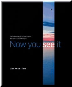
This book teaches simple, practical means to explore and analyze quantitative data–techniques that rely primarily on using your eyes. . You’ll learn to make sense of quantitative data by discerning the meaningful patterns, trends, relationships, and exceptions that measure your organization’s performance, identify potential problems and opportunities, and reveal what will likely happen in the future. Now You See It is not just for those with “analyst” in their titles, but for everyone who’s interested in discovering the stories in their data that reveal their organization’s performance and how it can be improved
3. STORYTELLING WITH DATA: A DATA VISUALIZATION GUIDE FOR BUSINESS PROFESSIONALS AUTHOR — COLE NUSSBAUMER KNAFLIC
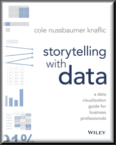
Storytelling with data teaches you the fundamentals of data visualization and how to communicate effectively with data. You’ll discover the power of storytelling and the way to make data a pivotal point in your story. The lessons in this illuminative text are grounded in theory, but made accessible through numerous real-world examples — ready for immediate application to your next graph or presentation. Storytelling is not an inherent skill, especially when it comes to data visualization, and the tools at our disposal don’t make it any easier. This book demonstrates how to go beyond conventional tools to reach the root of your data, and how to use your data to create an engaging, informative, compelling story.
4. INFO WE TRUST: HOW TO INSPIRE THE WORLD WITH DATA AUTHOR — RJ ANDREWS
This book draws from the entirety of human experience, quantitative and poetic. It teaches advanced techniques, such as visual metaphor and data transformations, in order to create more human presentations of data. It also shows how we can learn from print advertising, engineering, museum curation, and mythology archetypes. This human-centered approach works with machines to design information for people. Advance your understanding beyond by learning from a broad tradition of putting things “in formation” to create new and wonderful ways of opening our eyes to the world.Info We Trust takes a thoroughly original point of attack on the art of informing. Info We Trust is lavishly illustrated with hundreds of original compositions designed to illuminate the craft, delight the reader, and inspire a generation of data storytellers.
5. DATA VISUALIZATION: A HANDBOOK FOR DATA DRIVEN DESIGN AUTHOR — ANDY KIRK
This book is the starting point in learning the process and skills of data visualization, teaching the concepts and skills of how to present data and inspiring effective visual design. Benefits of this book: A flexible step-by-step journey that equips you to achieve great data visualization A curated collection of classic and contemporary examples, giving illustrations of good and bad practice Examples on every page to give creative inspiration Illustrations of good and bad practice show you how to critically evaluate and improve your own work Advice and experience from the best designers in the field Loads of online practical help, checklists, case studies and exercises make this the most comprehensive text available.
6. THE BIG BOOK OF DASHBOARDS: VISUALIZING YOUR DATA USING REAL-WORLD BUSINESS SCENARIOS AUTHOR — STEVE WEXLER, JEFFREY SHAFFER AND ANDY COTGREAVE
Learn how to build world-class business dashboards from leading experts in the field of data visualization. A well-designed dashboard can point out risks, opportunities, and more; but common challenges and misconceptions can make your dashboard useless at best, and misleading at worst. This workshop will discuss the tools, guidance, and models you need to produce great dashboards that inform, enlighten, and engage.
7. #MAKEOVERMONDAY: IMPROVING HOW WE VISUALIZE AND ANALYZE DATA, ONE CHART AT A TIME AUTHOR — ANDY KRIEBEL AND EVA MURRAY
#MakeoverMonday offers inspiration and a giant dose of perspective for those who communicate data. Originally a small project in the data visualization community, #MakeoverMonday features a weekly chart or graph and a dataset that community members reimagine in order to make it more effective. The results have been astounding; hundreds of people have contributed thousands of makeovers, perfectly illustrating the highly variable nature of data visualization. Different takes on the same data showed a wide variation of theme, focus, content, and design, with side-by-side comparisons throwing more- and less-effective techniques into sharp relief.
8. VISUALIZE THIS: THE FLOWINGDATA GUIDE TO DESIGN, VISUALIZATION AND STATISTICS AUTHOR — NATHAN YAU
Data doesn’t decrease; it is ever-increasing and can be overwhelming to organize in a way that makes sense to its intended audience. Wouldn’t it be wonderful if we could actually visualize data in such a way that we could maximize its potential and tell a story in a clear, concise manner? Thanks to the creative genius of Nathan Yau, we can. With this full-color book, data visualization guru and author Nathan Yau uses step-by-step tutorials to show you how to visualize and tell stories with data. He explains how to gather, parse, and format data and then design high quality graphics that help you explore and present patterns, outliers, and relationships
9. BEAUTIFUL VISUALIZATION: LOOKING AT DATA THROUGH THE EYES OF EXPERTS AUTHOR — JULIE STEELE
Visualization is the graphic presentation of data — portrayals meant to reveal complex information at a glance. Think of the familiar map of the New York City subway system, or a diagram of the human brain. Successful visualizations are beautiful not only for their aesthetic design, but also for elegant layers of detail that efficiently generate insight and new understanding. This book examines the methods of two dozen visualization experts who approach their projects from a variety of perspectives — as artists, designers, commentators, scientists, analysts, statisticians, and more. Together they demonstrate how visualization can help us make sense of the world.
10. EFFECTIVE DATA VISUALIZATION: THE RIGHT CHART FOR THE RIGHT DATA AUTHOR — STEPHANIE EVERGREEN
Written by sought-after speaker, designer, and researcher Stephanie D. H. Evergreen, Effective Data Visualization shows readers how to create Excel charts and graphs that best communicate data findings. This comprehensive how-to guide functions as a set of blueprints — supported by research and the author’s extensive experience with clients in industries all over the world — for conveying data in an impactful way. Delivered in Evergreen’s humorous and approachable style, the book covers the spectrum of graph types available beyond the default options, how to determine which one most appropriately fits specific data stories, and easy steps for making the chosen graph in Excel.
11. GOOD CHARTS: THE HBR GUIDE TO MAKING SMARTER, MORE PERSUASIVE DATA VISUALIZATIONS AUTHOR — SCOTT BERINATO
In “Good Charts,” dataviz maven Scott Berinato provides an essential guide to how visualization works and how to use this new language to impress and persuade. Dataviz today is where spreadsheets and word processors were in the early 1980s–on the cusp of changing how we work. Berinato lays out a system for thinking visually and building better charts through a process of talking, sketching, and prototyping. This book is much more than a set of static rules for making visualizations. It taps into both well-established and cutting-edge research in visual perception and neuroscience, as well as the emerging field of visualization science, to explore why good charts (and bad ones) create “feelings behind our eyes.”
12. DATA AT WORK: BEST PRACTICES FOR CREATING EFFECTIVE CHARTS AND INFORMATION GRAPHICS IN MICROSOFT EXCEL AUTHOR — JORGE CAMÕES
Data at Work will teach you how to think about and organize data in ways that directly relate to your work, using the skills you already have. In other words, Data at Work will help you to know which type of chart to use and how to format it, regardless of which spreadsheet application you use and whether or not you have any design experience. In this book, you’ll learn how to extract, clean, and transform data; sort data points to identify patterns and detect outliers; and understand how and when to use a variety of data visualizations including bar charts, slope charts, strip charts, scatter plots, bubble charts, boxplots, and more Visualizing Financial Data .
13. GRAPH ANALYSIS AND VISUALIZATION: DISCOVERING BUSINESS OPPORTUNITY IN LINKED DATA AUTHOR — RICHARD BRATH AND DAVID JONKER
Graph Analysis and Visualization brings graph theory out of the lab and into the real world. Using sophisticated methods and tools that span analysis functions, this guide shows you how to exploit graph and network analytic techniques to enable the discovery of new business insights and opportunities. Published in full color, the book describes the process of creating powerful visualizations using a rich and engaging set of examples from sports, finance, marketing, security, social media, and more. You will find practical guidance toward pattern identification and using various data sources, including Big Data, plus clear instruction on the use of software and programming.
14. THE TRUTHFUL ART: DATA, CHARTS, AND MAPS FOR COMMUNICATION AUTHOR — ALBERTO CAIRO
The Truthful Art explains: — The role infographics and data visualization play in our world — Basic principles of data and scientific reasoning that anyone can master — How to become a better critical thinker — Step-by-step processes that will help you evaluate any data visualization (including your own) — How to create and use effective charts, graphs, and data maps to explain data to any audience The Truthful Art is also packed with inspirational and educational real-world examples of data visualizations from such leading publications as The New York Times, The Wall Street Journal.
15. THE BOOK OF TREES: VISUALIZING BRANCHES OF KNOWLEDGE AUTHOR — MANUEL LIMA AND BEN SHNEIDERMAN
The Book of Trees, data viz expert Manuel Lima examines the more than eight hundred year history of the tree diagram, from its roots in the illuminated manuscripts of medieval monasteries to its current resurgence as an elegant means of visualization. Lima presents two hundred intricately detailed tree diagram illustrations on a remarkable variety of subjects — from some of the earliest known examples from ancient Mesopotamia to the manuscripts of medieval monasteries to contributions by leading contemporary designers. A timeline of capsule biographies on key figures in the development of the tree diagram rounds out this one-of-a-kind visual compendium.
16. THE BOOK OF CIRCLES: VISUALIZING SPHERES OF KNOWLEDGE AUTHOR — MANUEL LIMA
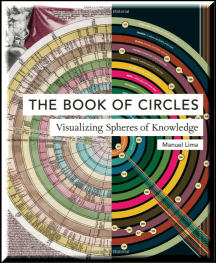
The Book of Circles juxtaposes clay trading tokens used by the ancient Sumerians with the iconic logos of twentieth-century corporations, a chart organizing seven hundred Nintendo offerings with a Victorian board game based on the travels of Nellie Bly, and a visual analysis of Stanley Kubrick’s film The Shining with early celestial charts that placed the earth at the center of the universe, among a wealth of other elegant and intriguing methods for displaying information. Lima provides an authoritative history of the circle as well as a unique taxonomy of twenty-one varieties of circle diagrams, rounding out this visual feast for infographics enthusiasts
17. COOL INFOGRAPHICS: EFFECTIVE COMMUNICATION WITH DATA VISUALIZATION AND DESIGN AUTHOR — RANDY KRUM
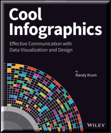
Research shows that visual information is more quickly and easily understood, and much more likely to be remembered. This innovative book presents the design process and the best software tools for creating infographics that communicate. Including a special section on how to construct the increasingly popular infographic resume, the book offers graphic designers, marketers, and business professional’s vital information on the most effective ways to present data. With Cool Infographics, you’ll learn to create infographics to successfully reach your target audience and tell clear stories with your data.
18. THE MODEL THINKER AUTHOR — SCOTT E. PAGE
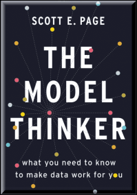
In The Model Thinker, social scientist Scott E. Page shows us the mathematical, statistical, and computational models–from linear regression to random walks and far beyond–that can turn anyone into a genius. At the core of the book is Page’s “many-model paradigm,” which shows the reader how to apply multiple models to organize the data, leading to wiser choices, more accurate predictions, and more robust designs. The Model Thinker provides a toolkit for business people, students, scientists, pollsters, and bloggers to make them better, clearer thinkers, able to leverage data and information to their advantage.
19. DEAR DATA AUTHOR — GIORGIA LUPI POSAVEC AND STEFANIE
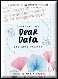
Dear Data reproduces in pinpoint detail the full year’s set of cards, front and back, providing a remarkable portrait of two artists connected by their attention to the details of their lives — including complaints, distractions, phone addictions, physical contact, and desires. These details illuminate the lives of two remarkable young women and also inspire us to map our own lives, including specific suggestions on what data to draw and how. A captivating and unique book for designers, artists, correspondents, friends, and lovers everywhere.
20. OBSERVE, COLLECT, DRAW!: A VISUAL JOURNAL AUTHOR — GIORGIA LUPI AND STEFANIE POSAVEC
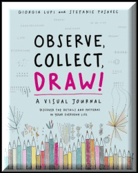
A guided journal with a fresh approach to the trend of journal-as-tool-for-self-examination. The journal is delightfully illustrated in the authors’ trademark style — accessible, whimsical, detailed. Blending inspiring examples with engaging instruction, this journal asks: What do we learn about ourselves when we measure our gratitude, confidence, and distraction levels? What do our collections say about who we are: our books, music, the clothes we wear? Observe, Collect, Draw! functions as a mini-course in information design, as accessible to beginners as it is engaging to seasoned info designers.
21. PAINTING WITH NUMBERS: PRESENTING FINANCIALS AND OTHER NUMBERS SO PEOPLE WILL UNDERSTAND YOU AUTHOR — RANDALL BOLTEN AND TOM CAMPBELL
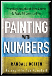
Painting with Numbers is brimming with hands-on advice, techniques, tools, rules, and guidelines for producing clear, attractive, and effective quantation (the word the author has coined for the skill of presenting numbers).Whether you are distributing a report or giving a presentation, you have a lot of numbers to present and only a few minutes to get your point across. Your audience is busy and has a short attention span. Don’t let an amateur presentation bog you down, confuse your audience, and damage your credibility. Instead, learn how to present numerical information effectively–in the same way you learned how to speak or write. With Painting with Numbers, you’ll discover how to present numbers clearly and effectively so your ideas and your presentation shine.
22. KNOWLEDGE IS BEAUTIFUL AUTHOR — DAVID MCCANDLESS
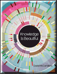
We are living in the Information Age, in which we are constantly bombarded with data — on television, in print and online. How can we relate to this mind-numbing overload? Enter David McCandless and his amazing infographics: simple, elegant ways to understand information too complex or abstract to grasp any way but visually. In his unique signature style, he creates dazzling displays that blend facts with their connections, contexts and relationships, making information meaningful, entertaining — and beautiful. Taking infographics to the next level, his new book Knowledge is Beautiful is an endlessly fascinating spin through the world of visualized data, which offers a deeper, more wide-ranging look at the world and its history. Covering everything from dog breeds and movie plots to the origins of life and a timeline of the far future, this stunning book is guaranteed to enrich your understanding of the world.
23. FACTS ARE SACRED AUTHOR — SIMON ROGERS
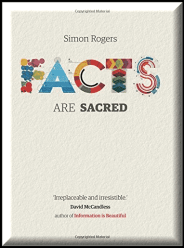
From today you can get a new version of Facts are Sacred, developed specially for iPad. It has all the visualizations and text from the hardback version but with lots more. This is a book you can interact with. Engage with interactive elements that show you what the world was like when you were born, or how rumours explode and are denounced on Twitter. Get the inside view on how journalists dealt with the enormous amounts of data contained in the WikiLeaks information
24. BETTER PRESENTATIONS: A GUIDE FOR SCHOLARS, RESEARCHERS, AND WONKS AUTHOR — JONATHAN SCHWABISH
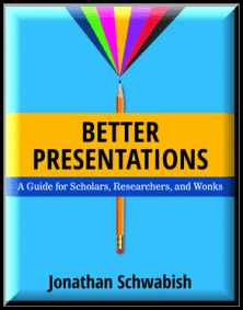
Designed for presenters of scholarly or data-intensive content, “Better Presentations “details essential strategies for developing clear, sophisticated, and visually captivating presentations. Following three core principles–visualize, unify, and focus–“Better Presentations” describes how to visualize data effectively, find and use images appropriately, choose sensible fonts and colors, edit text for powerful delivery, and restructure a written argument for maximum engagement and persuasion. With a range of clear examples for what to do (and what not to do), the practical package offered in” Better Presentations” shares the best techniques to display work and the best tactics for winning over audiences.
25. W. E. B. DU BOIS’S DATA PORTRAITS: VISUALIZING BLACK AMERICA AUTHOR — WHITNEY BATTLE-BAPTISTE
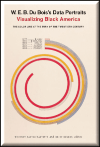
The colorful charts, graphs, and maps presented at the 1900 Paris Exposition by famed sociologist and black rights activist W. E. B. Du Bois offered a view into the lives of black Americans, conveying a literal and figurative representation of “the color line.” From advances in education to the lingering effects of slavery, these prophetic infographics — beautiful in design and powerful in content — make visible a wide spectrum of black experience. W. E. B. Du Bois’s Data Portraits collects the complete set of graphics in full color for the first time, making their insights and innovations available to a contemporary imagination.
26. VISUALIZING FINANCIAL DATA AUTHOR — JULIE RODRIGUEZ , PIOTR KACZMAREK
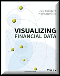
In Visualizing Financial Data, authors Julie Rodriguez and Piotr Kaczmarek draw upon their understanding of information design and visual communication to show you how to turn your raw data into meaningful information. Coverage includes current conventions paired with innovative visualizations that cater to the unique requirements across financial domains, including investment management, financial accounting, regulatory reporting, sales, and marketing communications.Presented as a series of case studies, this highly visual guide presents problems and solutions in the context of real-world scenarios. With over 250 visualizations, you’ll have access to relevant examples that serve as a starting point to your implementations.
27. PHOTOVIZ: VISUALIZING INFORMATION THROUGH PHOTOGRAPHY AUTHOR — NICHOLAS , SVEN AND ROBERT KLANTEN

PhotoViz explores the intersection of photography, infographics, and data visualization. Combining cutting-edge technology and classic photographic techniques enables us to tell stories and visualize information more powerfully and compactly than ever: a full day of flights all at once, invisible Wi-Fi networks, global trade, intimate psychology, movement, time itself, and more.The concept of PhotoViz invites us to simultaneously reinvent our collective reality and demystify our surroundings. Within this mesmerizing photographic world, striking images reveal the power of tools ranging from long exposure and slit-scan photography to post-processing, collage, and metadata. PhotoViz is a source of inspiration and a crucial resource for designers and photographers alike.
I hope you enjoyed the post ,please don’t forget to share this Article with others on Facebook, Twitter, LinkedIn and Whatsapp ,as it will help them and make my countless hours of work count. If you have any questions please do not hesitate to contact me on twitter (@rajvivan) or LinkedIn (@rajvivan)


