
30 R Packages For Data Visualization That You May Not Know Of
The packages/add-ins we will cover in this article include:
- Interactive Graphics:
ggvis,esquisse,ggThemeAssist,plotly,shiny,flexdashboard - Correlation Matrix:
corrplot,ggcor,ggally - Heatmap:
heatmap.2,d3heatmap,pheatmap,ComplexHeatmap,InteractiveComplexHeatmap - Color Theme:
tvthemes,ggtech,ggsci,ggthemr,MetBrewer,ghibli,ggcute,ggpattern - 3D Visualization:
scatterplot3d,plot3d,rayshader,ggthreed - Other Plots:
ggpol,raincloud plot (ggrain, gghalves),ggstatsplot (highly recommend!),waffle plot (waffle, ggwaffle),treemapify

1. Interactive Graphics
1.1 ggvis
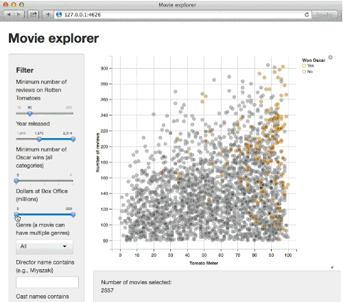
ggvis creates rich interactive graphics that you can play with locally.
1.2 esquisse add-in
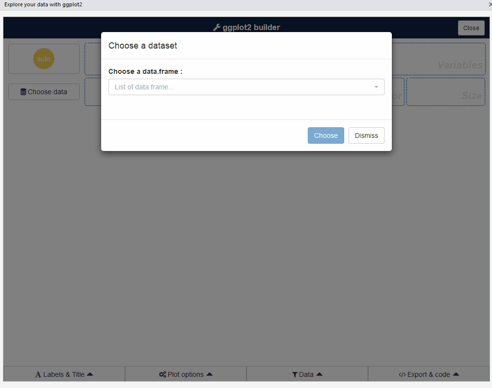
You can create plots by dragging and dropping.
1.3 ggThemeAssist
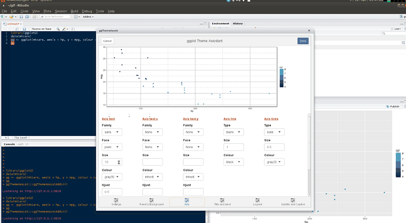
It’s an add-in that gives a graphical interface for editing ggplot2 elements. Highly recommend!
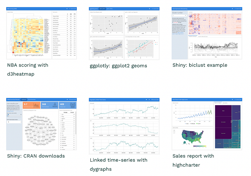
1.4 plotly
plotly’s R graphing library makes interactive, publication-quality graphs.
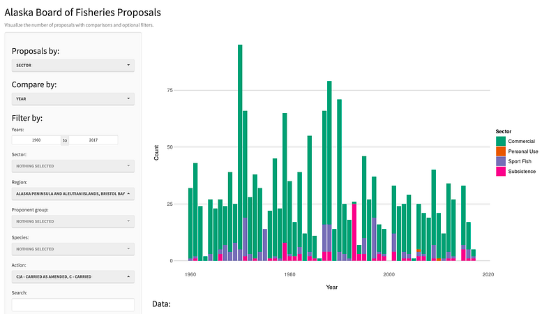
1.5 shiny
shiny is an R package that makes it easy to build interactive web apps straight from R.
1.6 flexdashboard
Similar to the shiny package, flexdashboard supports the construction of data visualization dashboards in a simpler way. It visualizes data through R Markdown files and publishes them as visual dashboards in the form of web pages.
2. Correlation Matrix
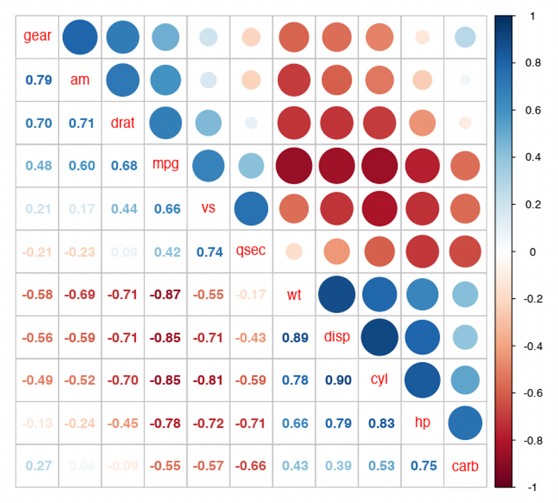
2.1 corrplot
corrplot provides a visual exploratory tool on correlation matrix
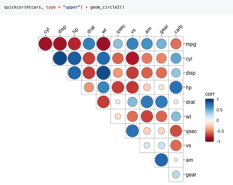
2.2 ggcor
ggcor provides functions to visualize a correlation matrix.
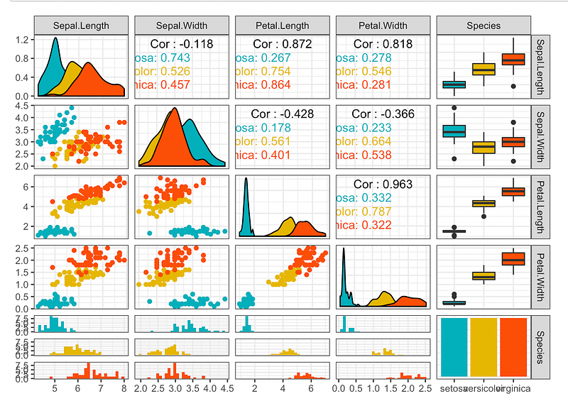
2.3 ggally
ggally extends ggplot2 by providing several functions including:
ggcor(): for pairwise correlation matrix plotggpairs(): for scatterplot plot matrixggsurv(): for survival plot
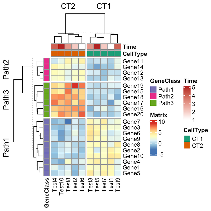
3. HeatMap
Packages can generate heatmaps include the following:
heatmap.2d3heatmappheatmapComplexHeatmapInteractiveComplexHeatmap
4. Color Theme
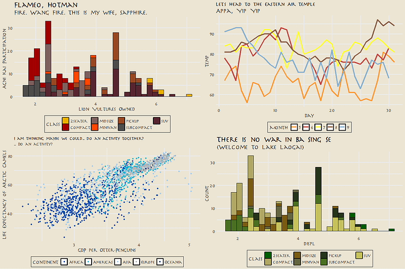
4.1 tvthemes
tvthemes is a collection of various ggplot2 themes and color/fill palettes based on everybody’s favorite TV shows including Avatar, Brooklyn Nine-Nine, Game of Thrones, Parks & Recreation, The Simpsons: theme + palette, and Spongebob.
4.2 ggtech
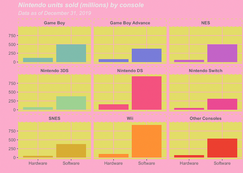
ggtech package can generate plots with theme colors from tech companies.
d + theme_tech(theme="google") + ggtitle("Google ggplot2 theme") + scale_fill_tech(theme="google")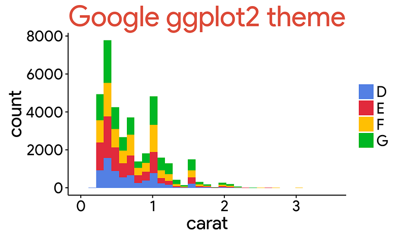
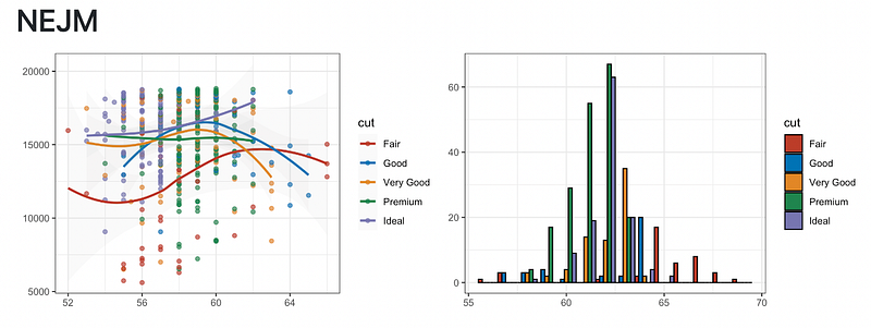
4.3 ggsci
ggsci offers a collection of ggplot2 color palettes inspired by scientific journals include NEJM, JAMA, Lancet, etc.
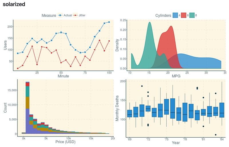
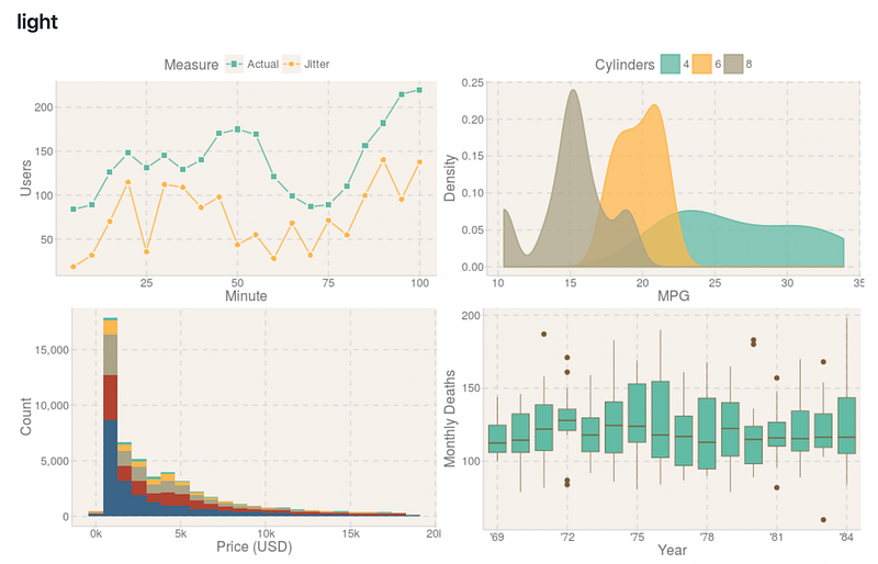
4.4 ggthemr
ggthemr includes 17 themes, such as flat, dust, light, solarized, etc.
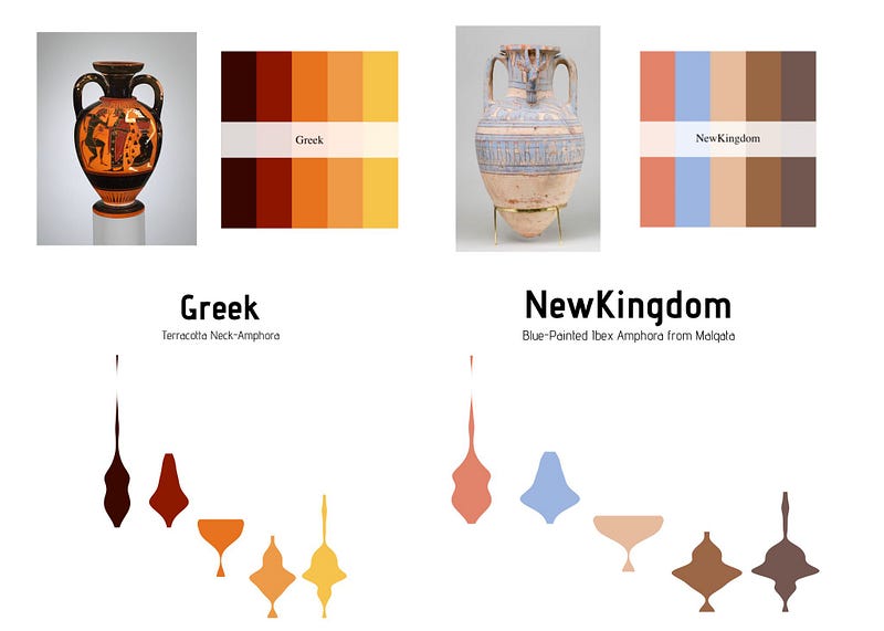
4.5 MetBrewer
Metbrewer is a color palette package inspired by works at the Metropolitan Museum of Art in New York.
4.6 ghibli
The ghibli package provides color palettes inspired by Studio Ghibli founded by Hayao Miyazaki. It provides palettes from 9 films, with a light, medium, and dark variant for each.
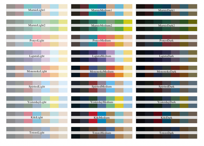
Ponyo corresponds to the movie Ponyo on the Cliff
Totoro: My Neighbor Totoro
Marnie: When Marnie Was There
Laputa: Castle in the Sky
Mononoke: Princess Mononoke
Sprited: Spirited Away
Yesterday: Only Yesterday
Kiki: Kiki’s Delivery Service
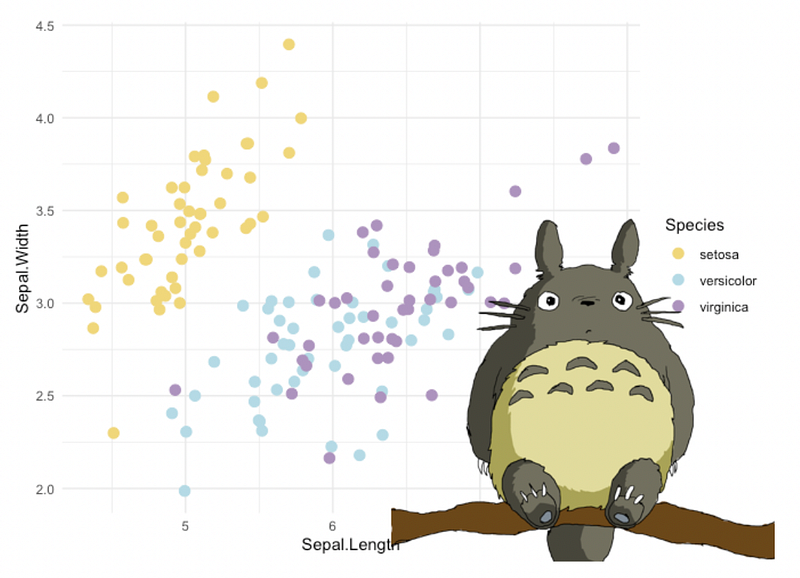
4.7 ggcute
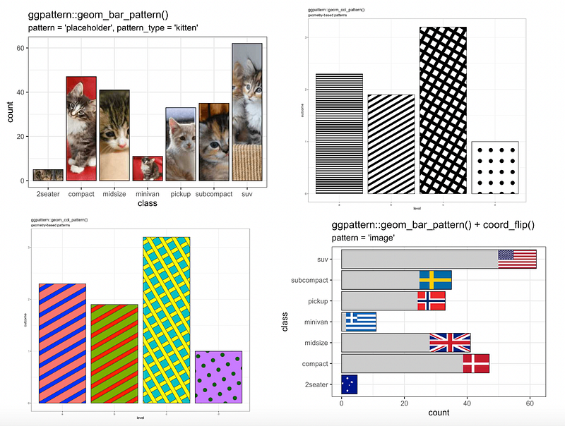
4.8 ggpattern
ggpattern provides custom ggplot2 geoms which support filled areas with geometric and image-based patterns.
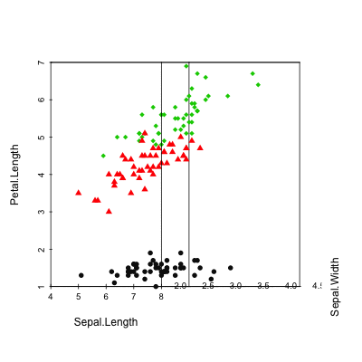
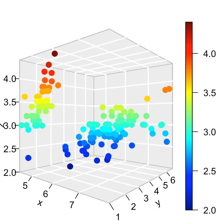
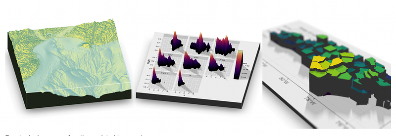
5. 3D Visualization
5.1 scatterplot3d
scatterplot3d is an R package for the visualization of multivariate data in a three dimensional space.
5.2 plot3d
5.3 rayshader
The rayshader package converts ggplot2 visualizations into 3D.
5.4 ggthreed
6. Other Plots
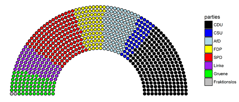
6.1 ggpol
ggpol adds parliament diagrams and various other visualizations and convenience functions to ggplot2.
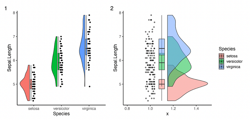
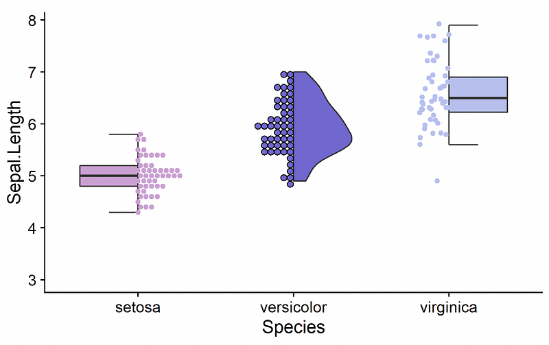
6.2 ggrain, gghalves
ggrain and gghalves allow you to create raincloud plots. A raincloud plot is a combination of a boxplot, density (violin) and individual data points.
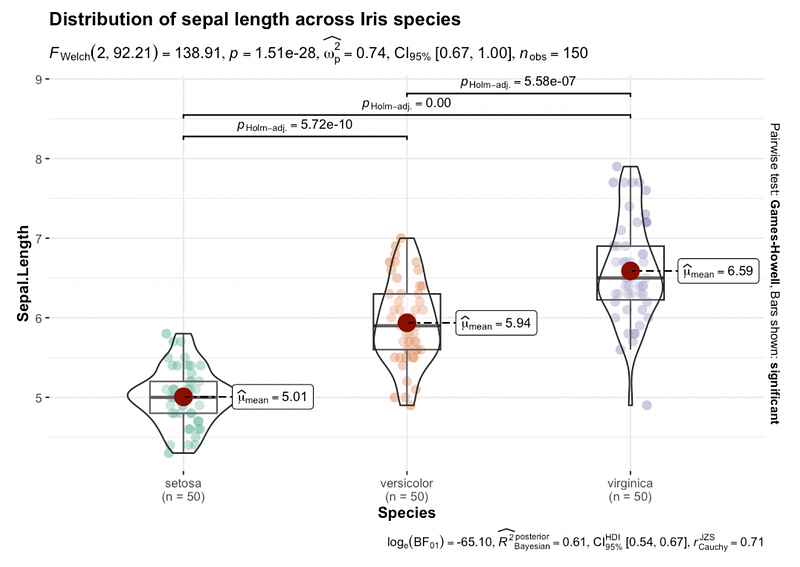
6.3 ggstatsplot
ggstatsplot creates graphics with details from statistical tests included in the information-rich plots themselves. Highly recommend!
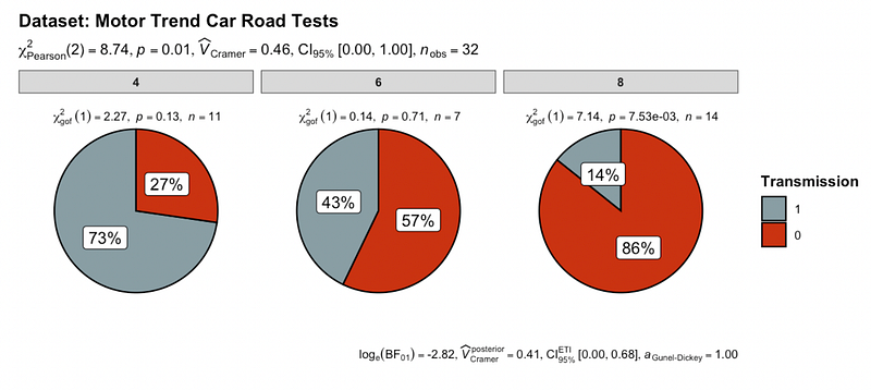
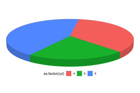
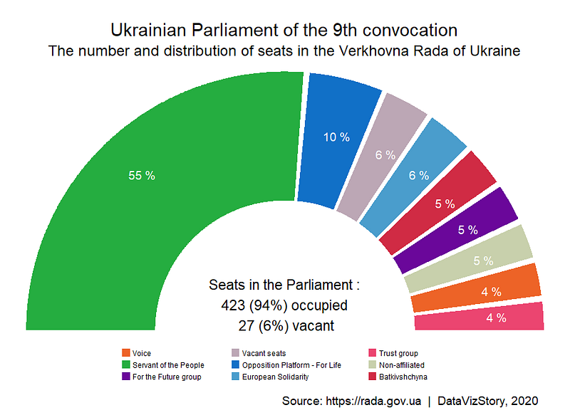
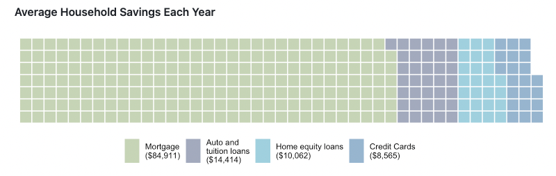
6.4 waffle, ggwaffle
Waffle charts (waffle, ggwaffle)can be used to communicate parts of a whole for categorical quantities.
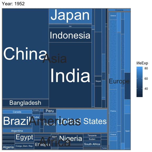
6.5 treemapify
In a treemap, each tile represents a single observation, with the area of the tile proportional to a variable.
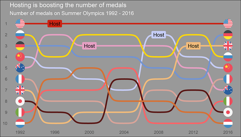
6.6 ggbump
Bump charts are good to use to plot ranking over time, or other examples when the path between two nodes have no statistical significance.
Thanks for reading! :)


