
1st Presidential Debate: By the Numbers
The first debate was a mess. But like most news today, it will undoubtedly fade as the next story comes out (e.g. Trump testing positive for COVID). Therefore, let’s use some data science and tools to analyze and visualize the debate as quickly as possible before it fades to the background!
Unlike many other data science-oriented articles out there, I’ll be focusing more on quick and dirty ways of data processing, analysis and visualization because — in full transparency — while the visuals above and the ones below may be fun to look at and serve an eye-catching purpose, they are not incredibly profound nor do they tell much of a story past a surface level. However, the text data itself is quite rich and I encourage you to further explore the data yourself! (I’ve uploaded the data to Kaggle here).
What To Do When You’re On A Tight Schedule
Before my current line of work, I worked at National Journal, the politics/policy division of Atlantic Media (the print and online media company), and our team would create visualizations on the fly daily. To create the following visual, here are some tips I’d recommend.
First question: Is there a story in the data?
Second question: Is it easily wrangle-able?
When I was watching the debate, the first thing I wanted to visualize was the number of interruptions that occurred throughout. But is it easily wrangle-able? Sadly, no. Through a quick Google search, I settled on a transcript of the debate from Rev.com, and it seemed that they had separated each speakers’ remarks during pauses.
In other words, short of manually reading through and joining these areas that double up — there was no quick and surefire way to identify if a speaker was interrupting another person, being interrupted, or the transcription was just acting funny.
In fact, if we disregarded who the previous speaker was and just analyzed the frequency of these occurrences, it would result in President Trump with 150 instances and Vice President Biden with 136 — a ratio far removed from reality. Here’s the code to check this:
import pandas as pddf = pd.read_csv('debate_csv.csv') # read in the csv# split into a list of words then count length of list
df['num_words'] = df['text'].str.split().str.len() # subset for only 8 words or less
df = df[df['num_words'] <= 8]# check count by speaker
d_count = df.groupby('speaker').count()
print(d_count)Using Excel
Yes, use Excel. For me it was the quickest way to copy and paste the raw transcription from the Rev website and use Text to Columns and F5 -> select blanks -> Delete selected rows to create the dataset.
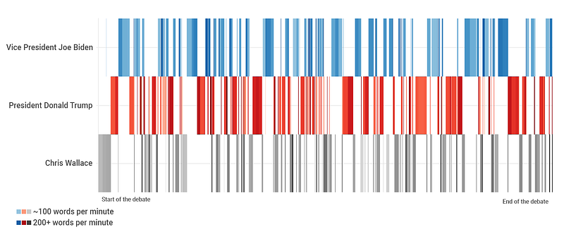
Creating the Time Plot
Visualization takes time when coded. Since I couldn’t easily analyze the first story angle I was interested in, I instead decided to visualize when each speaker had the floor.
To create the timeseries, I used Flourish Studio. While I’m not the biggest fan of their free tier, which requires all of your datasets to be public… For quick projects like these where time is of the essence as “newsworthy-ness” slips away, it’s a good tool to have in your back pocket. (Other quick, yet attractive viz tools also include DataWrapper (same public data requirement as Flourish) and Raw Graphs — which is completely open source and lets you maintain privacy, win win).
Taking a quick look at Flourish’ sample data, I realized my own data would have to be structured so that one row = 1 second, where the X axis would be these seconds passing (continuous variable) and the Y axis is the speaker (categorical variable). Before processing, the debate dataset had one row per speaker, with a column of the minutes:seconds when the speaker began talking.
import pandas as pddf = pd.read_csv('debate_csv.csv') # read in the csv# function to convert the time to seconds
def time_to_sec(text):
minsec = text.split(':')
minutes = minsec[0]
seconds = minsec[1]
tseconds = (int(minutes) * 60) + int(seconds)
return tseconds# convert timestamp (string) to seconds (int)
df['seconds'] = df['Time'].apply(time_to_sec)
# create multiple rows based on the number of seconds spoken# replace 0 seconds spoken with 1
df['seconds_spoken'] = df['seconds_spoken'].replace(0, 1)
# fill empty values
df['seconds_spoken'] = df['seconds_spoken'].fillna(1)
# now we can run repeat to create one row per second
df = df.loc[df.index.repeat(df.seconds_spoken)]# by resetting the index and making it a column
# we can have a column that increases +=1 seconds
df = df.reset_index(drop=True)
df['running_seconds'] = df.index# export this file
df.to_csv('export.csv')After importing this file to Flourish and setting the axes, we get the resulting chart (I screenshotted this visualization and used Photopea (free Photoshop) to add the final touches like the legend).
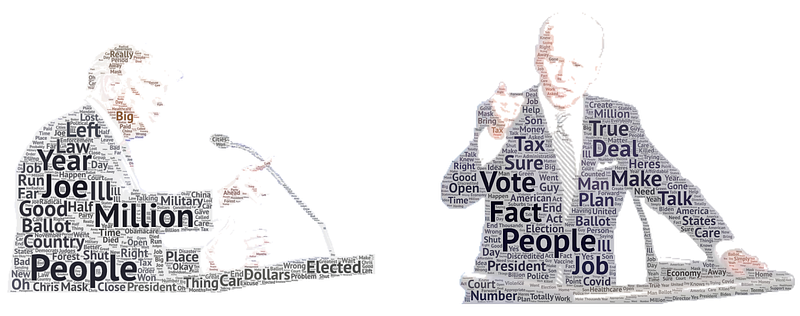
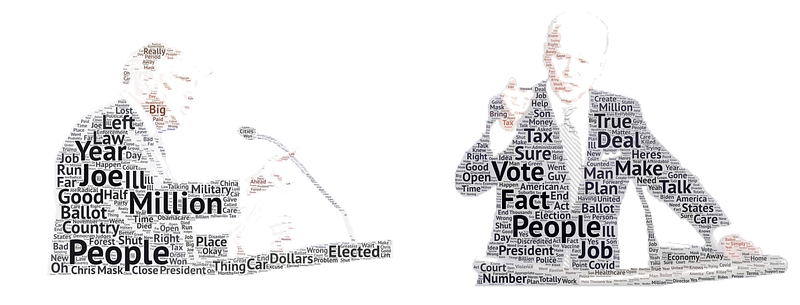
Creating the Word Clouds
Very clearly, I’ll say that I’m not a fan of word clouds. They do not communicate information effectively and often look cheap with unflattering color palettes. My team knows to never ever bring a word cloud to me.
That being said, they are not the end of the world when they are created appropriately with the purpose of drawing in a reader.
I used the code from Shashank Kapadia’s Towards Data Science article on Topic Modeling with minimal edits to return a dataframe with the most frequently used words and their corresponding frequency per speaker. I recommend his article by the way, it’s comprehensive, yet to-the-point and has been helpful for our new data science interns in grasping LDA.
Before running his code, I quickly cleaned the text to ensure the wordcloud isn’t dominated by articles and prepositions.
# quick text cleaning
def remove_accented_chars(text):
    text = unidecode.unidecode(text)
    return text
def expand_contractions(text):
text = list(cont.expand_texts([text], precise=True))[0]
return textcustom_remove_string = ['a','and','its','it','did','going','want','know','look','said','got','just','think','crosstalk','say','tell','00','way','like','lot','does','let','happened','came','doing','000','47','seen','shall','are']def remove_custom_words(text):
text = text.split()
text = [w for w in text if w not in custom_remove_string]
text = ' '.join(text)
return text# run remove accented characters
df['text'] = df['text'].apply(remove_accented_chars)
# lowercase the text and remove punctuation
df['text'] = df['text'].str.lower().apply(lambda x: re.sub(r'[^\w\s]','',x))# run expand contractions and remove custom words
df['text'] = df['text'].apply(expand_contractions)
df['text'] = df['text'].apply(remove_custom_words)While you can use the Python Wordcloud library, the goal of this project was to build these out as quick as possible and so I therefore used WordArt.com with corresponding strings of President Trump and Vice President Biden during the debate.
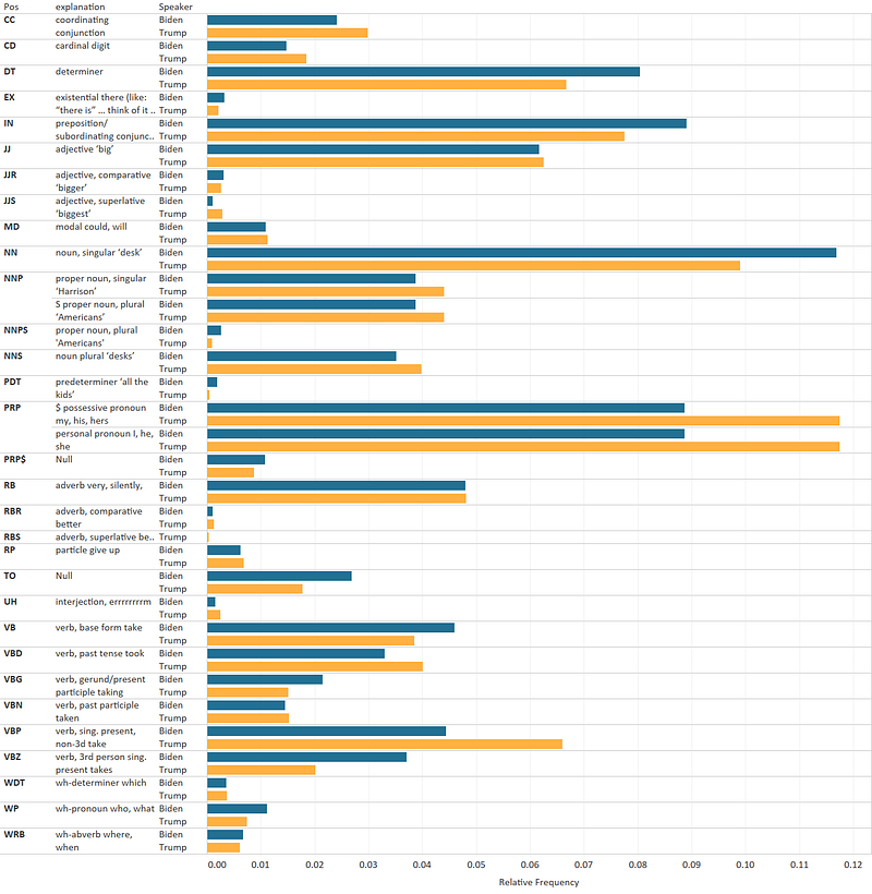
Part of Speech Analysis
The last piece of the visualizations was the part of speech analysis.
This one was the quickest of the bunch and there’s a lot of material out there on the internet on how to do this. Below is all the code I needed to create a dataset ready for visualization.
from nltk.tag import pos_tag
from nltk.tokenize import word_tokenize
from collections import Counter
# subset the data and create a string of the words used by Trump
trump = df[df['speaker'] == 'President Donald J. Trump '].text.tolist()
trump = " ".join(trump)# use nltk's libraries to determine pos
trump_text = pos_tag(word_tokenize(bid))count= Counter([j for i,j in pos_tag(word_tokenize(bid))])# determine relative usage of each part of speech
total = sum(count.values())
tcount = dict((word, float(co)/total) for word,co in count.items())# convert output to dataframe
tcount = pd.DataFrame(tcount.items())I then dragged in output of this script to Tableau and created a quick chart (Tableau is free for a year for students as a heads up). Instead of the standard color palette I used a custom palette which I set in the preferences.tps file. Then I joined the part of speech output file with a file that defines each part of speech abbreviation (copy/paste to excel → text to columns).
Takeaways
If you are working on quick, exploratory data visualizations like these, one of the most important things to keep in mind is to set the story/narrative/hypothesis questions that you will pursue before even touching the keyboard. At the same time, visualize what the final product might look like — not in terms of the code you’ll write, but in terms of what the viewer will see.
This will minimize the work you’ll end up doing because each step becomes a checkbox to tick off rather than a never-ending data exploration phase which results in 100 visuals, none of which are cohesive enough to tell a compelling story.
If you are a beginner in the field, this approach can help alleviate the feeling of being overwhelmed as you think of the 101 ways to analyze the data. And if you’re familiar with these standard NLP libraries and tools I used to make these visuals, this “story-first” approach can still help reduce the amount of time a project takes.
For reference, this project took around 2 and a half hours to complete — from Googling “debate transcript 2020” to photopea-ing the visuals together (longer to write this article 😂).
p.s. One actual takeaway from all this analysis is the sheer amount of possessive pronouns that President Trump uses (e.g. “I” “my” “mine” “our” etc). Cracked me up when I saw that.
About me: Founder of Basil Labs, a big data consumer intelligence startup that helps organizations quantify where consumers go and what they value.
Love music, open data policy and data science. For more articles, follow me on medium. And if you’re passionate about data ethics, open data and/or music, feel free to add me on Twitter.


